
What Separates a Mediocre Dashboard From a Great One
Dashboard design is an area where striking visuals often mask a lack of substance. Many dashboards circulating on platforms like Dribbble are visually appealing but carry little context and no evidence of research. That combination is a recipe for mediocrity, not greatness. A dashboard, by definition, is a part of an application that displays global information about app usage or other external data. They range from simple, one-layered layouts to complex, multi-layered systems, and the design guidelines in this article apply across that spectrum.
So, what is the actual difference between a mediocre and a great dashboard? The answer lies less in the final product and more in the process. The distinction can be plotted across a few key axes: sourcing inspiration, research, design validation, data visualization, and color palette. Similarly, separating good design from bad is often a matter of decluttering. Letting go of elements you have invested hours in is difficult, and designers are prone to becoming too attached to their work even when it doesn't serve the user. That bias is precisely the line between okay and great design.
Research Beats Copying
Designers have two broad paths when faced with a new dashboard project. The first is to copy competitors and tweak their patterns, or stitch elements together from various sources to create a "Frankenstein" solution. It seems easier than reinventing the wheel, but it is likely to doom a design to mediocrity, especially on commercial projects. While copying is a perfectly valid way to learn from great designs, it is insufficient for real-world work.
The main problem with copy-based design is reliability. Finding a source of inspiration that is both well-researched and applicable to your specific situation is highly unlikely. All you can see is the polished end product, rarely the research and decision-making behind it. This leads to a cargo cult: replicating patterns without understanding why they work. Following a proper design process is not perfect, but it is consistently better. Having a command of design principles yields usable designs with fewer iterations and usability testing sessions than mindless copying does.
Beyond looking at other dashboards for inspiration, the key differentiator is talking to users. User research is to design what exercise is to health: everyone knows they should do more of it, but few actually do. As Frank Chimero so aptly puts it, "People ignore design that ignores people." For dashboards specifically, several research activities provide structured ways to have that conversation with users, which can yield valuable insight with as few as five users and save an enormous amount of time down the line.
User Interviews
Interviews help establish the initial foundation. When planning a dashboard, ask users what information they need most, what the purpose of the dashboard is for them, what they consult it for, and how they currently go about finding that information. User interviews are the first step of the design thinking process, covering the empathy phase.
Card Sorting for Information Hierarchy
Card sorting reveals how users group and categorize information, capturing the similarities and differences in how people respond to cues. In practice, analysts break the dashboard into the smallest "atoms" of information and ask participants to establish relationships among them. The resulting structure allows you to build information hierarchy that matches the users' mental models.
Usability Testing for Iteration
Usability testing is perhaps the most important research activity for dashboard design. Skipping it is the cardinal sin of UX design. Even the best designers cannot craft a perfect user experience without iterative design that is driven by observations of real users and their interactions with the interface. Conduct usability tests after card sorting and user interviews. Those methods, combined with your own assumptions, should produce on early dashboard versions. Test and iterate on these, moving from sketches and low-fidelity wireframes to a high-fidelity prototype.
Once the research phase is complete, the next challenge lies in decluttering the interface to arrive at a final design that serves the user above all else.
Decluttering Isn't a One-Size-Fits-All Rule
“Keep it simple” has become a default design mantra, but simplicity is not always the right goal. A cluttered interface can overwhelm users, yet complexity itself is not inherently bad — context matters. Adobe products, for instance, are notoriously dense, but that density serves professionals who need quick access to a wide range of tools.
Consider a professional trading dashboard:
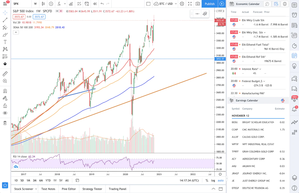
At first glance, this screen looks intimidating, and for a general audience, it probably is. But the people who actually use such software are likely to benefit from the density. Hiding or restructuring this information to make it look “cleaner” would force experienced users into extra clicks and unnecessary friction. The complexity is functional, not decorative.
On the opposite end, a minimal dashboard design may look appealing but can fail on clarity. Take a winner of a minimalist dashboard challenge:
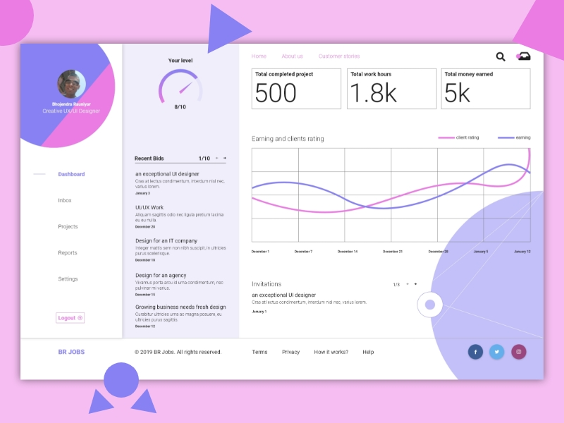
Without access to the designer’s rationale or testing data, a critique should stay speculative, but some issues are visible immediately. The chart compares “client ratings” with “earnings” on the same axis. That implies the two metrics share a unit of measurement — either earnings are measured in rating points or ratings are measured in dollars. Neither makes sense. There are no scale labels, so the units are unknowable. Separate, clearly labeled charts for each metric would have introduced “extra complexity” but also real clarity.
The raw stats themselves raise questions: Is earning “5k” over “1.8k” hours good? How does that compare to peers, and what is the trend over time? Without benchmarks or dynamics, the numbers are just floating figures.
Neither dashboard is perfect, and that’s the point: decluttering for its own sake is a poor design principle. The right level of density depends on the users, their goals, and the context. Usability testing with real users is the reliable way to find out whether an interface is overwhelming or appropriately rich. In addition, several practical techniques help keep an interface from feeling cluttered:
- Clear information hierarchy;
- Modals or expandable panels;
- On-hover interactions;
- A restrained palette of two to three colors;
- Generous white space.
Data Visualization as a Core Dashboard Skill
Dashboards exist to help users see patterns, compare data, articulate information visually, and track dynamics. Those are exactly the things data visualization does best, which is why almost every dashboard leans on charts and graphs. Competence in data visualization, therefore, is a direct path to competence in dashboard design. Get the visual encoding right, and the dashboard’s effectiveness follows naturally.
Choosing Charts That Earn Their Place
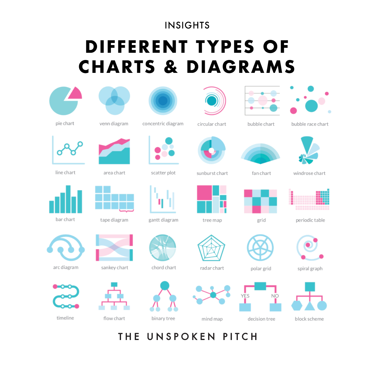
Chart selection is where dashboard readability often breaks down. A sunburst chart can look impressive, but it may not communicate as clearly as a simple pie chart — it depends entirely on the audience. Beyond chart type, color choice, semantic associations, and visual complexity all shape how easily users can extract meaning from a dashboard.
The guidance below draws heavily on the work of Claus O. Wilke, professor at The University of Texas at Austin and author of Fundamentals of Data Visualization.
Color: A Practical Ceiling
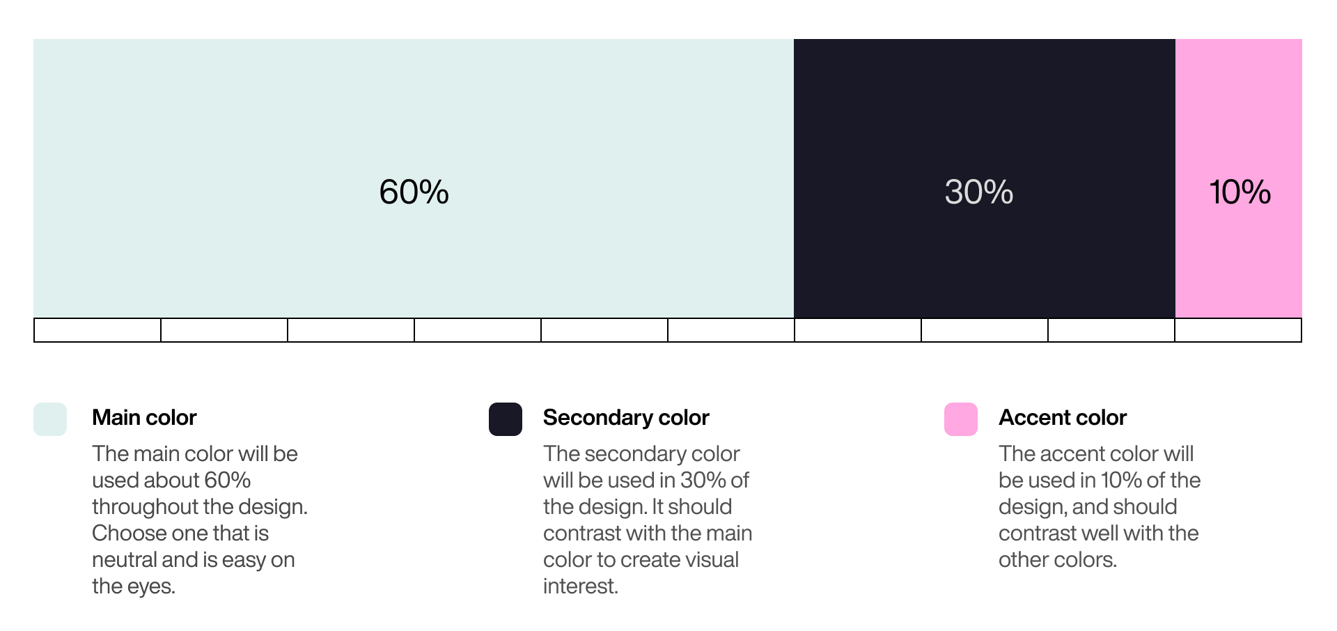
There is no universally correct number of colors for a dashboard. A reasonable working limit is five, excluding shades used to encode intensity and semantic colors such as red for errors or green for success. This aligns with the 6:3:1 “golden” rule of visual design, which proportions three brand colors — main, secondary, and accent — while acknowledging the need for white and black for text and backgrounds.
Different charting goals call for different palettes. When presenting information within a single category, a monochromatic palette can add an extra dimension to the chart; increasing color intensity can encode increasing value, which makes the chart easy to scan.
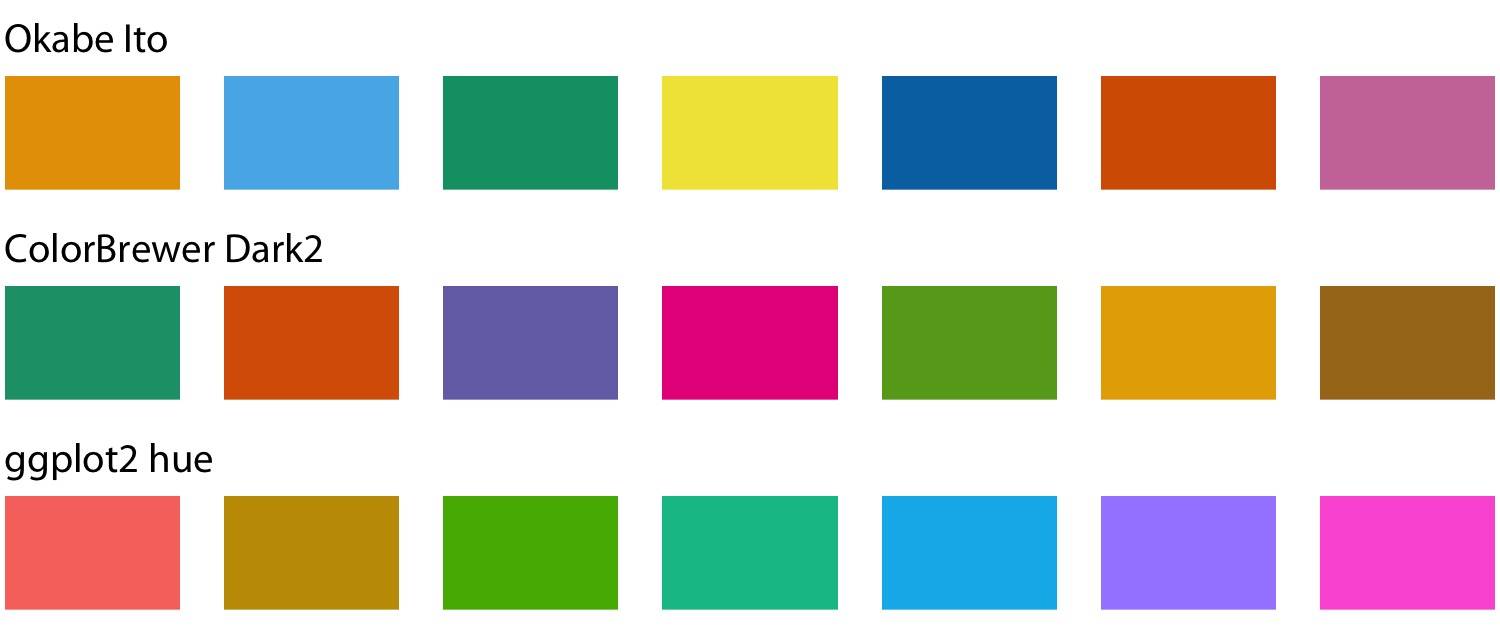
For instance:

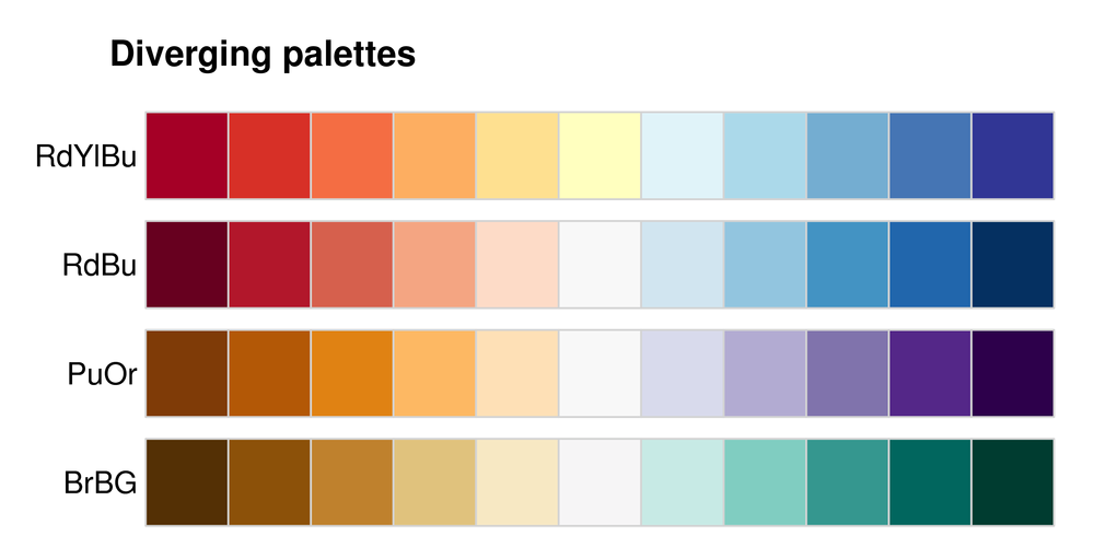
Alternatively, two colors can represent opposite ends of a spectrum, allowing viewers to distinguish between extremes at a glance.
The Hidden Weight of Color Semantics
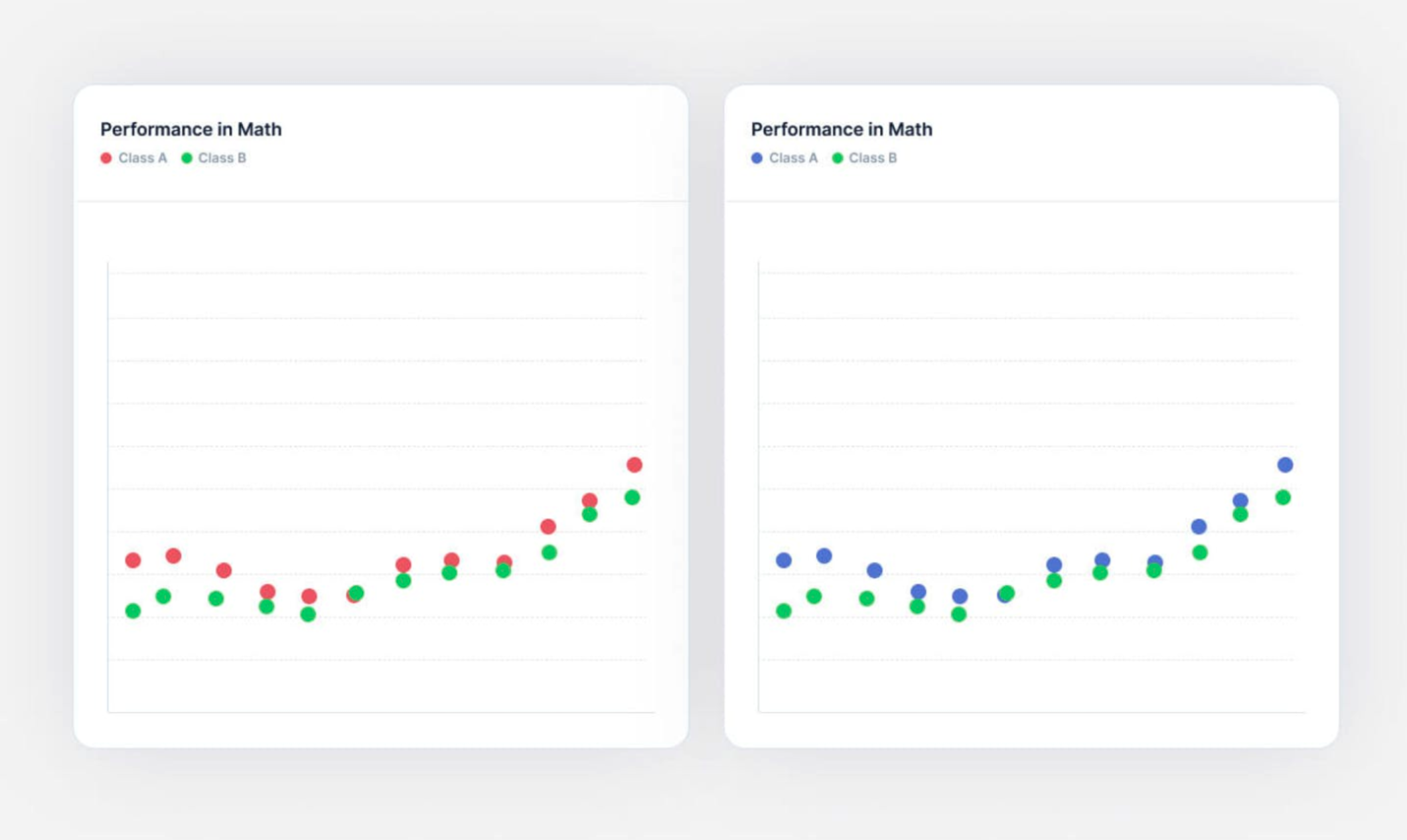
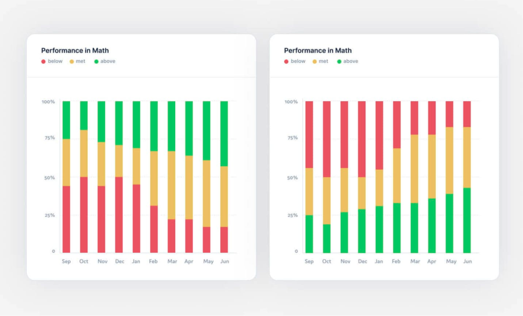
Colors provoke subconscious responses — a phenomenon referred to as “color semantics.” This can distort interpretation. Comparing two groups using red versus green, for example, taps into associations with danger, failure, success, and performance. A chart showing math performance that colors one class red and the other green will likely lead viewers to perceive the red class as underperforming, even if the underlying values are identical.
Used deliberately, the same semantics aid comprehension. Charting individual performance with red below the average and green above it feels natural, partly because of these color associations and partly because viewers instinctively perceive higher placements as greater values. This combination makes the chart far more readable than an arbitrary color scheme would.
Matching Chart Types to Tasks
The friction introduced by poor data visualization often comes from using the wrong chart for the job. Different chart types support different roles, and most charts serve more than one purpose. Below is a guide to choosing charts based on what you need to communicate.
Comparing Values
- Pie — Represents fractions of a whole. Works best with a relatively low number of segments of comparable size; too many segments or very small ones make it unreadable. It cannot display changes over time.

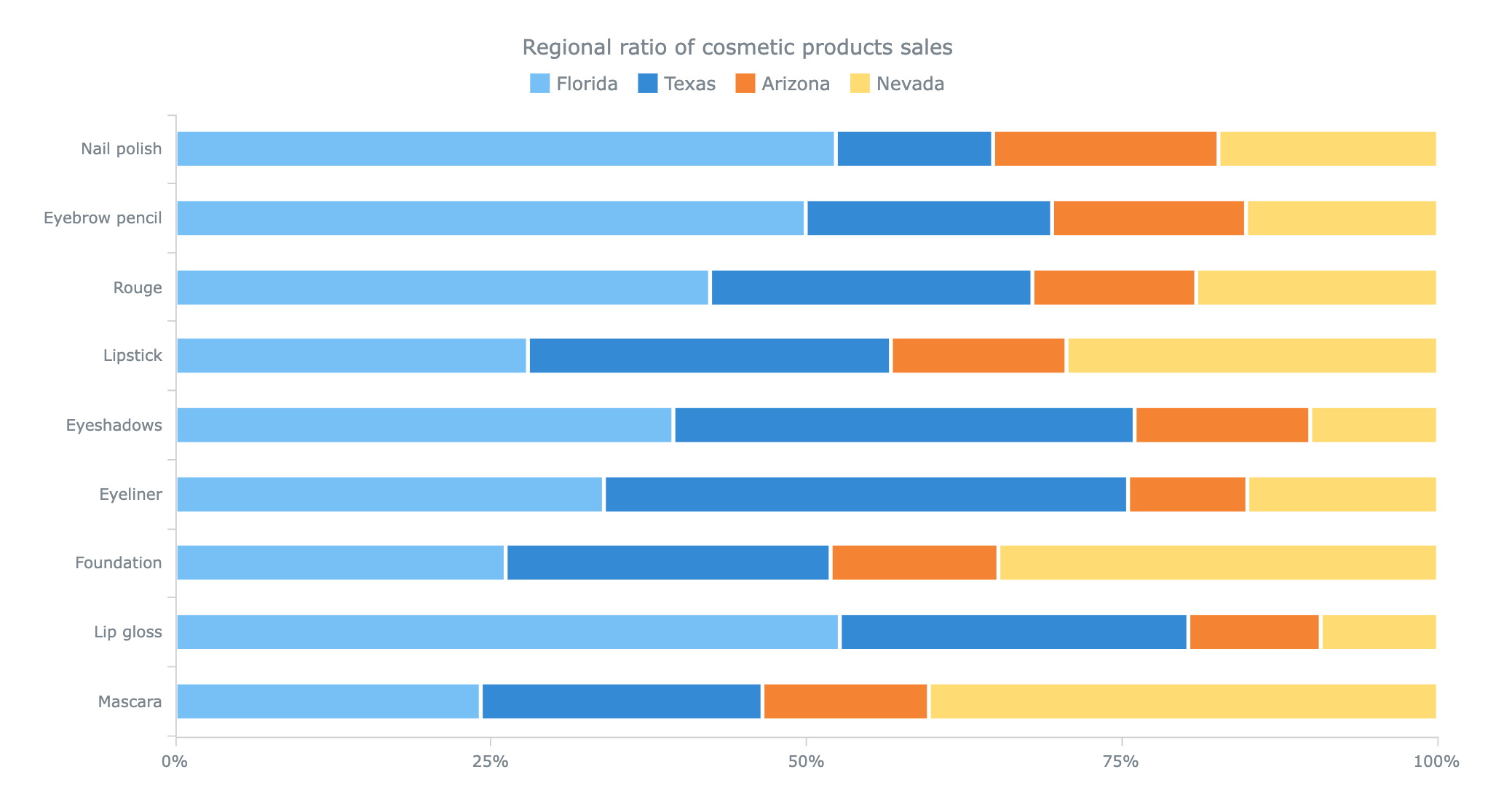
- Stacked Bar — Useful for comparing categories and supporting temporal context, which pie charts lack. As with pie charts, the chart becomes harder to read with more series and categories. When series values vary, comparing them visually becomes difficult — for example, it may not be clear whether the orange series for “Eyebrow pencil” is larger or smaller than “Foundation.”
- Mekko — Good for visualizing category differences across multiple dimensions. The chart stays readable with a few categories but becomes challenging as they multiply. Avoid it when the magnitude difference between elements is extremely large.

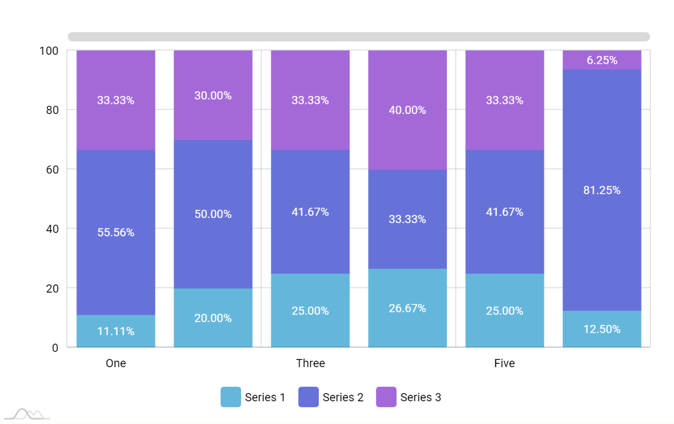
- Stacked Column — Similar to a stacked bar chart, but orientation matters. Horizontal bars typically rank values from highest to lowest or vice versa, while vertical orientation implies a different ordering rationale. A strong choice for category comparisons.
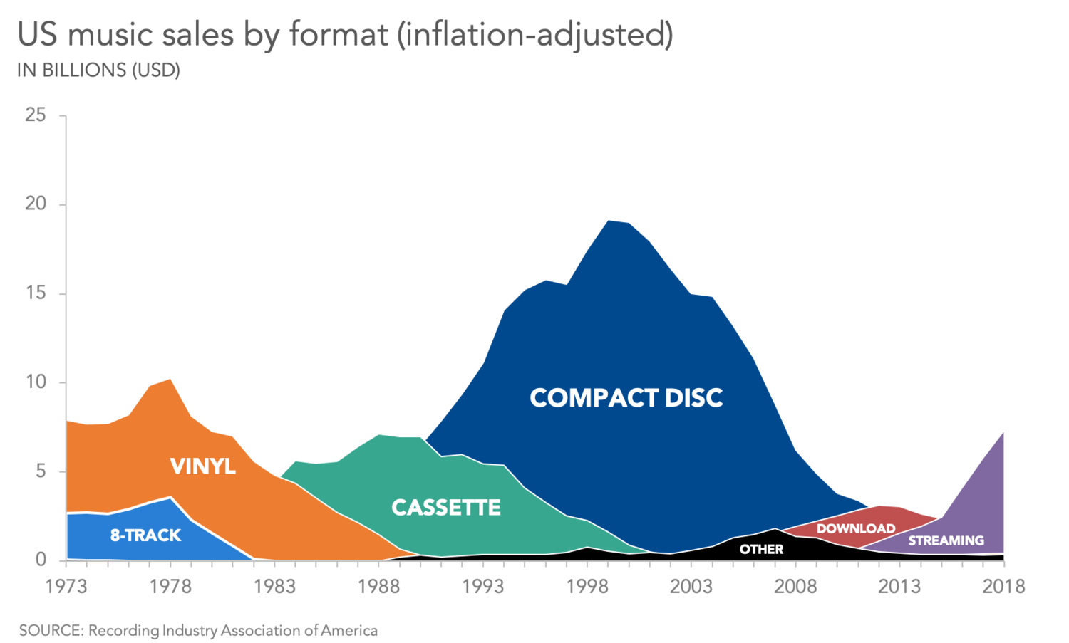
- Area — Commonly used for showing quantitative data trends over time. It is difficult to map a specific point on the graph to precise values on both axes, and increasing the density of information hurts readability. Overlapping areas obscure each other. Area charts suit a big-picture view rather than precise reading; they are particularly appropriate when emphasizing a part-to-whole relationship, unlike line charts.
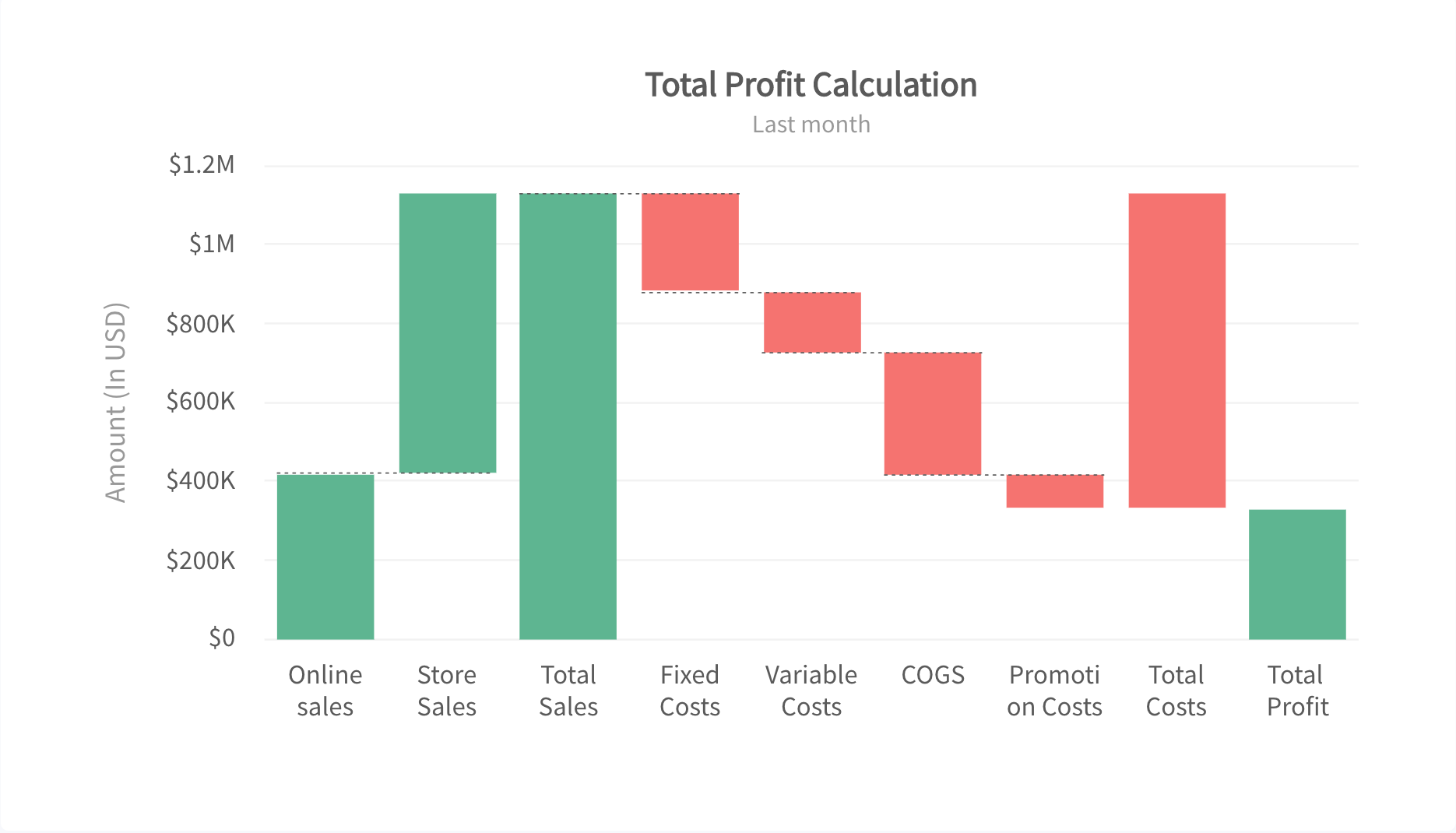
- Waterfall — Breaks down the incremental movement of a value toward an endpoint, frequently used in finance. These charts are less intuitive for general audiences and are best reserved for users who encounter them regularly.
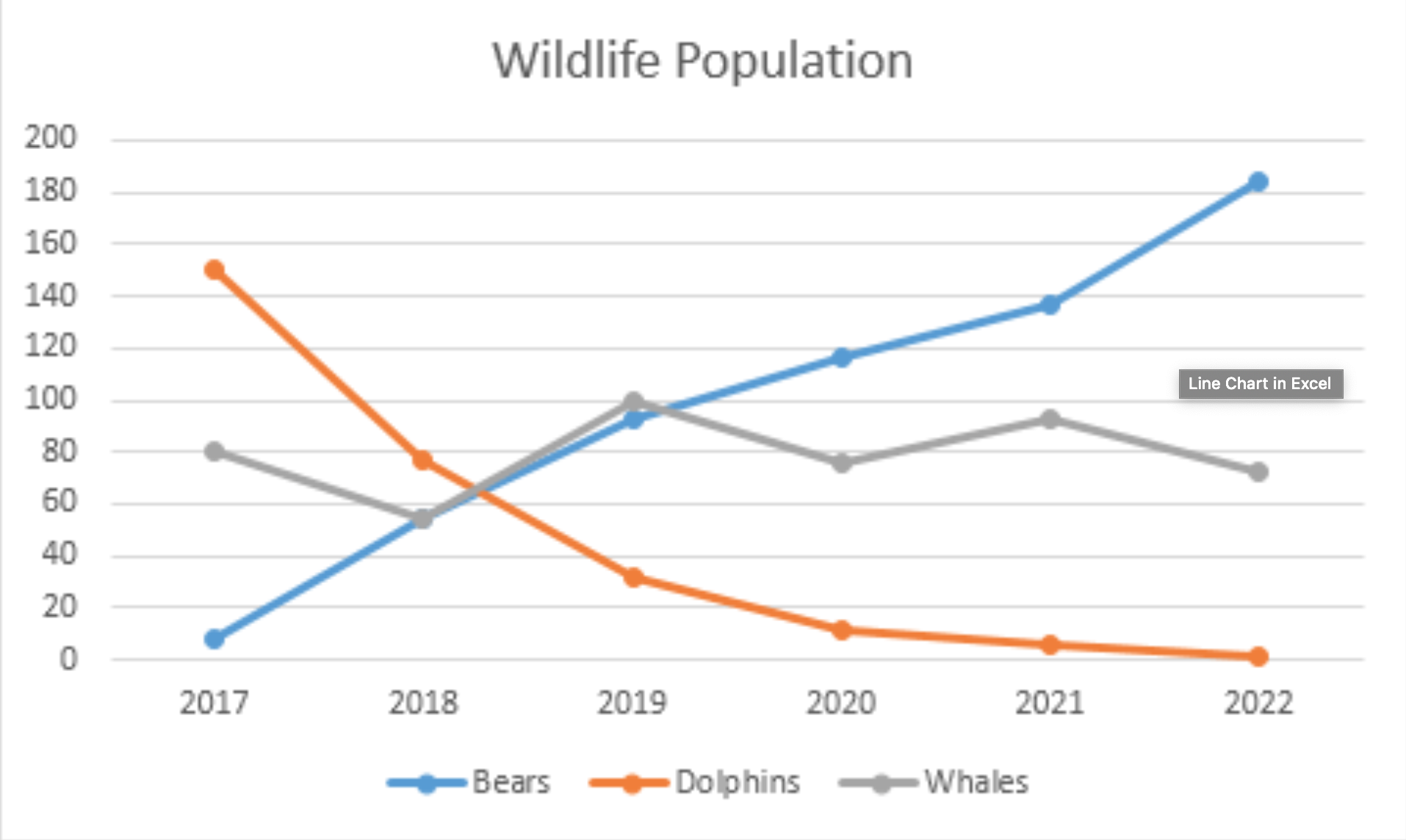
- Line — Presents a series of values connected by straight segments. It inherits the drawbacks of area charts but avoids the issue of overlapping fills.
Showcasing composition:
- Pie
- Stacked Bar
- Mekko
- Stacked Column
- Waterfall
Distribution of data:
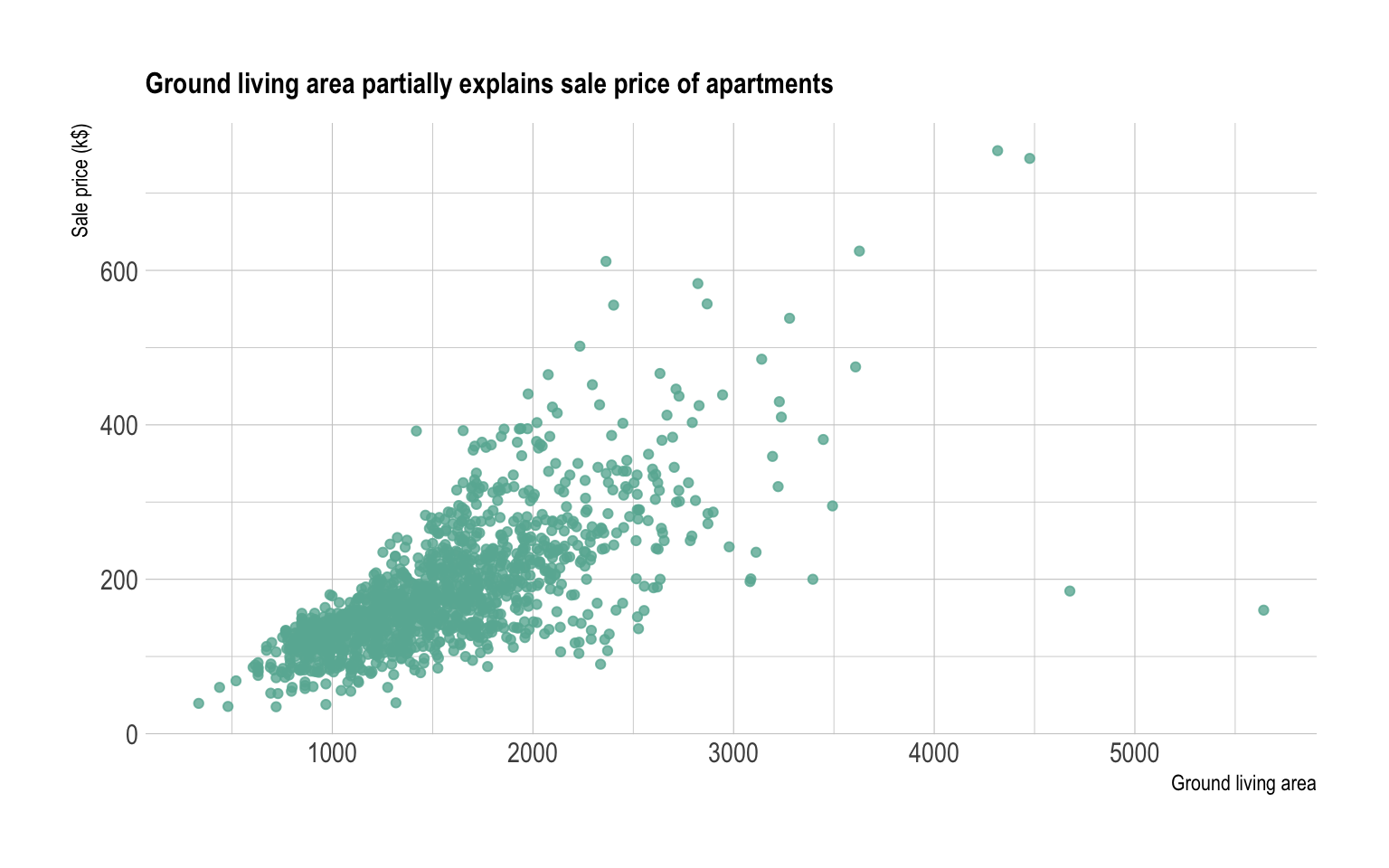
- Scatter Plot — Highlights relationships and distribution of one or more numeric variables across two axes. This chart is inherently harder to read than the others discussed, so it is advisable only for experienced users.
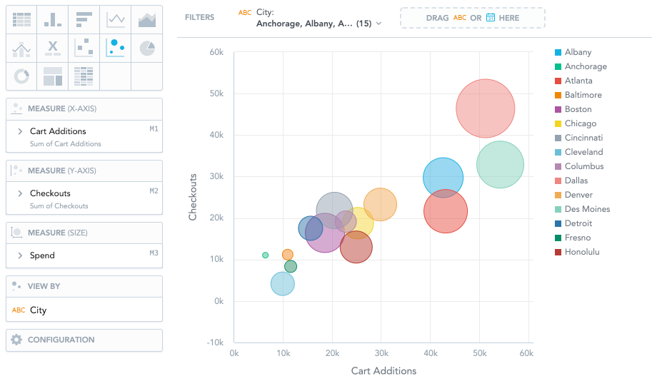
- Bubble — Common for financial data, providing a deeper view by adding a third dimension of information that a scatter plot lacks.
Correlation and relationships between values:
- Scatter Plot
- Bubble
- Line
A matrix summarizing these chart types and their general purposes:
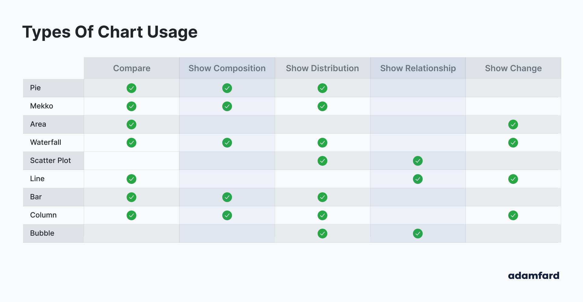
These guidelines are just that — guidelines. A bubble chart where each bubble is a pie chart could theoretically display composition within each bubble, though varying bubble sizes make this impractical in practice. You can get creative with chart types at your own discretion.
Balancing Complexity and Efficiency
Arbitrary selection among similar chart types is rarely wise; some communicate far more effectively for a given task. Once you narrow the options, it is worth selecting the least complex chart that does the job. Charts that combine high efficiency with low complexity — easily understood even by a middle-school student — are the right fit for a general “consumer” audience. As you move toward more complex chart forms, you should have solid reasons to believe your users can read them comfortably.
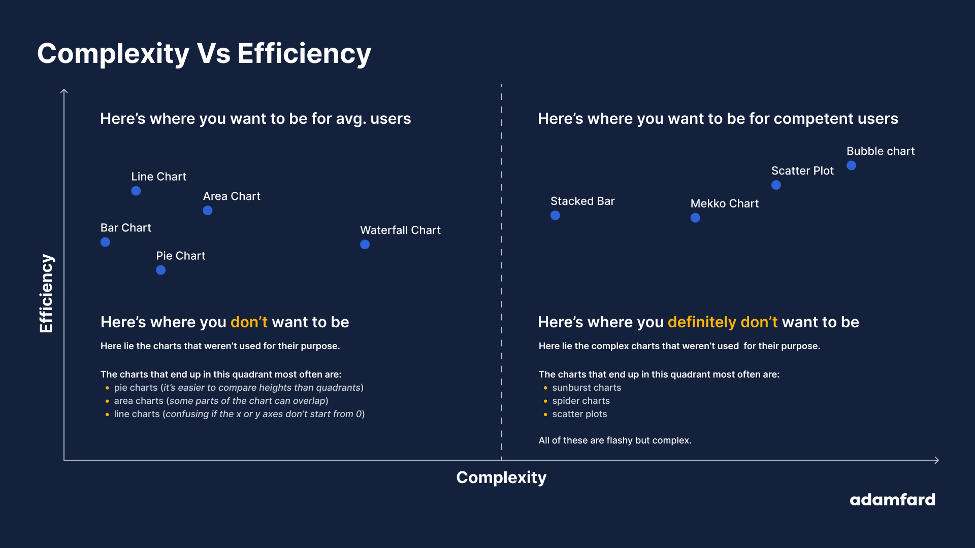
Pushing Further
For continued learning on dashboard design and related data visualization topics, these resources have proven useful, ordered by increasing complexity:
Articles
- Data-heavy applications: How to design perfect charts
- Top 16 Types of Chart in Data Visualization
- Dashboard Design: Best practices and examples
- How to design and build a great dashboard
- Dashboard UI Design: 14 Best Practices for Stakeholders
Books
- Refactoring UI
- Beautiful Visualization: Looking at Data through the Eyes of Experts (Theory in Practice)
- Functional Art, The: An Introduction to Information Graphics and Visualization (Voices That Matter)
Scientific Papers
- Visualization Criticism - The Missing Link Between Information Visualization and Art
- Principles of Effective Data Visualization
Further Reading
- Designing for Accessibility: Best Practices for Closed Captioning and Subtitles UX
- The Role Of Illustration Style In Visual Storytelling
- Creating An Effective Multistep Form For Better User Experience
- Lesser Known Uses Of Better Known Attributes



