
A new visual language for a multi-player product
Figma’s brand has grown alongside its user base. What started as a tool for designers has become a platform used by developers, product managers, and cross-functional teams. The old visual identity—rooted in vector vernacular, static cursors, and heavy black outlines—no longer matched that reality. The refresh replaces those rigid markers with a more flexible system built to represent the many roles involved in taking a product from idea to launch.
The new identity centers on four foundations: versatile primitives that represent different kinds of creators, dynamic compositions that mirror various modes of making, an expanded color palette managed with variables, and motion principles that animate workflows. The result is a language designed for anyone building in Figma, regardless of their role.

From playground metaphors to a visual lexicon
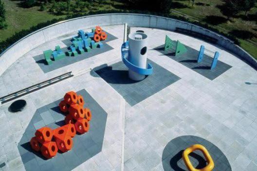
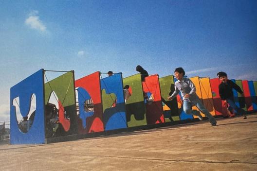
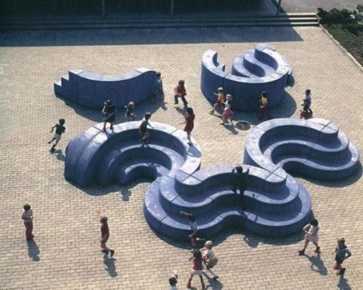
The Brand Studio began by auditing how people actually use Figma—from early brainstorming to inspecting final elements. Early inspiration came from playgrounds designed by Isamu Noguchi and Mitsuru Senda, which Brand Designer Jefferson Cheng saw as metaphors for the Figma canvas: a shared space for experimentation. Though the literal playground imagery was dropped, the concept of parallel activities in one space stuck.
That idea maps directly to the canvas, where a developer might inspect a rectangle through code view while a designer manipulates the same object visually. Brand Studio Director Damien Correll notes that these different modes of seeing and interacting became the foundation of the new visual language. The team cataloged as many activities as they could identify and assigned behaviors to each, creating a scaffold for a system where a single element can be transformed in countless ways.

Primitives over protagonists
The previous illustration style leaned on geometric shapes acting as protagonists in every scene. The new approach favors a broader collection of primitives—basic shapes ranging from abstract blobs to representational forms. These building blocks are intentionally varied, reflecting the range of hands that make them, and remain open-ended so new forms can always be added.
Enduring visual identities should be thought of as languages, not systems.“Enduring visual identities should be thought of as languages, not systems.”
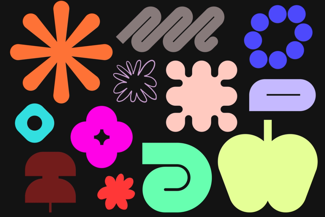

The primitives share a common character: they are graphic, oversized, and bold. “Jumbo” is the guiding principle—not just scale, but an emphasis on detail and precision. It is as if each element was zoomed in on, stripped of the non-essential. They remain vector-based, so they can be built entirely inside Figma.
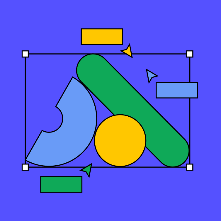
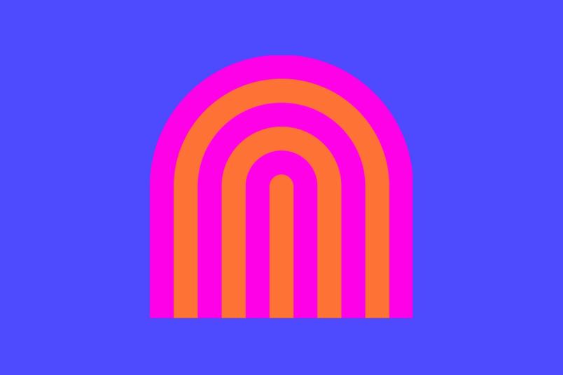
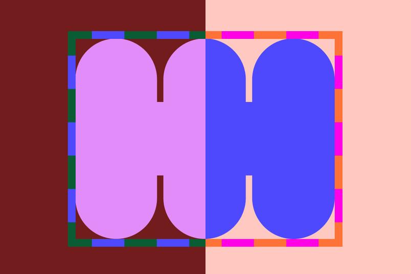
Jumbo nodes—large squares on bounding box corners—amplify the Figma UI and imply selection on the canvas. The nodes do more than decorate: square nodes become circles when an object is being edited, selected objects can be moved or reordered on the z-axis, and primitives can shift between “passive” (solid fill), “activated” (pattern), and “hyper-activated” (wide color spectrum) states. Motion designers collaborated with brand designers on animation studies that informed these interactions, including a dashed marquee border that suggests collaboration and activity.

Four compositional moves
Objects interact on the canvas just as people do. To standardize those arrangements, the team aligned compositions with the product development activities they audited. Ideation appears as freeform collage reminiscent of FigJam stickies, designing relies on manipulation and transformation, and building is represented through abstractions of coding, inspecting, and annotating. These arrangements distill into four core moves:
- Overlap: Shapes layer on each other, embracing the messiness of the canvas.
- Reveal: A selected shape exposes the underlying structure of another element.
- Clustering: Shapes and patterns group into freeform compositions.
- Multi-move: Different compositional elements combine.
A spectrum of color, guided by variables
The expanded palette keeps Figma's signature purple while adding bold primaries, bright neons, and muted earth tones. The move away from a single owner-color strategy is deliberate. Correll argues that heritage brands like Coca-Cola spent decades building color equity; for a contemporary, multi-product platform, a limited color-by-numbers approach is unrealistic. Instead, the team built a spectrum with principled usage rules.
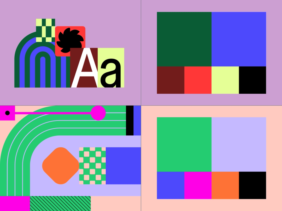
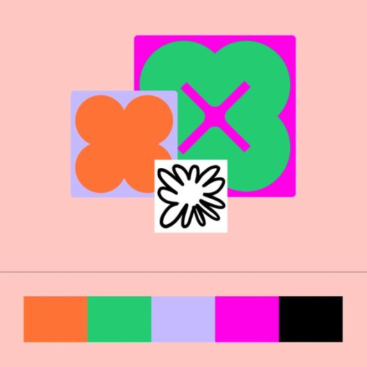
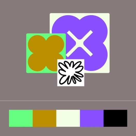
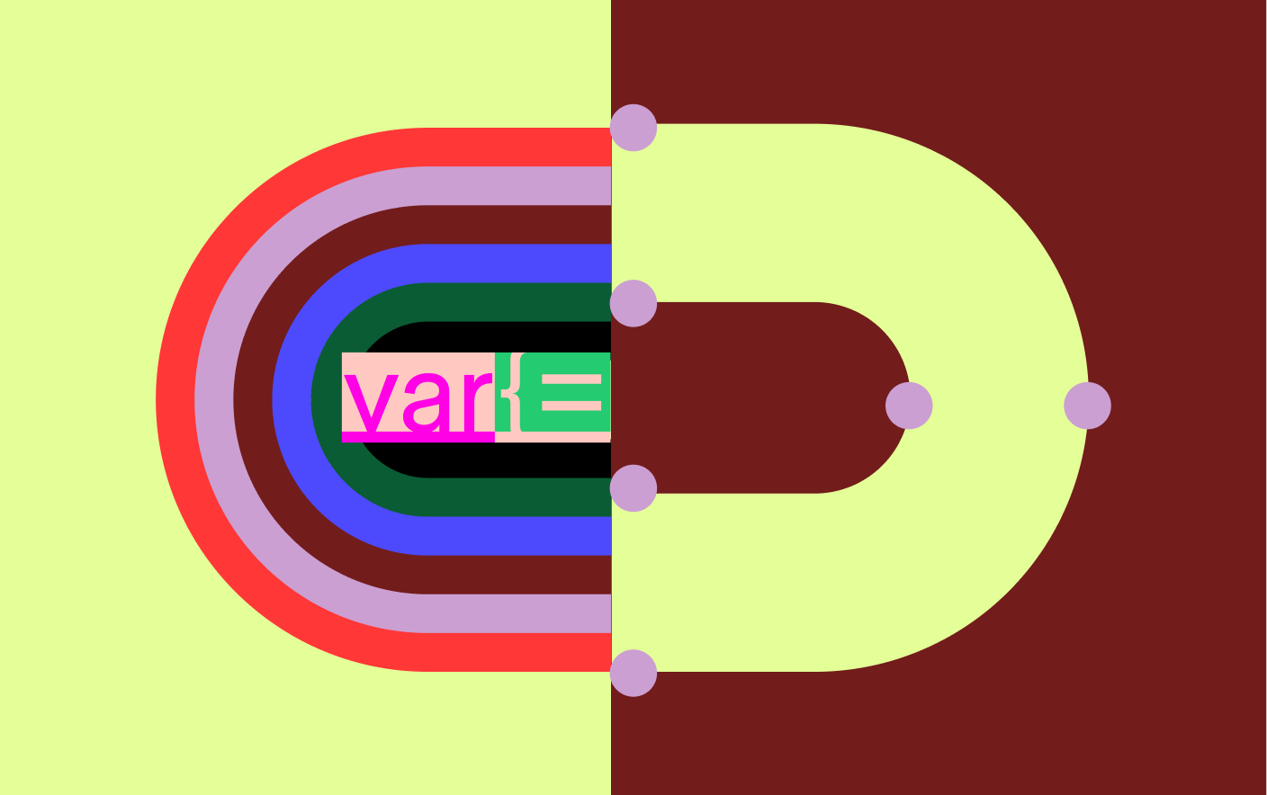
Using variables, the Brand Studio developed color schemes that pair tonal colors at the same hue level to create a vibrating effect. Without black outlines, these pairings produce contrast and a sense of movement. Three hero color schemes anchor the system, each with a vibrant primary pair and four secondary colors, plus light and dark modes that swap secondary colors by context.
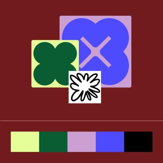
Two principles guide illustration and product imagery:
- Tonal vibrancy: Electric and unexpected pairings convey activation while preserving contrast.
- Adaptive schemes: Flexible palettes shift from dark to light and simple to complex as needed.
Maximalist schemes are reserved for emphasis, accentuating pattern, line, or hyper-activated shapes much like the jumbo principle does for scale.
Motion as a core principle
Motion was considered from the start, not layered on at the end. Brand Motion Designer Gilles Desmadrille explains the focus was on core actions—selection, activation, transformation—bringing the canvas to life without relying on cursors to tell the story.
An egoless design process
The refresh process was collaborative and non-linear. Team members grabbed and built on each other's work, often losing track of who originated an idea—an ideal outcome for building a scalable system. “Figma lends itself to being egoless,” says Cheng. The team also moved quickly because no one waited on a specialist; everyone worked on primitives and reused them across the board. Design system features made the resulting brand libraries and toolkits available to everyone at the company for ongoing use.
It doesn’t matter where something originates; we’re coming together to make something great.“It doesn’t matter where something originates; we’re coming together to make something great.”
A system built to evolve
The rebrand isn't meant to be a static endpoint. "This isn't the final destination. It's a new starting point," says Taryn Cowart, Design Manager of the Brand Studio. "We've created a system that's flexible enough to adapt as we continue to grow and change."
The work was led by Figma's Brand Studio team under Creative Director Damien Correll, with support from agencies Buck (out-of-home campaign) and Nimble (narrative work). The effort pairs the new flexible visual language with the custom typeface explored in the first part of this series, Figma Sans.
Related reading
This article is part of a series examining Figma's brand refresh. For more context, see the companion pieces below.


