

Making Tables Work For Every User
Tables are everywhere on the web, and for good reason: they are one of the most effective ways to present structured data. But just because we are comfortable with the <table> element doesn't mean we are building tables that everyone can use. People with cognitive conditions such as ADHD, dyslexia, or dyscalculia can struggle with dense, poorly organized tables, and the design choices we make can either help or hinder their ability to parse information.
The reality is that many of us are only temporarily "abled." As we age, our eyesight, memory, and attention spans change. Designing tables that are inclusive isn't just about accommodating a small group; it's about creating a better experience for everyone. A well-structured table can reduce frustration, improve comprehension, and boost productivity across the board.
In my work with a company that builds a JavaScript library for pivot tables, and through academic research on inclusive design, I've identified key principles that can make tables more accessible to people with cognitive disorders — and, by extension, to all users.
Understanding The Challenges
Cognitive disorders affect intellectual activities like thinking, reasoning, and remembering. ADHD makes it hard to maintain focus. Dyslexia complicates the recognition of written words. Dyscalculia creates specific difficulty with numbers and arithmetic. For designers, empathy is the first step. There are simulators and browser extensions that can give you a sense of how people with dyslexia perceive text, and videos that demonstrate the experience of ADHD. Experiencing these challenges firsthand makes it easier to identify and solve usability problems.
Cognitive Load
Cognitive load is the amount of information our working memory can handle at once. When a task or interface demands too much, comprehension drops. Any additional information, an unusual layout, or an unfamiliar data format can increase cognitive load. For example, a student accustomed to right-to-left text who is forced to use a left-to-right-only application will have to work harder to absorb the same material as their peers. The goal is to avoid overloading working memory with anything that competes with the user's task.
Cognitive Biases
Cognitive biases are systematic patterns of deviation from rationality. They influence decisions without us noticing. The peak-end rule, for instance, suggests that people judge an experience based on its most intense moment and its ending, not the average of all parts. This has implications for how we structure the beginning, middle, and end of data-driven interactions. A complex table that starts with a confusing column and ends with an awkward, cramped footer will leave a worse impression than one that peaks with useful insight and ends cleanly.
Signal-to-Noise Ratio
A high signal-to-noise ratio is essential. Relevant information is the signal; everything else that distracts from the task is noise. For users with cognitive disabilities, this sensitivity is heightened. A font that's too small, colors that clash, or gratuitous animation can make content unperceivable or even trigger adverse reactions. A good experience prevents cognitive overload for everyone; it's just that some users are more sensitive to noise.
A good user experience will prevent cognitive overload for everyone. It's just that we have to remember that many out there are more sensitive to such noises and loads.
Focusing on these specific user groups does more than solve their unique challenges — it clarifies what is necessary to make life simpler for every user.
Principles For Cognitive-Friendly Table Design
Design can be a noisy term, covering everything from color choices to animation. But when it comes to tables, the guiding principle is this: a good table design is invisible. The design should serve the content, not compete with it. To achieve this, you should aim to:
- Reduce cognitive load wherever possible.
- Maximize the signal-to-noise ratio.
- Leverage cognitive biases to enhance, not hinder, the experience.
These principles, drawn from professional and academic research, form the foundation of a cognitive-friendly table. The subsequent guidelines translate these broad goals into concrete, actionable design decisions.
Color In Tables: Less Is More, But Not Too Little
Get the color wrong in a table and nothing else matters. Colors carry information and emotion, so their use should be purposeful rather than decorative. A restrained palette does not guarantee a functional table, but an excessive one will almost certainly pull attention away from what matters.
Rule 1: Build A Minimalist Palette With Shades, Not Rainbows
Bright accents should be reserved for information that already has established meaning. That doesn’t rule out interesting color schemes — it simply means colors should serve a function rather than act as decoration. As Adam Wathan & Steve Schoger demonstrate with Slack theme customizations, a UI with a broader palette can still look more restrained when it relies on shades of a core color, leaving vibrant tones for highlights.
A quick personal experiment with Telegram’s interface options shows the value of testing palettes in context. In “Night Accent” mode, chat navigation feels clearer than in the default “System” mode — yet the reduced color count in that mode also makes uniformity slightly confusing. Too few colors can be as problematic as too many.
The sweet spot is one to three primary colors, expanded via shades, tints, and tones using complementary, split complementary, or analogous pairings. For tables, a monochromatic “shading” approach works well:
- Choose a primary color.
- Define an evenly darker and lighter shade of that primary color.
Repeat the process between adjacent shades until you have the range you need — generally 7–9 shades is sufficient.
Rule 2: Whitespace Is Part Of The Palette
Generous spacing between rows and columns improves legibility by separating the UI from its content. The right amount of “breathing room” depends on the data type and the device, so consider letting users resize rows and columns for an optimal view.
If you’re unsure about color distribution, apply the 60/30/10 rule:
- 60% for neutral colors,
- 30% for primary colors,
- 10% for secondary colors (e.g., highlights, CTAs, and alerts).
Rule 3: Be Careful With Gray
Gray reads as neutral and balanced, which makes it an easy default for de-emphasizing elements. In monochrome designs like Apple’s site, that works well. But once other colors enter the palette, gray shifts roles: it drains brightness from neighbors and makes the whole design look pale and dull rather than balanced. Against illuminated elements, gray doesn’t just lower significance — it makes elements seem unnecessary.
Gray doesn’t need to be banned, though. When you highlight something, other information is inherently de-emphasized, which reduces the need for gray anyway. A better alternative: replace gray cell backgrounds with lighter shades of the palette’s base color. The effect is the same, but the table retains more vibrancy without adding cognitive load.
Rule 4: Highlight Selectively, Not Decorative
Compare Medium and Hackernoon: Medium’s black-and-shades palette makes even simple tasks like scanning titles effortless, while Hackernoon demands more concentration. In analytical software, over-styled tables risk prioritizing the designer’s taste over the user’s needs.
A shades-first palette can still be compelling. The question is which elements genuinely earn color:
Active cells: When a user selects a cell or range, give it focus without distraction — a border in the base color and a light background shade, keeping text WCAG-compliant for contrast. It also helps to subtly identify the focused cell’s row and column.
Error messaging: Errors contain critical feedback and benefit from color. Reds, oranges, and yellows are conventional, but avoid overemphasizing mistakes, as that invites panic. (Vitaly Friedman’s piece on error-message UX covers these pitfalls in depth.)
Outstanding data: To flag outliers such as table highs and lows, avoid reds and greens, which imply success and failure. A darker shade of the base color for the text is often enough to draw attention without losing context.
Data-heavy tables are already overwhelming, and we don’t want any additional noise. Try to remove all unnecessary colors that add to a user’s cognitive load.
When in doubt, remember that a table’s primary goal is reliability, not beauty. Validate final color choices against a variety of target users and use contrast checkers to catch mistakes early.
Typography: The Foundation of Table Legibility
Typography is just as important to an inclusive table design as the colors we choose. Both have the same goal: reducing the cognitive effort needed to interpret what is on the screen. This is particularly true for the numerical data that often fills our tables.
Pick a Simple Font
The same principle that applies to color applies here: simplicity wins. You need a font that demands less brainpower to read, not one that fights for attention.
This doesn't mean abandoning your preferred font library, but you should filter your choices based on specific criteria to ensure better legibility in a dense data environment:
- Sans-serif fonts (such as Helvetica, Arial, and Verdana) are more effective in dense areas because they require less space, providing better breathing room.
- A large x-height — the height of a lowercase letter minus ascenders and descenders — generally makes a font easier to read.
- Monospace fonts create consistent character widths, which results in evenly spaced cells that are easier to compare.
- Regular font weights are preferable; bold text is a form of highlighting that can become confusing when overused.
- A stable, open counter (the enclosed space in letters like “o” or “b”) ensures better rendering at small sizes and prevents distortion.
Choosing fonts that meet these points will help you narrow down the vast array of available typefaces to those truly suited for tables.
Number Formatting Deserves Attention
Designers often select fonts based on the legibility of letters, but when a table's primary content is numeric, those characters also need first-class consideration. For instance, it is difficult to find a proportional font that produces a narrow “1” that aligns well with other digits.
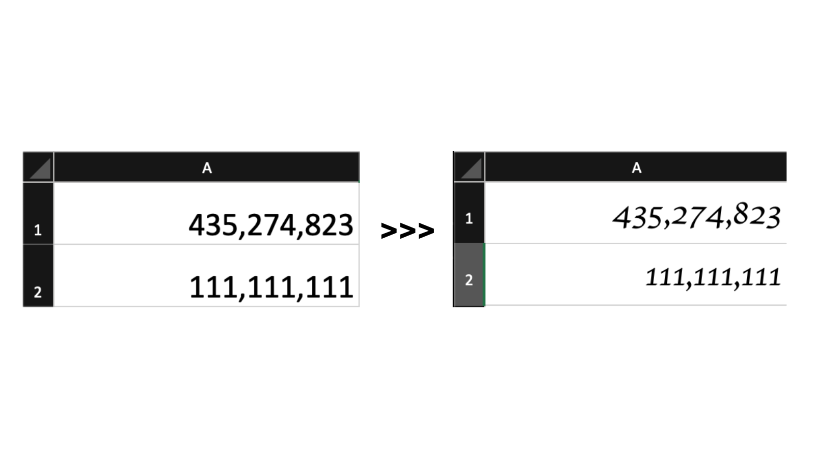
As the figure demonstrates, data is significantly easier to read when characters share the same width and are aligned. This reduces the distance the eye travels between values and makes it easier to determine which figure is larger at a glance. Similar fonts can still be used, but look for those with a robust "1" and consider variable fonts that support the font-variant-numeric feature for better control over spacing.
Limit Alignment to Left or Right
While the CSS text-align property technically offers four options, you should generally only use two of them. Center alignment should be avoided except in rare cases with unambiguous data, such as consistently-sized icons. Justified content alters spacing between characters to create even line lengths, which works against the need for consistent spacing when scanning numeric columns.
Instead, align data toward the left or right. Although language preference often dictates this, there is a strong case for right alignment with numbers. We compare values in a right-to-left fashion, looking at units, then tens, then hundreds. This is why spreadsheet apps like Excel, Sheets, and Notion default to right-aligning numeric values.
There is an important exception: qualitative numbers. These are identifiers or pieces of contextual information written numerically, not measurements meant for comparison. For these, left alignment is the better fit. Common examples include dates (e.g., 12/28/2050), zip codes (e.g., 90815), and phone numbers (e.g., 555-544-4349).
See the Pen [Table Heading UA Styles [forked]](https://codepen.io/smashingmag/pen/rNqRGby) by Geoff Graham.
Table headings should align to the same edge as the data in their column, even if browsers default to centering headings. In large data grids, keeping the header and data design consistent helps maintain a clearer perception of the whole grid.
Enhancing Meaning with Visuals
Data doesn't have to be just text. Icons and colors can add layers of meaning that help users process information faster. For instance, conditional formatting and heat mapping recreate data patterns efficiently, while styled icons can succinctly indicate increases, decreases, or status changes. Using these visual cues allows users to focus their decoding energy on the raw text and numbers that remain.
Let Data Lead, Not Headers
It is tempting to use bold, bright styling to make headers stand out, but this should not be overdone to the point where headings overshadow the data itself. In fact, the better strategy is often to de-emphasize headers so the data takes center stage. Consolidate and tone down any secondary information as well.
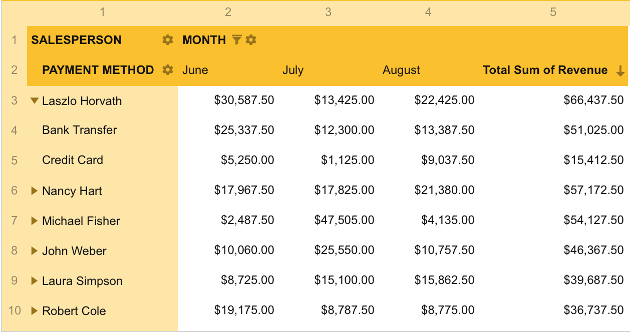
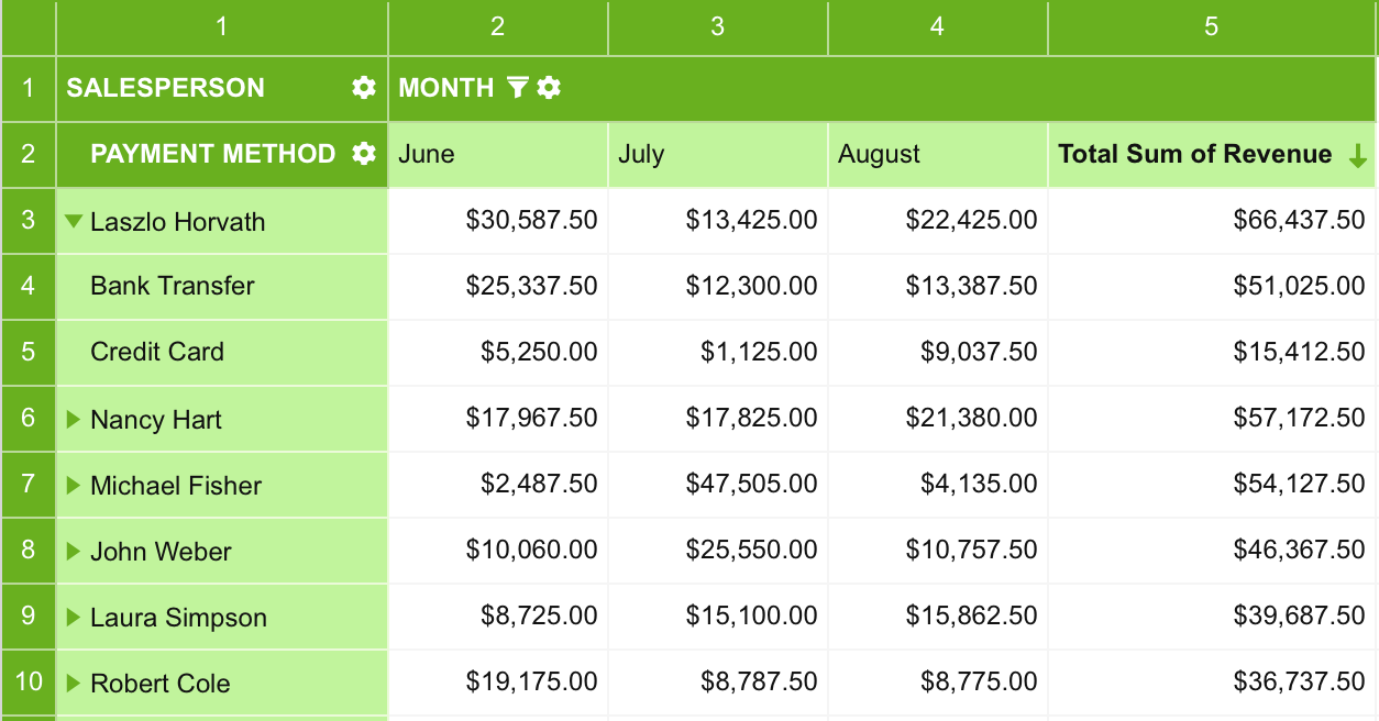
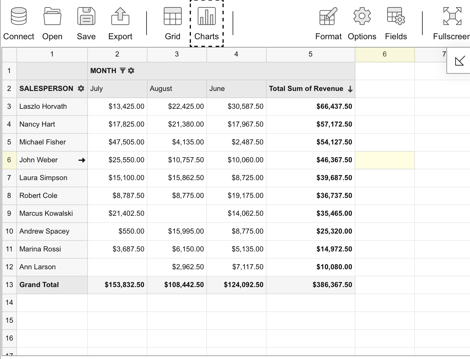
The screenshots illustrate this point well. In the first, the column headers immediately capture attention — which is good for establishing context — but the heavy bold formatting becomes distracting, tricking the brain into thinking the header is the most important content on the page. The second example uses a different tactic: by changing the background or text color rather than relying solely on weight, the header is emphasized without adding unnecessary cognitive load from the bolding.
One caution: avoid using gray when de-emphasizing elements. This can make content recede too much, especially if it sits against a busy background. Similarly, keep labels short so they don't compete with the actual data. For example, use “Total Revenue” or “Grand Total” instead of “Grand Total of Annual Revenue.”
Table Layout and Its Impact on Usability
While tables were once a common tool for webpage layout, today’s standardized CSS features have freed them for their primary purpose: displaying data. The lessons learned from that era of "intentional layout" still inform best practices for making data tables approachable.
Prioritize White Space Over Borders
Borders can define rows and columns, but too many of them can make the screen feel cluttered and distract from the data. Proper alignment and spacing can often make heavy borders unnecessary.
For navigation in large tables with many rows, borders can help delimit records, but instead of adding more lines, try increasing cell padding. Negative space is a design saver in this context. However, keep an eye on table width; you don't always need to stretch to the full container. Excess space between columns forces a reader's eye to travel long distances, which increases the chance of misreading a row. It's acceptable for that spacing to be uneven, since real-world data rarely fits a perfectly uniform grid. Let content dictate the column width, but avoid making columns so narrow that words wrap awkwardly.
Keep lines to a minimum. Add them only if alignment, joining cells, or spacing fails to direct the eye, and when you do use them, keep them light. Similarly, multi-line wrapping should only be used when truly necessary, such as with long data points. If you find yourself resorting to it frequently, reconsider the layout or the format you’ve chosen for the visualization.
Styling Rows and Columns
The right styling depends heavily on the table's purpose. Reducing visual noise might work well for a small dataset, but those same techniques fail when a user is scrolling through thousands of rows. To help users retain their place over long distances, borders become useful again.
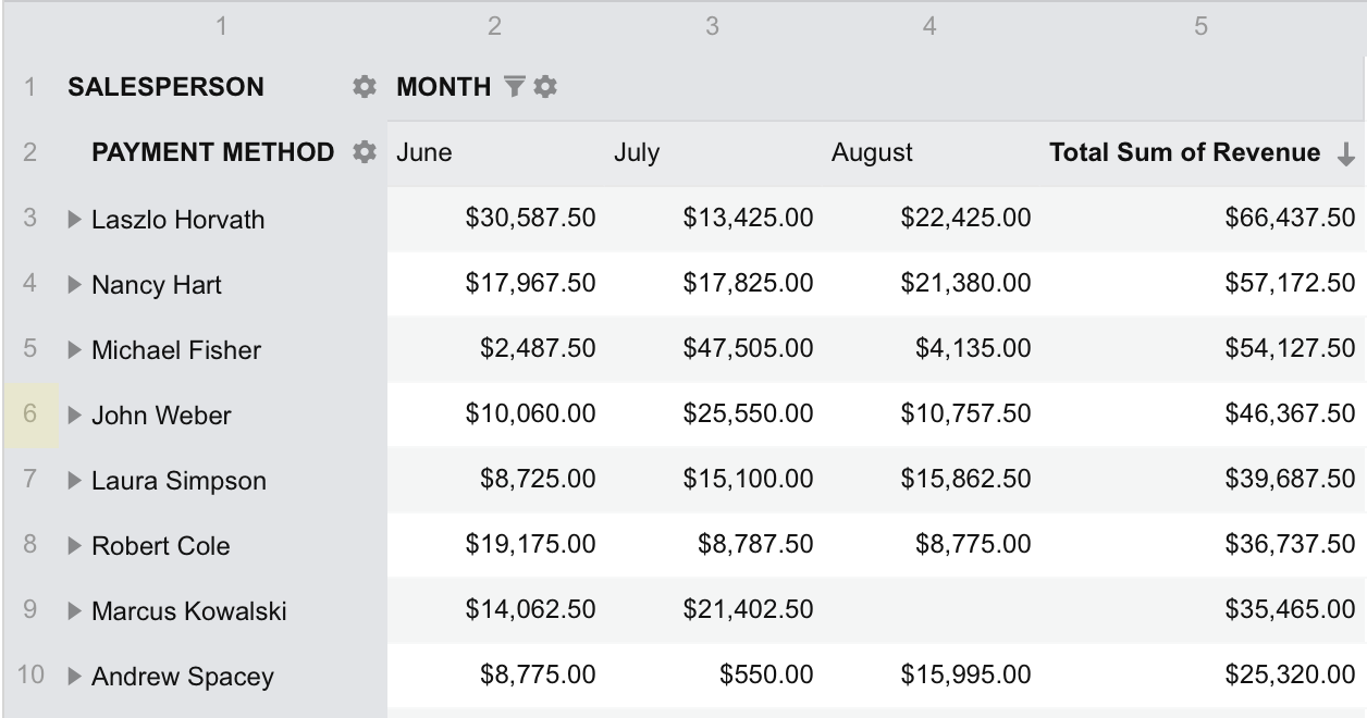
Zebra striping is an excellent visual cue to anchor the eye and maintain focus, but it is often treated as a purely aesthetic choice. To ensure it functions well, choose colors that promote usability. A slightly darker shade of the table's default background is often a safe choice. If the background is white, consider the lightest shade of your palette’s base color for the stripes. The same principle applies to borders: they should be present enough to guide the eye but subtle enough not to become a visual distraction.
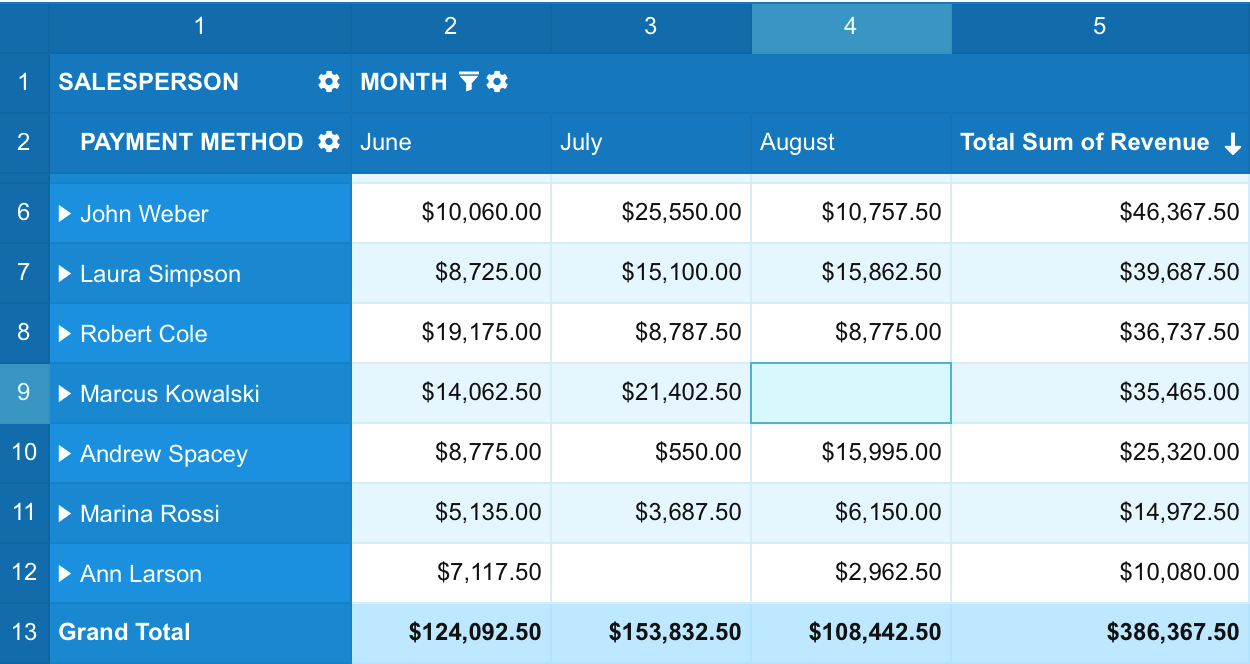
As a general rule for usability, consider that row density typically gravitates around the 40px–56px range, with a minimum padding of 16px on the right and left edges of each column. This provides enough space for the eye to track data without making the table feel sparse or overly dense.
Choosing Table Enhancements That Earn Their Place
A table does not have to be a static container of values. Filtering, sorting, searching, and reordering are common additions, but whether they improve or harm the experience depends on the data set. The safest path is to give the user control over extras such as colors, fonts, conditional formatting, and cell sizing, and to leave a comfortable default state for the average user. For smaller data sets, the overhead of heavy controls can outweigh the benefit, so assess enhancements against the data before adding them.
Keeping Context During Scrolling
Long tables bring scrolling errors along with cognitive ones. Striping already helps the eye track a row, but once you scroll far enough to lose the header, you lose the frame of reference for the values below. Sticky positioning on the header (and a first column, if useful) keeps the context visible at all times.
See the Pen [Table with Sticky Header and Sticky First Column [forked]](https://codepen.io/smashingmag/pen/MWPxOap) by Chris Coyier.
When a header becomes sticky, it should not pick up a new visual treatment mid-scroll. A sudden style change is itself an unexplained event that adds cognitive load instead of relieving it.
Anchored Links And Motion
A table that contains anchor links can drop a user into the middle of a long document, erasing the context that explains how they got there. Smooth scrolling with something like scroll-behavior: smooth shows the path from origin to destination, which gives the user a way back. Apple’s motion guidelines make the same point: motion shows how things change and what happens next, which helps people act with confidence. That said, smooth scrolling is not universally helpful, and any automatic motion should respect reduced-motion preferences.
Sort, Filter, And Search
These three functions decide whether a grid is actually usable for a large collection of records. The point is not flair; it is the ability to discard irrelevant rows and surface the ones that matter. If the table is large enough that a user cannot reasonably scan everything, the functions are necessary rather than optional.
Reordering Rows And Columns
When the row or column order carries no meaning, allowing the user to drag items into a new sequence is a natural interaction. It mirrors rearranging physical items, feels intuitive, and lets users impose their own logic on the data instead of accepting yours. The feature only makes sense where the change does not break the integrity of the data.
Resizing For The User
Any “optimal” cell height or column width you choose will be wrong for someone. The practical compromise is to give the user resizing controls while keeping a carefully chosen default for everyone else.

Designing For Assistive Technology
Accessibility is the hardest requirement to build and the most important one to get right. Users with diagnosed conditions feel the impact of a poor interface far more strongly. Plan for semantic markup, full keyboard navigation, and compatibility with screen readers, and do it as part of the core build rather than as an enhancement for later.
What Makes A Table Work
Designing a good table means weighing a wide set of user needs against the risk of over-engineering. Most of the recommendations here depend on the specific situation; a small table will not need everything a data-heavy grid does. Three goals should guide whichever choices you make: keep the cognitive load low, maximize the signal-to-noise ratio, and use cognitive biases deliberately rather than accidentally. If one principle matters more than the rest, it is that the data outranks everything else, and every table feature should serve it rather than decorate it.


