
The long-running split between design and development traces back to a simple problem: mockups are not websites, and knowing which artifact counts as the source of truth has never been settled. UXPin's answer is a code-based design tool in which the components on the canvas are the same components that ship to production.
What UXPin Brings to the Canvas
UXPin is an in-browser design and prototyping tool aimed at digital, screen-based work, with the feature set you would expect from that category. What distinguishes it is the code basis: elements on the canvas behave like real interface elements. A text input, for example, is not a static rectangle with an outline — it accepts typed text.
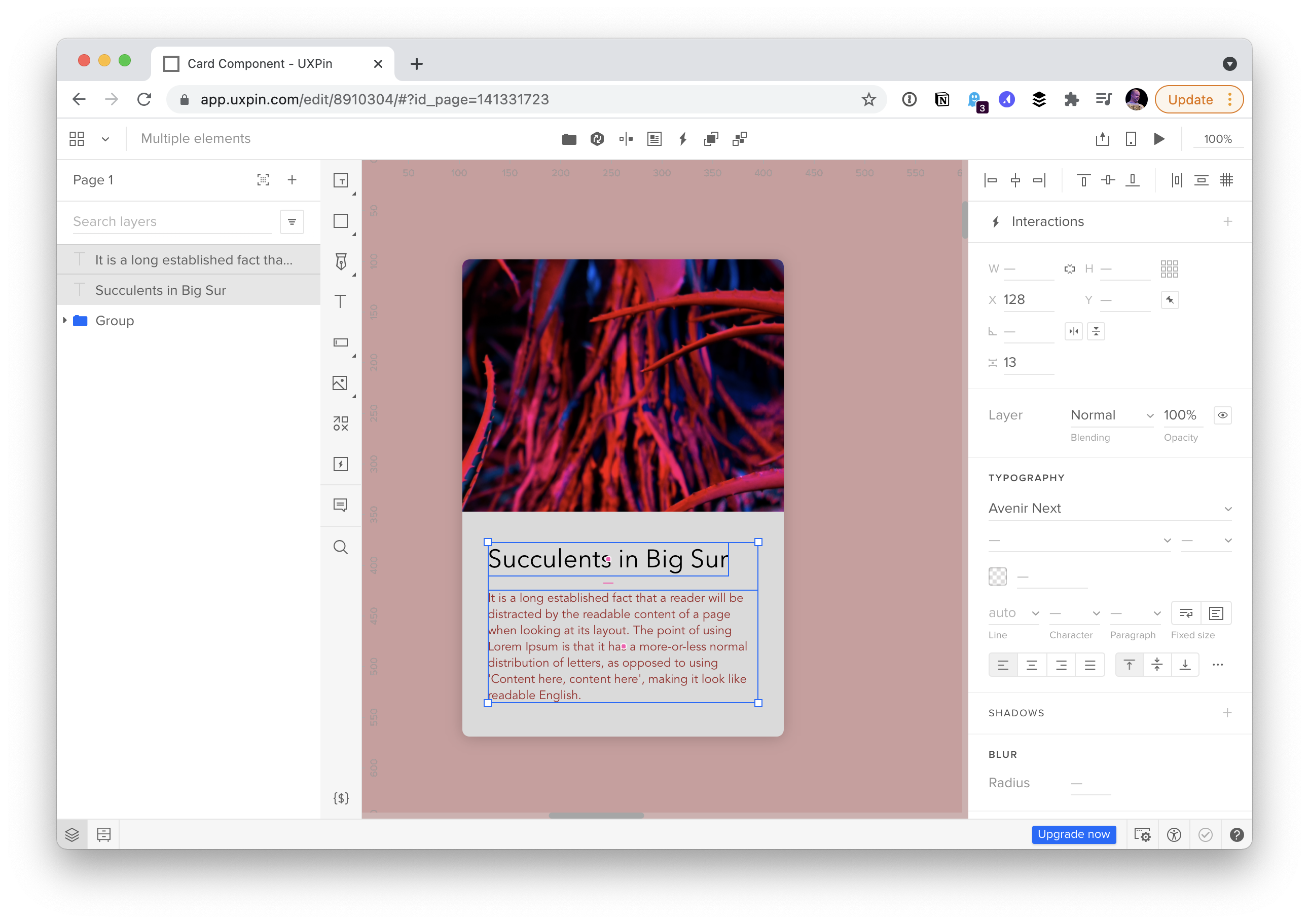
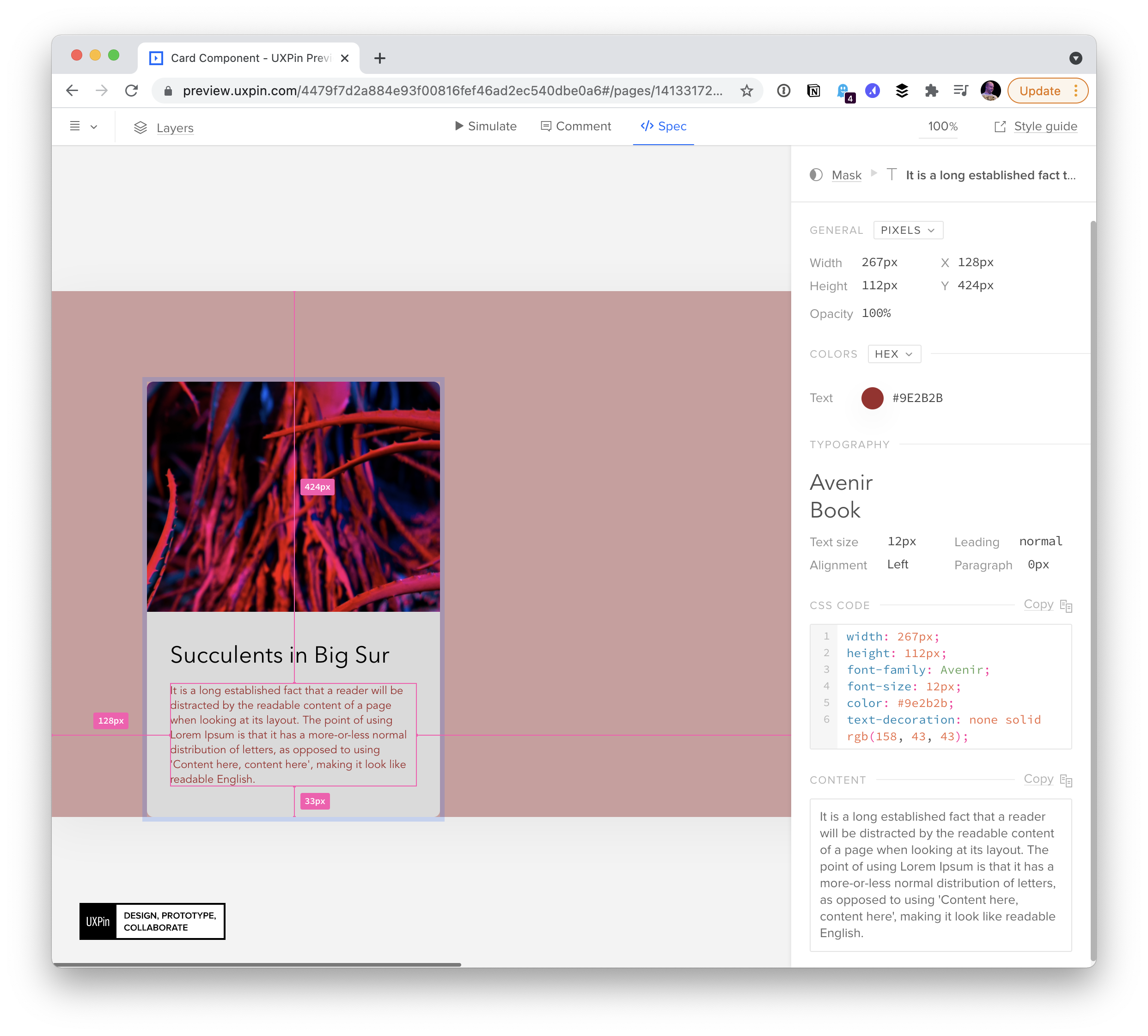
Because the building blocks are rooted in code, the design looks like the finished product and largely behaves like it. Each element also carries its specifications — exact colors in the correct formats, exact pixel dimensions — and in some cases the precise component code can be handed to a developer.
This is the model Ania Kubów demonstrates in a video walkthrough of the tool. The idea itself is older than the implementation. Writing more than a decade ago, Jason Santa Maria argued that a design tool should understand the inherent dynamism of the web:
Webpages are living, dynamic spaces where the smallest interaction from a visitor can change the scope of an entire site. […] Because we’re not dealing with a static medium, we need to be able to design for interactions and the shifting landscapes of a webpage […] an application needs to see elements rather than blocks of color or text. Photoshop, Illustrator, and Fireworks have some low-level functionality in this regard, but the need for more dynamic and non-destructive handling is clear.
The Single-Source-of-Truth Path: UXPin Merge
Exporting a framework component from a design tool is a one-way trick, and it does not solve the real problem. Production components carry logic that has nothing to do with design — a hook that reads the current user's permissions and disables a button, for instance, where only the disabled state is a design concern. A tool that can only push code outward has no way to respect that logic; what's needed is the ability to pull existing components in.
That is the job of UXPin Merge. It requires setup work: a few hours in the simplest case, or a few weeks for a full design system. For now, Merge supports React and integrates through a webpack configuration.
Once the integration is running, the components a designer works with inside UXPin are literally the components used to build the production site.
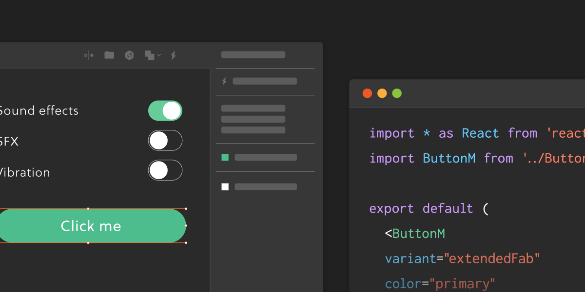

The vendor supplies documentation on integrating your own components and a starter repository, uxpin-merge-boilerplate, to work from.
Component Props as Design Controls
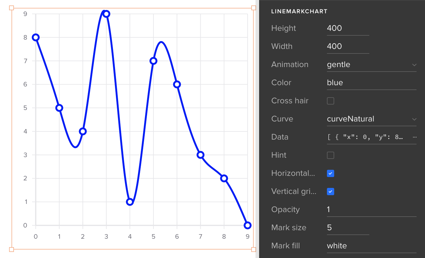
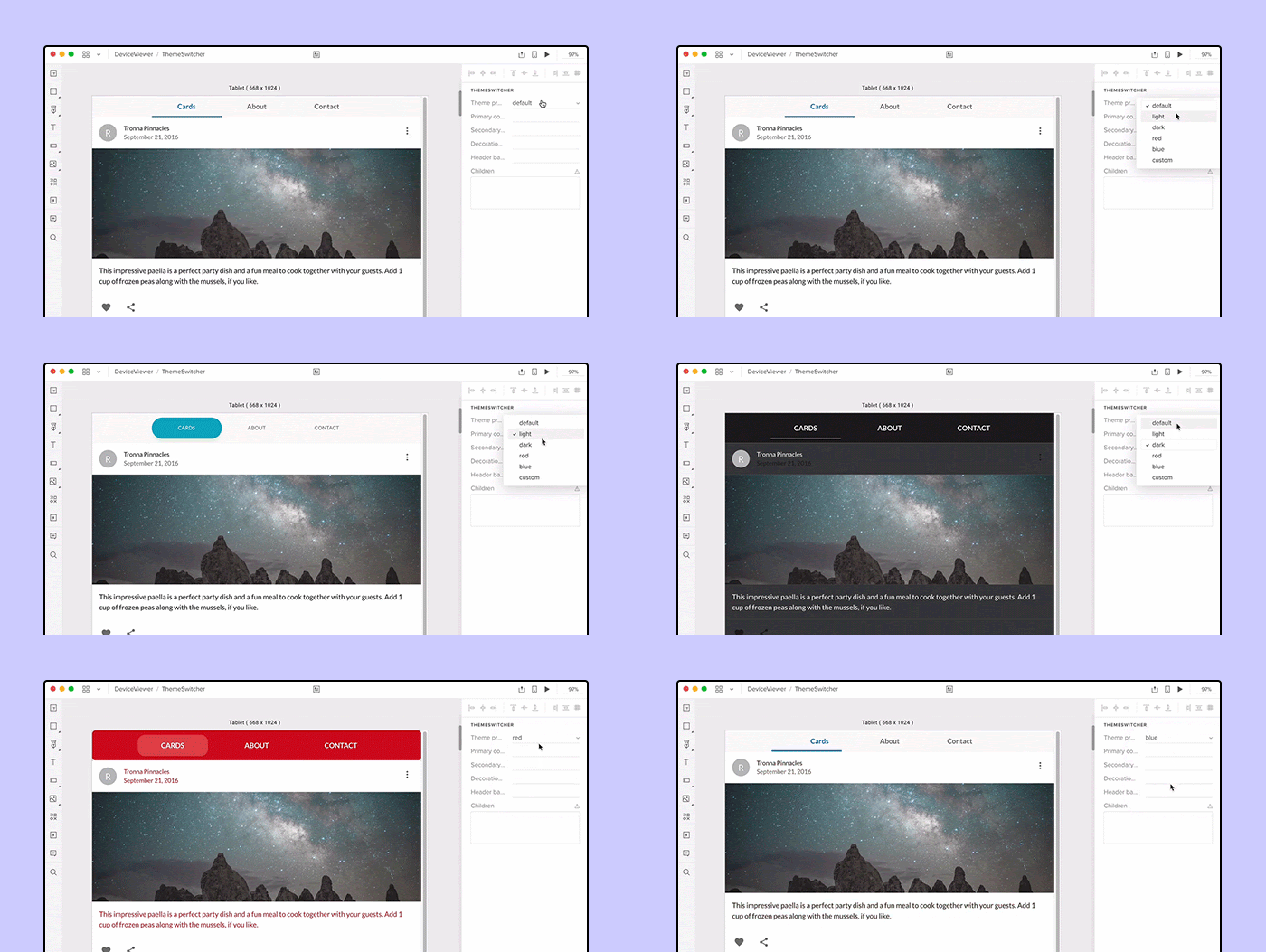
Integrating your components will likely affect how you build them. Props drive design and content inside a component, and UXPin exposes those props through a UI, giving the designer full control over the rendered result.
<LineChart
  barColor="green"
  height="200"
  width="500"
  showXAxis="false"
  showYAxis="true"
  data={[ ... ]}
/>
Knowing that, it makes sense to design prop interfaces that expose plenty of design control — theme switching, for instance, can be wired through as a prop.
Storybook as a Shortcut
Storybook is a common place to build and test JavaScript components — less a design tool than a library for them. If you already use it, Merge pairs with it directly: the integration becomes much quicker, and it extends support beyond React to frameworks such as Angular, Svelte and Vue. The Storybook side of the workflow runs fast enough that the source demonstrates the setup on video.
UXPin CEO Marcin Treder has described the underlying goal this way:
What if designers could use the very same components used by engineers and they're all stored in a shared design system (with accurate documentation and tests)? Many of the frustrating and expensive misunderstandings between designers and engineers would stop happening.
The planned workflow follows from that:
- Connect to a Git repo or Storybook library.
- Import components from there into UXPin.
- Watch for changes in the repo and sync them automatically into the visual editor.
- Let designers design and deliver accurate specs and fully functional design to developers.