

Why Motion Sensitivity Matters
When iOS 7 launched in 2013, the design world started to recognize that interface motion could have real physical consequences. Since then, major operating systems have added settings that let people reduce the amount of motion they experience. For those with vestibular disorders, migraines, or other conditions, certain types of screen motion can trigger symptoms ranging from mild dizziness to nausea and beyond.
Our animation choices directly shape how people with motion sensitivities experience our work. While animation remains a valuable UX tool, it is our responsibility to use it thoughtfully. Understanding which effects are likely to cause problems helps us design experiences that don't cause unintended harm.
The prefers-reduced-motion Media Feature
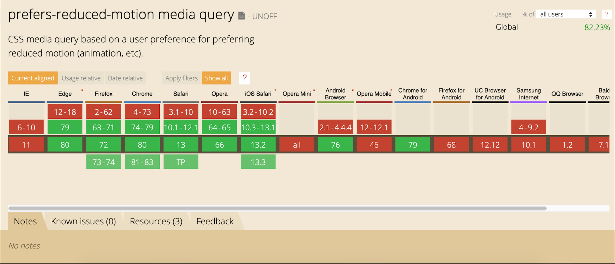
Support for the prefers-reduced-motion media feature is now strong across current versions of major browsers. If a browser doesn't support it, the query is simply ignored and nothing breaks, making it safe for production use.
The feature works like any other media query. In CSS, it looks like this:
@media (prefers-reduced-motion: reduce)  {
    /* reduced behaviour */
}
And in JavaScript:
let motionQuery = matchMedia('(prefers-reduced-motion)');

const handleReduceMotionChanged = () => {
  if (motionQuery.matches) //reduced behaviour;
}

motionQuery.addListener(handleReduceMotionChanged);
handleReduceMotionChanged()
Whichever approach you use, the query returns one of two values: no-preference (false) or reduce (true). The only value we know has been set intentionally is reduce (true). A false value could mean the user is fine with motion — or it could simply mean they haven't set a preference yet. So the more reliable approach is to reduce potentially triggering motion effects only when the query returns reduce (true).
For example, a looping bounce animation can be swapped for a simple fade when reduced motion is requested:
/* A constant bouncing motion effect applied to the title */
h2 {
  animation: bouncing 1.5s linear infinite alternate;
}

/* Replace it with a safer effect when prefers-reduced-motion returns true */
@media (prefers-reduced-motion) {
  h2 {
  animation: fade 0.5s ease-in both;
   }
What Users See
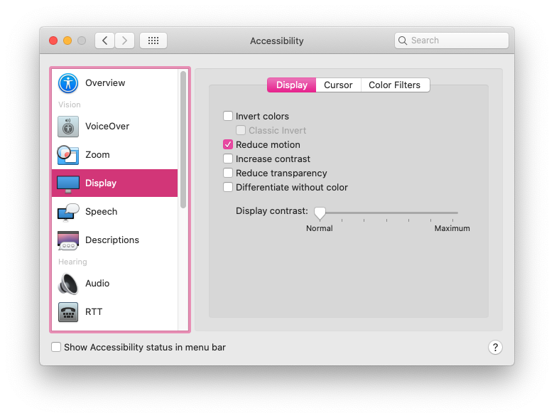
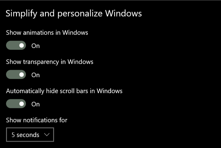
People set this preference in their operating system settings on iOS, macOS, Windows, and Android. The exact menu location differs by platform, but the underlying preference is respected across devices.
Putting Reduced Motion Into Practice
Applying prefers-reduced-motion effectively starts with two steps: identify potentially triggering effects on your site, and then provide a reduced version of those effects.
Finding Potentially Triggering Motion
Walk through typical user flows and examine the motion effects used. Look for large movements, big zooms, spinning effects, and parallax animations — these are all likely to be problematic for people with motion sensitivities. Color fades, opacity changes, and small scale shifts are generally safe. When in doubt, add an effect to your reduced-motion list to err on the side of caution.
The Web Content Accessibility Guidelines recommend providing reduced versions for any motion that creates the illusion of movement and isn't essential to the content's meaning. Unless your site depends heavily on motion, you'll likely end up with a short list.
Designing a Reduced Motion Version
Once you've identified the problematic effects, decide what the best reduced condition is for each. Can the animation be swapped for an opacity crossfade? Would pausing or removing the effect completely still preserve meaning? The role of the motion in the interface should guide your decision — you don't want to accidentally remove content or degrade the experience.
- Large page transitions: Replace with a crossfade effect. The same usually works for big zoom or spin transitions between states.
- Animated illustrations: If they exist for personality or branding, consider a static version or add a play button so users can view them on demand. Check that the static frame is meaningful — the most significant moment may not be the first or last frame.
- Parallax effects: These are universally problematic. Reduce or remove them entirely for reduced motion, and verify all content remains visible and usable. Smooth scrolling can be replaced with default browser anchor behavior.
Don't forget to consider animated GIFs and auto-playing videos, which can also contain triggering motion.
An Example: Swapping the Animated Property
Imagine a header animation where plant photos translate vertically into place, and text words translate horizontally. The motion is large enough to trigger sensitivity. To reduce it, you can keep the same transition timing, easing, and delays but change what is being animated.
The end-state styles position each element intrinsically where it would appear in normal document flow:
.active .plant1, .active .plant2, .active .plant3 {
  transform: translateY(0);
  opacity:1;
}
Each element's starting state translates it slightly above or below that intrinsic position, with a transition property defined:
.plant1 {
  transform: translateY(-100%);
  transition: $dur $ease-both;
}

.plant2 {
 transform: translateY(120%);
 transition: $dur $dur/6 $ease-both;
}

.plant3 {
   transform: translateY(-100%);
   transition: $dur $dur/3 $ease-both;
}
The text animation works similarly but uses horizontal translation per word.
When reduced motion is requested, simply change the starting state to animate opacity rather than the transform position:
@media (prefers-reduced-motion: reduce) {
.plant1, .plant2, .plant3 {
  transform: translateX(0);
  opacity:0;
  }
}
Now the elements start at their final position with opacity at 0. The same transitions, easing, and durations still apply — but opacity is animating instead of position. No changes to duration or easing were necessary. This same swap works with JavaScript and animation libraries too.
Reduced Motion in the Wild
viljamisdesign.com was one of the first sites after apple.com to handle reduced motion thoughtfully. With the preference enabled, the spinning starfield animation stops and large headline movements disappear, while useful hover effects remain. The experience keeps its affordances and design details while being safer for the user.

The AirPods Pro product page takes a different approach because nearly all of its motion could be triggering — the page relies heavily on big zooms and parallax-style effects. With reduced motion requested, these are not simply paused or removed. The page is redesigned to preserve the same content and meaning without the large motion effects.

A Separate Toggle For Motion-Heavy Sites
For sites built around storytelling or immersive experiences, motion is often woven into the content itself — it's not just decoration. Listing every potentially triggering animation and offering a reduced variant for each quickly becomes impractical when nearly all motion on the page could be problematic. In these cases, the solution needs to be more global: reduce the overall level of animation while preserving the meaning of the content.
A visible, custom motion toggle is a practical addition for these highly animated sites. Not everyone knows about the OS-level reduced motion setting, and some users may only be experiencing sensitivity at that particular moment. A toggle lets them adjust the experience immediately, without forcing them to leave the site entirely to avoid getting sick.
Context matters too. Users arriving at a site advertised as an interactive experience will have different expectations than someone visiting their bank's site. Both could contain heavy animation, but surprise is part of the problem — unexpected motion on a utilitarian site is far more jarring.
How A Modern Toggle Works
The concept of a custom motion toggle has been around for years, but it's far more viable today. Marcy Sutton's CodePen demonstrates a modern take that combines a manual toggle with prefers-reduced-motion and local storage. If a user arrives with reduced motion set at the OS level, they automatically get the reduced experience. If they manually flip the toggle, that preference is saved locally, so they don't have to repeat the selection on every visit. This same pattern scales to full applications or sites.
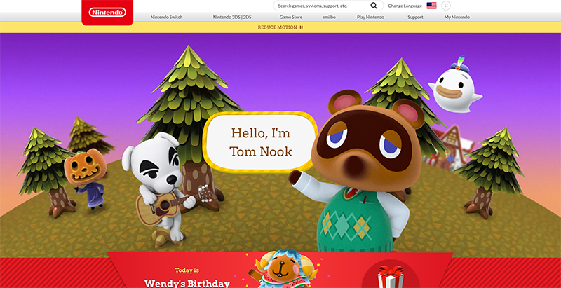
The official Animal Crossing site is a strong real-world example of this combined approach. Its designers reduced potentially triggering motion while keeping the site's playful feel intact — a balance that many content-rich sites could learn from.
Where Else Toggles Fit
If a site already offers a settings panel, adding a reduced motion preference there is a natural fit. Twitter does exactly this: the toggle respects the user's OS-level setting via prefers-reduced-motion and is preset accordingly. Respecting system settings when the toggle is part of a user interface is a sensible baseline.
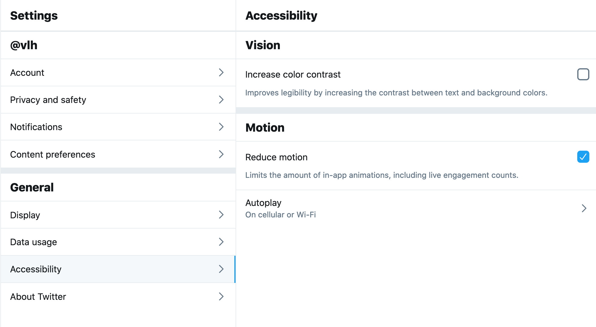
Another option is contextual toggles placed next to specific animated elements. The Dark Side of The Grid article does this well — each animated figure gets a play button, letting readers control when an animation runs rather than forcing it to loop endlessly while they scroll.
Other variations exist: Dave Rupert's technique pairs prefers-reduced-motion with the picture element to swap static images for animated GIFs, and Chris Coyier built on that to offer a play toggle for the GIFs. Steve Faulkner's gif de-animator example is another approach worth inspecting.
These options show there's no single correct answer — the range of techniques lets designers choose based on their content and context. And as more sites ship reduced motion variants, the community will keep producing more creative solutions.
Why Widespread Use Matters
Respecting prefers-reduced-motion makes the web safer and more inclusive, but awareness of the feature itself is still limited. Many users who would benefit from reduced motion don't know the setting exists in their OS, let alone that it can affect browser content — because so few sites honor it. The more sites adopt the feature and provide genuine, quality reduced-motion experiences, the more meaningful it becomes for the people who rely on it.


