

The ten-foot problem
Designing for television means designing for a fundamentally different physical relationship than any other screen. The “10-foot experience” is the term for what happens when interaction moves from arm’s length to the other side of a living room. At that distance, the constraints of the medium become obvious fast.
Text and UI elements need to be larger, because the viewer is three or more meters away. Contrast standards matter more: dark interfaces are the default, since bright surfaces can be overwhelming in a dim room. And interaction needs to be simpler, because the person holding the controller is typically leaning back, not leaning in.
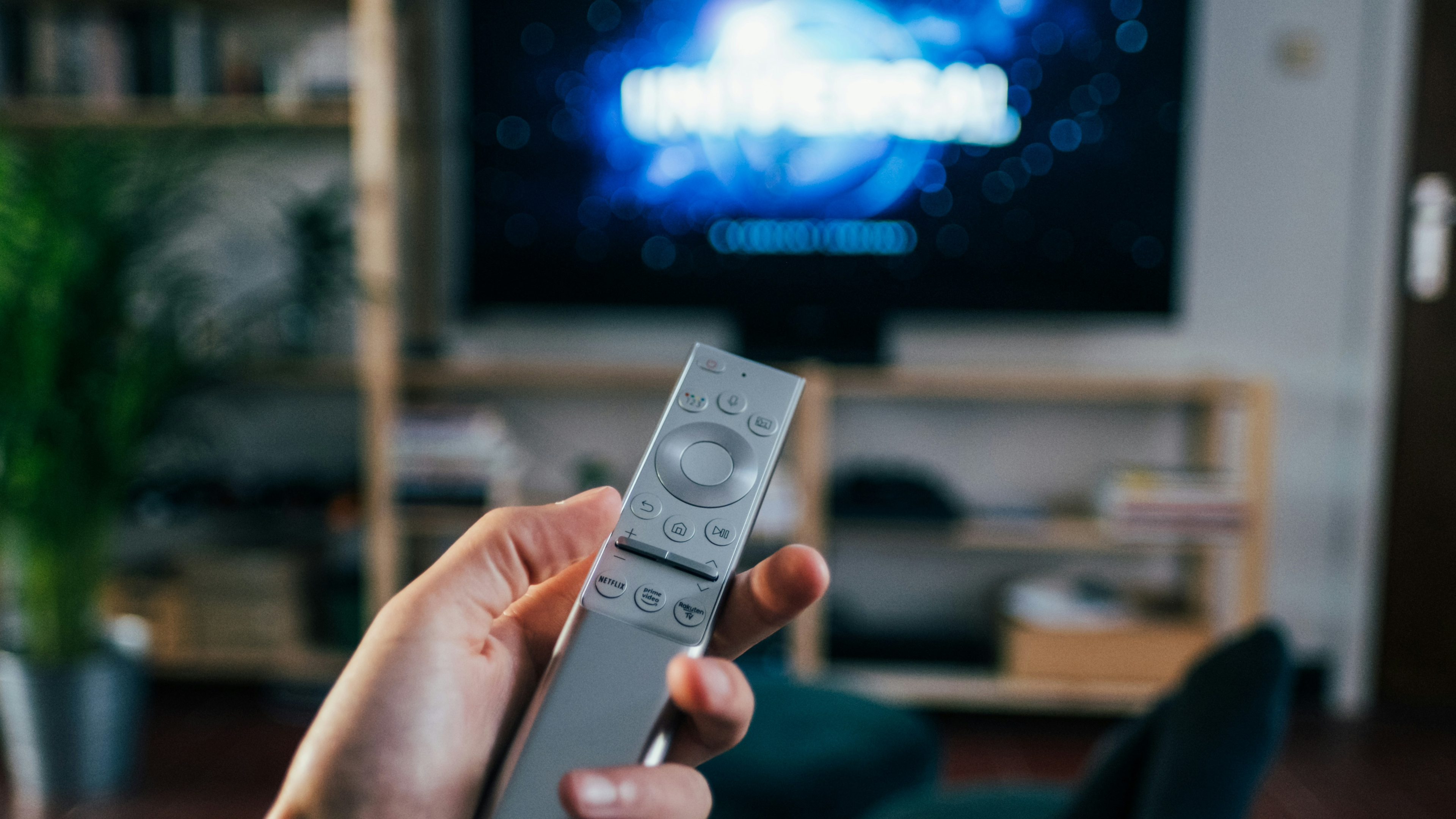
But the viewing distance is only half the story. The other half is the device in the viewer’s hand. Without a mediator between the user and the screen, a 10-foot interface would have nothing to work with.
The remote as the interface
The remote control is slow and deliberate compared to a mouse or a touchscreen. It has no fluid motion and no multi-touch gestures. Yet that limited set of functions has proven remarkably durable. The remote has been redesigned repeatedly over seven decades — made ergonomic, streamlined, even voice-enabled — but one pattern from forty years ago remains untouched at its core.
A basic controller from the 1980s can navigate a modern TV app just as well as the latest flagship remote. Any interface built around six core buttons — a directional pad and two action buttons — will work across platforms and stay system-agnostic. That is the pattern that shapes how TV experiences are designed.
Where the pattern came from
Television remotes arrived in the 1950s as a response to the annoyance of getting up to adjust the set. The early attempts were experimental. The Zenith Flash-Matic, from the mid-1950s, had a single button that activated a directional lamp; pointing it at different corners of the TV controlled the channel and volume.
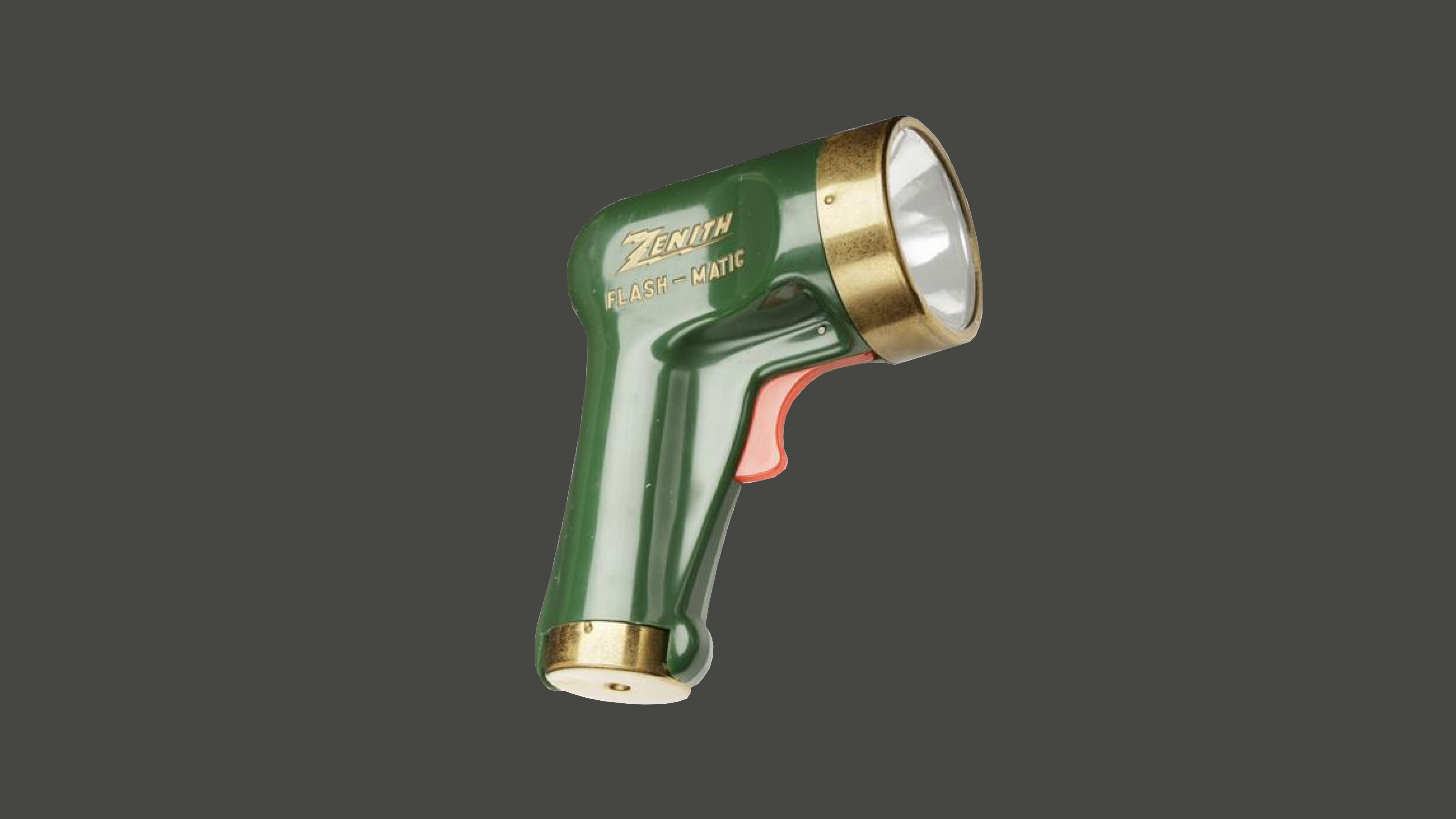
These devices were far from modern, but they established the remote as a concept. As the technology evolved, the remote became more than a channel changer — it became the control center for the home entertainment setup.
Still, for a long time, remotes were a luxury. By the late 1970s, only about 17% of US households had one.
The button explosion
The 1980s changed everything. Videocassette recorders and other consumer electronics moved into living rooms alongside TVs, and suddenly there wasn’t one remote but several. The solution was the universal remote: one device that could be programmed to control multiple products. It worked, but at the cost of elegance. These remotes were packed with dozens of buttons, prioritizing compatibility over usability.
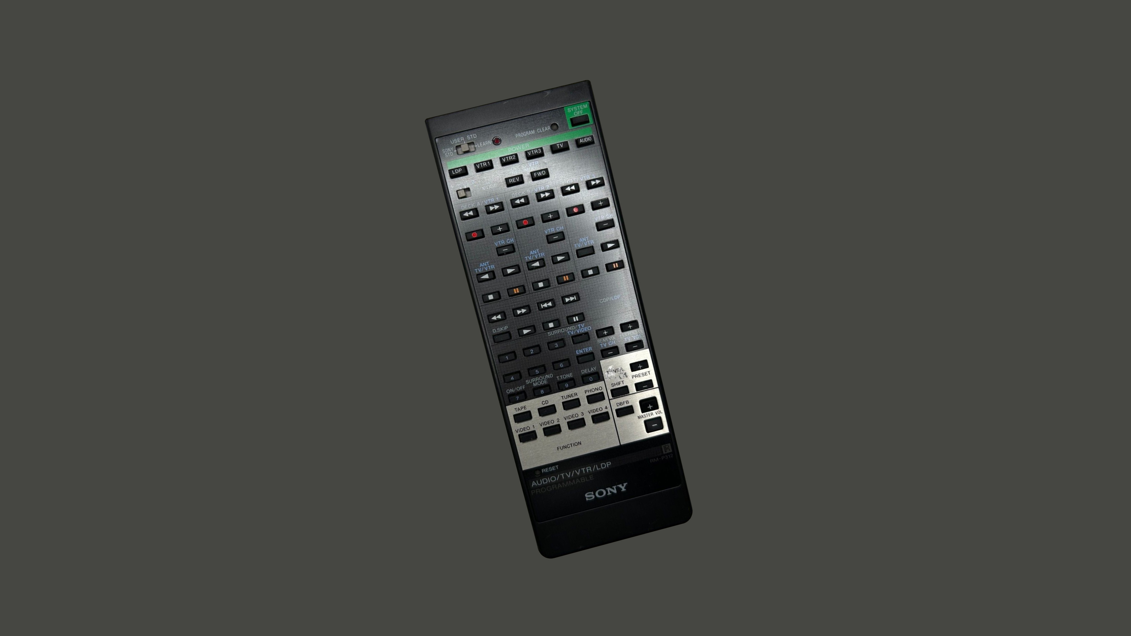
Meanwhile, a different kind of controller was being developed — one with a minimal layout that would end up defining TV interaction for decades to come.
The D-pad takes hold
The Nintendo Entertainment System launched in 1985 and sold sixty million units worldwide. Its controller — connected by cable, not wireless — introduced a control scheme with just six actions: a directional pad with four axes and two buttons, A and B.
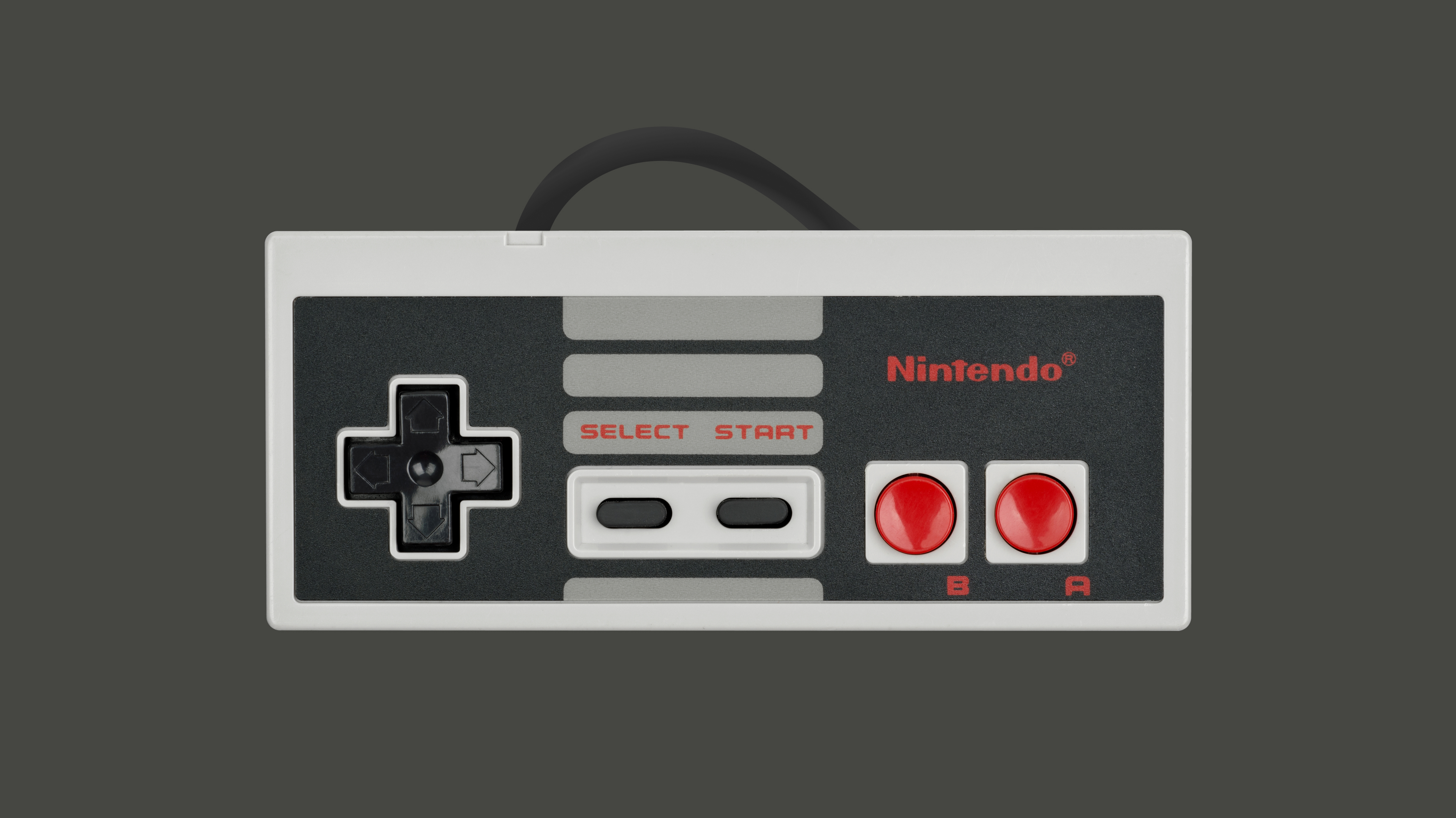
The cross-shaped D-pad was designed to replace a bulky joystick, allowing movement along two axes with the thumb. It was intuitive and cheap to produce, and its influence quickly spread beyond gaming. The D-pad and two action buttons became the foundation for the remotes that followed.
By the end of the 1980s, more than two-thirds of American TV owners had a remote. In the 1990s, as TVs gained more complex settings and on-screen interfaces, remotes became ergonomic — contoured to fit the hand, with buttons of different shapes and sizes that could be identified by touch alone. Commands were clustered into logical groups, and within those groups, a familiar shape emerged.
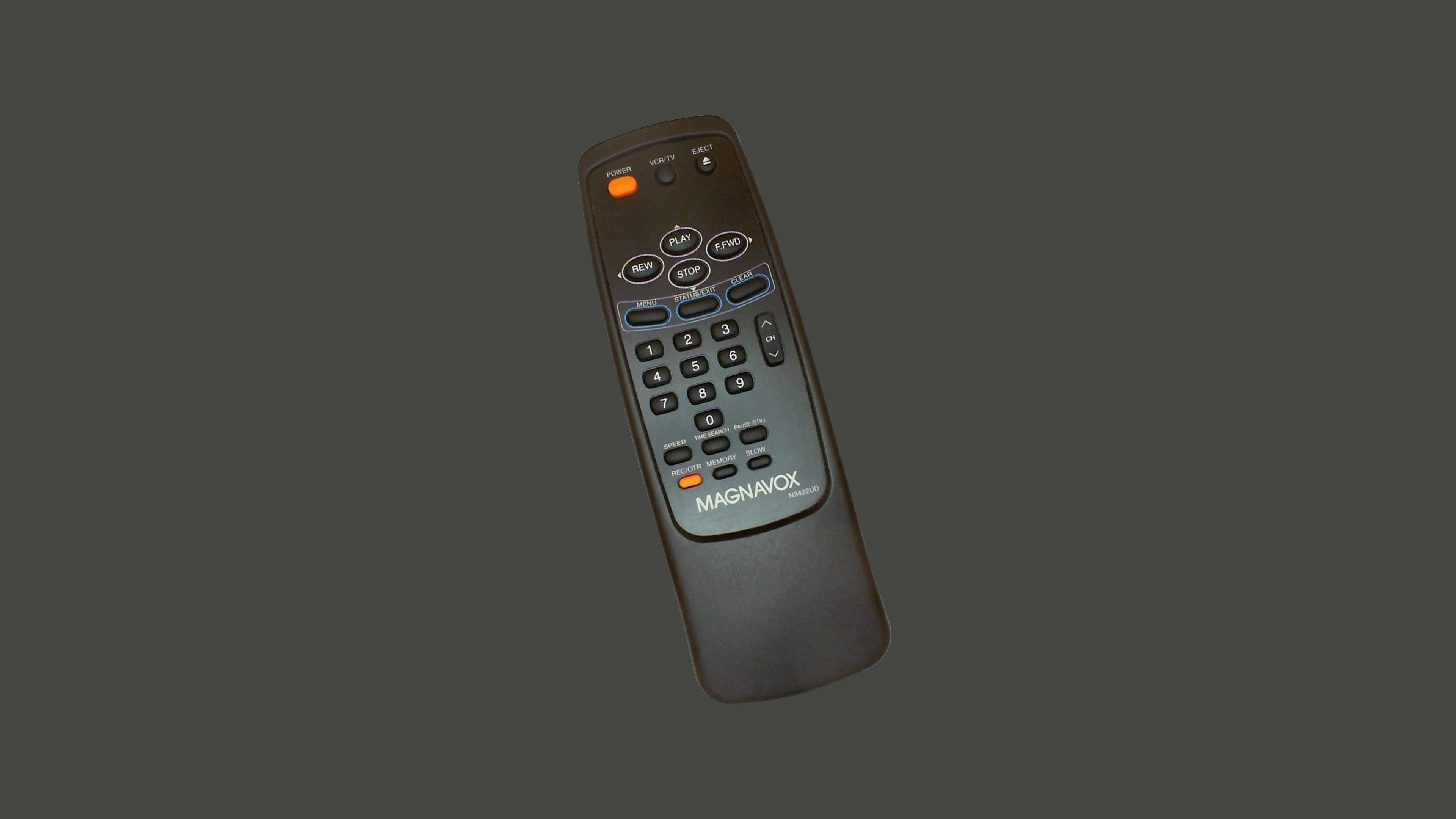
The D-pad settled into its place on TV remotes and became even more deeply embedded as the core of their interactivity.
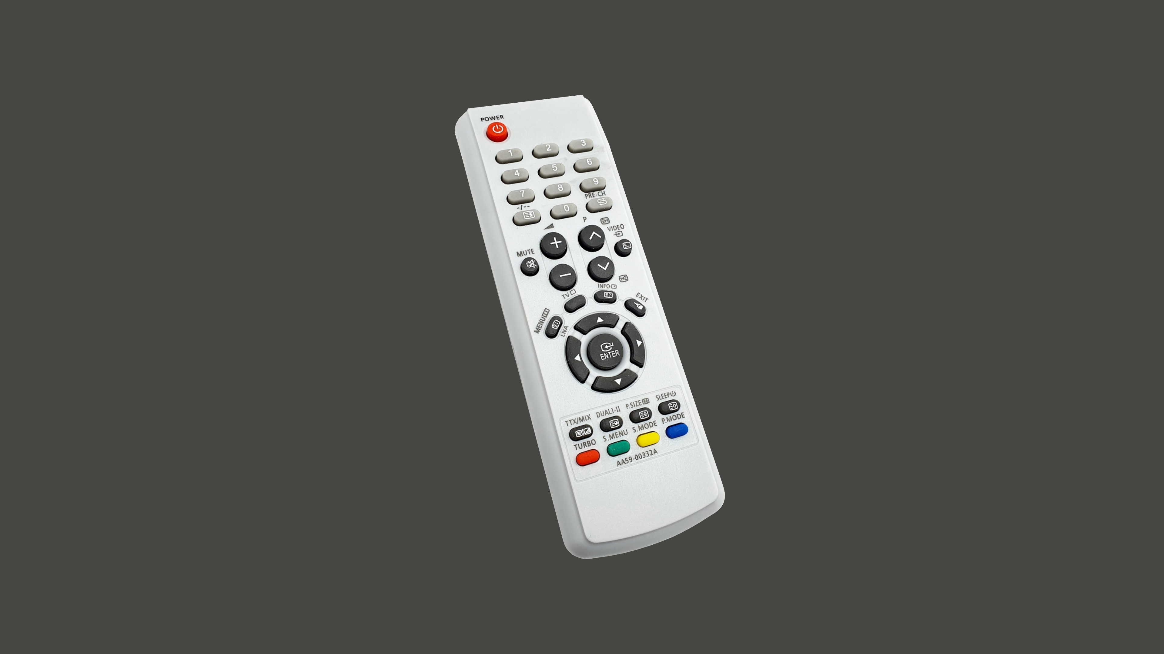
Set-top boxes and smart TV features came in the 2000s and 2010s. Displays got bigger, brighter and thinner. But every innovation in remote design has circled back to the same core principles established by the NES controller. Later efforts have augmented the pattern, but none have replaced it.
The Evergreen Pattern
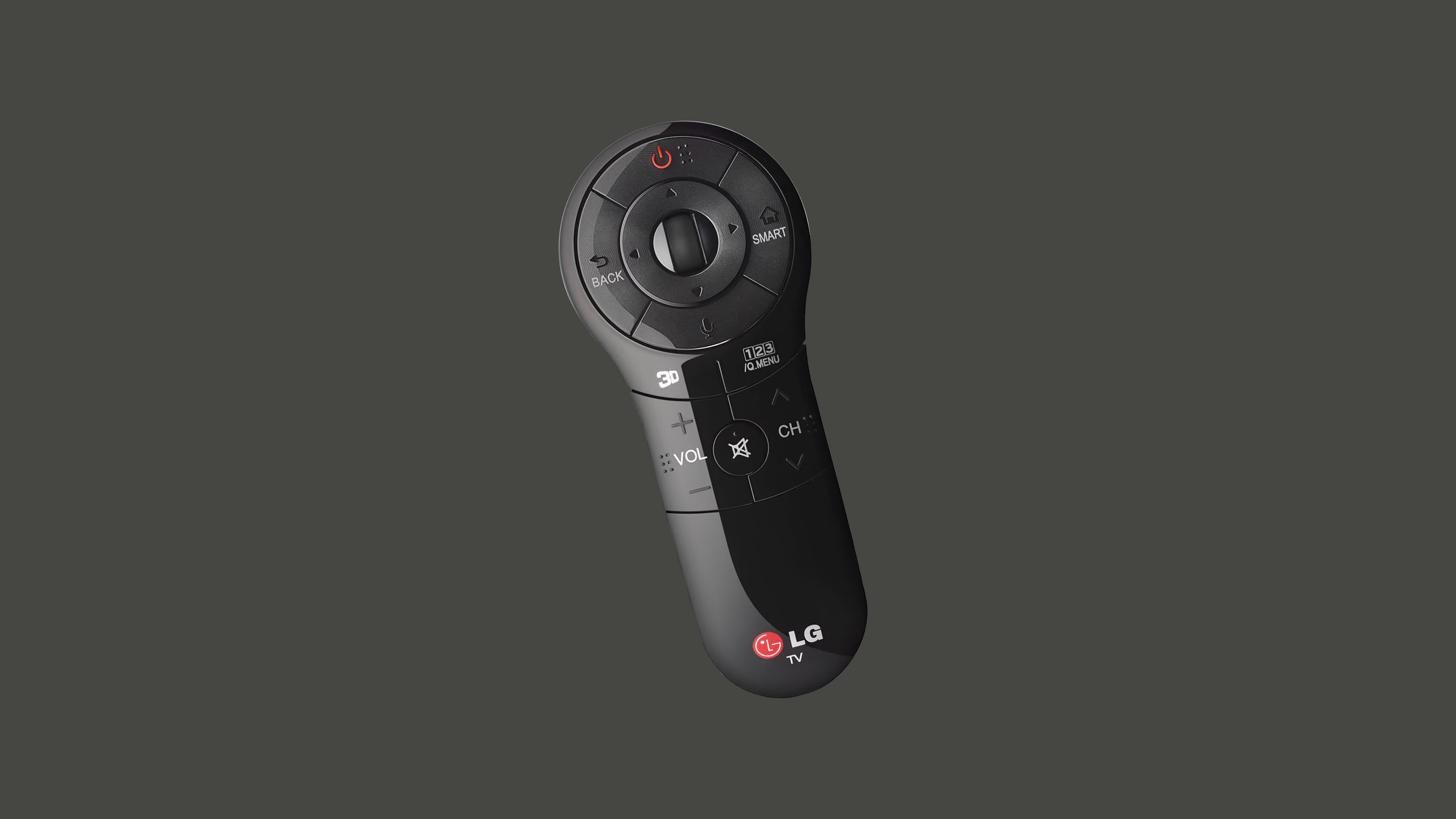
LG's 2013 Magic remote introduced motion controls to the TV, letting users point and click much like they would with a computer mouse. It was praised as one of the best smart TV remotes of its time, offering unprecedented speed and flexibility. Yet even with its novel pointer-based interaction, the device kept a D-pad at its core. LG didn't set out to replace directional navigation; they merely augmented it.
Apple's second-generation Siri remote took a similar path from a different angle. The glass touchpad on the top half enabled multi-touch gestures, swipe navigation, and quick scrolling — a noticeable upgrade for tasks like typing on horizontal on-screen keyboards. But despite appearances, the touchpad didn't eliminate the D-pad; it reinvented it. The same four directions governed interaction, just with an added layer of polish.
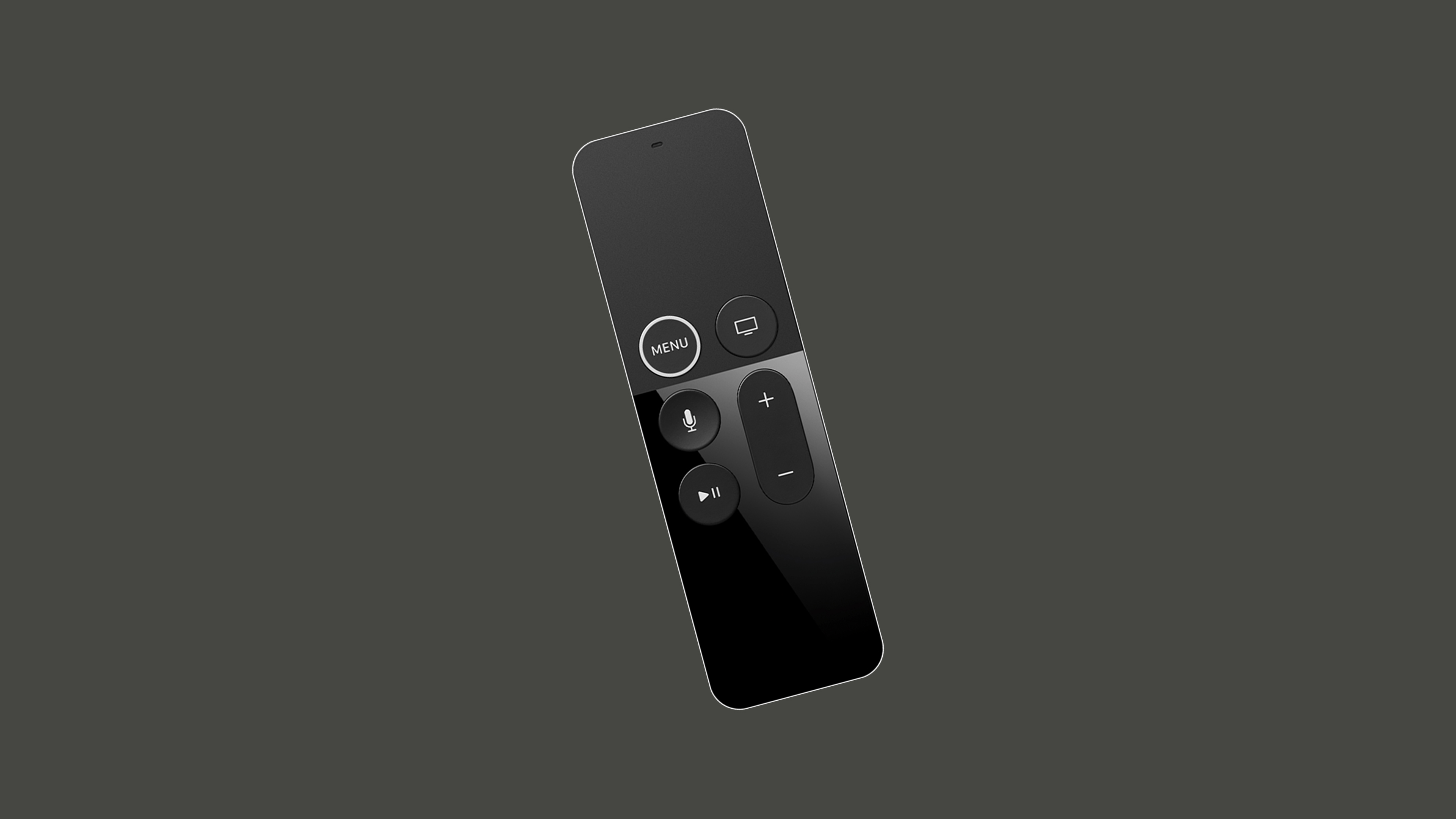
That polish didn't sit well with users, and the remote's ergonomics drew criticism. For the third generation, Apple reversed course, re-introducing a classic D-pad cluster while retaining touch capabilities like swiping through playlists and using a circular gesture on the outer ring for scene seeking.
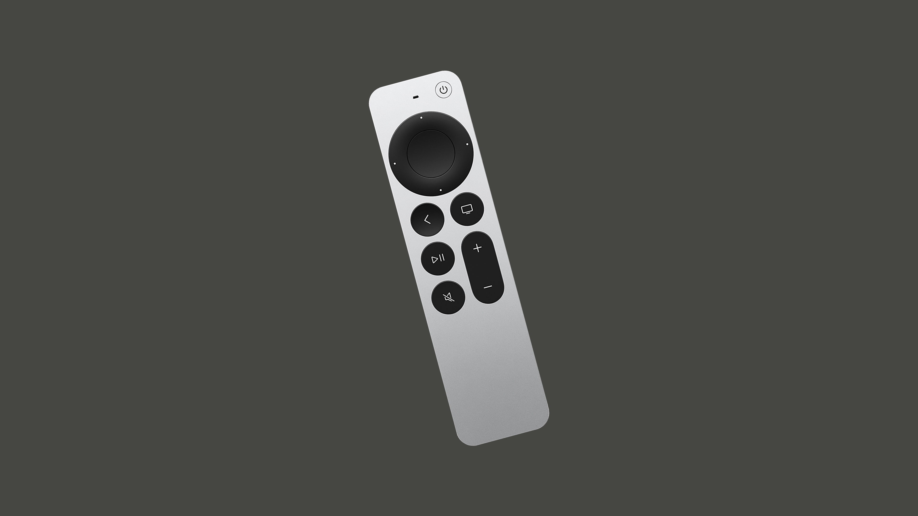
Why can't we seem to move past the D-pad? Motion controls and gestures seem like obvious upgrades in principle. They're more complex and costly to produce, but the deeper issue is that the TV is essentially a legacy system. Touch controls, while a staple of modern interaction, can reduce usability when added without thorough consideration.
Pitfalls Of Touch Controls
The trend toward touchscreens in car dashboards illustrates the problem well. They may impress at auto shows, but real-world usability suffers. Driving demands constant focus; any interface requiring eyes off the road increases risk. Physical buttons, knobs, and levers offer tactile landmarks that allow operation by feel alone. Touch surfaces demand visual attention, even for simple tasks like adjusting volume or climate controls. The upcoming 2026 Euro NCAP regulations will push manufacturers to reintroduce physical controls for core functions.
TV remotes face a similar, if less critical, issue. Sleek, buttonless designs feel modern but add unnecessary abstraction. Physical buttons with distinct shapes and positioning let users navigate by memory and touch, even in the dark. That's not outdated — it's a deeper layer of usability that modern design should respect, not discard. This is precisely why Apple reworked their third-generation remote: the touch area at the top disappeared, replaced by clearly defined D-pad buttons that can still be extended, not replaced, by touch gestures.
The Legacy Of TV
Consider the on-screen keyboard from The Legend of Zelda, released in 1986. Players navigated a letter grid with the NES controller, entering their name character by character. Now look at a modern television's on-screen keyboard.
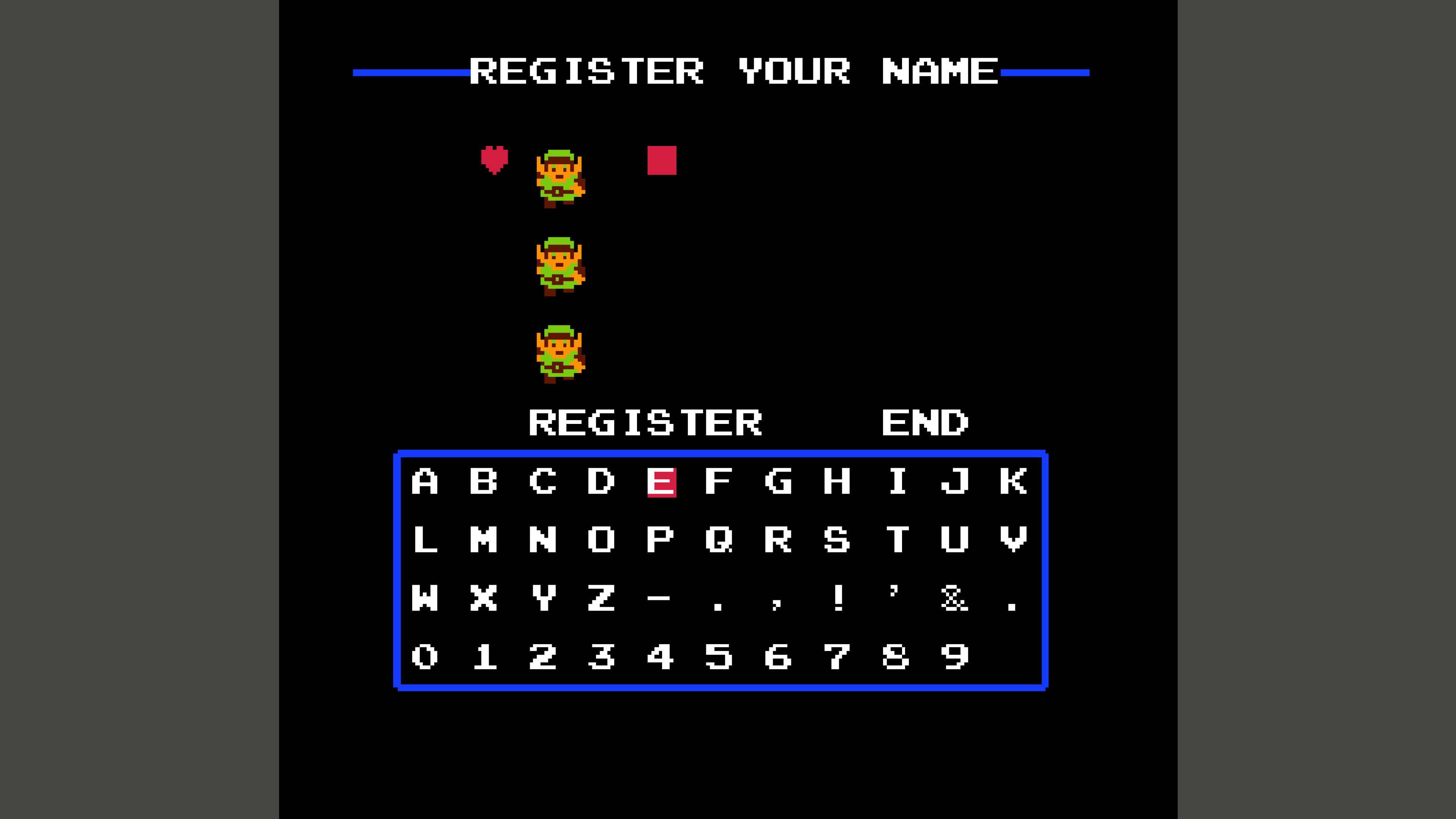
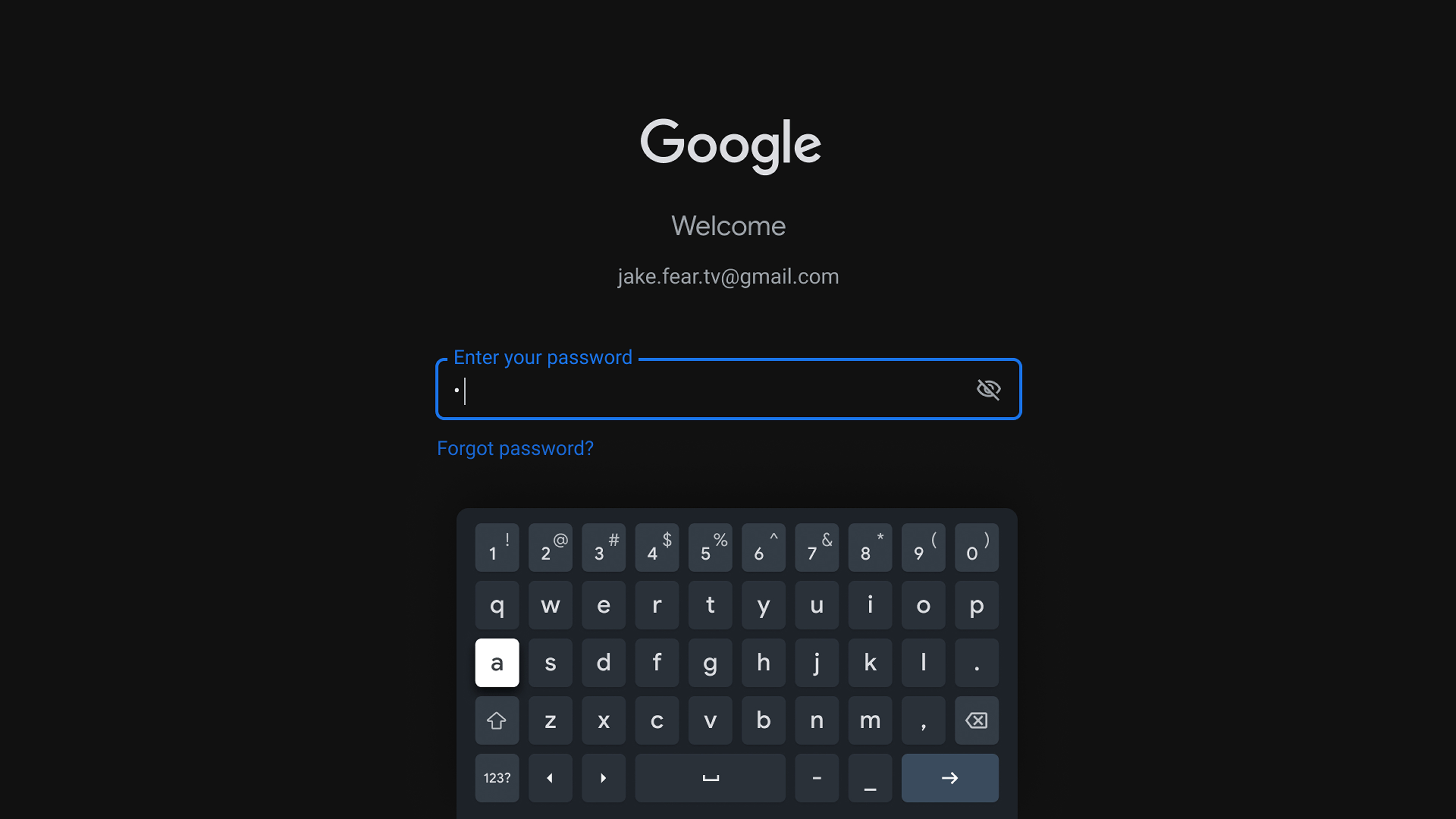
Notice the similarities? Despite decades of quality-of-life improvements, the core interaction remains identical. This isn't a failure of innovation — it's simply the most optimal way to interact given the circumstances.
Laying It All Out
TV interfaces, like those on phones and computers, are built on grid systems. But on TV, the system is more apparent and rudimentary, consisting mainly of horizontal and vertical lists called shelves.
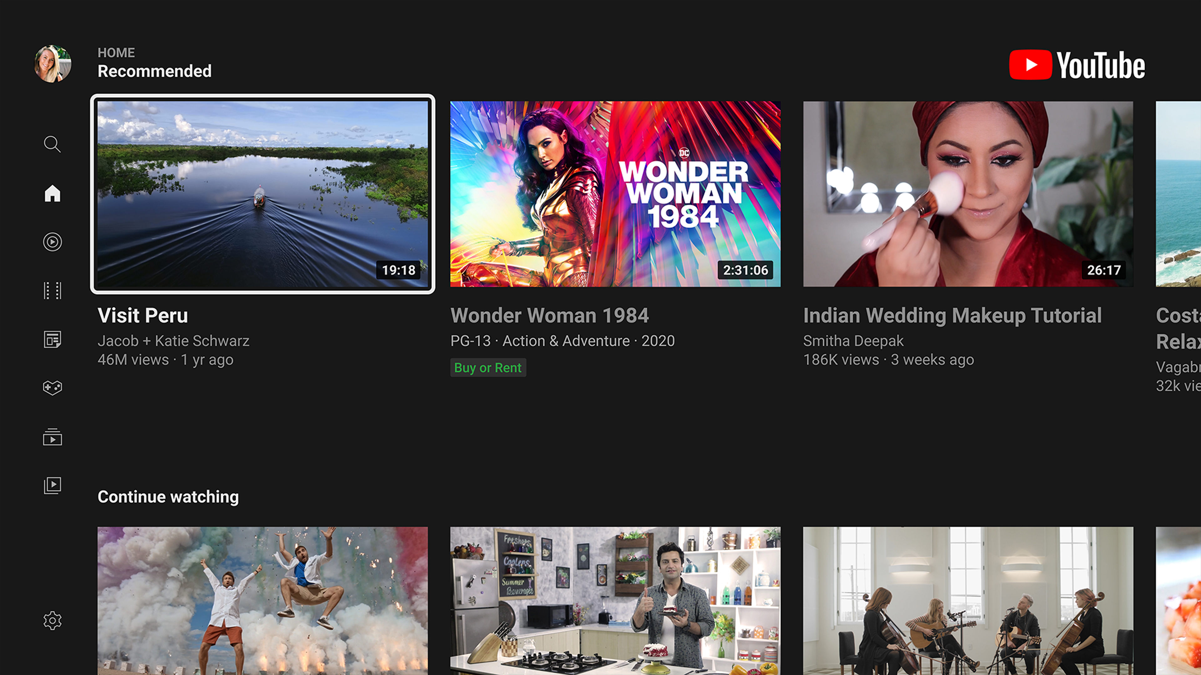
These grids may hold cards, letters, or anything else, but movement is restricted by two key factors. First, there's no pointer for the eyes to follow like on a computer. Second, there's no way to interact directly with the display like on a touchscreen. Instead, navigation relies on a focus state — an element that is always highlighted to anchor the eyes and serve as the starting point for any movement.
Movement from the focused element is restricted to one item at a time. To move from element #1 to element #5 in a list, you'd press a directional button four times.
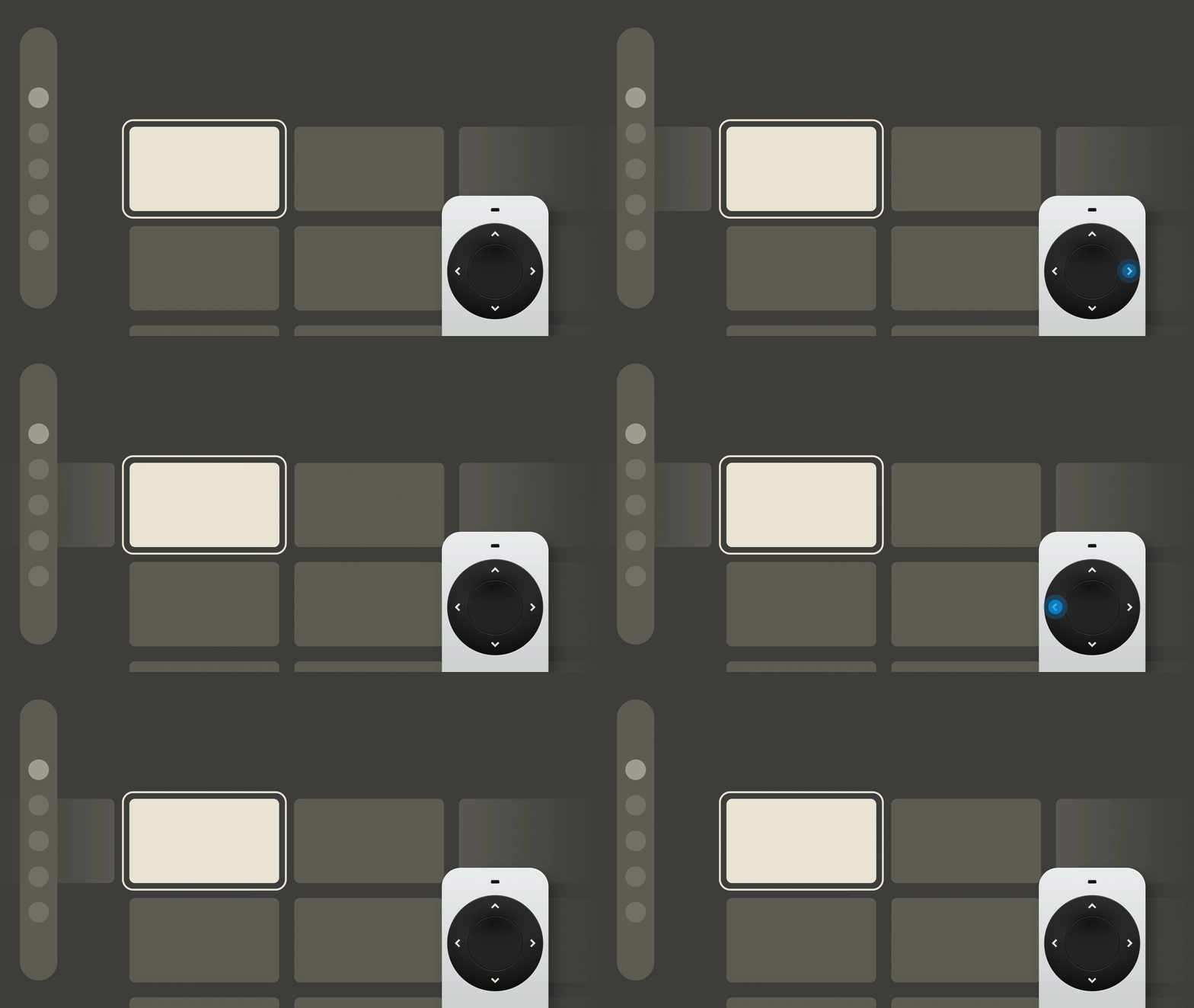
Successful navigation requires the ability to move left, right, up, and down — a D-pad. Landing on a desired item requires a way to select or confirm, and mistakes require a way to go back. Those two extra interactions need two more buttons: OK and back, or more abstractly, A and B.
So, to successfully navigate a TV interface, we need only a NES controller.
Yes, we can enhance it with touchpads and motion gestures, augment it with voice controls, but this unshakeable foundation of interaction will remain as the very basic level of inherent complexity in a TV interface. Reducing it any further would significantly impair the experience, so all we've managed to do throughout the years is to only build upon it.
The D-pad and buttons A and B have survived decades of innovation and will likely survive many more. Understanding and respecting this principle allows designers to create intuitive, system-agnostic experiences that translate easily across platforms. Once you know that these six buttons represent the irreducible core, you can build from the ground up and attach additional functionality to this time-tested foundation. Mastering these paradigms opens the door to mapping and re-mapping buttons by context — and knowing just how far you can go when designing for TV.
Why the Remote Still Defines the Interface
Designing for TV means designing for a controller that has barely changed in decades. The NES controller — with its directional pad and two action buttons — remains the clearest model for understanding the constraints of the 10-foot experience. When stakeholders worry about subtle differences between remotes, that simple diagram of a D-pad and buttons cuts through the noise. The historical evidence supports what that analogy suggests: the fundamental input vocabulary for television has been stable since the 1980s.
Understanding the boundaries of the medium is prerequisite to doing anything useful with it. When you have only up, down, left, right, OK and back as your interaction grammar, every design decision must accommodate those six commands. Users should never have to look at the remote; their thumb should move instinctively across the buttons to navigate and activate. The interface must be clear enough to operate without visual confirmation of the controller.
The 10-Foot Interface as Its Own Discipline
The phrase “10-foot user interface” (or “3-meter UI”) describes a graphical interface built for a television viewing distance. This distance is nominal — real homes vary substantially — but it pushes text and interactive elements far larger than anything on a desktop or mobile screen. Combined with the remote’s minimal input options, the 10-foot experience demands extra effort to minimize user effort.
The term originates from a shift in how computers are used: the classic 2-foot experience of a desktop workstation versus connected a PC to a TV for entertainment purposes — a scenario Microsoft documented for game developers to consider even when they weren’t explicitly targeting television. As entertainment devices began outputting to TVs, the entire interaction paradigm changed — no mouse, no keyboard, just spatial navigation.
The Long Evolution of the Remote Control
Entertainment controls did not wait for the television era to begin. Nikola Tesla patented a remote-controlled boat as early as 1893, establishing the foundational concept.
For television itself, the timeline is well documented. The first TV-specific remote was the Lazy Bone (1950), a cable-connected device. The first wireless remote, the Flash-matic (1955), suffered from sunlight interference. Zenith solved this with the Space Command in 1956, which used ultrasound and remained the industry standard for over a quarter century.
The important lesson of this history is not merely technical. It reveals why the remote became so simple: every added input button imposes a cognitive load on a user who is not looking at the controller. The NES controller is the archetype because it stripped the experience to spatial movement and binary confirmation.
Parallels Beyond the Living Room
Automotive interfaces provide a useful object lesson about the risk of overcomplicating controls. Research into 21 drivers found that touchscreen usage glued eyes to the display rather than the road. Automotive UX designers observed a clear correlation between screen interaction and distraction from the driving task.
Regulators have responded to this safety concern. New Euro NCAP tests due in 2026 will encourage physical, separate controls for primary functions to limit eyes-off-road time. The message is consistent across TV and automotive design: when a user must focus on anything but their primary task — be it the road, a narrative, or a ballgame — each fraction of a second spent deciphering the interface is a cost.
Moving Toward Practical Application
Now that the foundational interaction patterns are established, the discipline moves into the specifics. The next step is to cover the design conventions of the 10-foot experience: screen fundamentals, layout, typography, color, and especially focus states — which act as the visual language of directional navigation. This includes the common building blocks of TV experiences, such as menus, shelves of content, spotlights, and search — each of which has its own patterns for spatial scanning.
These components all operate within the constraints that the remote control imposes. Understanding how light or text behaves on a screen viewed from several meters away, and where the content hierarchy belongs in relation to the selectable focus, opens up the possibility of designing within — and occasionally against — these limitations.
Further Reading
- “The 10 Foot Experience” by Robert Stulle — a practical introduction to interface design for several-meter-distance viewing, where only directional commands are available.
- “10-foot user interface” on Wikipedia — definition and background of the interface category as it applies to televisions and home distances.
- “The Television Remote Control: A Brief History” by Mary Bellis — tracing the development from the Lazy Bone to the Space Command’s ultrasound era.
- “The History of The TV Remote” by Remy Millisky — from Tesla’s early patent to today’s universal controllers.



