

Building your own Preset annotations
Preset annotations are specific to the design system they were created for. Teams that aren’t using Primer can’t pull GitHub’s annotations into their own workflow, but the underlying approach translates: map the accessibility information that isn’t already visible in the design or baked into the code, then surface it where designers will see it.
Start by auditing your components. Not every component needs a Preset annotation, so focus on the ones with the highest impact. At GitHub, the team prioritized ten Primer components using an internal tool called Primer Query, which tracks every component implementation across the codebase and connects those instances to accessibility audit findings. They weighed four factors:
- Components aligned with organizational priorities, like high-traffic products.
- Components that keep showing up in accessibility audit issues.
- Components with React implementations, since React is the preferred development framework.
- The most frequently implemented components.

Mapping component properties across sources
For each component, the Primer team cross-referenced several sources to identify what should go into a Preset annotation. The goal was to find details that exist in only one or two places—information that often falls through the cracks between design and development.
Component documentation on Primer.style
Documentation should cover usage for both designers and developers, including accessibility requirements. Some of that guidance gets built into the Figma asset, some lands in the coded component only. The Preset annotation should capture accessibility requirements that aren’t in either place; repeating what’s already built in is redundant.
Coded demos in Storybook
The component sandbox showed how each component is assembled in React or Rails and what the final HTML looks like. The team looked for code structure and accessibility attributes that are missing from both the docs and the Figma asset, especially when those attributes change depending on how the component is used.
Component properties in the Figma asset library
Figma components offer flexibility through text layers, image fills, variants, and property sets. Paying close attention to what designers can and can’t modify reveals what still needs annotation: accessibility attributes, requirements, and usage guidance that exist in other sources but aren’t exposed in the Figma component itself.
Other places worth checking
- Experiences from team members: Designers, developers, and accessibility specialists can flag issues that never made it into the docs or design tools. If the team has been around a while, ask which components have had tricky bugs and which ones get broken intentionally during implementation.
- Findings from recent audits: Design system components sometimes have unresolved audit issues. If those are present in the system, they’ll show up in Storybook demos and may be missing from the documentation. Audit findings can tell you not just what to include in a Preset annotation, but also what should not carry over from existing resources.
What the process revealed
Preset annotations fit some teams better than others. They’re especially valuable for younger design systems or ones that haven’t been widely adopted. Mature systems like Primer change often, which risks the annotations falling out of sync with the components they describe. That can create confusion and rework once development begins. Any team building Preset annotations should plan for the maintenance burden.
For people new to the design system, the built-in links to documentation and demos made a difference. Experienced team members could fine-tune the Presets themselves. Without existing familiarity with the components—or colleagues to consult—mapping out all the properties can be time-consuming. Naming things is another challenge: a component property name long enough to be descriptive may get truncated in Figma’s properties panel. If the naming isn’t self-evident, you may need extra training or documentation.
Knowing when you actually need one
There’s often meaningful overlap between a component-specific Preset annotation and the generic annotations a design team already has. For example, the GitHub Annotation Toolkit has a standard annotation for a basic <textarea> form element, while the Primer <TextArea> component gets its own Preset annotation:
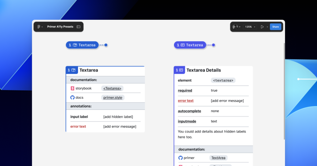
Having two ways to annotate the same thing can be confusing. The Primer Preset links to specific docs, but a generic annotation could be manually extended with those same links. One workaround is to add design-system-specific properties to the default annotation set—for example, a toggle on a generic Button annotation that reveals links and properties particular to your system’s button component. In either case, some annotation is better than none.
Automation might be the payoff
Plenty of Figma plugins claim to scan a design file and generate annotations, but the results are usually noisy and full of false positives. Those tools are design-system agnostic. They can’t recognize the components on the canvas, distinguish variants, or read component properties without custom programming or heavily trained AI models.
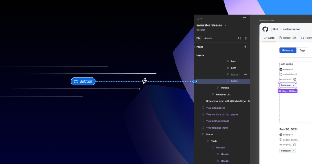
That points to a bigger opportunity. The work involved in creating a Preset annotation—mapping out the component properties that don’t show up visually or in code—is exactly the kind of structured data an automated tool would need. A tool cannot reliably annotate a design system without understanding its components, and it can’t understand them without this mapping. Building a set of Preset annotations may end up being a useful first step toward automating more of the annotation process.
Code Connect offers an alternative
While developing the new Presets, the Primer team also experimented with other annotation approaches. Most didn’t pan out, but one did: putting accessibility details directly into exported code with Figma’s Code Connect.
Primer was an early adopter of Code Connect in Dev Mode. As staff systems designer Lukas Oppermann put it, “With Code Connect, we can actually move the design and the code a little bit further apart again. We can concentrate on creating the best UX for the designers working in Figma with design libraries and, on the code side, we can have the best developer experience.” Code Connect sidesteps much of the Preset annotation workflow—and the downsides of other experiments—by attaching key accessibility information to the code that developers export from Figma.
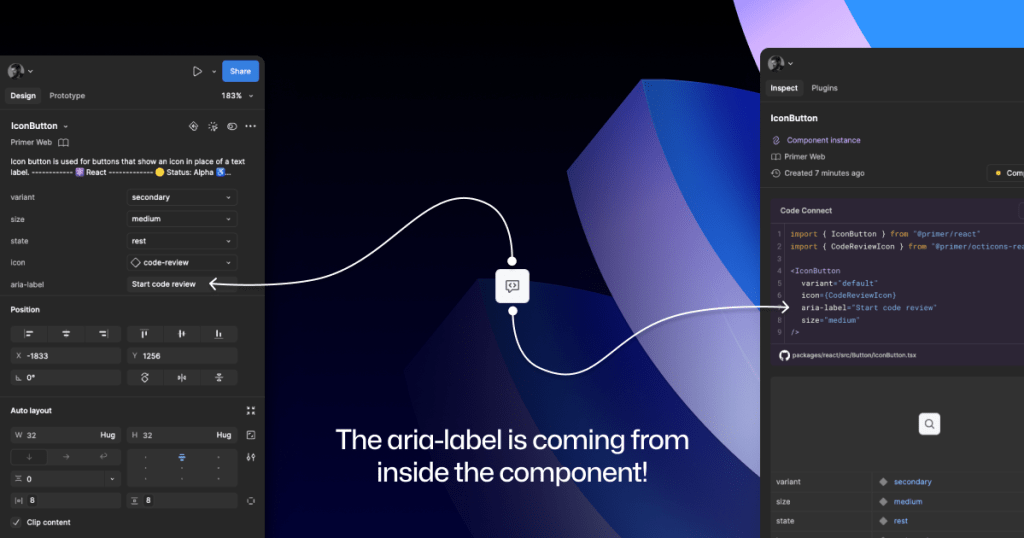
Octicons, GitHub’s icon set, appear in many Primer components. They’re decorative by default, but usage can demand alt text or an aria-label. For example, an IconButton uses an Octicon and needs an accessible name describing its function.
With the basic annotation kit, designers would add a Button stamp, a Decorative Image stamp, and a marginal note with the aria-label text. Preset annotations cut that down to fewer canvas elements. Code Connect goes one step further: Oppermann added a hidden layer to the IconButton Figma component with a text property for aria-label. Designers enter the value directly in the properties panel, no annotation needed. The hidden layer doesn’t disturb the visuals, and the aria-label is included when the component’s code is exported.
Setting up Code Connect for every design system component takes time. When doing it, keep these points in mind:
- Consistency is key. Keep property names and hidden layer placement uniform across components so teams can predict how they behave.
- Use a branch of your design system library to experiment. Hiding something like
aria-labelis simple compared with the complexity Preset annotations can carry. - Add visual regression testing. Adding hidden complexity to a component raises the risk of future breakage, especially in components with many variants. Figma’s merge conflict UI helps, but it won’t catch everything.
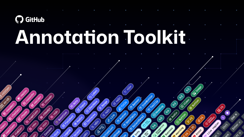
The GitHub Annotation Toolkit is open source, so you can see exactly how the Primer A11y Preset annotations and related visual regression tests were implemented.
When annotations point to deeper problems
Accessibility annotation kits are a useful tool, but they are not a substitute for fixing fundamental design or architecture flaws. As Eric Bailey, a contributor to the upcoming GitHub Annotation Toolkit, points out in his writing, annotations can surface and magnify structural issues that need more than a comment on a mockup. A well-placed annotation can draw attention to a broken pattern, but the real value is in using that attention to drive systemic change rather than patching individual instances.
The takeaway for design systems work is straightforward: annotations serve as a diagnostic layer. When the same problem keeps appearing across multiple components, that’s a signal to revisit the underlying token, layout system, or interaction model. Resolving the root cause eliminates the need for repeated annotations and reduces the burden on downstream consumers who might otherwise treat annotations as suggestions rather than directives.


