Documentation as the bridge between design and code
When Razorpay’s teams consistently missed small details—button states, error handling within text fields—Head of Design Saurabh Soni diagnosed the problem as a communication failure rather than a quality issue. Teams were hard-coding custom solutions and inadvertently omitting important nuances. The fix wasn’t more oversight; it was a shared reference point.
GitHub Staff System Designer Lukas Oppermann sees the same dynamic at scale. “Designers and developers speak a little bit of a different language,” he says, pointing to inconsistent naming conventions, misaligned component properties, and mismatched expectations about how a product should look and feel. Documentation that does more than list components—that captures the how and why of design decisions—closes that gap. Done well, it helps teams:
- Understand both design principles and implementation details
- Make consistent decisions across products and platforms
- Onboard new team members efficiently
- Bridge the communication divide between designers and developers
Choosing a source of truth
Bumble Design System and Platform Engineer Raul Menezes frames the first decision bluntly: “One of the most challenging things when it comes to keeping consistency is determining your source of truth.” Static PDFs in shared drives become obsolete immediately. The real options today range from fully custom documentation sites to collaborative workspaces.
Large organizations with complex integration needs often build dedicated documentation sites. Google’s Material Design, IBM’s Carbon, and eBay’s Evo all run custom platforms serving internal and external audiences, with gated content and specialized pathways for different user groups. eBay chose a unified playbook rather than separate destinations for brand and product guidance. “We wanted to combine guidance for both of these in one location so people wouldn’t have to jump ship to different experiences,” says Staff Product Designer Ryan Tinsley. The team built custom tooling that exports changes from Figma directly to their CMS, so approved updates land in the playbook immediately.
Smaller teams don’t need that level of infrastructure. Many start with Notion or Confluence, prioritizing quick setup and easy maintenance, then layer approaches as they scale: technical specs in Storybook, design guidelines in more accessible formats, custom plugins for the gaps. Razorpay built RazorSharp, a custom plugin that connects design documentation directly to implementation so different teams meet the system where they already work. The principle holds across scale: choose tools that serve the current workflow while leaving room to grow.
The essential contents
Once the platform is settled, the harder question is what belongs in the documentation. Five categories are essential.
Design principles
Clearly articulated principles inform decisions from big-picture strategy to small details. Documenting the rationale behind decisions helps teams understand not just what to build, but why—and how to apply the same reasoning themselves.
Component library
For each component, teams need usage guidelines and best practices, design specifications covering anatomy and dimensions, real-world examples and use cases, code snippets, and interactive prototypes showing all states and variations.
Visual style guide
This section captures the brand’s aesthetic decisions: color palettes with usage guidelines, typography systems with hierarchy and best practices, icon libraries with specifications, and image and illustration standards including accessibility requirements.
Technical implementation
Developers need component APIs and props documentation, accessibility requirements and testing procedures, performance considerations, integration guides for different frameworks, plus clear naming conventions and token documentation.
Accessibility guidelines
Accessibility needs to move from implied to explicit: WCAG compliance levels per component, screen reader behavior, keyboard navigation patterns, color contrast requirements, and minimum touch target sizes.
eBay’s team found that depth drives engagement. “People crave documentation,” Tinsley says. Requests for edge cases and scenarios keep coming even for a system as comprehensive as theirs. Rather than viewing that as a burden, the team treats it as a feedback loop. Partners aren’t passively consuming the documentation—they’re actively helping to shape it. The cycle is self-reinforcing: richer documentation leads to better questions, which lead back into even richer documentation.
Of course, documentation only drives adoption when it stays accurate. The teams that keep documentation alive treat it as a living artifact—one tied directly to the design and code it describes, so that updates flow through automatically rather than requiring heroic manual maintenance.
Keeping design system documentation alive
Documentation decays unless maintenance is treated as part of the process. The teams that keep their design systems credible treat docs as a deliverable, not an afterthought. A clear update workflow is what separates a living system from a static archive.
Razorpay treats documentation as a required step for completing any new component or pattern. That rule keeps the docs aligned with actual design decisions. The company backs it with dedicated staffing: roughly 70 designers and 100 front-end developers rely on a core team of three designers and five engineers who run office hours, focus groups, and an advocacy program for the Blade design system.
To manage updates and contributions, design system teams typically adopt a combination of governance and community input:
- Contribution guidelines: templates, style guides, and review processes for suggesting changes or additions
- Version control: semantic versioning to communicate the scope and impact of each release
- Change logs: a running list of new features, bug fixes, and breaking changes with migration steps
- Quality assurance: feedback loops, regular reviews, and linting systems as checkpoints
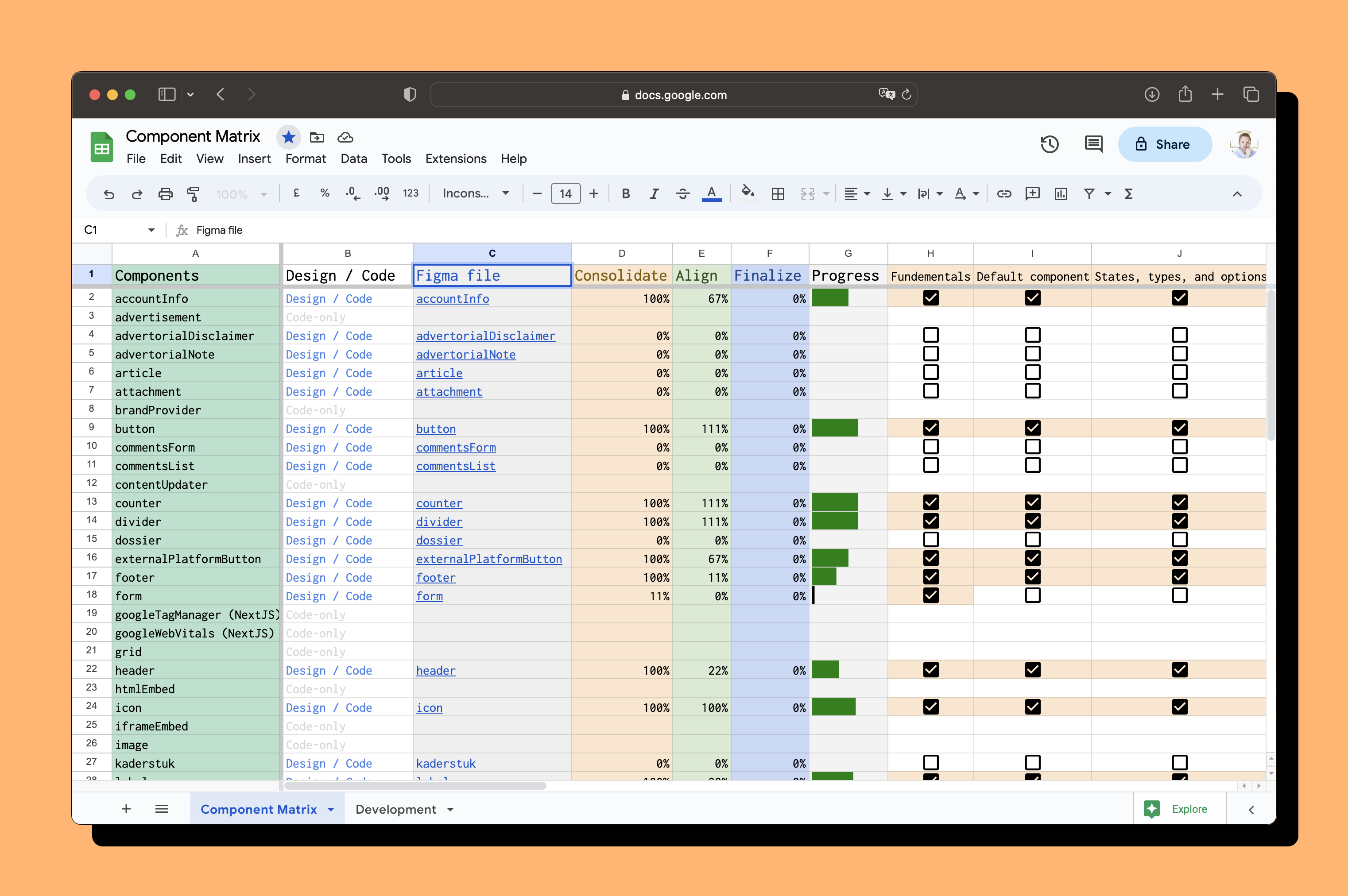
eBay’s Design Systems and Design Technology teams publish a component status table that tracks implementation across platforms. Developers use that API to check whether a component exists in their framework and whether it matches the Figma version and Playbook documentation. The team also built a custom linter that validates documentation: it checks component usage against guidelines, flags incomplete accessibility info, verifies alt text on images, and catches naming or structural inconsistencies.
Documenting for each audience
One documentation set cannot serve every reader equally. Designers, developers, and product managers come to the docs with different questions, and the structure should answer each of them directly.
At Alaska Airlines, the Auro design system team found that designers struggled with pixel-perfect implementation while developers received mismatched designs. Product Designer June Lee focused on educating designers about Figma’s capabilities. When designers used the tool more effectively, conflicts between designers and engineers dropped. The documentation effort paid off by aligning expectations across disciplines.
- For designers: visual examples and usage patterns, component variants and states, design token implementation, grid systems and spacing, asset libraries
- For developers: technical specifications, API documentation, integration guides, testing requirements, performance considerations
- For product managers: high-level system overview, component selection guidance, feature roadmap, release notes and updates

Measuring whether documentation actually works
Adoption numbers only tell part of the story. Razorpay set concrete goals for its Blade design system: teams building new features should use it for 70% of design work, while existing products target 50% coverage. In a survey of their designers and developers, 80% reported feeling more productive with Blade than without it.
Feedback should go beyond page views. User testing and interviews reveal whether documentation changes behavior—whether teams find the right component, use it correctly, and avoid filing duplicate requests. Tools such as Figma’s Design System Analytics (available on Organization and Enterprise accounts) can surface usage patterns and highlight where the system is being ignored or misused.
Planning for scale
Documentation that scales is documentation that integrates with how teams actually work. The most effective approaches tend to share a few traits:
- Meet teams where they work through integrated tools and custom in-house solutions
- Build bridges between design and development by creating what GitHub’s Lukas Oppermann calls “a third language” for cross-discipline communication
- Create clear contribution paths via dedicated teams and regular community engagement
- Measure impact by tracking improvements in productivity and collaboration
Maintaining a design system is a continuous loop, not a one-time publishing effort. When the documentation evolves alongside the components it describes, adoption follows naturally. The goal is not flawless prose or exhaustive coverage—it is documentation that helps teams ship better work with fewer misunderstandings.