
Start with the why: defining your system’s purpose
A design system only earns its keep if it solves problems your team actually has. Before opening any component file, agree on what those problems are. Inconsistency between platforms? Repetitive manual updates? Design and engineering building the same controls twice? Write down your goals and, just as important, decide how you’ll measure success against them.
Design systems are not one-size-fits-all. They run from a handful of shared components for a small team up to full enterprise-wide programs. Match the ambition to your situation and let the system evolve as your needs change.
Audit the current state
Gather screenshots of your UI across platforms and devices, and don’t forget interactive states or alternate versions. Patterns and repeated conventions will surface quickly, and those become the seed of your system.
Do the same on the engineering side. Developers may have already written reusable components that never made it into a design file. Look for repeated UI elements, standardized CSS variables, and shared code components. This technical inventory keeps the design system grounded in work that already exists instead of inventing a parallel set of solutions.
Once collected, sort everything into categories and judge the whole picture. Where does the product feel disjointed? Where are designers and engineers solving the same problem in different ways? Those are the areas where a shared system will have the most impact.
Assemble support and pick a direction
A design system is a cross-functional project. Recruit champions from development, product management, and design alike — developers especially, since they carry the implementation burden and can flag feasibility and maintenance concerns day one. Many successful systems start with a single dedicated person, so don’t wait for a large team to form.
Next, decide whether to build from scratch or adopt an existing open system. A custom build fits your exact requirements but costs more time upfront; an existing framework gets you running faster but may need heavy customization. Both are valid; the right call depends on team bandwidth and long-term goals.
Frame the project in terms of company objectives. Tie the system to concrete business benefits — faster releases, smoother handoffs, fewer redundant fixes — to justify the ongoing investment and secure leadership buy-in early.
Set principles that guide decisions
Guiding principles act as a north star for what the system should prioritize. They work best as a small set of specific, actionable statements rather than abstract values. Define the “why” behind each one, give concrete examples of how to apply it, and make sure it translates into everyday practice.
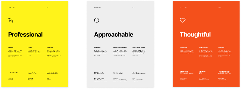
If accessibility is foundational for your team, for instance, a principle around inclusivity should include specifics like supporting varied vision and hearing abilities, testing contrast and legibility, and following current accessibility standards. Principles ideally come first, but they can emerge later on — what matters is that everyone knows them and uses them consistently.
Mine existing internal material — brand standards, voice and tone guides, engineering best practices — to ground the principles in what the organization already believes in.
Foundations: The Building Blocks of a Design System
Foundations are the core visual and functional elements—accessibility, color, typography, iconography, illustration, and dimensions—that give your design language its structure and consistency. When these work in harmony, they create a system that teams can understand and use without friction.
Start with Accessibility
Accessibility isn’t a checklist item; it’s a shared responsibility that shapes every design decision. When defining your foundations, think about font sizes, color contrast, and how components are labeled and organized. Document both the how and the why of your accessible assets so designers and developers can apply them effectively. Making accessibility a core principle from day one is the surest path to an inclusive product.
Build a Cohesive Color Palette
Color is one of your most immediate and powerful design tools. Aim for a palette that balances across modes (like dark mode) and platforms, and don’t be afraid to simplify—combine similar shades from existing designs where you can. A practical ratio to keep in mind: 60% neutral colors, 30% primary colors, and 10% secondary or accent colors. That mix affords flexibility without letting the palette spiral out of control.
Establish a Clear Typographic System
Typography should be both legible and on-brand. Pay attention to letter spacing, weight, and line height to craft a comfortable reading experience, and define a consistent type scale with a base size of 16 pixels. Your scale can be organized by application (e.g., 'display' or 'title') or with more primitive naming like 'heading-100'—choose what your team will use consistently.
Use Elevation for Hierarchy
Elevation—shadows, layers, and transparency—adds depth and order to your interface. Cards can feel raised from the page, while dialog boxes can float above everything else to command attention. Use this visual language to guide users intuitively toward what matters most.
Design Icons with Consistency in Mind
Icons communicate actions and ideas instantly, and a well-designed icon system reinforces brand identity and usability. Keep icons clear and visually consistent even when their styling changes. Implement an icon grid for sizing and alignment, and give each icon descriptive names and search terms so designers and developers can find them easily. Look to systems like Microsoft’s Fluent—with its rounded corners and regular/filled variants—for a model of how this works at scale.
Apply Design Tokens: Variables and Styles
Your token strategy will hinge on the difference between variables and styles. Variables in Figma store single values such as colors; styles store more complex information, like gradients, and suit intricate, multi-layered designs. Both are typically sorted into two categories:
- Primitives: The raw building blocks—like colors and spacing. They anchor the system but aren’t applied directly to components or layouts.
- Semantic: Tokens with meaning in context, like a
color-background-warningvariable used to flag danger.
For tokens to work, design and code must speak the same language. Consistent naming conventions bridge the gap: a base (like color or size) paired with modifiers (variant or state) keeps names readable. It also helps to align with developer syntax patterns—using kebab-case for CSS variables and camelCase for JavaScript smooths the handoff and sustains consistency across files and code.
Grids and Spacing: Matching Design to Implementation
Spatial systems—layout grids, spacing, and sizing—provide the structure that makes a product feel polished and professional. They cover:
- Layouts: Defining how your design behaves across a range of screen sizes and devices.
- Grids: Using column, baseline, and modular grids to align elements and build visual hierarchy.
- Spacing: Setting consistent units to balance the distances between elements for a readable layout.
When you plan a spatial system, talk with your developers early. Knowing whether your frontend relies on CSS Grid, Flexbox, or a UI framework will keep your designs within reach of what’s feasible to build. And yes, eight is the recurring magic number: most device breakpoints divide evenly by eight, making it a natural base unit for spacing and grids.
Different layouts call for different grid types. Column grids divide the screen vertically to keep alignment consistent across devices; baseline grids control vertical spacing in line with your text; modular grids combine columns and rows for more complex structures. Responsive design—optimizing the view across a diversity of devices—is where a design system pays off: pre-built layout components with defined breakpoints let teams create adaptive designs faster, with consistency intact. Some argue, though, that a grid isn’t non-negotiable; architect Donnie D’Amato makes a case for going gridless when it suits the content.
A spatial system is the recipe, not the meal. Designers still must understand why consistent spacing and layout matter and commit to following the system for the end result to look—and feel—right.
Build the system inside Figma
With your audit complete, the next step is translating those findings into a working system in Figma. The goal is to mirror what already exists in production as closely as possible.
Align design with code first
Revisit your initial audit alongside the code audit. Map design elements to existing code components wherever you can. This ensures you are building on the foundation your developers have already established rather than creating parallel systems that will drift apart.
Start by defining variables and styles based on what is already implemented in production. This minimizes inconsistencies between design intent and technical reality. Then define the components themselves: the reusable building blocks ranging from simple buttons to complex modals.
When defining components, make use of component properties: the changeable aspects of a component that you can tie to specific design properties. This lets you control which parts of a component others are allowed to change.
Name things by function, not appearance
Component and variable names should reflect what the element does, not how it looks or how it is coded. Use semantic naming that conveys the meaning and purpose of the element. For example, use color-warning for an alert message or surface-primary for the main background color.
This naming approach creates a shared language that bridges design and development. Designers tend to focus on visual variants like size and color, while developers work with behavioral props such as accessibility attributes and event handlers. When both sides agree on naming, handoffs are smoother and implementation errors drop.
On naming cases, check with your development team about existing conventions in your organization. Hyphens (primary-button) and camel case (primaryButton) are the most common approaches, so alignment with the codebase matters more than personal preference.
Structure the library for sharing
Figma libraries can be shared across files and projects, so everyone on the team has access to the same set of styles and components regardless of what they are working on. When setting up the library, decide whether a single file or multiple files per project area works best for your team. Consider how both designers and developers will consume the library.
To streamline handoff, look into Code Connect. It links design components directly to code implementation and surfaces design systems code from your codebase inside Figma. That makes it easier for both sides to maintain consistency without leaving the design environment.
For structural guidance, this community file from Figma Designer Advocate Luis Ouriach offers recommendations on organizing a design system across teams, projects, and files.
Building the system is an ongoing process that evolves with your team. Lay a strong foundation, then encourage designers and developers alike to contribute improvements over time. Further details on the build process are available in Figma’s step-by-step walkthrough.


