
Outsiders Build the Craft
By the mid-1990s the web had a content problem of its own making: too much of it, and search engines struggling to catalog it. Brands started looking for ways to stand out, and the people who answered that call were rarely polished professionals. Web design formed from blurry edges, taken up by junior art directors, designers fresh out of college, and amateurs with little to lose. Just as outsiders built the web, outsiders would design it.
Alec Pollak was a junior art director at Grey Entertainment when agency president Len Fogge called him—largely because he was one of the few people there with an email address. A forward-thinking client (later co-founder of Warner Bros Online Donald Buckley) wanted a site for Batman Forever, whose tech-fluent demographic made it a fitting experiment. Pollak had never built a website and said yes anyway. He and copywriter Jeffrey Zeldman, the only other employee he had convinced of the web's potential, joined art director Steve McCarron. The trio locked themselves in a room with few examples to work from and emerged three months later with the site, launched in May 1995.

A bat scripted in Perl by programmer Douglas Rice flew toward the screen and revealed the home page behind it. The site paired punchy copy and gothic visuals with a fan message board, a gallery of downloadable videos and stills, and easter eggs throughout. It was hugely successful and influential, visited by anyone with a connection and a browser, Batman fan or not.
Early web interest demanded tenacity, so it came from unusual places—Gina Blaber assembling a team inside O'Reilly to design GNN from scratch, or Walter Isaacson finding Chan Suh toiling in the marketing arm of a Time Warner publication. These weren't the usual suspects. These were web designers.
Jamie Levy and the Art-Directed Page
Jamie Levy came out of the San Fernando Valley punk scene to NYU's Interactive Telecommunications Program. Her resistance to computers as glorified calculators for shut-ins dropped once she saw what they could do with graphics. She brought her zine experience—designing, printing and distributing them herself—to multimedia, starting with a Hypercard digital magazine called Electric Hollywood, distributed on floppy disks, that mixed bold colors and grungy zine artistry with a clickable hypertext interface. The project built a following and caught the eye of Billy Idol, who recruited her to create graphical interactive liner notes for Cyberpunk, distributed on floppies alongside the CD. The album failed critically and commercially; Levy's reputation was cemented regardless.
Seeing the web, she later recalled, was a conversion: "Once the browser came out, I was like, 'I'm not making fixed-format anymore. I'm learning HTML and that was it.'" Her style—bringing the user in to experience a design on their own terms—fit the medium. A fixture in Silicon Alley, she became known for Cyber Slacker parties packed with hackers and artists, and her work was widely emulated.
That reputation brought Icon CMT calling about a new web magazine, Word, her most ambitious project and her greatest influence on web design.

Levy's first recruit was Marisa Bowe, whom she had met on Stacy Horn's Echo BBS. Bowe came on as managing editor, then took charge of editorial vision when editor in chief Jonathan Van Meter left before launch. The two shared an ethos, and Bowe's ear for what she called "first-person memoirs"—personal stories tied to the cultural topics of the day—was matched by an edgy, sarcastic, conversational style and backed by Levy's radical design choices.
Word articles were one of a kind: images, backgrounds and colors chosen to carry the tone of a piece, blending 8-bit graphics, off-kilter layouts and the chaotic bricolage of punk zines so that pages embodied their authors' personalities. The site also pushed new technology as soon as it appeared. It was one of the first magazines to use music, carefully paired with article content. When Levy encountered what HTML tables could do for grid-based layouts, she needed to use them immediately: "We've got to do an artistic piece with tables in it. Every week there was some new HTML code to exploit."
Levy once bragged, "Nobody is doing anything as interesting as Word, I wish someone would try and kick our ass," and Bowe described the rest of the web as "like frosting with no cake." The design drew on print but was something separate: audio or garish background colors were there to augment content, and the artistry was the point. Finding things might be confusing, but the joy of the site was discovering its design. Levy left before the first anniversary; the pop art style continued under creative director Yoshi Sodeoka.
Others carried the spirit further. Ben Benjamin left CNet to create Superbad, offbeat and banal content in charged visuals with no central navigation—you clicked and found what came next. Net.art pushed hardest: Olia Lialina built visual narratives gluing animated panels and prose together with hypertext, while Jodi.org made a site that looked like gibberish and hid its content in the page's source code. These extremes fed a web that felt unrefined, and the first rules of web design were written by twenty-somethings in Silicon Valley, Silicon Alley, and everywhere in between.
Codifying the Practice
In January 1996 two web design books appeared: Designing for the Web by Jennifer Robbins, one of the original GNN designers, who compiled months of notes into a how-to guide, and designing web graphics by Lynda Weinman, already owner of Lynda.com, who fused abstract thinking about the new medium with concrete tips drawn from film and animation experience. Technical manuals and code guides existed; publications truly dedicated to design did not.
Six months later came Dave Siegel's Creating Killer Websites, a different kind of book. Its thesis: so-called third generation sites needed to guide visitors through interactive, familiar, engaging experiences, which required more than the platform offered. What followed was a book of programming hacks—HTML tables and spacer GIFs for advanced layouts, images used for heading fonts and visual backgrounds—techniques that soon became a de facto standard. The 1996 publishing cadence shows both the field's maturation, as early books codified it and later ones made it repeatable, and a growing tension: browsers were imperfect and HTML limited, so alongside sophistication came techniques aimed at correcting browser limitations. They caused problems later, but in the moment they gave designers freedom.
On server push, introduced in Netscape Navigator 1.1 in March 1995, streaming data without refreshes was expected to serve stock tickers and news widgets. It could also animate. Two sites used it on release day: the Netscape homepage and a single bouncing blue dot, TheBlueDot.com, built overnight by Craig Kanarick to be ready on Day One.

Clay Shirky recalled seeing it: "The Blue Dot came up, and we wanted to hate it, but we looked at it and said, 'Wow, this is really good.'" Kanarick went on to found Razorfish with childhood friend Jeff Dachis, one of the earliest digital agencies, where many influential early designers began their careers.
Jonathan Nelson moved to San Francisco with a vague nightclub idea, worked on it with high school friend Jonathan Steuer—whose day job was at Wired—and Brian Behlendorf, a recent Berkeley grad with a mailing list of rave-goers. Steuer got Nelson and Behlendorf jobs at the magazine, where Behlendorf became chief engineer on HotWired under Steuer. When the nightclub stalled, Nelson, his brother and programmer Cliff Skolnick, and Behlendorf founded Organic Online in an office one floor above Wired. HotWired had sold advertising to half a dozen partners, none of whom had websites; Razorfish built the ads and Organic built the brand microsites. Suddenly there were web design experts.
Amateurs soon consolidated into agencies—Organic and Razorfish, but also Agency.com, Modem Media, CKS, Site Specific and dozens more—with little influence on advertising overall. Even CKS, perhaps Silicon Valley's most popular, earned what one writer noted was the equivalent of "in one year what Madison Avenue's best-known ad slingers collect in just seven days." Freelancers and smaller agencies filled the other end, serving businesses that needed a site for far less.
In 1995, the year The Blue Dot, Word and Batman Forever launched, Amazon and eBay arrived, and by year's end Disney, Apple and Coca-Cola were followed by thousands more. Levy could design with an idiosyncratic brush; sites built to sell, directly or through marketing, needed to be clear, simple and familiar. From 1996, navigation and header elements smoothed out from site to site, stylistic flourishes gave way to best practices, and designers drew on one another to create repeatable patterns. The web grew less visually distinct and easier to navigate.
In 1997 Jeffrey Zeldman started the A List Apart mailing list (later a website) to circulate design tutorials and topics, one of many efforts filling the knowledge vacuum as tutorials blanketed mailing lists and sites. A decade later, in 2007, he defined web design as "the creation of digital environments that facilitate and encourage human activity; reflect or adapt to individual voices and content; and change gracefully over time while always retaining their identity"—merging familiar interface with brand identity, a shift from the site as its creator's aesthetic to a utility centered on the user.
The philosophical shift was balanced by a technical one. Microsoft and Netscape vied for market control, introducing browser-specific capabilities for colors, backgrounds, fonts and layouts that made consistent sites hard to build, forcing designers toward fragile code or toward tools. Visual editors—Microsoft Frontpage, Macromedia Dreamweaver and others—offered code-free construction by drag and drop: WYSIWYG, "What You See Is What You Get." Separately, developers worked out how to separate content from output so writers could update sites without calling an administrator. The first Content Management Systems let editors log in and update content through form fields, some with rudimentary WYSIWYG tools built in. Both introduced uniformity out of necessity: CMS content went into pre-fabricated templates, and visual editors focused on the most common patterns.
Toward Usability
In 1998 PBS Online relaunched, centered on a new section, "TeacherSource," a repository of materials for educators. Three years after PBS's first site, it held tens of thousands of pages, drew two million visitors a day, and had won Webby Awards two years running.

Focus groups with teachers produced little comment on images, layouts or colors. The number one complaint was that it was hard to find things: the menu confused them and there was nowhere to search. The redesign emphasized navigation; Cindy Johanson described its more understandable menu and in-site search as a "new front door and lots of side doors." The metaphor doubles as an indicator of where design was headed: visual design receding in favor of clarity. Users' surfing habits were growing more varied, and a common design language helped them orient themselves from site to site. What the web lost in visual flourish it gained in usability—a practice soon to be named User Experience. But one final burst of creative expression came first.
Flash and the Full-Screen Canvas
The second version of MONOcrafts.com, launched in 1998, paired a muted palette and plain photography with elements that danced on the page: text folding out from the side, pages transitioning smoothly. One writer called it "orderly and monochromatic, geometric and spare. But present, too, is a strikingly lyrical component." It had a slight friction—a menu moving away from your mouse, a wait for a transition—and for all its precision, contained little more than a description of its purpose and a brief biography of creator Yugo Nakamura.
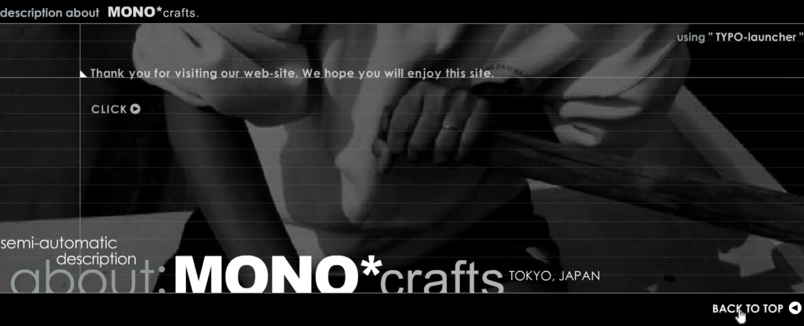
Nakamura studied civil engineering and architecture at Tokyo University and worked in the field before turning to screens. "I found the simple fact that every experience was determined by the relationship between me and my surroundings," he later stated, "and I realised that I wanted to design the form of that relationship abstractly. That's why I got into the web." Under the moniker yugop, he built elaborate sites for hire and for himself, becoming famous for expertise in the tool that gave him the composition and interactivity engineering denied him: Flash.
Flash had three lives before web design. Born as software for the doomed pen computing market, it was adapted to screens as a drawing tool, then transformed in 1996 into the keyframe animation package FutureSplash Animator, paired with a file format and embeddable player. Creator Jonathan Gay first turned to Netscape Navigator, using its new plugin architecture to spread the player; luck followed when MSN needed streaming video and Microsoft baked the player into Internet Explorer. Within months, FutureSplash was playable in 99% of browsers. By the end of 1996 Macromedia had purchased it and rebranded it Flash.
Designers learned to recreate website functionality inside Flash, some expanding the player to fill the whole screen—the first Flash websites. The appeal was visual: drag-and-drop tools for animated navigation, transitions and audiovisual interactivity the web couldn't do natively, without HTML tables' struggles and with little if any code. It offered consistency when the Browser Wars produced inconsistent HTML and CSS implementations that designers couldn't rely on. And it met demand from commercial clients who wanted to stand out: in the Flash era, even e-commerce shopping carts zoomed across the page.
MONOcrafts stood out even amid the coming saturation. Flash 4, released just before Nakamura began work, introduced ActionScript, letting him add interactive elements programmatically. MONOcrafts was the first animated intro many designers saw—elegant and brief, before intros became interminable and "Skip Intro" buttons a reflex. He used audio, digitally compressed tones and clicks, before background sound became ubiquitous and then nearly extinct. And his carefully handled transitions and animations were retooled in thousands of incarnations.
Much of the embellishment was the point. The outsiders who created the field had graduated to senior positions at agencies they founded, some leaving the industry, replaced by a new class as eager to define the medium; many turned to Flash as their outlet. The results reached the largest brands—works that, as Will Bedingfield noted, feel "bizarre, almost sentimental" for billion-dollar multinationals: long loading times, gaudy graphics, intrusive sound. Some saw Flash as the web's full potential realized; others, a nuisance.
Letting the Child Go Its Own Way
In April 2000, John Allsopp wrote "A Dao of Web Design" for A List Apart, at the end of web design's first era. "What I sense is a real tension between the web as we know it, and the web as it would be," he wrote. "It's the tension between an existing medium, the printed page, and its child, the web. And it's time to really understand the relationship between the parent and the child, and to let the child go its own way in the world." Designers had long asserted control—hence HTML hacks, and later Flash—but the web's fluidity was its strength.
The post's second half outlined techniques for embracing the medium, setting the stage for the coming decade: accessibility, web standards, and the separation of content and appearance. Five years earlier those concepts were whispered by a barely known community; ten years earlier they didn't exist. From that tension came a new practice entirely: web design.