

When Bad Design Is the Attack Vector
Online scams have evolved from crude, typo-laden emails into polished, convincing operations that leverage AI, deepfakes, and social engineering. For older, non-tech-savvy users, these attacks are especially dangerous — not because they lack intelligence, but because scammers have become expert at exploiting the same design patterns that legitimate products use to build trust.
Consider a typical scenario: an older user receives an email that appears to be from their bank. It has a professional logo, clean formatting, and a clear call to action: verify an account activity immediately. The design is flawless — which is exactly the problem. The user hesitates, unsure whether to click. That hesitation is often the only line of defense.
The troubling reality is that good visual design is no longer a reliable signal of legitimacy. Scammers understand layout, hierarchy, and persuasive language as well as any product team. Meanwhile, the usability gaps in legitimate apps — bottom navigation bars that confuse older users, multi-step flows that overwhelm working memory, and vague button labels that require interpretation — create openings that fraudulent interfaces are built to exploit.
Who Is Being Targeted
The statistics paint a clear picture of vulnerability. In 2021, the FBI logged more than 90,000 older victims of fraud, with losses of US$1.7 billion — a 74% increase from the previous year. Australia's ACCC reported that people aged 65 and over were the only group to experience rising scam losses in 2023, up 13.3% to $120 million, frequently following contact initiated on social media. In the UK, 61% of those over 65 have been targeted by fraud; those who fall victim lose nearly £4,000 on average.
These numbers are likely understated, as embarrassment and lack of awareness discourage reporting. The reasons older users are picked out are well documented:
- Perceived assets: They are assumed to have accumulated savings or property.
- A digital literacy gap: They did not grow up with the internet and may not recognize red flags that are obvious to digital natives.
- Trust in authority: They are more likely to believe messages that appear to come from banks, government agencies, or known brands.
Scammers exploit this trust systematically. They impersonate institutions, health providers, and even family members. The rise of AI voice cloning makes the latter especially concerning — no amount of UX polish on a legitimate app can protect a user who receives a phone call that sounds exactly like their grandchild asking for money.
Cognitive Load and Decision Fatigue
Aging brings measurable cognitive changes: slower processing speeds, reduced working memory, and a lower tolerance for complexity. For an older user, a poorly designed app is not just an annoyance — it is a cognitive obstacle course. Multistep processes become harder to follow, unexpected layout changes cause anxiety, and vague language amplifies confusion.
Decision fatigue compounds the problem. When a user has already worked through several screens of choices, the sixth button becomes easier to click without full comprehension, especially if it appears to fit the flow they're already following. Scammers are aware of this. Good UX, however, can reduce the cognitive load that makes users vulnerable to these pressure tactics.
Where Design Can Intervene
The core obstacles older users face are consistent: distinguishing safe links from suspicious ones, telling ads apart from actual content, knowing how to verify a source, and understanding security terminology like "multi-factor authentication." Many blame themselves for their confusion, which keeps them from asking for help and makes them repeat targets.
UX designers cannot eliminate these problems entirely, but they can shape how users understand risk. Every design decision — wording, layout, color, and flow — contributes to whether a user feels safe or confused, confident or overwhelmed.
Simple, Clear Interfaces Are a Safety Feature
Linear flows, fewer input fields, and consistent instructions reduce errors. Users who feel oriented are less likely to make impulsive clicks on unfamiliar elements.
Security Cues Must Be Obvious and Unchanging
Users look for padlocks, HTTPS indicators, and verification badges. These signals must be consistent across all pages; a padlock that appears on some screens but not others trains users to ignore it when it matters most.

Language Should Remove Ambiguity
Plain, direct phrasing is essential for critical actions. A button that reads "Confirm $400 transfer" leaves no room for misinterpretation, whereas vague CTAs like "Continue" or "Let's go!" force the user to guess what happens next. Clear wording reduces uncertainty specifically in high-stakes contexts like banking.

Accessibility Is Protective Design
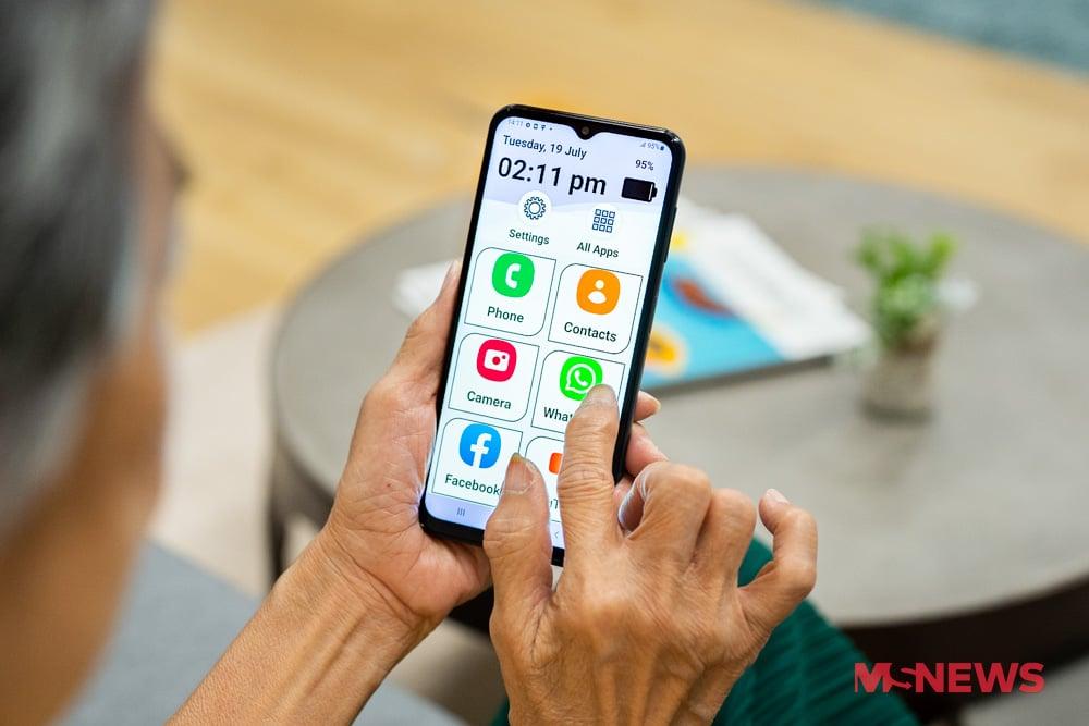
Minimum 16px fonts, high-contrast color schemes, and generous spacing improve scannability. These changes benefit all users while directly addressing the visual challenges of aging. Overly compact or stylized interfaces force older users to guess — an invitation for mistakes.
Well-Placed Friction Prevents Errors
Verification steps and warnings serve a corrective function when applied deliberately. A second confirmation screen before a transfer is not an obstacle; it is an intervention that disrupts an automatic or pressured response.
Contextual Education, Not After-the-Fact Alerts
Tips, tooltips, and passive warnings placed inline help users assess risk within the flow rather than after a mistake. Educational content embedded at the point of interaction is far more effective than a security notice that appears elsewhere or later.

The Limits of Interface-Level Protection
Design cannot solve everything. Phishing emails will still reach inboxes, and a well-crafted scam page will still look convincing. For some users, no interface will ever fully bridge the digital literacy gap — they need human support structures: phone numbers for help, in-person safety courses, and family members who can assist on demand.
What designers can realistically offer is a system that makes hesitation natural. Visual clarity, minimal ambiguity, and moments of deliberate friction before consequential actions give users permission to pause and think. For a person staring at an unfamiliar screen, that pause can be the difference between closing an account and closing the browser tab.
Practicing Safety Outside the Interface
Vulnerability is reduced when users adopt habits beyond any single app:
- Treat unsolicited contacts with suspicion. Never click links or download attachments from unknown sources, and verify any request for personal information through official channels, not contact details provided in a suspect message.
- Use strong, unique passwords and enable two-factor authentication. Combining letters, numbers, and symbols and avoiding reuse across accounts limits the damage of a single compromised credential.
- Acknowledge urgency alerts carefully. Requests for money or personal details, especially urgent ones, warrant independent verification through an organization's official website or phone number.
- Report suspected scams promptly. This protects other potential victims and helps authorities track emerging tactics. Reputable organizations like the National Council on Aging, Age UK, and the eSafety Commissioner provide updates on current scam methods.
The most effective defense remains a combination of thoughtful design, ongoing education, and genuine human support. UX provides the safety net — but the community catches those who still fall.
Warning Screens That Actually Work
My mother once flagged a transaction in her banking app as fraudulent. It turned out to be a legitimate purchase at a local cafe, but the payment was processed through a head office in an unfamiliar suburb — and that discrepancy was enough to cause alarm.
That confusion is preventable. Several banks have introduced friction at the point of transaction review, but in a way that informs rather than obstructs. Some of the more effective approaches:
- ING bank: Tapping a transaction reveals additional detail about the business behind it.

- NAB (National Australia Bank): Suspicious transfers now trigger messages such as, “Have you spoken to this person on the phone? Scammers often pose as trusted contacts.” NAB reported that December 2024 was its biggest month for abandoned payments, with customers rejecting $26 million worth of transactions after seeing an alert.
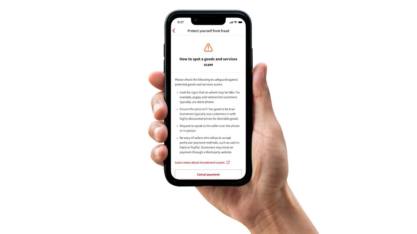
- Macquarie Bank: Added prompts that ask users to confirm approval of every transaction.

- Monzo Bank: Introduced three layered security features for online fraud:
- Verified Locations: Large transfers are only permitted from locations the account holder has marked as safe, blocking fraudsters operating outside trusted areas.
- Trusted Approvers: Big transactions require a second nod from a designated contact, adding a safeguard against phone theft or for vulnerable users.
- Secure QR Codes: Users generate a QR code stored in a safe place, then scan it to unlock additional security layers when needed.

- Email platforms such as Gmail surface spoofed addresses and impersonation attempts with yellow banners and warning icons.

The goal of these interventions is not to stop users cold, but to give them one final moment to reconsider. That alone can be decisive.
Clear visual cues also help users navigate their journey with greater confidence and direction.

Security as a Design Feature, Not a Gate
The security measures appearing in banking apps are not purely fraud prevention — they are examples of thoughtful UX. Built to feel natural rather than burdensome, they keep users safe without overwhelming them. For UX professionals, the responsibility is to design with protection in mind, anticipating threats and guiding users away from risky actions. In financial products, good UX is not just seamless; it is security by design.
With digital deception on the rise, protection is usability. Interfaces that support safer choices — especially for older users whose life savings may hinge on a single click — are within designers’ power to create.
Security should not be treated as a backend concern or someone else’s problem. The systems we build should be scam-resistant, age-inclusive, and intentionally clear. And a human touch — reaching out to help older family members — should never be forgotten.
At its core, good UX isn’t just helpful — it can be life-changing.



