

A Single Source of Truth for Design and Development
Design systems teams often find themselves stuck in a repetitive loop: design a component, document it, deliver it to developers, then audit the implemented code to verify it matches the original intent. Every update multiplies that overhead. What if the component library itself could be the shared artifact, eliminating the duplication of effort?
UXPin's Merge feature attempts to answer that question by bridging the gap between the design canvas and the codebase. Rather than maintaining parallel component libraries — one visual, one code-based — Merge synchronizes them so that components live in one place that both disciplines share.
Reversing the Traditional Workflow
The conventional component process is sequential and labor-intensive: design the base component, create variants, write documentation, publish to the library, deliver to developers, and hope nothing breaks during handoff. Updates add another full pass, plus a second delivery to a separate development library. The back-and-forth between design and engineering can stall product teams waiting on components to meet deadlines.
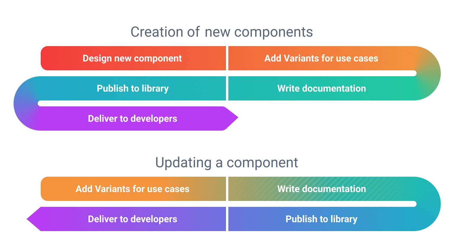
Merge flips that order. Instead of designing first and coding later, the developer builds the component and publishes it directly into the UXPin library via Merge. Designers then place fully functional, code-accurate components onto their canvases — no need to re-create or re-style what already exists in code.
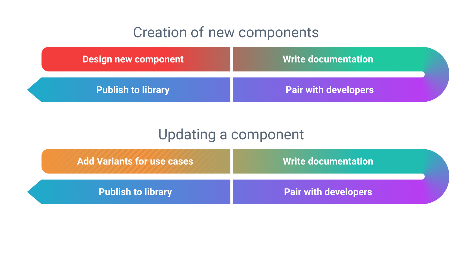
For simple, atomic-level components like buttons, designers may skip designing altogether. The focus shifts to the detail level needed for documentation and implementation, not to replicating everything from scratch. When an update is needed — say, adding an icon option to a button — the conversation goes to development directly rather than through a redesigned mockup. The library becomes the delivery mechanism: if a component is available to designers, it is already available and tested in the development environment.
From Repository to Library
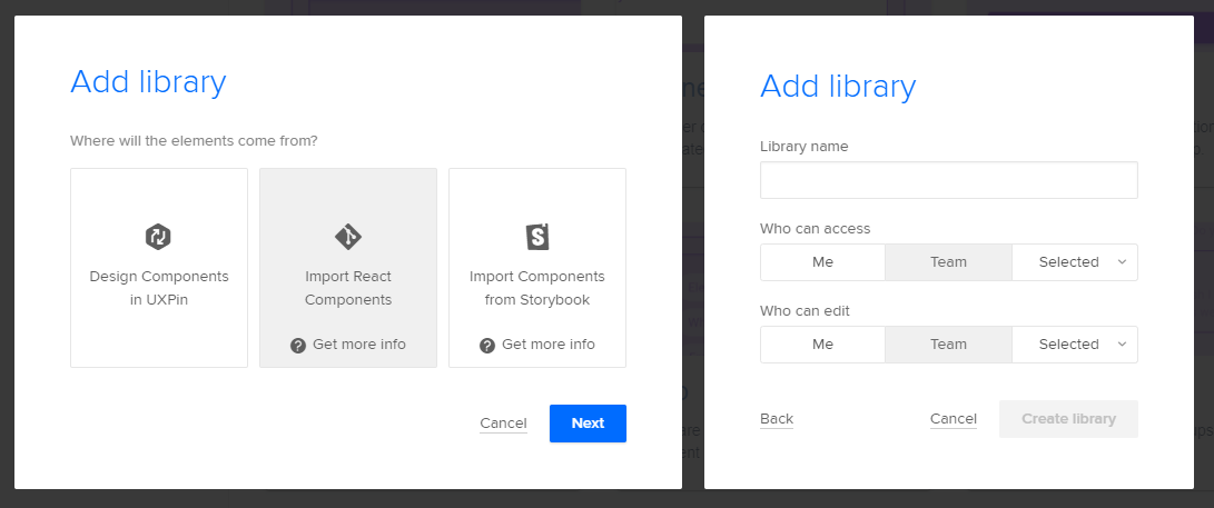
Libraries can be imported directly from code repositories like GitHub, Bitbucket, or GitLab (for React components), or from a Storybook instance. With Storybook, you paste the library URL and UXPin handles the rest. For React, a CLI gives you fine-grained control over which components get published, scoped by a unique library token.
Version Control and Testing Built In
Component upgrades in a design tool often carry anxiety: will a reorganized layer tree or renamed layers break existing usage? Merge sidesteps that concern because the component's visual representation is generated from the underlying code. As long as the component's properties remain stable, a designer can upgrade to the latest version without worrying about internal code structure. And should something go seriously wrong, the standard version rollback applies — revert and republish the previous version.
Safe Testing Grounds
You can publish a branch of your component code to a test environment inside UXPin, share it with a beta group, and validate the update before merging it into the primary library. This avoids the risky practice of editing a live design library to trial changes and mirrors how developers already test with forks and branches.
Designing With Code Components
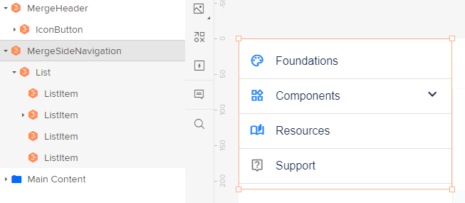
From the designer's perspective, using a Merge-connected component is nearly identical to using a traditional library item. Interface elements sourced from the developer's library appear marked with an orange hexagon, and the components themselves accept properties and configurations just like native UI kits.
Enforced Behavior Limits
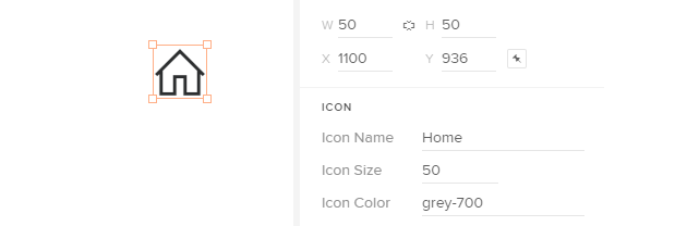
Companies wrestle with frequently misused atoms — for instance, styling a bare icon as a link instead of wrapping it in a button. Code-derived components can impose restrictions that prevent such errors: a bare icon from the library can be locked so that no interactions can be attached to it.
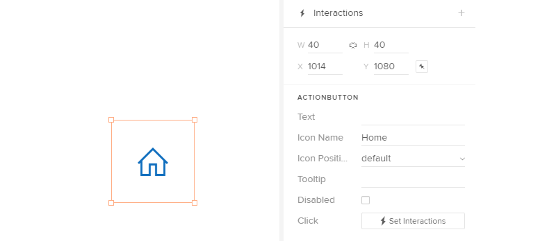
Wrapping the same icon in a button component unlocks interactions, steering teams toward proper usage and accessibility. These guardrails reduce the burden on design system teams to police component usage in every design, while any custom overrides remain visibly flagged in the layer panel.
Handoff and Accessibility Data
When it's time to build, the finished prototype lists each component with its configuration for fast copy-paste into the developer's workflow. Teams without a component library can start with UXPin's built-in defaults or import public libraries directly.
Accessibility metadata often gets lost in handoff. Merge lets component properties expose values that never render visually — such as ARIA labels or meta information — so designers or copywriters can enter them in the prototype, and developers receive them pre-populated without extra documentation digging.
Layouts, Templates and Grids
Layouts, grids, and whole-page templates can also be packageable as library components. A login page, form, or profile view stored as a component becomes a drag-and-drop starting point with spacing logic driven by the development library itself — reducing the margin for errors in both styling and misalignment.
Closing the Loop
Components defined in code and consumed on a design canvas cut down duplication, version-skew, and handoff reviews. They strengthen the working relationship between design and engineering, let designers trust the latest versions they adopt, and let design teams focus on composition and use cases rather than rebuilding abstract versions of what already runs in production.


