Green bubbles: a contrast problem that is easy to measure
The complaint is familiar: text messages from non-iPhone users are hard to read. Green bubbles mark standard SMS/MMS traffic, while blue bubbles mark iMessages between Apple devices. Putting the green and its white text through a contrast checker gives a ratio of 2.17:1.
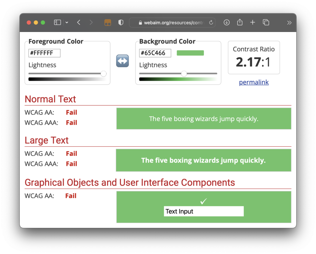
That is short of the WCAG 2.0 AA threshold of 4.5:1 and far from AAA at 7:1.
The issue has drawn wider attention, with several news and blog posts covering it, some as recent as last week:
- How iPhone Violates Apple’s Accessibility Guidelines (Kevin Voller)
- Apple Accused of Purposely Making Messages From Android Devices Hard to Read (Hypebeast)
- Text Messaging Wars: Apple Makes Android Green (Psychology Today)
- Apple Message Color Complaints Continue (Infopackets)
- Apple Using Green Color For Android Messages To Establish iPhone’s Dominance? (Gizbot)
- How To Make iPhone Green Messages Easier To Read (Inquier.net)
What changed across iOS releases
- iOS 6: Dark text on a green gradient background
- iOS 7: White text on a
#5AB539background (or something close to it) - iOS 16.1: White text on a
#6ACC46background
The iOS 7 value comes from older screenshots and may not be exact. Even so, moving from dark text in iOS 6 to white text in current releases reads as a regression. One would hope the updated values were checked against WCAG guidelines, or at least Apple's own Human Interface Guidelines.
Not even the system green passes
The green actually drawn in the bubble (#65C466) differs from the green listed as a system color in the iOS palette in the guidelines (#30D158, from RGB 48, 209, 88). Swapping one for the other would not bring the combination any closer to passing WCAG AA or AAA.