
A third-party accessibility audit of Slack for Android
In 2024, Slack ran a Voluntary Product Accessibility Template (VPAT) assessment with an external vendor, following its major IA4 redesign. The audit surfaced a mix of accessibility issues across Android, iOS, and desktop. For Android, the straightforward fixes such as color contrast and image labels went straight to the relevant teams, while the remaining items went through a triage process.
Several recurring patterns emerged from the Android findings. Here is a look at the themes, what it took to resolve them, and the broader lessons from the exercise.
Common threads across the audit
The open issues fell into a few distinct categories, most of which have now been addressed:
- Error messages not reaching screen readers (P1) — resolved
- Missing heading semantics (P2) — resolved
- Edit fields without persistent labels (P2) — resolved
- Incorrect list item counts announced by TalkBack (P2) — resolved
- Inaccessible drag-and-drop in the workspace switcher (P2) — resolved
- Strikethrough formatting not conveyed (P2) — resolved
- Errors conveyed by color alone (P3) — resolved
- Keyboard navigation and focus (P3) — deferred
The keyboard navigation issue was set aside because Slack for Android does not yet support the large form factor that this use case implies. The team chose instead to explore options that align with current Android best practices.
Making errors visible to TalkBack
The most critical issue was that error messages shown after invalid input were silent to screen readers. Two distinct UI patterns caused this:
|
(1) Immediately below the editing field.
|
(2) Via the SK error banner.
|
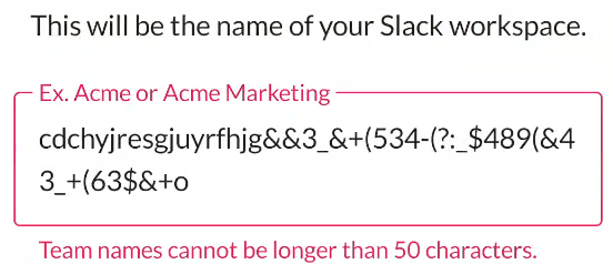
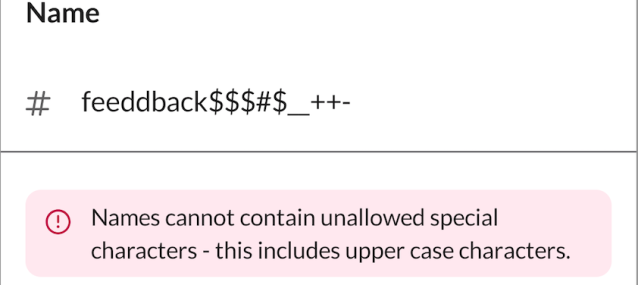
Neither pattern announced an error, forcing TalkBack users to swipe through the screen to discover what had gone wrong. For the inline error case, the team modified OutlinedTextField so the error message is announced immediately after the field itself. For the banner case, Slack’s SKBanner error type was updated to trigger an announcement on error. The change is demonstrated before and after the fix:
|
Before |
After |
Headings: what counts and what doesn’t
Screen reader users rely on headings to skim and navigate a page structure quickly. The audit found that headings inside lists — for example, sections of the Preferences page — lacked heading semantics entirely. Those were fixed.
The vendor also suggested that top app bar titles should be headings. The team tested this against standard behavior in other Android apps and found it inconsistent with platform conventions, so those tickets were closed.
The label problem on edit fields
Some input fields relied solely on placeholder text that disappears once the user types. For people with cognitive disabilities, losing the hint can be disorienting. The search field presented a clean fix: adding an explicit search icon, giving users a persistent visual cue of the field’s purpose.
|
Before
|
After
|
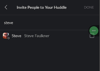
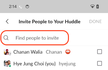
The message input area (AMI) was trickier. Space constraints prevented an optimal permanent label, and the design team had to weigh what was feasible against what was ideal.
Why TalkBack over-counted list items
The vintage Slack Kit bottom sheet was misreporting list lengths. Dividing lines in the bottom sheet, though purely decorative, counted as list items. A sheet with seven visual rows could announce “7 items in a list” when only five were interactive.
The solution was a new SKListAccessibilityDelegate for SKListAdapter, which overrides the accessibility CollectionInfo to reflect the true number of items.
Rebuilding drag-and-drop for all users
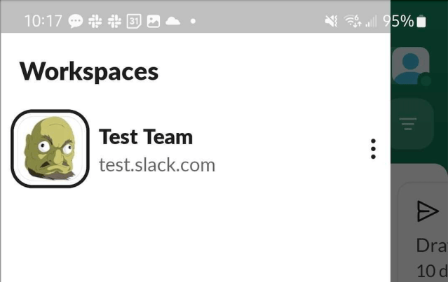
The workspace switcher allowed reordering but only via a drag gesture, which is inaccessible to many users with motor impairments. The design decision was to add an explicit Edit mode. In that mode, each workspace row shows a six-dot drag handle, making the capability visible.
For TalkBack users, the team added custom actions — "Move before" and "Move after" — accessible from the context menu via a three-finger tap on a row or by drawing L or r gestures.
|
Before
|
After
|

Questioning the strikethrough requirement
The audit flagged that strikethrough text was read as normal text by screen readers. Rather than engineering an announcement, the team consulted a member of the blind community and concluded that screen readers generally do not interpret this formatting — and for good reason. Announcing it could be mistaken for part of the message content and would add verbosity.
The broader recommendation stands: avoid strikethrough formatting wherever possible, since even sighted users can find it hard to parse.
Moving beyond color alone
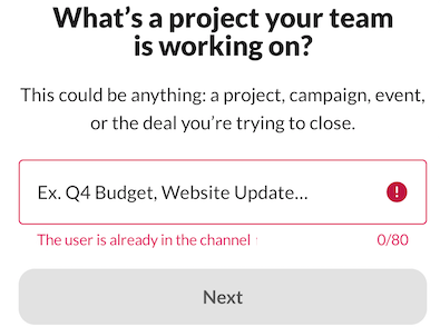
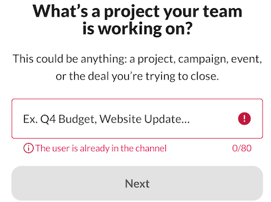
The audit found cases where error state was communicated by red text only, which fails for users who cannot perceive that color. A design update had already moved error presentation toward more than just color, but implementation was inconsistent. A usage audit corrected the affected screens.
|
Before
|
After
|
Lessons from triaging the VPAT
Several principles came out of this cycle that Slack will carry into future work:
- Announce errors immediately. Screen reader users should never have to hunt through a screen to learn whether an action failed.
- Small visual changes can matter a lot. Adding an icon to a text field meaningfully improved the experience.
- Gestures need discoverable alternatives. Custom TalkBack actions should be considered from the start for interactions like drag-and-drop or swipe-to-dismiss.
- Design partnership was key. Having an accessibility-aware design team shortened decision cycles considerably.
- WCAG does not always map cleanly to Android. The team spent time testing native Google apps to judge which WCAG standards genuinely apply to mobile native patterns.
The next VPAT assessment date is not fixed, but the effort to keep Slack accessible across platforms is ongoing.
Reference: WCAG mapping
| WCAG standard | Issue | Description |
| 4.1.2 Name, Role, Value (Level A) |  Error messages are inaccessible. Error messages are inaccessible. |
If the user enters an invalid input to an edit field and presses “Next” (or Submit), an error message is displayed, but the error is not communicated to users using screen readers. TalkBack should announce that it is in an error state when it receives focus, along with the error message so that users understand why it’s in error. |
| 1.3.1 Info and Relationships (Level A) | Heading is not identified. |
The heading does not convey clear semantic information, making it difficult for screen reader users to quickly grasp the page’s structure and navigate efficiently. Defining headings enables assistive technology to convey the hierarchical organization of the content, enhancing accessibility and providing an alternative navigation method. |
| 4.1.2 Name, Role, Value (Level A) |  Missing a11y label on EditField Missing a11y label on EditField |
Some edit fields do not have permanent labels. It is labeled using placeholder text that is removed when the user enters text. Some users with cognitive difficulties may forget the purpose of the edit field without a permanently visible label. |
| 4.1.2 Name, Role, Value (Level A) | Incorrect number of items in list |
When TalkBack users have Always speak number of list items setting enabled and navigate through a list, TalkBack announces an incorrect number of items. |
| 2.5.7 Dragging Movements (Level AA) | Drag and drop in the workspace switcher is inaccessible. |
Workspaces in the workspace switcher can be rearranged, but it requires the user to select a workspace and drag it to the new location. People who lack the dexterity required to perform this action may have difficulties completing the task, or may not be able to complete the task at all. |
| 1.3.1 Info and Relationships (Level A) | Strikethrough information not conveyed to screen reader users |
Users have the option to format text as strikethrough, but the strikethrough information is not conveyed to screen reader users. It is visually evident that the text has strikethrough, but it is read as normal text for screen reader users. |
| 1.4.1 Use of Color (Level A) |  Errors indicated by color alone Errors indicated by color alone |
If the user enters an invalid input to an edit field, an error message is displayed below the edit field. The only indication it is an error is that it is written with red text. To users unable to perceive red text, the error text is just another message on the screen and not necessarily an error. |
| [Not planned] Keyboard navigation and focus |


