

Color Is Best-Effort: A Deep Dive Into Video Color Spaces
There is an assumption buried in most of our video work: that the color you see is the color you get. It isn't, and it never really was. Color handling is best-effort at every stage of the pipeline, from camera capture through compositing to final display. The artifacts you see aren't necessarily bugs — they're the visible seams of a system built on approximations.
The Case of the Floating Dots
While editing video recently, I ran into a visual artifact that resisted every fix I tried. A composited image showed small dots appearing in dark regions, visible at full resolution but becoming dramatically worse when scaled down. At quarter resolution, the artifacts became pronounced colored circles, and the pattern extended into streaks when a Tilt-Shift Blur effect was applied — even at zero strength.
The source layers were innocuous: a stock background image with reduced exposure, a tilt-shift blur for subtitle readability, and a transparent Safari screenshot. The latter had an opaque table background from GitHub's CSS, which was removed with a 3D keyer. The dots appeared only after the keyer was applied — removing the keyer made them vanish, and the problem persisted across the Ultra Keyer, Luma Keyer and Chroma Keyer alike.
Pausing playback temporarily hid the issue, but it came back — and appeared in exports too. None of the usual remedies worked: switching color spaces in the keyer, toggling pre-divide/post-multiply, adding an Alpha Multiply node, or applying a Gamut Limiter. The source PNG was plain sRGB, per the IEC standard. The behavior suggested colors being pushed outside the representable gamut, but clamping them didn't help either. Whatever this is, it isn't a simple gamut overflow.
Gamut Is a Triangle
We can see the real issue by looking at the CIE chromaticity diagram. The colored "horseshoe" shape represents the full range of visible light. The triangle drawn inside it — Rec.709, P3-D65, or Rec.2020 — shows the subset a given color space can encode.
Footage shot in different color spaces looks visibly different, even before any processing. Rec.709 video appears "noisy" in a way that P3-D65 footage doesn't. Rec.2020-HLG footage shows colors carefully fitting inside its triangle, but also wanting to escape — in the same way you can see audio peaks flatten when they clip.
Even on an sRGB screenshot, the differences scream: a cat's fur brightens too quickly in one space, a floor reads wrong in another. These aren't subtle color grading choices; they're structural properties of the encoding space chosen at capture time.
Gamma: Spending Bits Where They Matter
The gamma curve exists for one reason: to spend our limited bits wisely. Display a gradient with 16 shades of grey and a linear response curve where brightness tracks encoded value 1:1, and it will feel wrong — shadows and midtones crush while highlights dominate. Apply the familiar sRGB-ish curve, where encoded value 0.1 maps to a lightness of only 0.01 and where 0.35 is needed to reach 0.1 lightness, and the same 16 shades become usable.
Encoding values map to physical lightness through the transfer function. If that mapping is wrong in any link of the pipeline — the camera's capture profile, the color space assigned in the editor, or the display's decoding — the result is washed-out shadows, over-saturated highlights, or darker or brighter images than intended.
The specification of the sRGB curve was published in 1999 and amended in 2003, but variations persist in practice. "Simplified sRGB" using gamma 2.2 rather than the piecewise IEC curve would be close enough that most pipelines would never reveal it in normal content.
What HDR Video Changes
Modern iPhone cameras default to HDR video. The built-in Camera app tags its output automatically, but the Blackmagic Camera app names its color spaces directly: Rec.709, P3-D65 and Rec.2020-HLG appear as selectable options. Shooting the same scene a few seconds apart in each of those spaces produces noticeably different footage, before any post-processing — a mix of exposure inconsistencies and the wider gamuts of P3 and Rec.2020.
All three spaces share the D65 white point, which is intended to represent average daylight at approximately 6500 K. The practical difference between them is the gamut triangle: Rec.709 was designed for CRT-era equipment, while Rec.2020 covers far more of the visible spectrum, intended for future UHD displays that have not yet arrived at scale.
The takeaway, if there is one, is to treat color-space awareness as a fundamental skill rather than a post-processing concern. The moment content crosses from one encoding into another — camera to editor, composite to export, file to screen — assumptions collide. Some of those collisions are subtle, like a floor that reads a bit too bright. Others are a rash of floating dots that export straight into the final video.
Naming the First Transfer Function
Before diving deeper, it helps to pin down what we’ve actually been plotting. The function we saw earlier is technically called a “reverse OETF.”
An OETF, or opto-electronic transfer function, handles the capture and encoding side: a camera sensor records light, and the OETF maps that light level to an integer value in the video signal. Examples include sRGB, Rec.709, Rec.2020-HLG, and Rec.2020-PQ.
The EOTF, or electro-optical transfer function, is the display-side counterpart. It takes the signal values and decides how much light a monitor should emit. Monitor color profiles like Display P3, sRGB, and Adobe RGB all rely on EOTFs.
There’s also an OOTF, which simply combines the OETF and EOTF into one operation — we don’t need to worry about it for this discussion.
Our focus is on reversing the OETF that was applied in the camera, so we can recover the original light information. For sRGB, the OETF is defined piecewise:
- For
v ≤ V:E(v) = A·v - For
v > V:E(v) = (1 + C)·v^(1/Γ) − C
with V = 0.0031308, A = 12.92, C = 0.055, and Γ = 2.4. Here v represents the light level hitting the sensor, and E(v) is the encoded signal value stored in the file.
Its inverse, the reverse OETF, is:
- For
u ≤ U:D(u) = u / A - For
u > U:D(u) = ((u + C) / (1 + C))^Γ
with U = 0.04045 and the same A, C, and Γ constants.
Verifying the Inverse
We can sanity-check that D really is the inverse of E in a couple of ways. Plotting both reveals symmetry around the y = x line — the curve resembles an almond shape when overlaid.
More rigorously, applying D to E(v) should return v. For the linear segment:
D(E(v)) = A·v / A = v
For the exponential segment:
D(E(v)) = (((1 + C)·v^(1/Γ) − C + C) / (1 + C))^Γ = (v^(1/Γ))^Γ = v
The breakpoint also checks out. Evaluating D(U) for the linear part gives 0.04045 / 12.92 ≈ 0.0031308. For the exponential part, ((0.04045 + 0.055) / (1 + 0.055))^2.4 ≈ 0.0031308. Both match the original V = 0.0031308, confirming the inverse is correct.
Reading a Parade Scope
Back to the footage: another useful diagnostic is the Parade view, which displays red, green, and blue values side by side, typically on a scale of 0 to 1024 to mimic 10-bit encoding. The Rec.709 footage — which looks “good” — shows a healthy spread across the range.
The Rec.2020 footage, however, appears compressed toward the top of the scale. A slider can adjust the view, but here’s the puzzle: when the same Rec.2020 footage is reviewed on an iPhone, it looks perfectly fine — not blown out at all.
A screenshot taken from the iPhone and exported as an sRGB JPEG shows more vivid colors than the raw file does when pulled into a video editor. The iPhone is clearly applying some transformation to make the Rec.2020 footage look correct on its display, yet it can still export an sRGB screenshot that doesn’t look as broken as the untouched footage does in DaVinci Resolve.
The same effect appears on a Mac: opening the footage in QuickTime shows “correct” colors as well. What’s happening in both cases is tone mapping — the display system maps the wide-gamut Rec.2020 signal down to the narrower output range while preserving a natural appearance. The
Reading the Matrix in H.265 Headers
The macOS Finder gives us three numbers for each file, which map directly to standardized fields in the ITU-T H.265 Recommendation. Blackmagic Cam footage tagged as “Rec.709” shows 1-1-1, while “P3 D65” mode yields 12-1-6. For “Rec.2020 - HDR,” the file carries 9-18-9.
These codes are defined across 728 pages of the spec. The first field is the color primaries — the xy coordinates of the red, green, and blue primaries in the CIE 1931 color space. Notable encodings include:
1for Rec. ITU-R BT.709-6 and IEC 61966-2-1 sRGB/sYCC (HD SDR content)4for Rec. ITU-R BT.601-7 625 (PAL)5for Rec. ITU-R BT.601-7 525 (NTSC)9for Rec. ITU-R BT.2020-2 and Rec. ITU-R BT.2100-2 (HDR)12for SMPTE ST 2113, the “P3D65” gamut

The Rec.2020 gamut covers more of the visible spectrum than Rec.709. The cramped cloud of colors in the Rec.709 chromaticity plot is actually Rec.2020 footage clamped down to Rec.709 — some original colors are simply discarded.

Why not just adopt a gamut that covers the entire visible spectrum? The short answer is bit depth. With 8-bit color, naive encoding concentrates all possible values near the illuminant, leaving gaps at saturated red, green, and blue.
The second coded value is the transfer characteristics — the tone response curve, or gamma curve — that overcomes this by spreading codes radially toward the primaries. But there's a wrinkle, noted in the spec:
some values of
transfer_characteristicsare defined in terms of a reference OETF, and others in terms of a reference EOTF. For Rec.709 and Rec.2020, a suggested corresponding EOTF for flat panel displays has been specified in Rec. ITU-R BT.1886-0.
So the EOTF isn’t the same function we plotted for encoding. The BT.1886 EOTF converts video signal back to screen luminance in candelas per square meter (nits):
L = a(max[(V + b), 0])^γ
Vis the video signal in [0,1] — just divide your 8-bit or 10-bit code by the max value.γis 2.4 for Rec.709 SDR.a = (L_W^(1/γ) − L_B^(1/γ))^γis the user “contrast” gain.bis the black level lift, known as “brightness.”L_WandL_Bare the screen luminance for white and black.
Mnemonics: EOTF is electro-optical (electric → optic); OETF is opto-electrical (optic → electric). Displays are optical, video files are electrical.
For transfer characteristic value 1, the spec gives this OETF:
V = α * L_c^0.45 − (α − 1) for 1 ≥ L_c ≥ β
V = 4.500 * L_c for β > L_c ≥ 0
Here L_c is linear optical intensity, and α and β are fixed constants that make the curve continuous:
β = 0.018053968510807
α = 1 + 5.5 * β = 1.099296826809442
Rewriting with familiar notation, using A = 4.5, C = 0.099296826809442 and Γ = 1/0.45:
E(v) = A * v for v ≤ V
E(v) = (1 + C) * v^(1/Γ) − C for v > V
That’s structurally identical to sRGB encoding — same form, different linear slope, breakpoint, and exponent. The BT.709 curve uses Γ = 1/0.45 ≈ 2.222…, not 2.4.
For HDR, field value 18 refers to ARIB STD-B67, also known as Rec. ITU-R BT.2100-2 HLG (Hybrid Log-Gamma). The spec’s version looks dense, but simplifies to:
E(v) = A * v^(1/Γ) for v ≤ 1/12
E(v) = a * ln(12*v − b) + c for v > 1/12
With A = √3, Γ = 2, and the constants a = 0.17883277, b = 0.28466892, c = 0.55991073.
Notice what’s missing: no linear segment. That’s because in HLG’s native scale, lightness isn’t in [0,1] but in [0,12]. HDR is not merely about 10-bit or 12-bit coding — it’s a brighter signal range entirely.
White Is Not a Number
There’s a demo called Wanna see a whiter
white that embeds an HDR video to make a point: when you type
#ffffff or rgb(255, 255, 255), you’re not actually asking for “the whitest possible.”
You’re asking for the brightest SDR white your display can produce — and that figure
is device-dependent.
Consider my own monitors, a pair of LG 27UP85NP-W displays carrying the “VESA DisplayHDR(TM) 400” badge. That rating promises a peak of 400 nits (candelas per square meter), and independent testing has clocked them at 413. But that’s the ceiling; it’s not where they sit day to day.
Right now those monitors are set to the DCI-P3 color profile:

And I’ve deliberately left “High Dynamic Range” turned off in macOS’s Display settings:

So how white is my white? I honestly can’t tell you. I don’t own a luminance meter like the Konica Minolta LS-150, which reads out in — foot-lamberts? Good grief.
Without instrumentation, I can only compare shades visually, and my eyes adapt quickly to whatever room I’m in. That adaptation is the entire reason different display standards target different gammas. sRGB is typically shown at a gamma around 2.2, suited to a well-lit office. Rec.709 is displayed at gamma 2.4, for dimmer living rooms in the evening. DCI-P3, from the Digital Cinema Initiative, is displayed at gamma 2.6, calibrated for near-dark theaters:
From top to bottom: a gamma 2.2 curve, a gamma 2.4 curve, and a gamma 2.6 curve.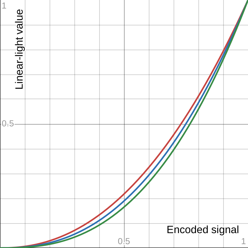
The higher the display gamma, the deeper the blacks — it’s effectively a contrast control. Crucially, this “display gamma” is not the same as the encoding gamma baked into the OETFs discussed earlier.
The sRGB OETF tracks closely to a gamma of 2.2:
sRGB OETF (solid) versus gamma 2.2 curve (dotted)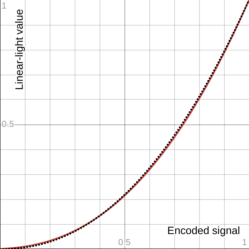
The Rec.709 OETF, despite its exponential portion using , is better approximated overall by a gamma of 1.96:
Rec.709 OETF (solid) versus gamma 1.96 curve (dotted)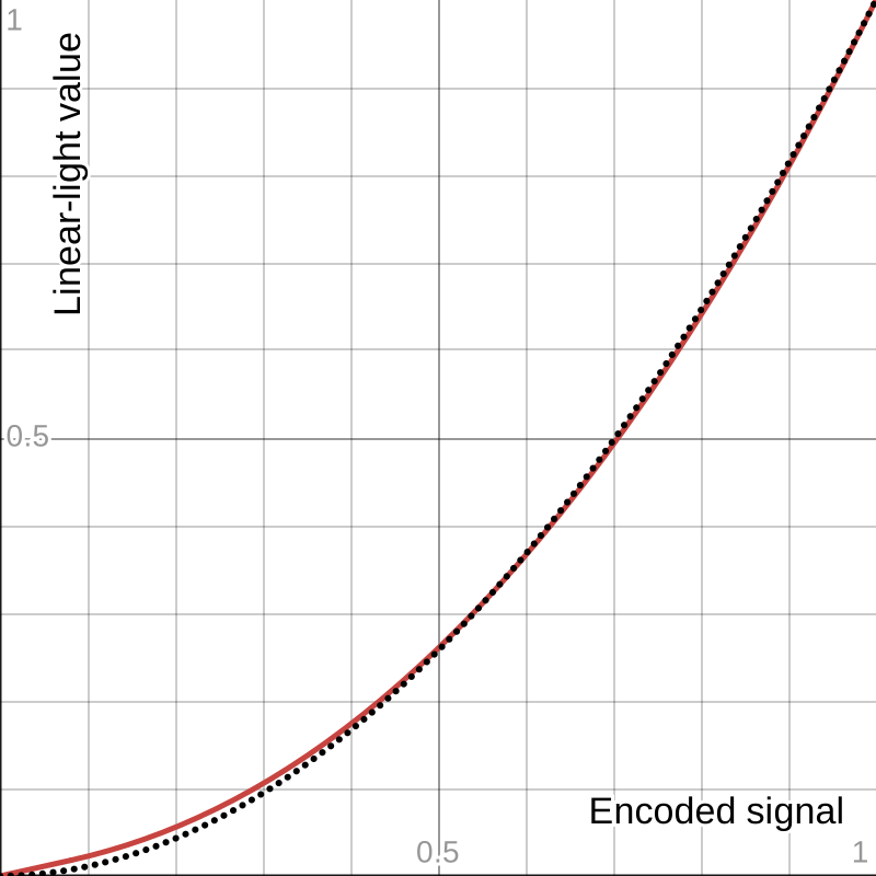
The gamma within an OETF exists solely to make efficient use of your bits. Display gamma, by contrast, is a user-adjustable setting on most monitors and TVs, there to match the ambient lighting — it’s all about perceived contrast.
Gamma is a fascinating operation because it always maps back to the range. That’s not true of every adjustment. Something like lift, for instance, behaves differently:
And neither does gain:
The Case of the Vanishing Stars
I left this article in a half-finished state for months, off working on other projects. At one point, I thought I had the answer: if you tell DaVinci Resolve to work in an HDR color space, the starfield artifacts disappeared. But I could never quite pin down what was going wrong.
Then the issue came back:

As before, it’s subtle at full resolution:

And unmistakable at half resolution:

In the Color tab, I found that raising the gamma slider mitigates the problem (though it also shifts the colors), while lowering it makes the artifacts far worse. I even managed to isolate the artifacts on their own — a night sky teeming with false stars.
My prior workaround had been to insert a gamut mapping node, which seemed to sidestep the issue during the unsynn video project:

But that trick no longer works either. The mystery persists. It’s likely a floating-point precision issue — but exactly where, I cannot say. Not me.


