
Variables give Alaska Airlines’ design system a smoother flight path
Alaska Airlines has a long history of adopting new technology first. It introduced online ticket sales back in 1995, and has since pushed innovations like check-in kiosks and mobile boarding passes. That forward-looking mindset now extends to its internal design workflow, where a 45-person team manages the customer experience across the airline’s website, mobile app, digital signage, and airport kiosks.
The centerpiece of that effort is Auro, Alaska’s design system. After migrating from a legacy stack of Sketch and InVision, the team has built a single source of truth in Figma that has cut design time significantly. According to Alaska’s Principal Engineer Dale Sande and Product Designer June Lee, the switch to Figma solved long-standing fragmentation problems. Their old tools lacked intuitive prototyping, real-time collaboration, and a solid concept of reusable components, which led to designs that were off by several pixels or didn’t match the live website. Designers had to copy changes between platforms and sometimes adjusted colors manually through a browser slider. Engineers grew frustrated with specs that didn't align with the final product.

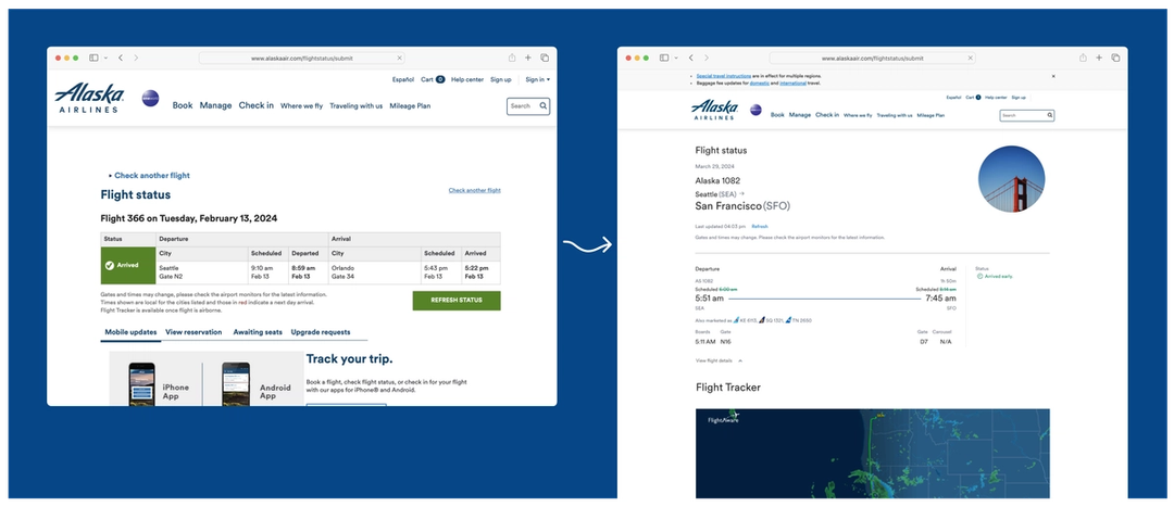
Consolidating on Figma gave the team one shared system with proper documentation for both design and engineering. That alignment paid off quickly during a redesign of the flight status page. When severe storms caused widespread disruptions, the page suddenly became a critical customer touchpoint, but it lacked essential information like flight tracking and aircraft details. A joint "tiger team" of designers and engineers rebuilt the page in a single sprint by pulling 90% of its components from Auro. What once took four or five sprints was completed in one, and the page is now one of the most visited in the app. Average time on the page jumped 761%, from 36 seconds to five minutes and 10 seconds.
Better collaboration through shared components
Figma’s design system features also brought engineering and design closer together. Designers reference components that mirror the exact web components developers use in the Auro library, which builds trust between the two disciplines. As Brandon Shields, Product Manager at Alaska, explains, engineers are more confident that a given design can be implemented without unnecessary friction.
To drive adoption, Lee created documentation covering how to use features like auto layout, merging, and branching. She focused on education so designers understood what Figma could do, which in turn reduced conflicts between the design and engineering teams.
The lift from variables
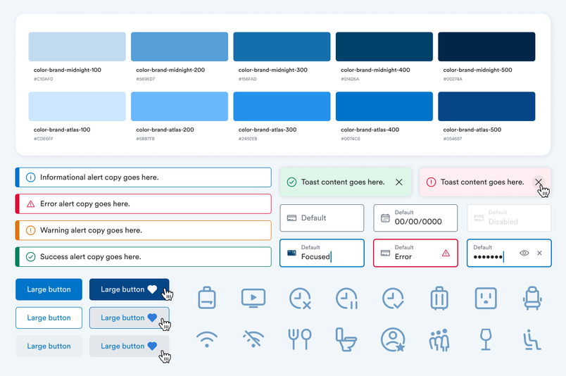
When Figma introduced variables at Config in 2023, Alaska’s design team gained a way to move beyond memorizing raw values for border radius, padding, and color. Previously, Lee had to manually type design token names into the description field of a color style to help engineers. Variables made that process obsolete.
The bigger win is theming. The team can now define primitive, semantic, and component-specific design tokens and use them to create modes for light and dark themes, various screen sizes, or the branding of different teams and external partners. Because both internal and external products can reuse Auro’s components with a customized theme, designers can alter an entire interface by swapping one mode for another.
For Sande, one of the main benefits is that design work now operates closer to the underlying code, with less retyping of token names and copies of specs passed backward and forward. That makes it simpler for designers to visualize what’s possible with the design system—changes that were once "walled off by the coding world" are now accessible to anyone working in Figma.
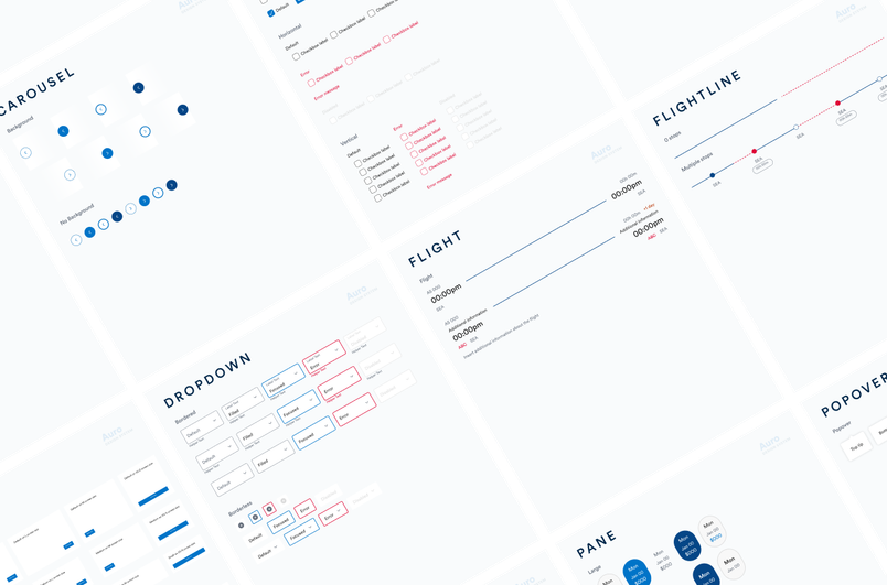
The variables work is part of a much larger effort at Alaska. The team plans to "increase the number of design tokens, opening the floodgates for customization and theming," says Sande. For a company that built its brand on early adoption of first-generation travel innovations, the push to connect design and engineering through a flexible, token-driven system is the next logical step. The result is a more consistent digital experience, faster delivery cycles, and a tighter feedback loop between the people who build the product and the people who design it.


