

Beyond Screen Readers: Visual Accessibility in SVG
Most SVG accessibility guidance centers on screen reader compliance—names, roles, and values. But screen reader users represent only a fraction of the people who struggle with digital graphics. According to the World Health Organization, roughly 246 million people have low vision, and an estimated 300 million are colorblind. That's roughly 546 million people who may not use a screen reader at all, but who may rely on browser zoom, magnification software, or customized stylesheets to make sense of the screen. For them, the most important accessibility feature of an SVG isn't its accessible name—it's whether the graphic is actually visible and interpretable.
Contrast Requirements for Non-Text Graphics
The first check for any SVG color palette is the WCAG color contrast ratio guidelines. Under WCAG 2.1, essential non-text imagery must maintain a contrast ratio of at least 3:1 against adjacent colors. The qualifier matters: if removing the SVG wouldn't change the information or functionality of the content, it's probably decorative and exempt. If the SVG carries meaning—like a navigation icon with no visible text label—the 3:1 requirement applies.
Consider a common example: a line-drawing house icon used as a home button, with the text "Home" hidden in a sr-only span for assistive technology. The accessibility pattern is sound, but the contrast may not be. Testing the icon against its background reveals the issue: a stroke of #8f8f8f on a #cccccc background yields a ratio of only 2:1—failing the threshold. Darkening the stroke to #717171 pushes the ratio to 3:1, making the icon pass without changing the pattern at all.
Several tools can help you check these values. Chrome DevTools includes a contrast checker for quick spot checks. For non-coded designs, the Colour Contrast Analyser is a reliable desktop option. For evaluating an entire palette at once, A11y Color Palette visualizes which combinations meet accessibility standards. Whatever you choose, consistency matters more than the specific tool.
Supporting Light and Dark Preferences
Color contrast is only one part of visual accessibility. The @prefers-color-scheme media query—now widely supported across browsers—lets users choose between light and dark themed experiences. This doesn't replace contrast checking, but it does give users control over their viewing environment, which is preferable to assuming what works best for them.
Implementing this media query is straightforward if SVG styles are already controlled externally via CSS rather than hard-coded in the markup. For the house icon example:
- In light/default mode, CSS defines one set of stroke, fill, and background colors.
- In dark mode, additional CSS rules within the
@media (prefers-color-scheme: dark)block override those same properties.
If your SVG has inline presentation attributes, you'll need to refactor those styles into CSS before the media query can work. An alternative is to create two distinct SVG versions and swap them based on the user's preference—but remember to hide the nonvisible version from assistive technology.
The choice of which theme to make default is up to you. If your existing design is light, make that the default and build a dark variant using @media (prefers-color-scheme: dark). If you start with a dark design, reverse the approach with `@media (prefers-color-scheme: light)`.
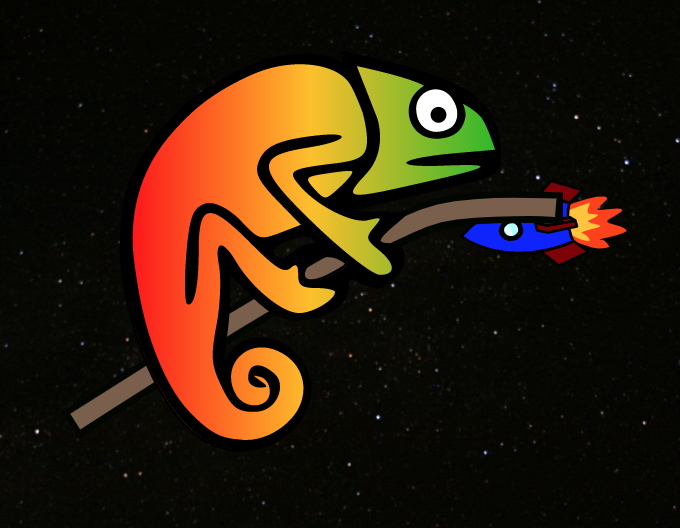
More complex SVG compositions can also respond to theme changes. An illustrated scene of a chameleon in a green forest, for example, can switch to a space environment with a rocket when dark mode is detected—while maintaining roughly equivalent contrast in both versions.
Why Dark Mode Matters
Supporting dark mode isn't just a visual preference. It serves real accessibility needs:
- Photophobia: People with light sensitivity can experience headaches or migraines from overly bright interfaces.
- Readability: Some users find text easier to read on dark backgrounds, while others prefer light themes. Providing a choice addresses both groups.
- Browser support: Unlike related media queries such as
@inverted-colors(Safari only) or@forced-colors(still emerging),@prefers-color-schemeis well-supported today, including in Chromium-based Microsoft Edge.
Following color contrast guidelines and supporting user color preferences won't replace screen reader patterns—but for the majority of users with visual impairments who don't use assistive technology, these steps are often the difference between a usable graphic and an inaccessible one.
Motion in SVGs: WCAG Rules and User Preferences
The WCAG motion guidelines are unambiguous: non-essential moving, blinking, or scrolling content that starts automatically, runs for more than five seconds, and appears alongside other page elements must give users a way to pause, stop, or hide it. The rationale sits in how different people perceive movement. Users with ADHD or attention deficit disorders can find animated elements distracting enough that they lose track of their original task. For others, the consequences are physical — vestibular disorders can make motion trigger nausea or dizziness, and flashing or bright content can induce seizures in susceptible individuals.
The balance is a simple one to state, harder to execute: creative animation should not come at the cost of user comfort or safety. Striking that balance means treating motion as a functional element of your design, not just a decorative flourish.
Giving Users Control Over Animation
Since SVG animations — like any moving content — must not auto-play beyond five seconds, you need an explicit mechanism for users to pause or stop them. A JavaScript toggle button for play/pause is one approach. If your SVG plays a central role (such as animations that trigger as users scroll through a page), a single pause/play button near the top of the viewport can govern the entire experience. For smaller SVGs tied to user interaction (say, a brief animation after form submission), individual pause buttons rarely make sense. A more practical alternative is to code the animation to end after five seconds rather than looping infinitely.
The Reduced Motion Media Query
Beyond manual controls or finite animation loops, the @prefers-reduced-motion media query lets you respect user-level motion preferences. Like @prefers-color-scheme handles theme preferences, @prefers-reduced-motion detects whether a user has requested minimized motion in their operating system or browser settings. You can then serve a static version of your SVG instead of the animated default.
A common pattern: an SVG that "writes out" a word as the page loads in its default state, versus a stationary version where the word simply appears for users with reduced motion enabled. The amount of additional code needed depends heavily on the complexity of your animation and what you want the reduced-motion experience to look like.
Simply adding @prefers-reduced-motion rules isn't a complete solution; how you reduce the motion also matters. Consider creating a slowed-down version of your SVG via the media query. If that version runs on an infinite loop, it still exceeds the five-second rule and violates WCAG. Instead, a reduced-motion variant that stops the animation at the five-second mark would pass that part of the guideline. A subtle difference in code yields two quite different user experiences.
The effect of these choices is visible across entire scenes. With a @prefers-reduced-motion query in place, a light-mode scene with an animated character and fluttering elements can become fully static — character colors, eyes, and background items all stand still in reduced-motion mode. The same applies in dark mode: dynamic background objects, such as a rocket, remain fixed in place instead of moving.
The Practical Upside of Calmer Motion
Restricting screen movement (or providing alternatives) has clear accessibility benefits worth restating:
- Less is more. Keeping animations simple aids users with cognitive and attention disorders, and this is particularly important for SVGs tied to core content or functionality — navigation, buttons, links, and anything triggered by user input.
- Don't trigger physical reactions. Movement in SVGs can cause adverse effects for people with seizure, vestibular, and vision disorders. If your SVG has any flashing or blinking characteristics, it's prudent to check it with the free Photosensitive Epilepsy Analysis Tool (PEAT).
- Browser support is on your side. Most major desktop and mobile browsers now support
@prefers-reduced-motion, meaning more users than ever can limit unwanted motion — and, unlike@prefers-color-scheme, it currently has no competing media query.
The Shared Benefit of Accessible SVGs
Color, contrast, and motion sit at the core of every SVG. These elements carry intrinsic meaning, feed into brand recognition, and shape a company's perceived value — and that makes SVG an expansive area where designers and developers can make an immediate difference for users.
It also pays to remember that this is not just about accommodating "other people." Screen glare affects everyone. A migraine makes floating, fading SVGs nauseating rather than delightful. A dim environment makes gray-on-gray text an exercise in frustration. Accessibility tools, WCAG guidelines, and new CSS media queries that grant users more control mean we can design and code for a wider range of real-world conditions.
True digital inclusivity only comes from realizing that every one of us can benefit from more accessible designs — SVGs included.


