
Where Solution Discovery Actually Happens
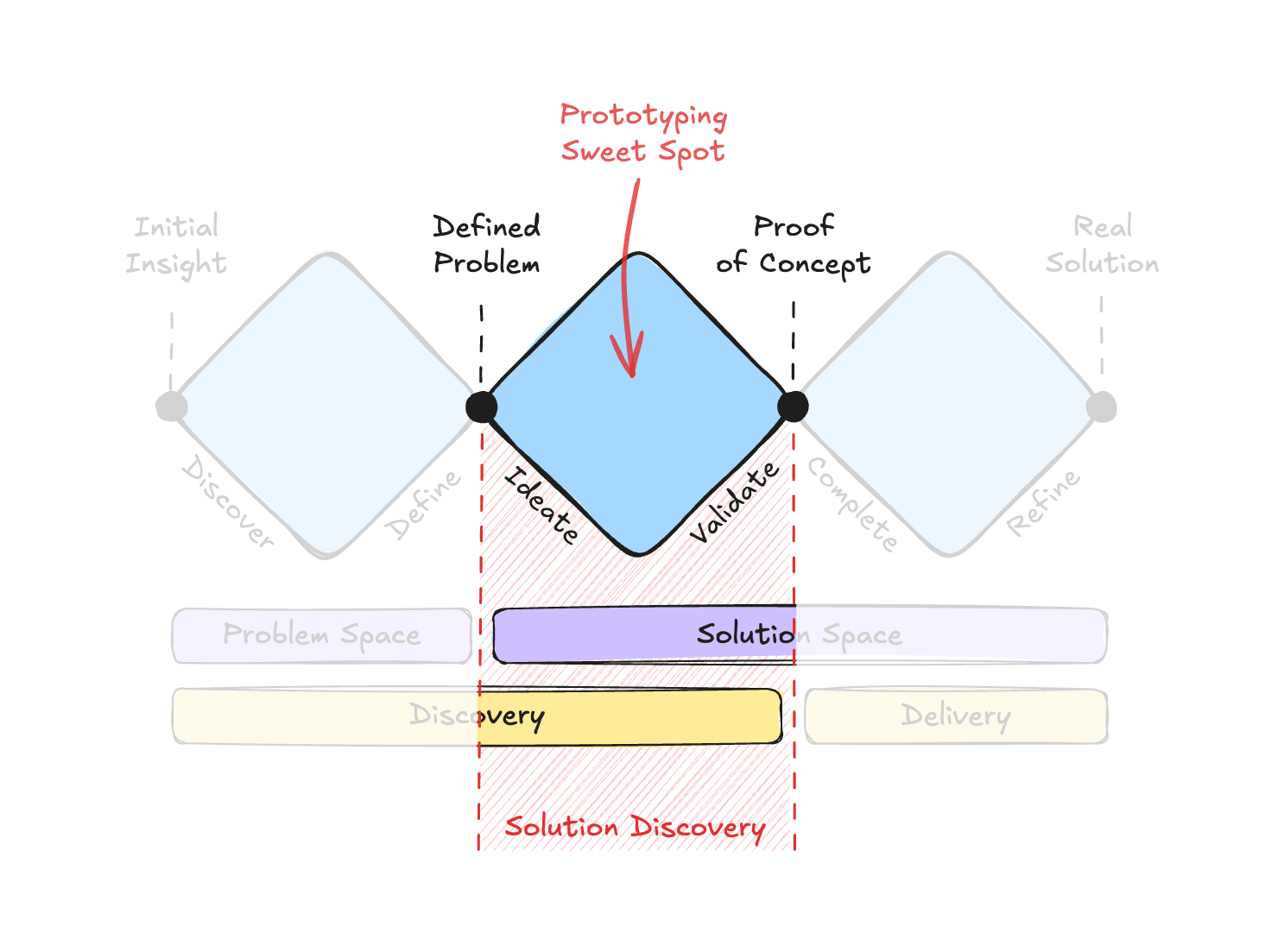
Before we can assess whether AI-assisted prototyping is a genuine breakthrough or just a faster way to make the same mistakes, it helps to be precise about where in the design process we’re operating. The classic Double Diamond model covers problem finding and problem solving, but a more useful framing for this discussion is the Triple Diamond model, which splits the solution space into two distinct phases: Solution Discovery, where the right concept is identified and validated, and Solution Delivery, where that concept is engineered into a production product.
This article is concerned exclusively with the middle diamond: Solution Discovery. What comes before — problem discovery and research — is a different discipline with its own AI implications. What comes after — engineering optimization — is likewise outside this scope. The focus here is the designer’s sweet spot, specifically in the context of enterprise applications, where intricate data models and non-linear workflows make complexity the primary design challenge.
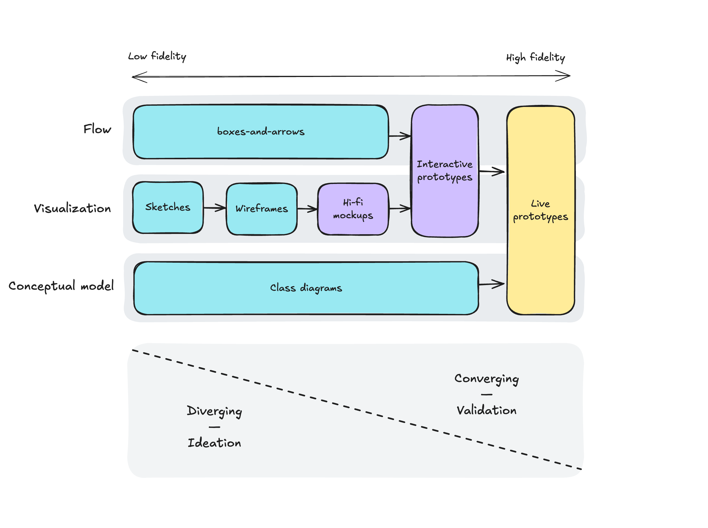
At the start of Solution Discovery, the designer has two things: a well-defined problem and a core hypothesis. Everything produced from that point forward exists to turn the hypothesis into something tangible enough to test. In a traditional workflow, that output runs a gamut of artifacts at increasing fidelity, from sketches and conceptual diagrams to high-fidelity mockups, interactive prototypes, and occasionally even live prototypes.
The work itself spans three facets that need to be considered holistically:
- Conceptual model: Objects, relations, attributes, and actions.
- Visualization: Everything from rough screens to pixel-perfect mockups.
- Flow: User journeys at both high and granular levels.
These three aren’t strictly sequential layers. In practice, the design process hops between them repeatedly, which is why the artifact types that support each facet differ substantially. Early on, each dimension is explored with its own low-fidelity representation — boxes-and-arrows for structure, sketches for visuals, journey maps for flows. Only later does a live prototype emerge that integrates all three simultaneously. That progression is a classic trade-off, comparable to moving from pencil sketches to oil painting: the early materials let you iterate freely, while the finished painting is rich in detail but painful to alter.
The High-Fidelity Trap
Given this inverse relationship between fidelity and flexibility, it’s unsurprising that many teams collapse the entire artifact spectrum into a single category. Static high-fidelity mockups sit at what appears to be a comfortable middle ground: they look detailed enough to signal progress, yet don’t demand the maintenance burden of an interactive prototype.
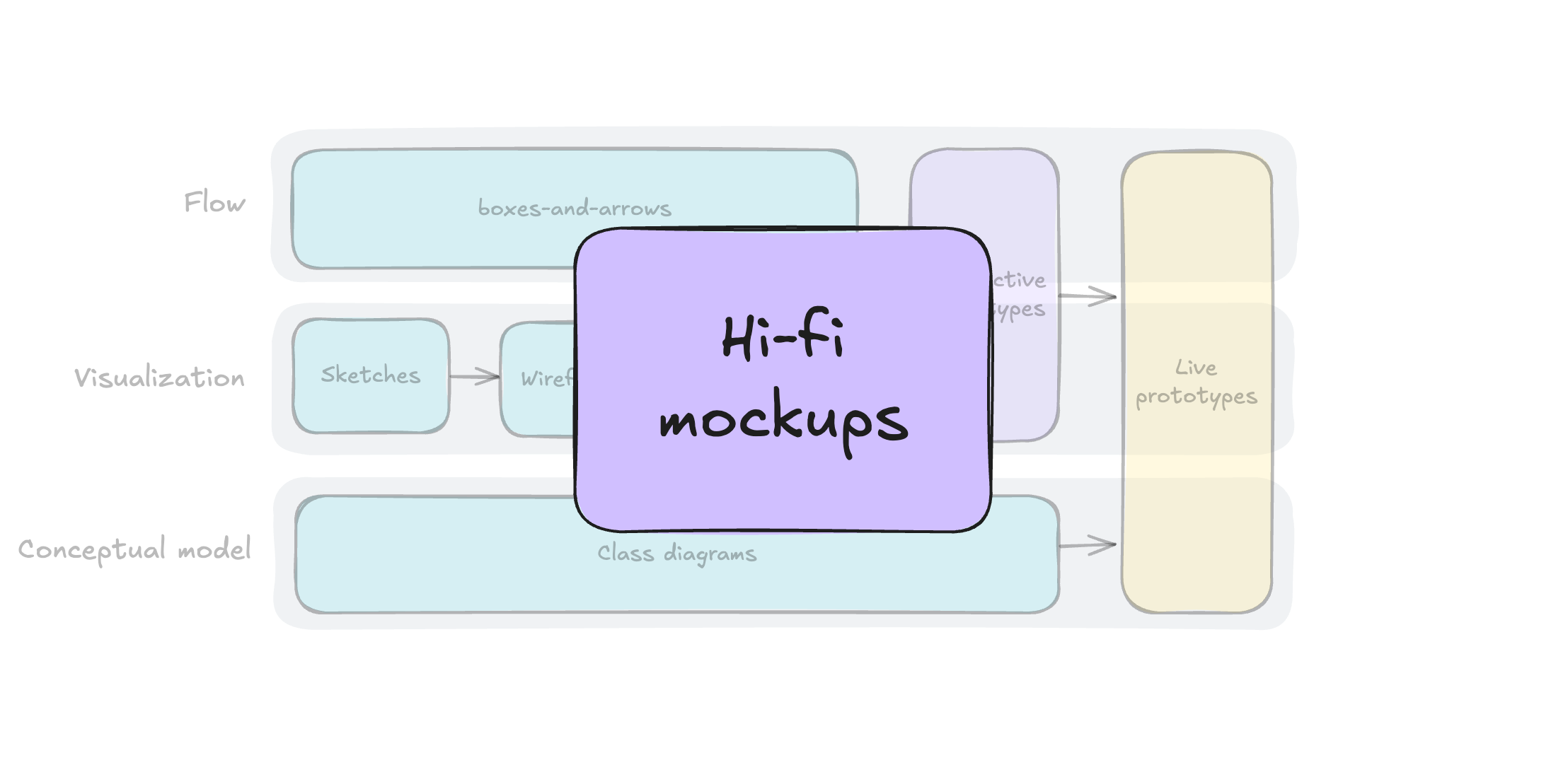
Several forces push designers toward this default. Stakeholders can judge a good-looking screen immediately, but have little patience for flow diagrams or conceptual models that read as too abstract to validate. On the other end, interactive and code-based prototypes historically required relentless effort to build and maintain, and teams rarely invested in them until the very end of Solution Discovery — by which point the cost of pivoting was already prohibitive.
The result is a chronic imbalance. Validation with users runs only against the visual surface. The conceptual model and user flows — precisely the aspects that underpin an application’s architecture — stay dangerously underdeveloped. Teams then move into engineering on a leap of faith, armed with mockups that show every pixel but hide every structural assumption. The output resembles the classic horse-drawing meme: polished renderings up front, vague anatomy behind.
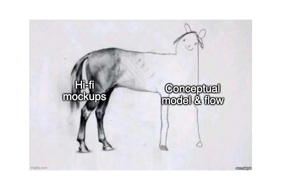
The severity of this problem depends heavily on the project domain. For a B2C flow that is linear and well understood, mockup-first validation is often acceptable; the risk is contained and surface errors are rarely fatal. For enterprise systems defined by complex data models and interconnected flows, the opposite is true. The most dangerous mistakes live below the visual layer, and a process that doesn’t exercise them until late in the game is a poor guard against them.
Closing the Gap Between Intent and Interactivity
This raises a pointed question: how might teams close the gap between design intent and a live prototype so that real functionality is testable from day one?
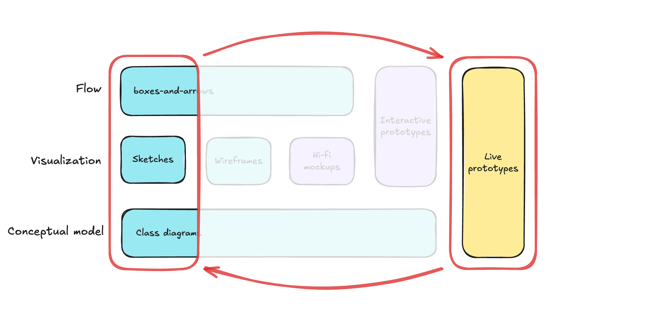
If such a workflow became practical, four benefits would follow:
- Faster learning. Going directly from intent to a testable artifact compresses feedback cycles from weeks to days.
- Stronger confidence. When users interact with real logic — not photos of it — validation carries far more weight.
- Conceptual discipline. A working prototype cannot hide an ill-defined data model; ambiguity surfaces immediately.
- An unambiguous specification. A live prototype paired with documented intent gives engineering a single, clear source of truth.
The vision isn’t new. For enterprise products, a prototype-driven workflow has always been appealing precisely because it provides the best protection against structural flaws. The blocker was never philosophical — it was effort. Prototyping in code demanded specialized skill and serious time. With the recent arrival of powerful AI coding assistants, that barrier looks far less formidable, and for the first time the trade-off between exploration and validation may be resettable.
The Allure Of Vibe Coding — And Why It Fails Fast
Vibe coding — the practice of describing software in natural language and letting an AI assistant build it in a conversational loop — is genuinely impressive. Coined by Andrej Karpathy in early 2025, the approach feels like the ultimate shortcut: express an idea, get a working prototype moments later. For non-developers, it's almost magical.

But the magic comes with a serious caveat. Vibe coding treats the system description and the UI description as the same thing, which means the prototype is built on shifting assumptions rather than a clear model. It's like hiring a builder and giving instructions one sentence at a time without ever handing over a blueprint. The result might look good, but you have no guarantee it can hold weight.
The Ambiguity Trap
The core problem is that conversations are the most ambiguous way to express intent. Every turn of dialogue forces the AI to guess at what you mean, and those guesses compound. A simple demo can survive a few rounds of guessing; a data-heavy enterprise application cannot.
Consider a concrete example: building a prototype to track tests that validate product ideas. The first prompt is straightforward:
I need an app to track tests. For every test, I need to fill out the following data:
- Hypothesis (we believe that...)
- Experiment (to verify that, we will...)
- When (a single date, or a period)
- Status (New/Planned/In Progress/Proven/Disproven)
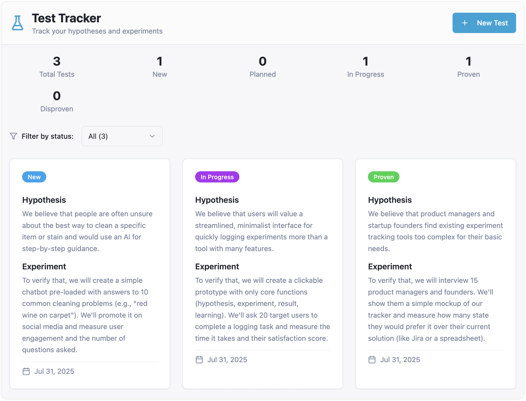
Within a minute, you have a working prototype:
Encouraged, you extend the feature set:
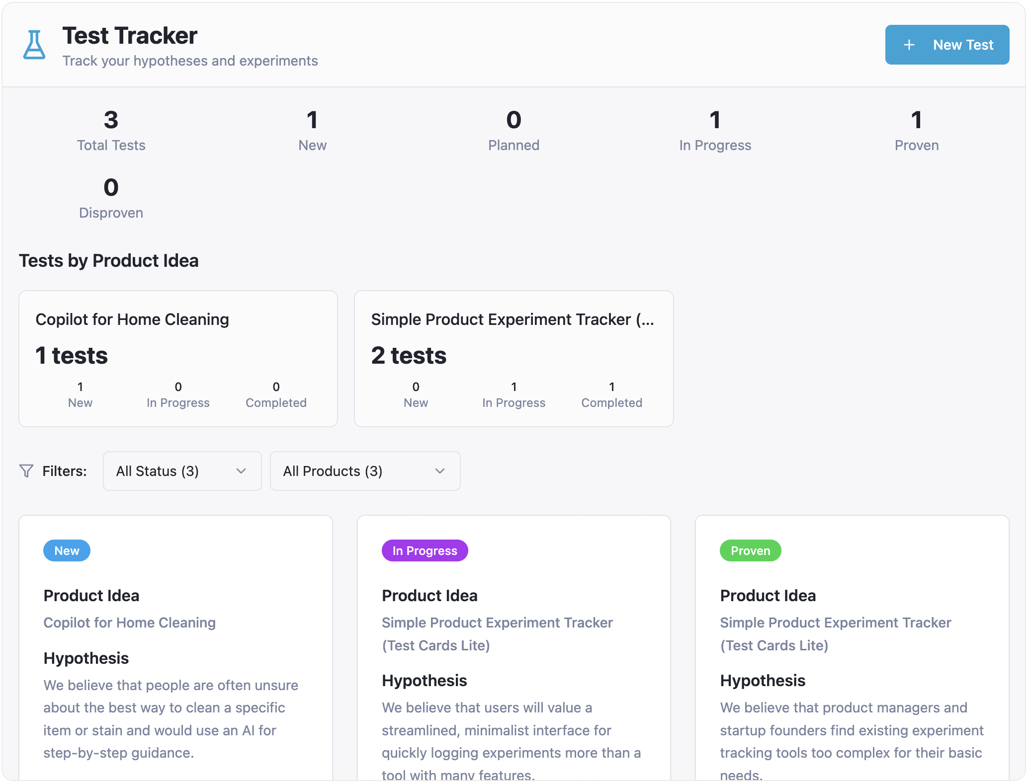
Please add the ability to specify a product idea for every test. Also, I want to filter tests by product ideas and see how many tests each product idea has in each status.
The result still looks good:
Then you decide to expand how product ideas are handled:
Okay, one more thing. For every product idea, I want to assess the impact score, the confidence score, and the ease score, and get the overall ICE score. Perhaps I need a separate page focused on the product idea, with all the relevant information and related tests.
And from this point, things fall apart. The tests you created are still there, seemingly organized by product ideas. But opening the "Product Ideas" page shows nothing:
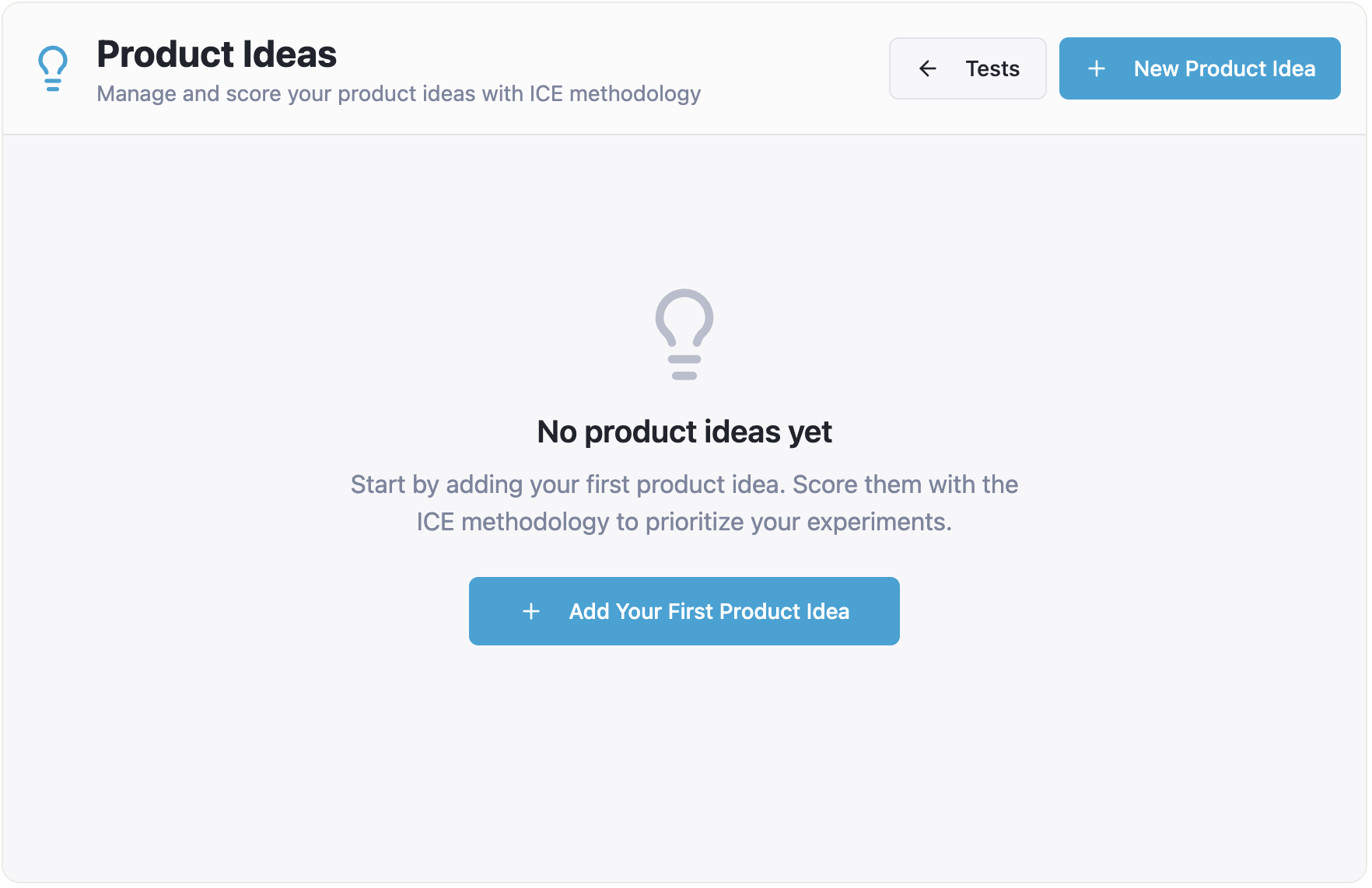
You create ideas from scratch, but they aren't linked to the tests you already made:
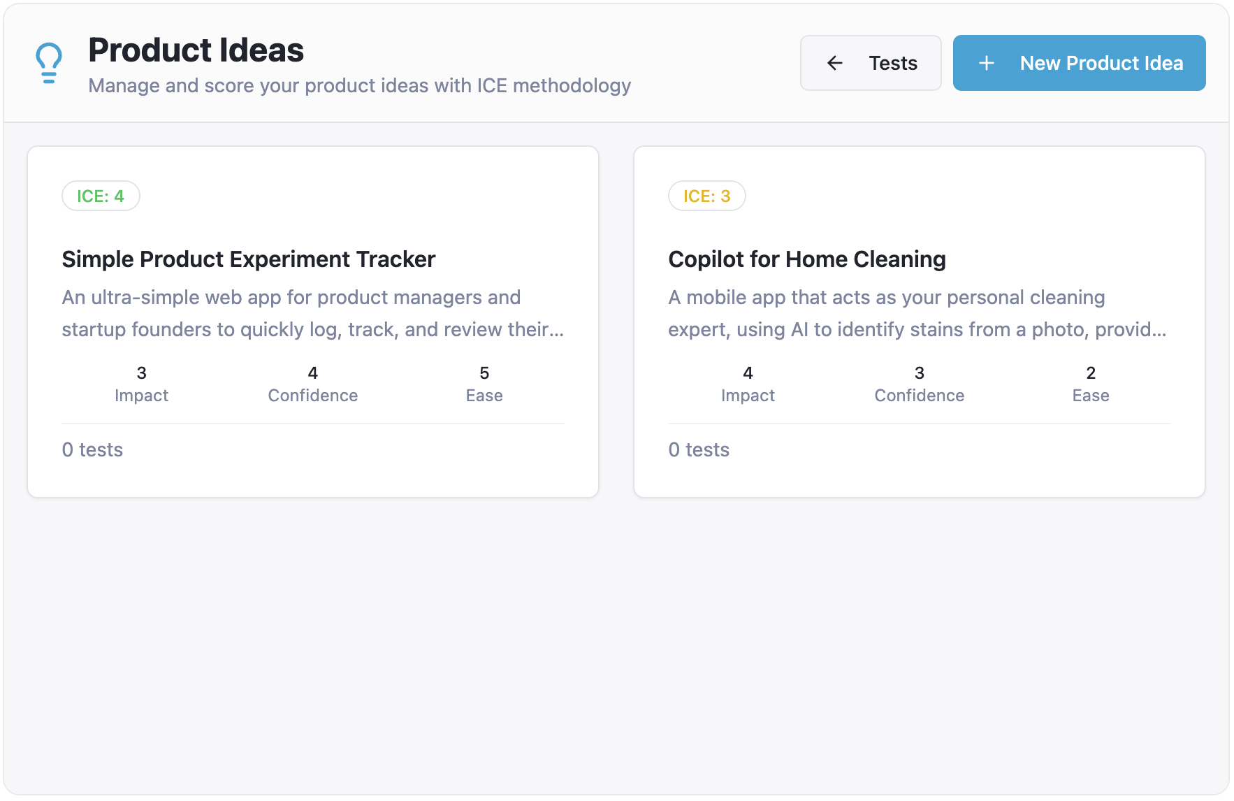
When you return to "Tests," they've all vanished. The AI assistant's diagnosis is telling:
No, this is not expected behavior — it's a bug! The issue is that tests are being stored in two separate places (local state in the Index page and App state), so tests created on the main page don't sync with the product ideas page.
That bug can be patched, but only the technical symptom was fixed. The underlying conceptual problem — an undefined relationship between product ideas and tests — remains. The UI still allows creating "orphan" tests with no connection to any idea, leading to mismatched counts across pages:
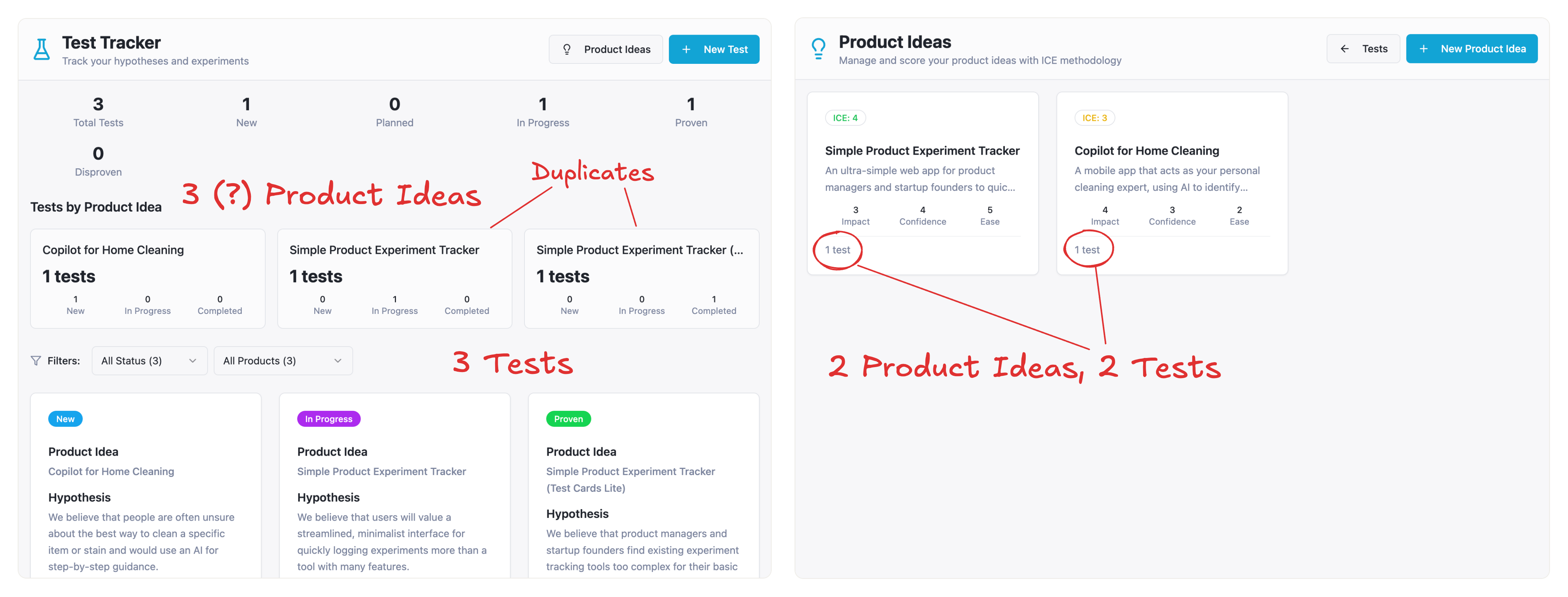
Calling this a bug is only half the story. The true root cause is a conceptual model failure. No prompt ever defined how ideas and tests relate, so the AI had to invent a relationship. In a demo that's an annoyance. In a complex enterprise system, that kind of structural ambiguity is fatal.
The Black Box Problem
Even when you manage to coax the prototype into a state that works, you're left with another issue: the artifact is a black box. The reasoning behind design decisions is lost in the conversation thread, leaving only the final code as evidence of what was intended. Development teams become code archaeologists, reverse-engineering what the designer meant from AI-generated — often convoluted — code. Any speed gained up front is quickly eaten by this friction and uncertainty.
This isn't a criticism of the tools themselves. They produce real magic. But the "garbage in, garbage out" principle still applies: if intent isn't expressed with precision, the output won't meet expectations.
From Fast Magic To A Solid Foundation
Pure vibe coding encourages building without a blueprint, producing structural ambiguity that's unacceptable for complex applications. The process feels fast but is actually fragile, and it yields artifacts that are hard to iterate on and even harder to hand off cleanly.
The path forward requires closing the gap between design intent and live prototype without falling into that ambiguity trap. That means a more disciplined, methodical approach — one that puts the designer's explicit intent at the center while still leveraging AI's capabilities. The full workflow for this method is outlined in Part 2 of this series, Intent Prototyping, which explains how to build with clarity from the start.