
Finding the Right Transparency for Agentic AI
When we hand a complex task to an autonomous agent, we get a peculiar kind of waiting period. The system disappears for 30 seconds or 30 minutes, then returns with an answer. In that gap, users are left with few options: trust that it worked, or wonder whether the AI hallucinated, skipped a compliance step, or misread the input.
Most current designs respond to that anxiety with one of two extremes. The Black Box approach hides everything for the sake of simplicity. The Data Dump approach exposes every log line and API call. Both miss the point. A pure Black Box leaves users powerless, while a Data Dump induces notification blindness: users tune out the constant stream until something fails, at which point they lack the context to diagnose it.
The real challenge isn't choosing between hiding and showing everything—it's identifying which moments in a workflow need explicit user communication. Knowing that an Intent Preview or an Autonomy Dial exists is only half the problem. The harder question is knowing where in a process to deploy them. A 30-second workflow might need one prominent status update and a quiet log entry elsewhere. How do you tell those moments apart?
This article walks through the Decision Node Audit, a process for mapping backend logic to the user interface. It helps designers and engineers agree on the exact moments when a user needs to understand what the AI is doing, and it pairs each decision node with an Impact/Risk matrix to prioritize what gets displayed and which design pattern fits.
A Case Study in Decision Mapping
Consider Meridian, an insurance company (name changed) that processes initial accident claims with an agentic AI. The user uploads damage photos and a police report; the agent spends about a minute running its analysis, then returns with a risk assessment and a proposed payout range.
The first version of the interface simply displayed "Calculating Claim Status." Users were frustrated. They had submitted multiple detailed documents and had no way to tell whether the AI reviewed the police report at all—a document that contained mitigating circumstances. The Black Box built distrust.
The design team ran a Decision Node Audit and found that the agent worked through three distinct, probability-based phases, each with its own smaller steps:
- Image Analysis — Comparing damage photos against a database of typical collision scenarios to estimate repair cost, producing a confidence score.
- Textual Review — Scanning the police report for liability keywords (fault, weather, sobriety) and evaluating legal standing through probability assessment.
- Policy Cross Reference — Matching claim details against the policy's terms to find exceptions or coverage limits through probabilistic matching.
The team converted those phases into explicit transparency moments. The revised interface sequence told users exactly what was happening:
- Assessing Damage Photos: Comparing against 500 vehicle impact profiles.
- Reviewing Police Report: Analyzing liability keywords and legal precedent.
- Verifying Policy Coverage: Checking for specific exclusions in your plan.
The processing time didn't change. What changed was that users could follow the agent's internal steps and knew where to focus their attention if the final assessment seemed wrong. That simple shift turned a moment of waiting anxiety into an interaction that felt deliberate and trustworthy.
What the Impact/Risk Matrix Keeps Hidden
The audit's most significant outcome was deciding what not to show. No AI experience lacks candidate events for display; in Meridian's case, the backend generated more than 50 events per claim. The team could have defaulted to surfacing each one as it processed. Instead, they applied the risk matrix to prune them.
- Log Event: Pinging Server West-2 for redundancy check.
- Filter Verdict: Hide. (Low Stakes, High Technicality).
- Log Event: Comparing repair estimate to BlueBook value.
- Filter Verdict: Show. (High Stakes, impacts user's payout).
Removing the technical noise made the information that actually mattered—like coverage verification—stand out. The result was an open interface and, more importantly, an open experience. Users could see the work being done: the specific steps labeled "Assessing," "Reviewing," "Verifying" transformed a 60-second wait from a period of doubt ("Is it broken?") into one of visible progress ("It's thinking").
With this mental model in hand, the question becomes how to run the same review on your own product's decision points—a process we'll now break down step by step.
The Decision Node Audit
Transparency fails when it is treated as a style choice rather than a functional requirement. Teams often ask “What should the UI look like?” before asking “What is the agent actually deciding?”
The Decision Node Audit is a method for mapping an AI system’s internal process to find the exact moments where it stops following set rules and makes a choice based on chance or estimation. By identifying these points of uncertainty, teams can expose them directly to users, turning vague system updates into specific, reliable reports about how the AI reached a conclusion.
In a project with a procurement team building a contract review agent, the original interface displayed a simple progress bar: “Reviewing contracts.” Users felt anxious about the legal implications of a missing clause. The team ran an audit with engineers to outline the system’s workflow and identify “Decision Points” — moments where the AI had to choose between two valid options.
In standard programs, the logic is deterministic: if A happens, B follows. In AI systems, the process is probabilistic. The AI may think A is the best choice but only be 65% certain. In the contract system, the AI checked liability terms against company rules. Because a perfect match was rare, the system had to judge whether a 90% similarity score was sufficient. That was a key decision point.
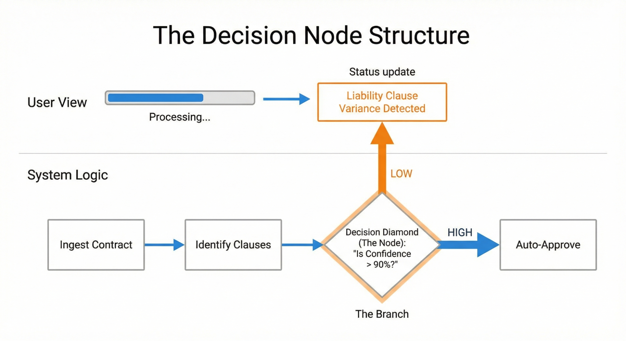
Once identified, the team exposed this node to users. Instead of “Reviewing contracts,” the interface displayed: “Liability clause varies from standard template. Analyzing risk level.” Users immediately understood why the system paused, what it was checking, and where to look more closely once the contract was generated.
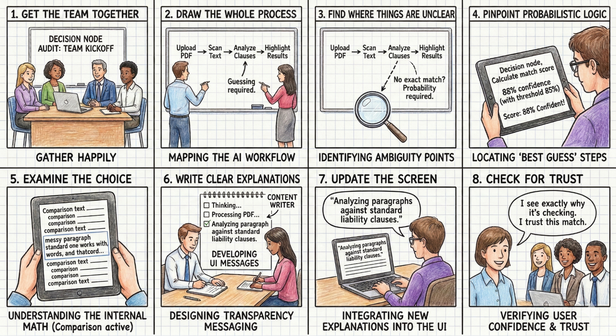
To run this audit, assemble the product owners, business analysts, designers, subject-matter experts, and the engineers who built the AI. Then follow these steps:
- Draw the whole process: Document every step from the user’s first action to the final result, including all supporting workflows.
- Find where things are unclear: Look for any step where the AI compares options or inputs that lack a perfect match.
- Identify the “best guess” steps: Check whether the system uses a confidence score at these unclear spots; those are the points where the AI makes a final choice.
- Examine the choice: Determine the specific internal math or comparison being done, such as matching contract text against a database of standard clauses.
- Write clear explanations: Create user-facing messages that describe the specific internal action occurring at each choice point.
- Update the interface: Replace vague messages like “Reviewing contracts” with the new explanations, placed in status bars or other visible UI elements.
- Check for trust: Verify that the new messages give users a simple reason for any wait time or result.
The Impact/Risk Matrix
An audit of a complex task will likely surface dozens of decision points. Surfacing all of them creates noise. To prioritize, sort nodes using an Impact/Risk Matrix based on the type of action the AI is taking.
Low Stakes / Low Impact:
- Example: Organizing a file structure or renaming a document.
- Transparency Need: Minimal. A toast notification or log entry suffices; users can easily undo these actions.
High Stakes / High Impact:
- Example: Rejecting a loan application or executing a stock trade.
- Transparency Need: High. These actions require Proof of Work — the system must demonstrate its rationale before or immediately as it acts.
Consider a financial trading bot that handles every transaction with equal opacity, from a $5 trade to a $50,000 one. Users need the system to pause and show its work for high-value trades. The solution is to introduce a reviewing logic state for transactions exceeding a specified dollar amount, so users can see the driving factors before execution.
Mapping Nodes to Patterns
Once decision nodes are identified and prioritized, the next question is which UI pattern applies to each. The choice depends primarily on reversibility:
High Stakes & Irreversible: Require an Intent Preview. Because the user cannot easily undo the action (e.g., permanently deleting a database), the transparency moment must happen before execution. The system must pause, explain its intent, and require confirmation.
High Stakes & Reversible: These nodes can rely on the Action Audit & Undo pattern. If an AI-powered sales agent moves a lead to a different pipeline, it can proceed autonomously as long as it notifies the user and offers an immediate Undo button.
| Reversible | Irreversible | |
|---|---|---|
| Low Impact | Type: Auto-Execute UI: Passive Toast / Log Ex: Renaming a file | Type: Confirm UI: Simple Undo option Ex: Archiving an email |
| High Impact | Type: Review UI: Notification + Review Trail Ex: Sending a draft to a client | Type: Intent preview UI: Modal / Explicit Permission Ex: Deleting a server |
Table 1: The impact and reversibility matrix can be used to map transparency moments to design patterns.
This strict categorization prevents “alert fatigue.” High-friction Intent Previews are reserved for truly irreversible moments, while the Action Audit maintains system speed for everything else.
The “Wait, Why?” Test
Whiteboard analysis can identify potential nodes, but validation requires observing human behavior. The “Wait, Why?” Test checks whether the map matches the user’s mental model.
Ask a user to watch the agent complete a task and speak aloud. Whenever they ask a question — “Wait, why did it do that?”, “Is it stuck?”, or “Did it hear me?” — mark a timestamp. These questions signal confusion and a perceived loss of control.
In a study for a healthcare scheduling assistant, users watched the agent book an appointment. The screen remained static for four seconds. Participants consistently asked, “Is it checking my calendar or the doctor’s?” That question revealed a missing transparency moment.
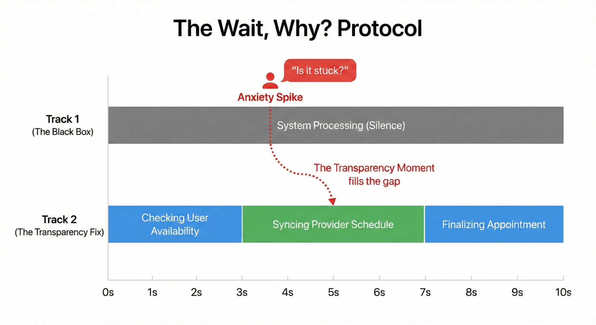
The fix was to split that wait into two distinct steps: “Checking your availability” followed by “Syncing with provider schedule.” This small change measurably reduced users’ expressed anxiety.
The interface must connect the technical process to the user’s specific goal. Displaying “Checking your availability” alone falls flat because it lacks context — the user knows what the AI is looking at, but not why. Pairing the action with the outcome grounds the process in the user’s actual situation. A clearer sequence would be: “Checking your calendar to find open times” and then “Syncing with the provider’s schedule to secure your appointment.”
The same principle applies to an AI managing inventory for a local cafe during a supply shortage. A message such as “contacting vendor” or “reviewing options” sparks anxiety — the manager cannot tell whether the system is canceling an order or sourcing an expensive alternative. The better approach is to explain the intended result: “Evaluating alternative suppliers to maintain your Friday delivery schedule.” That tells the user exactly what the AI is trying to achieve.
From Audit To Interface
With your list of essential transparency moments approved, the real work begins: turning each one into something users can actually see. This is a cross-functional effort. Open a design tool alone and you will fail. You need engineers who understand the backend logic and content designers who know how to phrase a message humans will trust.
Start with a Logic Review alongside your lead system designer. Bring your process map and confirm the system can expose the internal state you want to show. Often, the backend only reveals a generic working status. That is not enough. Push for a specific technical hook that fires when the agent moves from reading text to checking business rules. Without that connection, your UI mockups are fiction.
Next, bring in the Content Design team. Engineers give you the raw technical truth; content designers translate it into plain language. Do not draft these messages solo. A developer might output “Executing function 402”—correct but meaningless. A designer might write “Thinking”—friendly but vague. The right phrasing sits in between, like “Scanning for liability risks”, which signals progress without overloading the user with jargon.
Finally, test your wording before you build the full product. I run comparison tests on stripped-down prototypes where the only variable is the status message. One group sees “Verifying identity” while another sees “Checking government databases” (both made-up examples, but you get the idea). Ask which AI feels safer to use. Certain phrases create anxiety, others generate confidence. Treat copy as a component that needs evidence, not a cosmetic afterthought.
The Transparency Matrix
Adopting this audit rhythm changes team dynamics. You stop handing off polished design files and start sharing messy prototypes and editable spreadsheets. The central artifact becomes a transparency matrix, a living document where engineers and content designers jointly map backend codes to user-facing phrases.
Expect friction during the logic review. A designer asks how the AI rejects a suspicious expense report. The engineer says the API only returns a flat Error: Missing Data. The designer argues that tells the user nothing. After negotiation, the engineer adds a rule that reports the precise failure, such as a missing receipt image. That specific technical hook makes the interface actionable.
Content designers work as translators during these sessions. An engineer might expose a string like “Calculating confidence threshold for vendor matching”. The content designer rewrites it as “Comparing local vendor prices to secure your Friday delivery”. The user now understands both the immediate action and the eventual benefit. Neither phrasing is wrong; only one builds trust.
Have the whole team watch usability tests together. Seeing a participant flinch at a message that reads “Executing trade” changes priorities quickly. The group rewrites the copy to “Verifying sufficient funds” before any purchase happens. Shared observation makes the final interface serve both system logic and human peace of mind.
Yes, these extra steps slow the calendar. The payoff is a team that communicates internally with the same clarity it projects externally, and a user base that understands what their agentic tools are doing and why. That integrated approach is what makes AI experiences genuinely trustworthy.
Making Trust Mechanical
Trust is often treated as an emotional byproduct of good design. More usefully, it is a mechanical result of predictable communication. Show relevant information at the moment a judgment call happens, and trust increases. Hide the machinery or overwhelm the user, and trust erodes.
So run the Decision Node Audit for your agentic systems. Find every spot where the AI makes a judgment call. Run those through the Impact and Risk Matrix. Where the stakes are high, open the box and show the work.
The next article covers the design layer: writing the copy, structuring the UI, and handling errors when the agent gets something wrong.