

Long links — registration forms, articles, videos — become unwieldy when shared on social media or printed on flyers, so a URL shortener stores each long/short pairing in a database and redirects visitors of the short form to the full address. I built a personal shortener for my own articles and videos, with Firebase as the backend and Firestore holding the link pairs. Creating links through the Firebase console worked, but the experience was cumbersome at the frequency I was editing, which led me to build a frontend. The requirements came down to three things: the platform and architecture, the UI toolkit, and convenience — clean code and fast development, since the backend had not been hard to build.
Choosing the platform
Frontend options broadly fall into three groups: website builders such as WordPress, Wix and Squarespace; plain HTML, CSS and JavaScript; and JavaScript frameworks such as Angular, React and Vue.
Website builders offer a restricted set of widgets, components and templates and little easy integration for a complete custom backend like Firebase, so my project's complexity was likely beyond them. Vanilla was ruled out by the latest non-CDN release of the Firebase JavaScript SDK (Version 9), which is designed for installation via npm or yarn and module bundling. That left frameworks, which handle core frontend concerns like routing and backend linking for the developer.
Why Angular
Among the frameworks, I have the most experience with Angular, having used it for projects including the Choir Carol Quiz, the Genesys AE-FUNAI Community form and a Tutorial Management System. That familiarity lets me build quickly, which should not be underestimated. Three technical traits reinforced the choice.
- Object-oriented programming. OOP centers on classes and the state they manage rather than the logic around them, and encapsulation lets parts of a program be scoped to their own domains. Angular components and their lifecycle methods are scoped to TypeScript classes, which pushes you to think in OOP terms: each component is a reusable, self-sufficient UI unit that is still part of the whole.
- TypeScript. TypeScript adds typed-language features to JavaScript, so a variable cannot change the kind of value it holds over its lifetime — a string will not suddenly hold a number. The type system improves code quality, cuts bugs and reduces debugging time, leaving more time to actually build.
- Dependency injection. Angular apps arrive as a complete setup, handling things like bundling CSS preprocessors or services without configuring each library independently. Angular services configure dependency injection: the app receives what it needs without managing how those dependencies are obtained. Firebase, for instance, is auto-provided to every component that needs it with no extra configuration.
Angular's OOP model, TypeScript and dependency injection, plus my existing familiarity and the confidence Angular articles on CSS-Tricks gave me, made it the convenient choice here.
Choosing the UI toolkit
Hand-writing vanilla CSS would defeat the convenience that motivated using a framework in the first place. Toolkits like Bootstrap, Bulma, Semantic UI and Tailwind are all viable, but Material Design led the pack, chiefly because of its Angular support: Angular Material has a dedicated specification at material.angular.io, a subdomain of the Angular docs.
Material focuses on components rather than CSS utility classes, which suited me since I only wanted a component kit — buttons, icons, inputs, sidebars, snack bars. It adds animations, ripple and shadow effects by itself, and Angular Material supports theming out of the box: on initialization you either pick a pre-defined theme for the whole app or create a custom one.
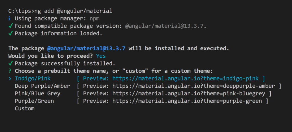
For convenience I chose a dark theme during setup.
Handling the form
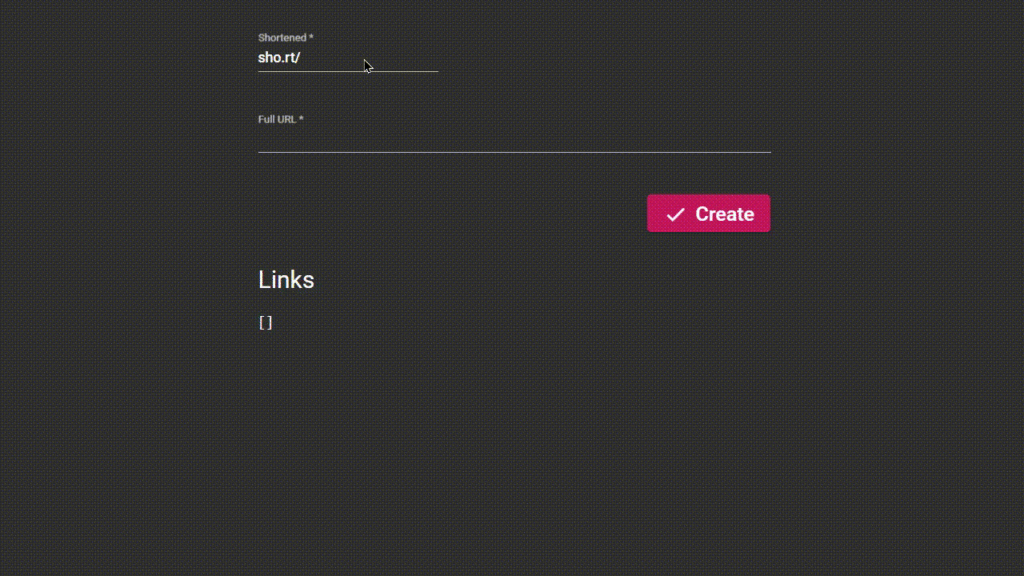
The core of the frontend is the links editor, a form with just two inputs: one for the short version of a link, one for the full URL it redirects to. Angular offers two form mechanisms in place of vanilla HTML and JavaScript validation and submission: template-driven forms, where the template controls most of the form and which suits simple or one-off forms; and reactive forms, a model-driven approach for inputs whose values change over time. I needed reactive forms because the same form edits different links at different times.
Here the earlier choices paid off. Angular Material's form-field component wraps an input and supplies animations, ripple effects and error messages where needed, and I used it for both editor inputs.
Fitting the editor into the UI
The shortener also needs to show all created links and their analytics, and those features need screen space. Keeping the editor permanently visible when it is not needed wastes that space, but splitting the experience across two pages felt disruptive. Instead, I added a floating action button that opens the editor form in whichever component fits.
On mobile, a bottom sheet — a component that opens from the bottom of the screen with interactive content and overlays the view without fully blocking it — is a good fit, and sheets are generally preferred over pop-ups when users will spend a long time interacting. On wide screens, though, interacting with a bottom sheet is hard, so a drawer that opens from the side is the go-to; on a mobile screen a drawer would be too wide and risk blocking the screen entirely.


In code, Angular checks whether the device has a small screen width: if so, the editor form opens in a bottom sheet; if the screen is wide, the same form opens in a drawer. This produces a minor complication. If a phone is rotated or a laptop browser window is narrowed, the form opens in the opposite component — a drawer on a laptop becomes a bottom sheet once the width shrinks.
What Comes Next, and What I'd Do Differently
The single-administrator design makes the current project hard to extend as-is. Authentication and user accounts would change that: multiple users could manage their own links and see their own analytics. The UI choices already made would not need to be replaced if that happened. The links editor is responsive, so each user would get a consistent experience on any device.
If I rebuilt the project from the start, I would try the vanilla approach: pure HTML, CSS, and JavaScript, with no Angular, Material, or UI components to lean on. The question I'd want to answer is whether the convenience those tools provided really could not be made up for by building everything myself.
On Picking UI Components
The components discussed above cover only the UI parts of a URL shortener's frontend. They made that work convenient, above all for the links editor form, which turned out to be responsive, and they can serve other projects in the same way, not just link shorteners.
Plenty of UI libraries offer components like these. If convenience is what you weigh most heavily, you should pick whichever set of components fits the UI you're aiming for. Three things guided my own choices: working out what the project actually needed, familiarity with tools I had used in earlier projects, and the time I had available. My past experience, mistakes included, also played a part.
The complete Angular code is on GitHub: obum.me (admin branch).




