
inline-block is a long-standing display value with no browser-support concerns, and many developers reach for it by habit. The question worth asking is narrower: which problems does it actually solve, and when is it the wrong choice next to alternatives like inline-flex or inline-grid?
(I bet this makes for interesting replies.)
— Chris Coyier (@chriscoyier) June 19, 2020
What is the last thing you used `display: inline-block` for?
Buttons: right answer, incomplete reason
Buttons are the most cited case. The reasoning usually goes that button-like elements built from <a>, <button>, or <input> should lay out in the inline direction — which they already do — while still accepting margin and padding. That second half is where the reasoning drifts: display: inline elements can still take margin and padding.
The real limitations of plain inline elements are these:
- Block-direction margins on inline elements are ignored entirely.
- Padding on inline elements does not affect the height of the line of text.
The buttons themselves may look fine, but the parent and surrounding text usually won't. A demo shows this:
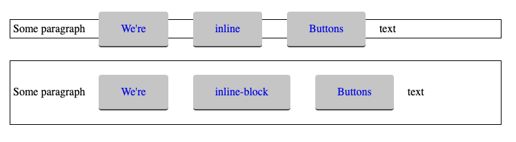
Wrapping makes it worse:

So inline-block is a sound call for buttons — but it isn't the only sound one.
Inline flex and grid as stronger siblings
inline-flex and inline-grid produce the same desirable inline behavior, with a stronger layout system available inside the element. The classic case is a button with a text label and an icon:
<a href="#" class="button>
  <svg> ... </svg>
  Text
</a>
Centering icon and text precisely is tempting to attempt like this:
.button svg {
  vertical-align: middle;
}
The result never quite lines up:

inline-flex resolves it cleanly:
.button {
  display: inline-flex;
  align-items: center;
}
lh units nicely!)Either inline variant gives you the full flexbox or grid layout model inside a box that still lays out in the inline direction.
Width, wrapping, and column layouts
An inline-block element respects a width, unlike a straight inline element. That distinction once made inline-block the basis of column layout systems: it did what floats could do without the clearing burden, and the wrapping it provides is more elegant than float's. This approach to building a column system has largely been superseded — today you would use flexbox or grid, or skip the "system" altogether since these layout modes make one largely unnecessary.
The wrapping behavior still has a live use, though: multi-column layouts in HTML emails that collapse to a single column on small screens without media queries, which some email clients do not support.
Yesterday in an HTML email, on divs that wrap tables, to allow for responsive columns without media queries
— Dan Denney (@dandenney) June 19, 2020
See Dan's example.
Two further cases fall out of inline-block's nature:
- Transforms. Inline elements cannot take a
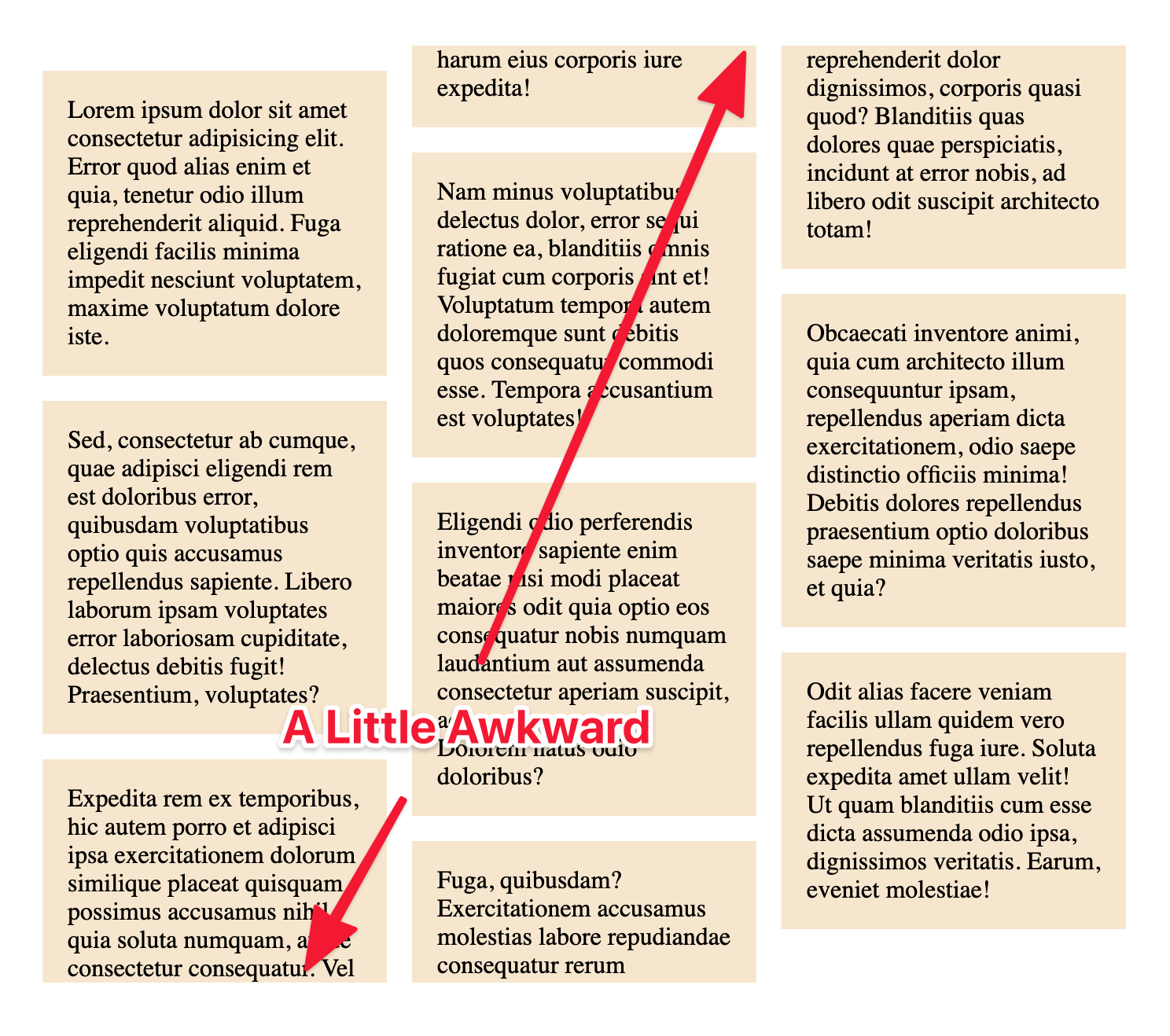
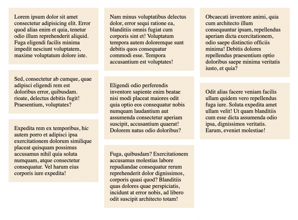
transform, so a transformable element needs to be inline-block (or otherwise non-inline). - Unbreakable column children. CSS columns work well for text, but when column children carry backgrounds and padding, mid-item breaks look visually wrong. Applying
display: inline-block;to those boxes — and probablywidth: 100%;so they hold column width — prevents the break and preserves the padding.
Lists: horizontal rows and centering
Laying a list out as a row
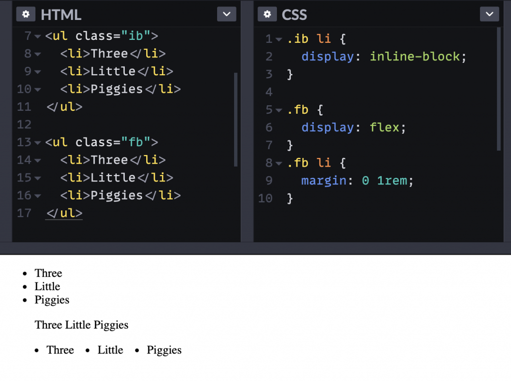
List items are not block boxes; they are display: list-item;, which matters here. To lay a list out horizontally, the common move is:
<ul>
  <li>Three</li>
  <li>Little</li>
  <li>Piggies</li>
</ul>
li {
display: inline-block;
}VoiceOver still announces the result as a list but no longer speaks the bullet points, since the bullets are absent. Changing the display of the list items away from list-item strips them of exactly that list-item character.
A flexbox container on the parent achieves the horizontal row as well, without touching the list items' display, so the bullets remain; removing them becomes a deliberate choice.
ul {
  display: flex;
}
Centering a list
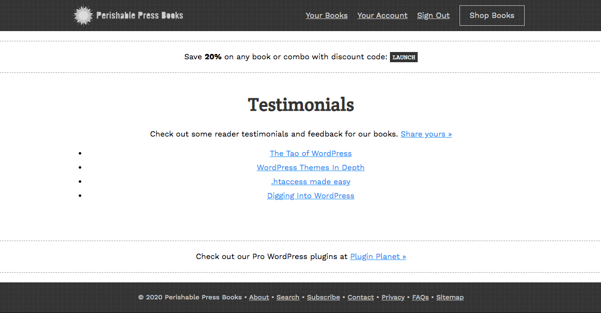
Lists inside centered text are awkward: the text within items can be centered, but each list item remains full width, leaving bullets aligned left. Jeff Starr's solution is to apply inline-block to the whole list, which shrinks it to the natural width of its content so the bullets travel with the centered content. This works provided there are block-level elements before and after the list.
If the narrower goal is only to shrink the list to its content width while keeping it block-level, that can also be done:
ul {
  width: max-content;
  margin: 0 auto;
  text-align: left;
}
One gotcha: whitespace
Inline-block shares an inline element's quirk: whitespace between such elements renders as a space. Two 50%-wide inline-block elements therefore will not fit on one line if any whitespace separates them. There are established tricks for fixing it.




