
Where interpolation shows up in CSS
Color interpolation is the process of computing the colors that sit between two color points. It is what lets CSS produce palettes, gradients and smooth transitions, and the same mechanism can drive a color animation: oklch(80% 0.3 340) stepping through oklch(80% 0.3 60), oklch(80% 0.3 180) and oklch(80% 0.3 270) before returning to its starting value.
Several CSS features rely on it:
- All gradient functions, such as
linear-gradient()andconic-gradient() color-mix()animationandtransitionfilter- Every function in the relative color syntax
Gradients and color-mix() take a formal interpolation syntax:
<color-interpolation-method> = in [ <rectangular-color-space> | <polar-color-space> <hue-interpolation-method>? ]

<color-space> = <rectangular-color-space> | <polar-color-space>
  <rectangular-color-space> = srgb | srgb-linear | display-p3 | a98-rgb | prophoto-rgb | rec2020 | lab | oklab | xyz | xyz-d50 | xyz-d65
  <polar-color-space> = hsl | hwb | lch | oklch
  <hue-interpolation-method> = [ shorter | longer | increasing | decreasing ] hue
Concretely, in color-mix() that resolves to something like this:
.element{
  color: color-mix(in lch longer hue, red, blue);
}
The example in lab longer hue carries three pieces of information. The in keyword always precedes the interpolation method, the following value is the color space used for mixing, and a third, optional value ending in the hue keyword selects the hue interpolation method. In that snippet, interpolation happens in CIELCH using the longer hue arc. Gradient functions accept the same syntax, and changing only the interpolation clause is enough to produce a fundamentally different gradient:
.element {
  background: linear-gradient(in oklch longer hue 90deg, magenta, cyan);
}
Rectangular vs. polar color spaces
Any interpolation happens in one of two families of color space: rectangular or polar.
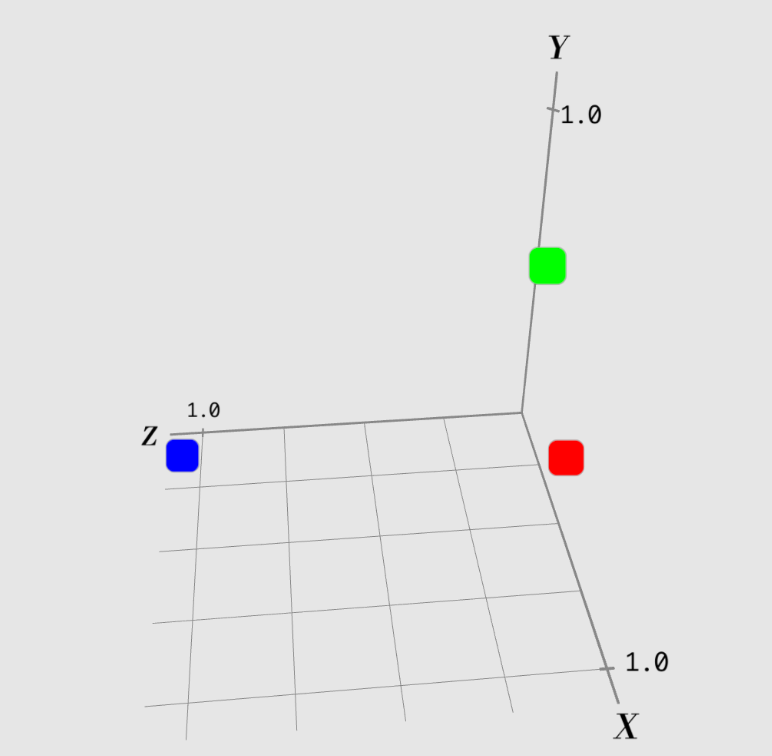
A rectangular space treats color as points in a three-dimensional Cartesian coordinate system, the familiar X (horizontal), Y (vertical) and Z (depth) axes — just mapping color rather than position. In sRGB, those three axes describe a color's redness, greenness and blueness.
A polar space is also three-dimensional, but cylinder-shaped. Each color is described by a value for lightness or brightness (the distance from the point to the center), a value for chroma or saturation (the radial distance from the center) and the hue angle around the center.
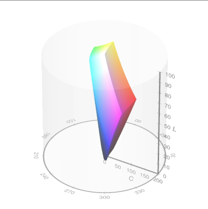
The hue angle is what sets polar spaces apart. Because the angle is cyclic, a full circle, there is more than one route from one hue to another, and CSS has to decide which one to take.
Choosing a hue route
A useful mental model is finding the distance between two positions on a clock, assuming the hand may travel clockwise (forwards) or counterclockwise (backwards). If the minute hand sits at 10 minutes (2) and the target is 50 minutes (10), the shorter path is counterclockwise, going back in time. The longer path passes through 3, 4, 5 and all the way up, while the shorter route arrives in 15 minutes.
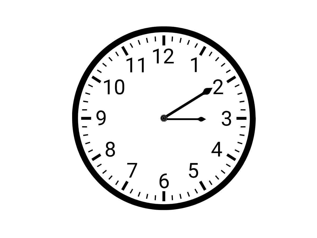
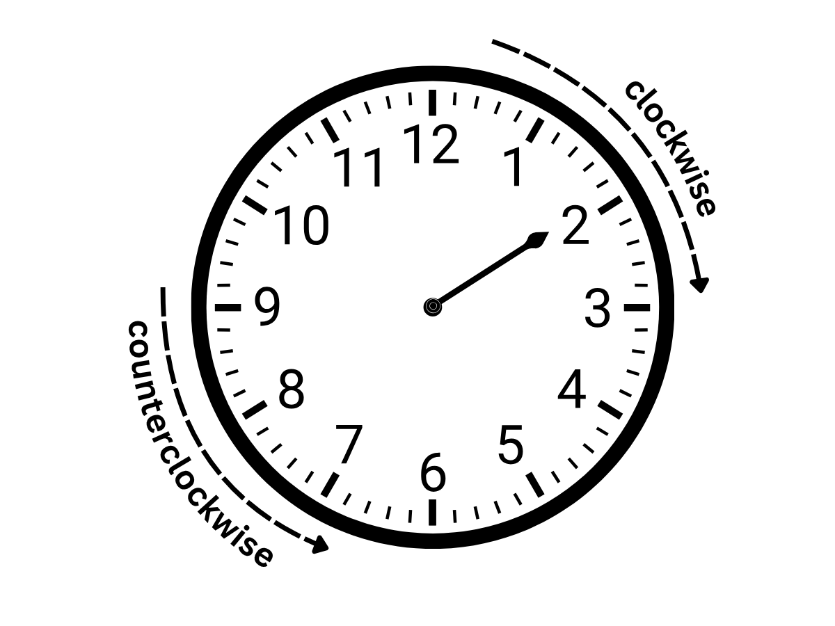
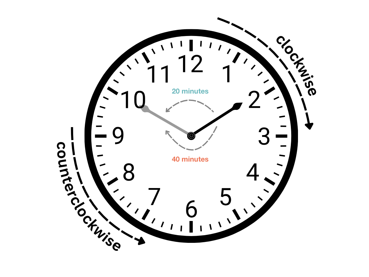
CSS formalizes this in a hue interpolation algorithm that picks direction and distance between two hue points in a polar space. Four methods exist.
shorter and longer
shorter is the default and takes the shorter route; longer takes the longer one. Mixing red (0deg) with blue (240deg) leaves two options, a longer path of 240deg and a shorter one of 120deg. With shorter the browser covers 120deg; with longer it covers 240deg. Either way the result can be clockwise or counterclockwise depending on which distance is shortest or longest. The direction can also be left to the browser by using one of the two keywords below.
increasing and decreasing
Back to the clock: increasing always moves the hand clockwise, so going from 2 to 10 advances through 3, 4, 5 and onward, and a target of 1 would still be reached clockwise after almost a full turn. decreasing always moves counterclockwise. As the specification notes, depending on the difference between the two angles, this will either look the same as shorter or as longer. Interpolating from 20deg to 50deg with increasing moves clockwise through the intermediate colors; with decreasing the same endpoints are traversed counterclockwise. Because increasing keeps going forwards, a value can reach 360deg — the full circle — and then resets to 0deg until it reaches the next point. When decreasing reaches 0deg, it resets to 360deg so the hue change stays consistent.
Putting interpolation to work
Gradients
Every gradient function interpolates. conic-gradient(), for instance, blends colors smoothly around a center point as the sweep passes each stop:
background: conic-gradient(
  from 0deg,
  oklch(70% 0.3 0deg),
  oklch(70% 0.3 120deg),
  oklch(70% 0.3 240deg),
  oklch(70% 0.3 360deg)
);
Mixing colors
The raw form of a color-mix() call looks like this:
/* First Box */
background-color: color-mix(in oklch, rgb(255 0 0) 50%, lch(60% 40% 220deg) 50%);

/* Second Box */
background-color: color-mix(in oklch longer hue, rgb(255 0 0) 50%, lch(60% 40% 220deg) 50%);
Its main advantage is that colors can be mixed in one color space while both inputs originate in another — and because mixing is still interpolation, the direction taken matters.
Animation
Because animation interpolates between color values, it shows every color between the two endpoints, not just a mix of them:
@keyframes bg-shift {
  from {
    background-color: oklch(30% 0.3 20deg); /* dark pink */
  }
  to {
    background-color: oklch(70% 0.3 200deg); /* Cool bluish */
  }
}



