

Flutter 2: Web Goes Stable, Desktop Gets Closer
Flutter's March 2021 2.0 release marks a clear shift in what the framework is for. Originally built as a mobile SDK for Android and iOS, Flutter now supports running the same code natively in browsers, on Windows, Linux and macOS. With Flutter 2, web development is officially on the stable channel, and desktop support is available as an early release beta snapshot in that same channel.
Google's Flutter Engage event brought concrete examples of the framework's expanding reach. Toyota will build car infotainment systems with Flutter, and Canonical announced that Flutter will be its default option for desktop apps. Canonical also released a Flutter version of its Yaru theme, which we'll use to build a sample desktop app.
Better Support for Keyboard-and-Mouse Platforms
Flutter's usability improvements for non-mobile devices address some longstanding gaps. One example is the addition of a built-in Scrollbar widget, previously handled only through third-party packages or custom implementation. The new widget adapts to the target platform — with or without a track, and with platform-appropriate click behavior. You can theme it, and Flutter is expected to eventually show scrollbars automatically when content is scrollable.
For now, you can wrap any scrollable view with the scrollbar of your choice and provide a ScrollController as the controller for both the scrollbar and the scrollable widget, just as you might use a TextEditingController with a TextField.
Web: CanvasKit Default for Desktop Users
Flutter for the web had been usable but not fully polished, especially in performance. Flutter 2 brings the previously experimental compilation target with WebAssembly and Skia into a refined offering now called CanvasKit. By default, the app renders with CanvasKit for desktop web users, while mobile web users get the HTML renderer, which received improvements but still isn't as strong as CanvasKit.
Hyperlinks are easier to create now, though the capability comes via Google's url_launcher package rather than the core framework. The Link class lets you build links more like you would in HTML.
Text selection has improved: the pivot point now matches where the user started selecting text instead of the left edge of the SelectableText widget, and Copy/Cut/Paste options are available. Still, you can't select text across different SelectableText widgets, and selectable text isn't on by default.
Desktop: Stable Enough to Try
Desktop support doesn't yet carry the stable label, but it's much further along than the experimental stage. Performance and stability have improved significantly, and the usability changes for keyboard-and-mouse platforms help here as well. That said, tooling is still thin and there are severe outstanding bugs — don't plan to publicly distribute a Flutter desktop app yet.
Building a Simple Flutter Desktop App
To see Flutter desktop in action, we'll build a basic app with a sidebar navigation and content items for each section. The full code example is on GitHub. We'll compile for Linux and use the Ubuntu Yaru theme to make it feel native.
First, enable desktop support with:
flutter config --enable-${OS_NAME}-desktop
Replace ${OS_NAME} with windows, linux or macos. Native builds require additional tooling: Visual Studio 2019 on Windows, Xcode and CocoaPods on macOS, and an up-to-date list of Linux dependencies is on Flutter's website.
Create the project:
flutter create flutter_ubuntu_desktop_example
Then add the Yaru theme as the only dependency in pubspec.yaml:
dependencies:
  yaru: ^0.0.0-dev.8
  flutter:
    sdk: flutter
In lib/main.dart, import the Material library and only the light Yaru theme:
import 'package:flutter/material.dart';
import 'package:yaru/yaru.dart' show yaruLightTheme;
Call MaterialApp directly from main via runApp, and set the theme to yaruLightTheme:
void main() =>
  runApp(MaterialApp(
    theme: yaruLightTheme,
    home: HomePage(),
  ));
The HomePage widget is a StatefulWidget that holds the data (widgets are immutable; only the State manages changes):
class HomePage extends StatefulWidget {
  final dataToShow = {
    "First example data": [
      "First string in first list item",
      "Second in first",
      "Example",
      "One"
    ],
    "Second example": [
      "This is another example",
      "Check",
      "It",
      "Out",
      "Here's other data"
    ],
    "Third example": [
      "Flutter is",
      "really",
      "awesome",
      "and",
      "it",
      "now",
      "works",
      "everywhere,",
      "this",
      "is",
      "incredible",
      "and",
      "everyone",
      "should",
      "know",
      "about",
      "it",
      "because",
      "someone",
      "must",
      "be",
      "missing",
      "out",
      "on",
      "a lot"
    ]
  }.entries.toList();

  @override
  createState() => HomePageState();
}
In HomePageState, define the widget tree — list and grid items and spacing widgets excluded:
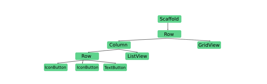
Restrict the left-hand Column (containing the controls) to a fixed width of 400 pixels with a Container, and let the right-hand GridView be Expanded. Within the left Column, the ListView expands to fill vertical space below the row of buttons, and in that top Row, the TextButton reset button expands to the right of the chevron IconButtons.
The full HomePageState implementation, with logic to show content on the right based on the left-hand selection:
class HomePageState extends State<HomePage> {
  int selected = 0;

  ScrollController _gridScrollController = ScrollController();

  incrementSelected() {
    if (selected != widget.dataToShow.length - 1) {
      setState(() {
        selected++;
      });
    }
  }

  decrementSelected() {
    if (selected != 0) {
      setState(() {
        selected--;
      });
    }
  }

  @override
  Widget build(BuildContext context) {
    return Scaffold(
      body: Row(
        children: [
          Container(
              color: Colors.black12,
              width: 400.0,
              child: Column(
                children: [
                  Row(
                    children: [
                      IconButton(
                        icon: Icon(Icons.chevron_left),
                        onPressed: decrementSelected,
                      ),
                      IconButton(
                        icon: Icon(Icons.chevron_right),
                        onPressed: incrementSelected,
                      ),
                      Expanded(
                          child: Center(
                        child: TextButton(
                          child: Text("Reset"),
                          onPressed: () => setState(() => selected = 0),
                        ),
                      ))
                    ],
                  ),
                  Expanded(
                    child: ListView.builder(
                      itemCount: widget.dataToShow.length,
                      itemBuilder: (_, i) => ListTile(
                        title: Text(widget.dataToShow[i].key),
                        leading: i == selected
                            ? Icon(Icons.check)
                            : Icon(Icons.not_interested),
                        onTap: () {
                          setState(() {
                            selected = i;
                          });
                        },
                      ),
                    ),
                  ),
                ],
              )),
          Expanded(
            child: Scrollbar(
              isAlwaysShown: true,
              controller: _gridScrollController,
              child: GridView.builder(
                  controller: _gridScrollController,
                  itemCount: widget.dataToShow[selected].value.length,
                  gridDelegate: SliverGridDelegateWithMaxCrossAxisExtent(
                      maxCrossAxisExtent: 200.0),
                  itemBuilder: (_, i) => Container(
                        width: 200.0,
                        height: 200.0,
                        child: Padding(
                          padding: const EdgeInsets.all(8.0),
                          child: Card(
                            child: Center(
                                child:
                                    Text(widget.dataToShow[selected].value[i])),
                          ),
                        ),
                      )),
            ),
          ),
        ],
      ),
    );
  }
}
Build the app with:
flutter build ${OS_NAME}
where ${OS_NAME} matches what you used with flutter config. On Linux, run the compiled binary at:
build/linux/x64/release/bundle/flutter_ubuntu_desktop_exampleOn Windows, the binary is at:
build\windows\runner\Release\flutter_ubuntu_desktop_example.exeFor macOS, open macos/Runner.xcworkspace in Xcode and build from there.
Beyond Mobile: The Rest of the Flutter 2 Update
Flutter 2’s headline features target web and desktop, but the release brought meaningful changes to mobile development as well. Among them is official support for AdMob ads via the google_mobile_ads package on Pub, answering a long-standing request from the community. The framework also introduced new autocomplete widgets: a Material-styled Autocomplete and a lower-level RawAutocomplete for custom implementations.
The new Link widget, though highlighted for its role in Flutter web, is actually available across all platforms. Its most visible impact will still be in web projects, where it enables more natural anchor-based navigation.
Dart 2.12 and the Push for Null Safety
Several changes to the Dart language directly affect Flutter development. Dart 2.12 introduced C language interoperability support, with platform-specific setup instructions available in the official Flutter documentation. More importantly, the stable Dart channel now includes sound null-safety, a shift that brings compiler optimizations and reduces the likelihood of runtime errors.
While adopting null-safety is optional for now, it’s becoming the standard. The main barrier to migration is third-party package support: not all Pub packages are fully null-safe, so projects depending on those libraries cannot yet take advantage of the new system.
Working With Nullable Types
If you’ve used Kotlin, Dart’s approach will look familiar. The official Dart null-safety guide is the best place for a full explanation, but the core rules are straightforward. All standard types—String, int, Object, List, and your own classes—are now non-nullable by default. Their values can never be null. A function with a non-nullable return type must always return a value, or you’ll get a compile-time error. Non-nullable variables must be initialized unless they’re local variables assigned before any use.
To allow null, append a question mark to the type name:
int? a = 1
At any point, you can set that variable to null without issue. When you need to pass a nullable value to something expecting a non-nullable type, you can check for null explicitly:
void function(int? a) {
    if(a != null) {
        // a is an int here
    }
}
If you’re certain a value isn’t null, the ! operator tells the compiler to skip the check:
String unSafeCode(String? s) => s!;
Assessing Flutter 2’s Platform Readiness
Flutter 2 widens the scope of what’s possible, but it’s not yet a universal solution for every development project. On mobile, Flutter has been polished since its earliest releases, and you’re unlikely to encounter a task it handles poorly.
Desktop is still rough around the edges. Windows apps in particular require more work before they meet the quality bar, and while Linux and macOS are in better shape, they aren’t fully mature either. Web is further along than desktop: you can build solid single-page applications and PWAs, but Flutter web remains a poor fit for content-centric sites where text selection quality, indexability and SEO matter.
For teams building a companion web version of an existing Flutter app, the platform is likely adequate. The growing catalog of web-compatible packages reduces friction, and that ecosystem continues to expand with each release.
Further Reading
- Keynote (Flutter Engage), YouTube
- What’s New in Flutter 2, Flutter, Medium
- Understanding
null safety, Dart.dev - Responsive Web And Desktop Development With Flutter, Smashing Magazine
- Solving Common Cross-Platform Issues When Working With Flutter, Smashing Magazine



