

Scroll effects, scrollspies, and random() demos
For anyone with patience for flashy scroll work, Kevin Powell's walkthrough of the scroll effects on the GTA 6 website is worth a watch — though the site itself reportedly doesn't work in Firefox.
On the practical side, Mojtaba Seyedi showed how to build a scrollspy using modern CSS. The pattern in question: a navigation linking to sections of a page, with the current section highlighted as you scroll. Brecht De Ruyte also collected and explained a set of demos built on random().
Proposals and deep dives
Lea Verou published a detailed survey of the different ways to implement icons on the web, covering upcoming CSS features such as Linked Parameters, ident(), @mixin, @apply, and the @property shorthand.
Kilian Valkhof raised the idea of a universal pseudo-selector. The universal selector (*) doesn't match pseudo-elements, which is why sites commonly rely on a reset snippet like this:
*,
::before,
::after {
  box-sizing: border-box;
}
With more pseudo-elements in play today — ::backdrop and ::details-content among the common ones — Valkhof proposes ::*.
Declan Chidlow, meanwhile, rounded up new HTML and CSS features that suit design systems. Notable picks include text-box, sibling-index(), sibling-count(), @scope, and @custom-media, all of which are useful well beyond design systems.
Techniques with textareas, shapes, and gradients
Adam Argyle shared a CSS trick that lets <textarea> elements size themselves to their content, the way contenteditable elements do naturally. The approach leans on anchor positioning:
For a more decorative result, Temani Afif-style wavy dividers can be created by combining random() and shape().
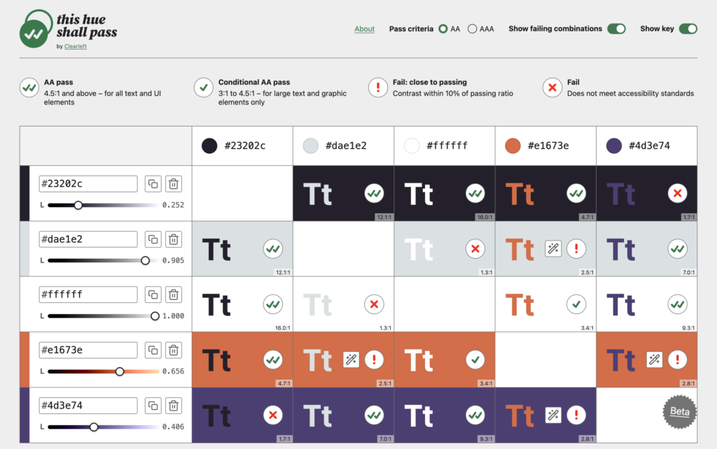
Two new tools made the rounds as well. This hue shall pass, built by Clearleft, is a color contrast checker that tests every combination of colors, distinguishes Fail from Fail: close to passing, and lets you adjust lightness until the ratio satisfies AA/AAA. Gradient Layers, from Ahmad Shadeed's lab, is a visual editor for working with gradients — handy when a gradient has multiple layers.
On the specification side, two new gradient types are in progress, with Josh Tumath explaining how they work and what their CSS might look like.
background-image: mesh-gradient(red, blue; green, yellow);
background-image: freeform-gradient(red top left, yellow bottom right);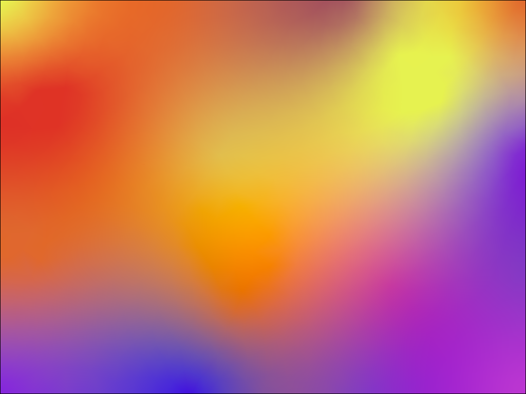
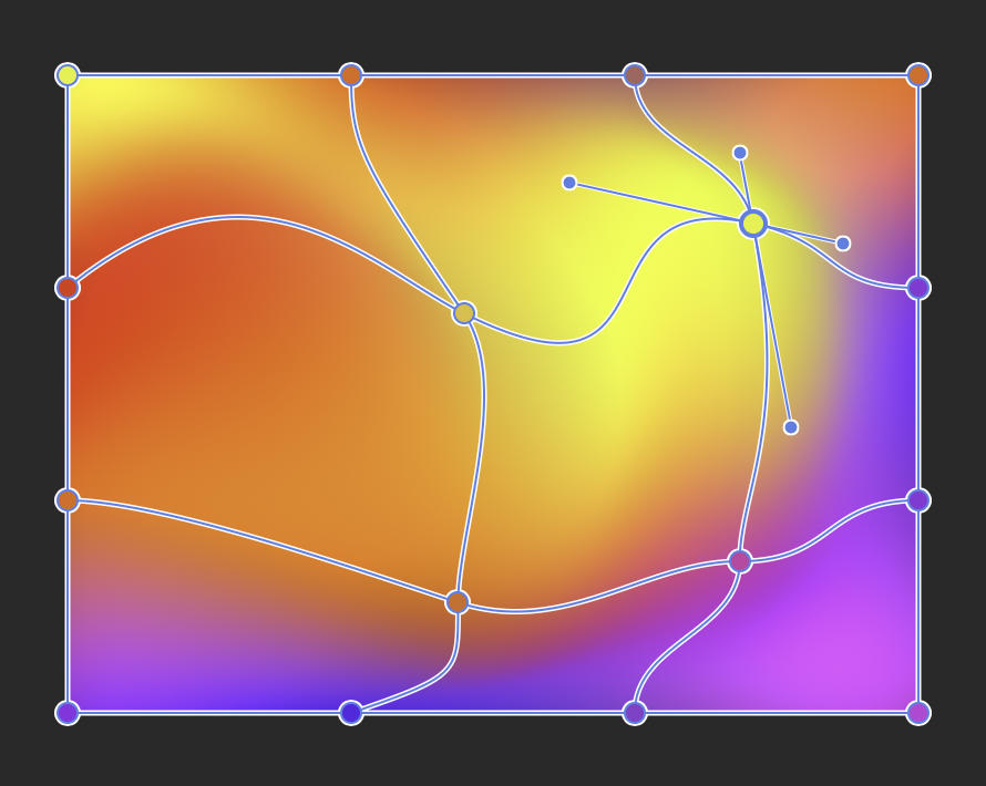
A mesh gradient example shows off the potential of these types:
Platform releases
- Chrome 155:
margin-trim(no Firefox support),symbols()(no Safari support), andtext-decoration-skip-spaces(no Firefox or Safari support). - Firefox 158: JPEG XL and CSS typed arithmetic, both now Baseline.
- Chrome 156:
random()(no Firefox support) and:navigation-source(no Safari or Firefox support). - Safari 27.1: a batch of CSS features for the iPhone Duo.
- Firefox 159: scroll-driven animations, now Baseline.




