

HTML-in-Canvas arrives in experimental form
The HTML-in-Canvas API, which lets semantic HTML be rendered into a <canvas> with visual effects applied, is the current center of attention. Amit Sheen has documented how the API works and published a set of demos in the HiC Showroom, one of which requires Chrome 146 with the chrome://flags/#canvas-draw-element flag enabled.
A hex map for analytics
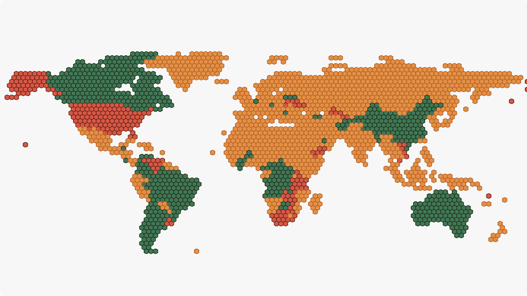
Ben Schwarz wrote up the construction of a hexagonal world map-analytics feature. The piece reads as a retrospective rather than a developer walkthrough, but it covers analytics, design constraints, inspiration, engineering, and both SVG and CSS.
Rekindle: an e-ink operating system in the browser
Rekindle is a web-based operating system aimed at e-ink devices — Kindle, Kobo, Boox — which tend to be low-powered and limited in features. It bundles a large collection of features and apps, renders in black and white, omits animations, and layers on further e-ink optimizations.
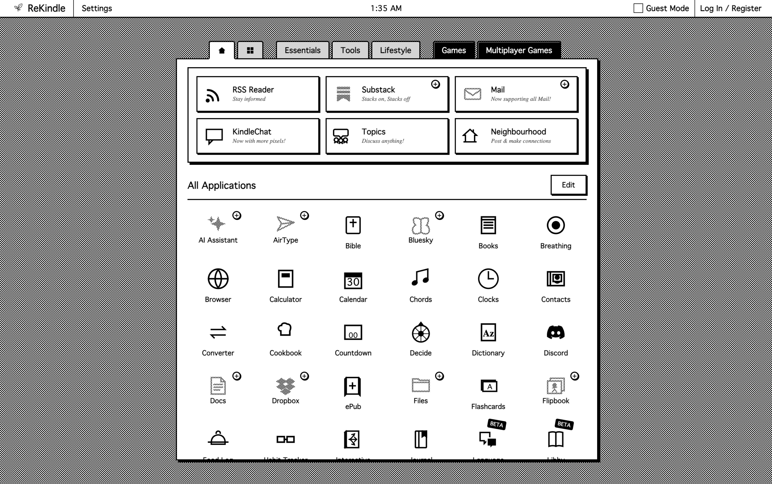
The interesting part is not the tutorial (there isn't one) or the commentary (unlike the map retrospective): it is that Media Queries Level 5 already defines queries that would serve e-ink devices well — hover capability, pointer precision, display update frequency, color depth, monochromatic bit-depth, color index size, dynamic range and probably more. Those queries are of little use on hardware that ships with low-powered, proprietary browsers that don't recognize them. Both the browsers and many of the queries are still in active development, so whether e-ink optimization breaks out in the coming years is an open question; a dedicated service like Rekindle currently has to exist regardless. A developer deep dive on Rekindle would be welcome.
Swapping image sources with content
Jon found that CSS can replace an <img>'s source directly — no pseudo-element involved:
<img src="image.png" alt="Alt text">img {
content: url(new-image.png) / "New alt text";
}TIL! Who knew you could change the "src" of an #HTML <img> using #CSS: img { content: url(whatever.png) } NO PSEUDOS! Seems to work in all current browsers too. How did I miss this?
— Jon (@scrwd.mastodon.social.ap.brid.gy) Apr 20, 2026 at 13:09
The content property has been Baseline for 11 years. Experimenting further shows the same technique works with the image-set() function:
img {
  content: image-set(
    url("image.png") 1x,
    url("image-2x.png") 2x
  );
}
For sites with non-responsive <img> elements and no way to change the markup, the logic can live in CSS instead.
When markup is editable: sizes=auto
With HTML access, responsive images belong in the srcset and sizes attributes. Mat Marquis demonstrated how the new sizes=auto attribute-value combination removes responsive breakpoints for lazily loaded images. Amit Sheen has also covered building layouts without breakpoints, not necessarily images.
Platform updates
- Firefox 150
:mutedand the other media-based pseudo-classes (no Chrome support)revert-rule(no Safari support)sizes=auto(no Safari support)light-dark()with image support (no Chrome/Safari support)color-mix()with syntax for two or more colors (no Chrome/Safari support)ariaNotify()(no Chrome/Safari support)
- Safari TP 242
closedby- Advanced
attr()(no Firefox support)
For more, Wes Bos and Scott Tolinski of Syntax.fm discuss 10 new CSS and HTML APIs.




