Florin Pop's line-through-text demo puts a stroke over or under the letters of a single-line headline. It works, but the implementation duplicates the headline text, hardcodes the line length as a magic number, and leans on JavaScript. The version below removes all three problems, relying on an HTML preprocessor and a handful of CSS features instead.
Markup without duplicated text
The reference approach wraps the text in a heading, clones that heading, and uses Splitting.js to swap the clone's content for one span per character. Once text duplication is off the table, reaching for a library just to split characters feels like overkill, so the character spans here are emitted by the preprocessor.
- let text = 'We Love to Play';
- let arr = text.split('');

h1(role='image' aria-label=text)
  - arr.forEach(letter => {
    span.letter #{letter}
  - });
Because splitting text across many elements can trip up screen readers, the whole element gets role="image" and an aria-label. The generated HTML looks like this:
<h1 role="image" aria-label="We Love to Play">
  <span class="letter">W</span>
  <span class="letter">e</span>
  <span class="letter"> </span>
  <span class="letter">L</span>
  <span class="letter">o</span>
  <span class="letter">v</span>
  <span class="letter">e</span>
  <span class="letter"> </span>
  <span class="letter">t</span>
  <span class="letter">o</span>
  <span class="letter"> </span>
  <span class="letter">P</span>
  <span class="letter">l</span>
  <span class="letter">a</span>
  <span class="letter">y</span>
</h1>
Positioning and drawing the stroke
A grid layout centers the heading inside its parent, body in this case:
body {
  display: grid;
  place-content: center;
}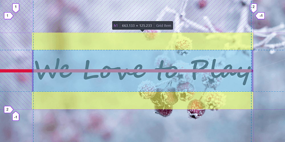
width, but is instead placed in the middle.Decorative touches — a suitable font, a background on the container — are optional. The stroke itself is an absolutely positioned ::after pseudo-element with height set to a thickness variable $h:
$h: .125em;
$r: .5*$h;

h1 {
  position: relative;

  &::after {
    position: absolute;
    top: calc(50% - #{$r}); right: 0;
    height: $h;
    border-radius: 0 $r $r 0;
    background: crimson;
  }
}
That settles position and height. Width is the interesting part: the line must run from the left edge of the viewport to the right edge of the heading text.
Deriving the width instead of guessing it
Under the grid layout the heading is horizontally centered, so the viewport's vertical midline and the heading's midline coincide, dividing both into equal halves:

The span from the viewport's left edge to the heading's right edge therefore equals half the viewport width (50vw) plus half the heading width. Inside a width computation on the pseudo-element, that heading half can be written as a % value, giving:
width: calc(50vw + 50%);Letters above the line
At this point the effect is simply a crimson line crossing black text. To let selected letters sit on top of the stroke, the Pug code assigns a class of .over to letters at random:
- let text = 'We Love to Play';
- let arr = text.split('');

h1(role='image' aria-label=text)
  - arr.forEach(letter => {
    span.letter(class=Math.random() > .5 ? 'over' : null) #{letter}
  - });
Those letters are then relatively positioned and given a positive z-index:
.over {
  position: relative;
  z-index: 1;
}
translatez(1px) was the first idea, but z-index: 1 won on both browser support and effort. The result: the line passes over some letters and beneath others.
Animating the entry
With the hard part done, an animation can slide the line in. The stroke starts shifted along the negative x-axis by its full width (100%) and returns to its resting position. A 1s delay leaves a moment of breathing room before it starts, which in turn requires the backwards value for animation-fill-mode so the line holds the 0% keyframe state during the wait:
@keyframes slide { 0% { transform: translate(-100%); } }animation: slide 2s ease-out 1s backwards;Threading the line through each letter in 3D
A further idea: have the stroke pass through every letter individually — starting above the glyph, crossing it, and ending below (or the reverse). That calls for genuine 3D and a few adjustments.
- Set
transform-style: preserve-3don the heading so its children and pseudo-elements join one 3D assembly, ordered and intersecting according to their 3D positions. - Rotate each letter around its y-axis, with the direction set by the randomly assigned class — renamed from
.overto.rev(for "reverse"), since "over" no longer describes what happens.
One catch: the span elements are still inline, and transform has no effect on inline elements. Setting display: flex on the heading fixes that, but introduces a second problem — spans holding only a space (" ") collapse to zero width:

<span> in Firefox DevTools.The remedy is white-space: pre on the .letter spans. After that, each span can be rotated by an angle $a, one way or the other:
$a: 2deg;

.letter {
  white-space: pre;
  transform: rotatey($a);
}

.rev { transform: rotatey(-$a); }
Rotating around the y-axis compresses the letters horizontally, so they are scaled along the x-axis by a factor $f equal to the inverse of the cosine of $a:
$a: 2deg;
$f: 1/cos($a)

.letter {
  white-space: pre;
  transform: rotatey($a) scalex($f)
}

.rev { transform: rotatey(-$a) scalex($f) }
The reasoning behind that specific factor is covered in detail in an earlier article on circular distribution of partially overlapping items. One caveat: the font here was picked because the result looks good with it, and a different font may not behave as well.