

Semantics Beyond the Visual
HTML passes two related but distinct sets of information to user devices. The first is visual presentation information, which determines how the document is displayed by default. The second is semantic information: the “meaning” embedded in the document, describing each element’s purpose and its relationship to other elements.
The h1 element illustrates this distinction. Its visual presentation is why it renders bold and larger than surrounding text. Its semantics tell browsers and assistive technology that it is the highest-ranking heading for its section. Sighted users can often infer semantic relationships visually — larger headings, bulleted lists, numbered markers. Users relying on assistive technology, however, need that meaning exposed through the accessibility API, which browsers populate based on the semantic richness of the underlying HTML.
Grouping elements also carry semantic weight. Sometimes, the meaning they communicate matters for how a document is understood and navigated.
Does the Grouping Serve a Document Purpose?
The first step in choosing the right container is determining whether grouping the content is actually necessary for the document structure to make sense. Two questions help clarify this:
- Does the content in this block share something in common that adds meaning to the document when read together?
- If describing the document structure to someone without showing it, would you naturally refer to this grouped area?
If the answer is “no,” a div may be the appropriate choice, as Scott O’Hara points out in his work on the pitfalls of overusing and misusing div. The grouping should at least in part be driven by document structure before you consider article or section. It need not be the only reason — content can share a visual style or language and still influence document semantics — but structural relevance is the baseline.
A Content-First Mental Model
Deciding between article and section has to start from the content itself, not from the desire to build semantic-looking containers. A common mistake is to reach for these elements when structuring a layout or a component before writing any content. But without knowing what the content is and how it relates to the rest of the page, the choice remains arbitrary.
The mental model that emerges is a decision tree rooted in content. First, confirm the grouping has a structural role. If it does, then examine whether the content in that group is self-contained: could it be syndicated or republished on its own as a standalone item? If yes, article is likely correct. If the group is instead a thematic grouping of content that typically belongs within a larger document — a chapter, a subsection under a heading — then section fits better.
Headings play a key role in making that determination. A section needs a heading that describes its theme; that heading should make sense within the broader page outline. An article also benefits from a heading, but the content beneath it should hold up even when that heading is read in isolation, outside any surrounding page structure.
Practical Takeaway
The difference between article and section is not a matter of aesthetic preference or styling convenience. It is a decision that should be made with the actual content in hand, using what the content will contain to determine how it should be programmatically described. Writing semantic HTML is not about labeling every grouping container with the most specific tag available, but about choosing the element whose implied meaning most accurately matches the real structure of the page. That requires a grouping-first decision: whether the div is s sufficient or the semantics of article or section adds meaning for assistive technology. Content, not code, drives the ultimate choice.
Deciding Between article and section by Meaning
Once you have decided that grouped content deserves something more semantic than a div, the next question is whether that group is best described by the meaning baked into article or section. Both carry specific definitions in the HTML spec, and those definitions — not your intuition about the words — should drive the decision.
What the Spec Definitions Actually Say
The HTML Living Standard describes the article element as representing:
a complete, or self-contained, composition in a document, page, application, or site and that is, in principle, independently distributable or reusable, e.g., in syndication. This could be a forum post, a magazine or newspaper article, a blog entry, a user-submitted comment, an interactive widget or gadget, or any other independent content item.
By contrast, the same spec defines section as:
a generic section of a document or application. A section, in this context, is a thematic grouping of content, typically with a heading... Examples of sections would be chapters, the various tabbed pages in a tabbed dialog box, or the numbered sections of a thesis. A website’s home page could be split into sections for an introduction, news items, and contact information.
The spec adds a practical test for section: it is appropriate only if the element’s contents would be listed explicitly in the document’s outline.
Even with those definitions in hand, the choice can feel subjective. Are you building a landing page that lists blog post teasers? You need to decide what wraps the list itself, what wraps each teaser inside it, and — after a click takes the user to the full post — what wraps that expanded view. For a social feed such as Twitter, is each tweet an article because it is self-contained and independently distributable, or a section because it sits inside an application’s generic UI? And what about the timeline container itself?
Rethinking What article Means
A common source of confusion is assuming the article element was named after a written article — a blog post, a newspaper story. That intuition is understandable, but it is wrong. The spec uses “article” in the dictionary sense of “a particular item or separate thing,” closer to how you might refer to an article of clothing: a discrete entity that can be reused in another context. A shirt is an article, and it works with different trousers; a pair of boots is an article that travels from one outfit to another. None of those items lose their identity when placed in a new setting.
An article, then, represents content that can be lifted out of its immediate surroundings, dropped onto another page, and still make complete sense on its own. Consider a table lamp: it complements the sofa, the console, and the curtains in the living room, but carry it into a bedroom or onto a desk and it is still recognizably a whole lamp. The surroundings change; the object does not depend on them.
A section works differently. It is a thematic grouping, but it is a part of a larger whole. A chapter is a section of a book; a tabbed dialog page is a section of a larger interface; home page content can be split into introduction, news, and contact sections. Each of those may be coherent, but they refer back to the larger document to which they belong. The spec explains this is why a section often carries a heading: to indicate which part of the broader composition it covers.
The lamp analogy helps here too. A lamp obviously has parts — a hood, a bulb, a base, an upright stand. You could physically separate them, but you should not. Show someone the umbrella-shaped hood alone and they will ask what it came from and where the rest is. Show them a loose light bulb and they will wonder where it goes. Those parts only make sense in conjugation with each other. That is the difference between an article (the complete lamp) and a section (the hood or the base): one is self-sufficient, the other is always a piece of something bigger.
Working Through Real-World Examples
Knowing the spec definitions is one thing; applying them under real-world pressure is another. Let’s walk some concrete pages through the decision process.
A Blog Landing Page
Take a typical blog homepage. Structurally, it breaks down into a header with site navigation, a main content area, and a footer with topic navigation. Those top-level regions already have dedicated elements, so the real choices happen inside main. On a page like Smashing Magazine’s, the main area contains distinct clusters: selected articles, newsletter signup, components and guides, latest posts, products, conferences, and community-contributed pieces.
For each of these clusters, run the mental model: does the group clarify the document structure? If not, reach for a div. If it does, ask whether the content is thematically related and belongs in the page outline — that points to section — or whether it stands alone well enough to be lifted out and redistributed elsewhere — that points to article.
Applying that filter to the blog homepage:
- Selected Articles — Contributes to the page outline and relates to the site’s content. Verdict:
section. - Newsletter Subscription — Not central to the page’s theme or outline. Verdict:
div. - Components and Guides — Appears in the outline as part of the site’s offerings. Verdict:
section. - Latest Posts — Another outline-worthy content area. Verdict:
section. - Products — Outlines the page’s commerce-related content. Verdict:
section. - Conferences — Part of the page’s announced content. Verdict:
section. - Community Articles — Outlines externally sourced content. Verdict:
section.
The judgment calls are where the nuance lives. A newsletter block would not make most outlines, so a div is defensible — though on a platform like Substack, where subscribing is the entire point, a section would fit better. The value is not in matching some canonical answer; it is in deliberately questioning the role of each group. That exercise, done consciously, produces markup that communicates intent to other developers and assistive technology.
From Index to Individual Post
Click through one of those “Selected Articles” and you land on a dedicated page for a single post. The base layout — header, main, footer — stays the same. The question becomes: what element wraps the post itself, and do its internal chunks need their own wrappers?
An individual post is a stronger candidate for article than the index page’s clusters, because it is eminently distributable: it has a clear topic, author context, and can live standalone. Whether its subsections become sections depends on whether those parts deserve outline entries or simply need styling hooks. Running each piece through the mental model will surface the answer.
A Web Application: Twitter
Applications stretch the vocabulary differently than documents. On Twitter, the timeline never appears in the page’s document outline, but it behaves almost like a self-contained module. Is it a section or an article? The deciding factor is intent: the timeline is an integral part of the app view, not something meant for redistribution. That makes section the better fit.
Tweets within the timeline are another matter. Each one is fully self-contained and independently distributable — you can open any tweet as its own page with its own URL, comments, and reply context. Tweets are not thematically sequenced for an outline; they are discrete units. That matches article semantics.
If you inspect Twitter’s markup, you will find a section wrapping the timeline, and deeper down, article elements for individual tweets. This is a useful reality check on two counts: real-world implementations align with the spec’s intent, and heavy use of divs elsewhere does not erase the semantic meaning of the elements that do carry it.
Nesting and Headings
These elements compose freely. A div can sit inside an article, a section can wrap an article, and each level responds to its own application of the mental model. Nesting does not inherently break accessibility; incorrect semantics do.
A full blog post can be the outer article, with major portions wrapped in sections where a chunk deserves its own place in the outline. When you use a section, give it a heading — the spec calls for one, and it supplies the text that assistive tech and browsers use to expose the structure. A header can hold that heading, and a footer can hold supplementary links like “Further reading.”
Be mindful of the constraints on main. It must appear hierarchically correct — as a direct child of html, body, div, or form — and you cannot use more than one visible instance per document without the hidden attribute.
What Users Actually Experience
All the semantic care you put into markup has to survive contact with browsers and screen readers, and there the picture gets uneven. Inspecting the Accessibility Tree in Firefox, Chrome, or Edge shows that browsers expose article with the role article and section with the role section. The underlying semantics are recognized, but that does not mean users get obvious cues. Neither element is perceivable or keyboard-navigable by default in the browser; only CSS styling can hint at the grouping visually.
One caveat worth flagging: the ARIA role section is an abstract role and must not be used by authors. Do not write role="section" in your markup, even though browsers internally report that role for the HTML section element.
Screen Reader Support Is Inconsistent
Screen reader behavior diverges considerably for each element. For article, JAWS, Talkback, and VoiceOver announce entry into and exit from the element, while NVDA and Narrator are silent by default. NVDA has a setting to enable announcement, but it is off out of the box. Navigation is equally fragmented: JAWS has a shortcut (O) to move between articles, and VoiceOver offers a similar mechanism, but Narrator and NVDA cannot jump between them at all.
The specifications note that assistive technologies should consider switching to document browsing mode when entering an article, and they may allow users to navigate a hierarchy of nested articles. That intended behavior was not reproducible in common screen readers at the time of testing, so treat it as future-proofing rather than a current user benefit. One real, nonstandard advantage exists: Apple WatchOS uses article elements to decide what content to show in Reader mode.
For section, behavior is consistent but minimal: no screen reader announces entry or exit, and there is no way to jump from one section to another.
Upgrading a Section to a Region
You can change that default for section by turning it into an ARIA region landmark. A landmark gives assistive technology users a way to quickly scan and jump to parts of the page, mimicking how a sighted user visually skims. The W3C defines a region as a perceivable section containing content that is important enough that users should be able to navigate to it easily and have it listed in a page summary.
A section with an accessible name automatically gets the implicit role region, so you do not need to set role="region" explicitly. But an accessible name is mandatory; without it, browsers and assistive technologies must not expose the region at all.
Two Ways to Name a Region
The preferred method is aria-labelledby, which references visible text already on the page, ideally a heading. Give that heading an id, then point to it without the # prefix:
<section aria-labelledby="posts">
<!-- This area contains teasers for all blog posts on the website  -->
    <h2 id="posts">All blog posts</h2>
    <article>
        <header>
            <p>Cosima Mielke wrote</p>
                <h2>Expand Your Horizons (June 2022 Desktop Wallpapers Edition)</h2>
        </header>
        <div>
            <p>What could be a better way to welcome June than with some colorful inspiration? Well, we might have something for you: wallpapers created with love by artists and designers from across the globe.</p>
            <p><a>Continue reading ↬</a></p>
        </div>
</article>
    <!-- More blog post teasers here  -->
</section>
With no suitable visible text to reference, use aria-label directly. The value you supply is read as the region's name:
<section aria-label="all blog posts">
<!-- This area contains teasers for all blog posts on the website  -->
    <article>
        <header>
            <p>Cosima Mielke wrote</p>
                <h2>Expand Your Horizons (June 2022 Desktop Wallpapers Edition)</h2>
        </header>
        <div>
            <p>What could be a better way to welcome June than with some colorful inspiration? Well, we might have something for you: wallpapers created with love by artists and designers from across the globe.</p>
            <p><a>Continue reading ↬</a></p>
        </div>
</article>
    <!-- More blog post teasers here  -->
</section>
Keep the label in sentence case; screen readers may spell out all-caps words letter by letter. aria-labelledby is favored because it pulls the label from content sighted users see, while aria-label relies on the author's own description and should be a fallback.
Do not to turn every section into a region. Overpopulating a page with landmarks reduces their usefulness for finding important content. Reserve regions for areas where users will genuinely want quick access.
Real-World Patterns
Smashing Magazine applies the aria-label approach to the “Quick Summary” box on its own articles, letting screen reader users jump past the full text to a short overview:
<section aria-label="quick summary" class="article__summary">
    <span class="summary__heading">Quick summary ↬</span>
    <!--     Rest of summary continues here -->
</section>
Twitter demonstrates the aria-labelledby pattern on its timeline. The section carries an aria-labelledby="accessible-list-9" attribute that points to an h1 with id="accessible-list-9", whose text is “Your Home Timeline.” Here, Twitter sets role="region" explicitly even though the accessible name implies it, a practical choice for an application with wide device and browser variability.
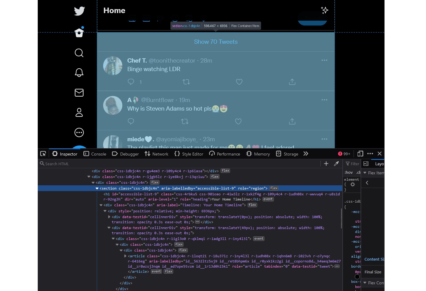
That h1 is not visible on the page. It has been visually hidden with CSS while remaining available to screen readers — a standard technique for naming landmarks without duplicating visible structure.
Browser inspection shows another quirk: Firefox renders the region as a child branch beneath the section in the accessibility tree, while Chrome and Edge expose the section itself as a region:
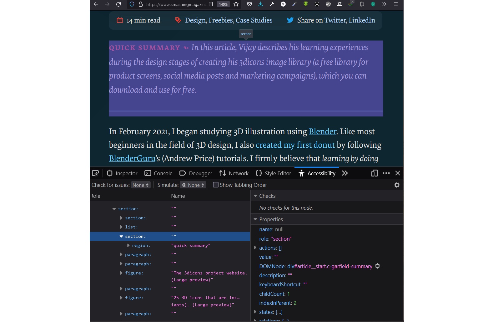
region branch as a child of the section when a section is assigned a role of region. (Large preview)
section made into a region, the section is removed from the accessibility tree and replaced with a region. (Large preview)
section is made into a region, the section is removed from the accessibility tree and replaced with a region. (Large preview)The Practical Verdict
Even if no assistive technology user lands on your page, the correct element still wins. Browsers and reading apps look at sectioning content like article and section when generating Reader mode, stripping away navigation, images, and backgrounds to focus on the main content. Careless wrapping risks having text dropped from that minimalist view.
The deeper benefit is structural thinking. Choosing article over section or a plain div forces decisions about whether content is self-contained, thematically related, or simply styleable. Even a small block of text benefits from conscious grouping into headed sections rather than a wall of unstyled text:
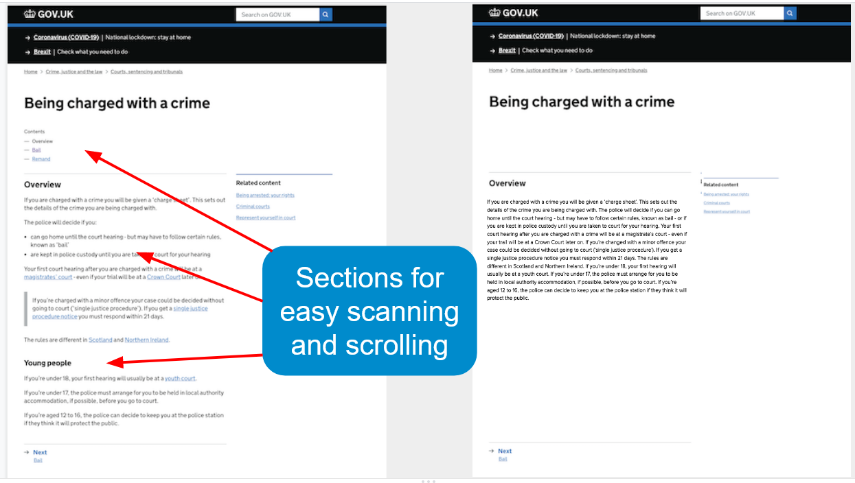
Semantic HTML is not just for machines. It is a contract with readers, and it helps you organize your work before a single line of CSS is written.
Picking the Right Container
The decision between section, article, and plain div comes down to two questions about the content you are grouping:
- Does the grouping contribute to the document’s structure?
- If so, what structural role does it play?
Answering those questions tells you which element fits. If the group is a self-contained composition, article is correct. If it is a thematic cluster within a larger document, section applies. If it only serves styling or scripting hooks, a div is honest and sufficient.
What the Accessibility Tree Adds
When the browser parses section or article, the resulting accessibility tree depends on the element’s content and context. A section with a heading becomes a region landmark, which is exposed to assistive technology and appears in navigation shortcuts. Without a heading, that same section produces no landmark, so it offers no navigational benefit.
To give users of assistive tech an explicit landmark, you can extend the element using role="region" with an accessible name. This forces the creation of a region regardless of the content inside, making navigation across the page easier for users who rely on screen readers or keyboard shortcuts.
The Second Audience for Your Markup
HTML has two sets of consumers. End-users read the rendered page from a URL, and developers read the source markup when they maintain, debug, or extend it. Most writing about semantics focuses on the first group, but the second group matters just as much.
Choosing the correct semantic element is not only about accessibility or search engines. It is a form of communication with the next person who opens the file. Markup that is self-explanatory — where the structure’s purpose is obvious from the tags alone — reduces cognitive load and prevents errors during future edits. If you can look at an element and immediately understand its role, the semantic pressure to choose correctly is justified on clarity grounds alone.


