

Why Hex Falls Short for Real-World Color Work
Hex colors work fine for capture, but they fail when you need to reason about color. Two shades of the same blue share no visible relationship when written as #87CEEB and #4682B4. You cannot look at the string and know what you will see on screen. Making a component slightly darker on hover or producing a consistent set of brand tints forces you back into a color picker for every variant.
HSL removes that friction. It exposes exactly what you are changing: the hue angle, the saturation, and the lightness. Adjusting one value gives you a predictable visual result without ever leaving your editor.
Anatomy of an HSL Color
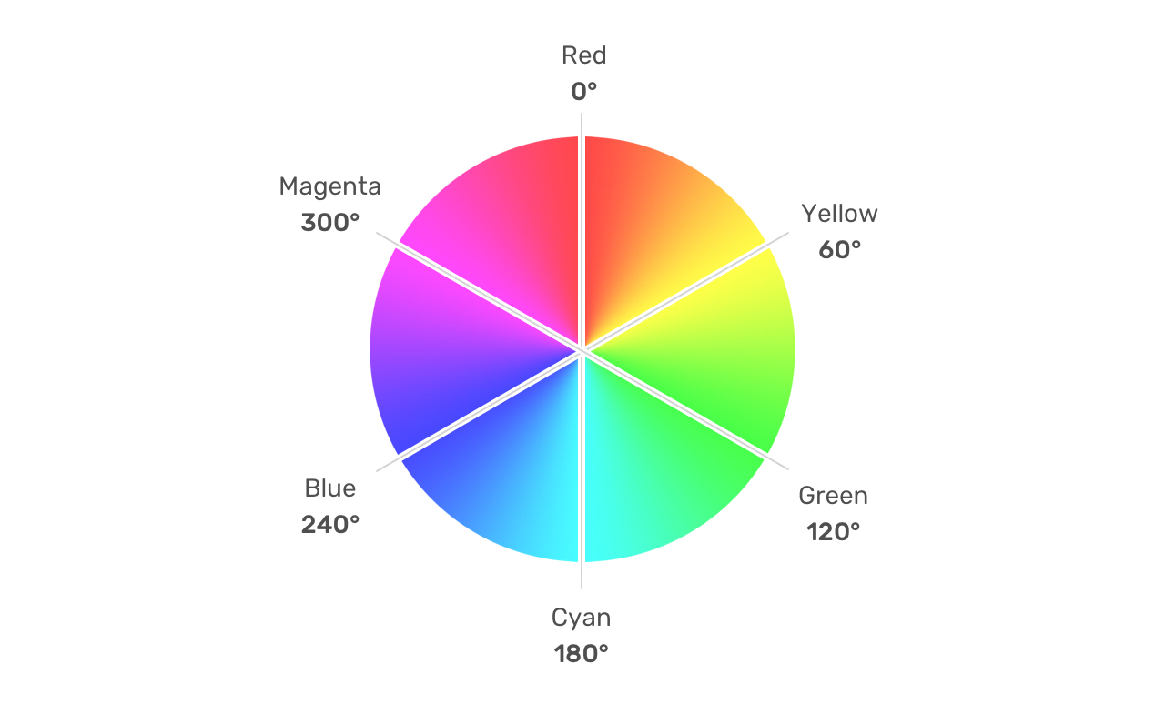
HSL means hue, saturation, and lightness. The model places every color on the RGB color wheel, identified by an angle plus two percentages. Pick a color in any design tool and inspect its HSL output; the first number is the hue angle. In hsl(197, 71%, 73%), the value 197 points to sky blue.
Once you have the angle, you control the remaining two axes:
- Saturation ranges from
0%(a fully desaturated gray) to100%(pure, vivid color). - Lightness controls the brightness:
0%is black and100%is white.
Keeping an angle constant while sliding only the lightness produces shades that feel like relatives of the same family. Turning the hue angle while holding saturation and lightness fixed yields secondary colors that sit consistently in tone, useful for building a coherent multi-color palette.
In CSS the function follows the same shape:
.element {
    background-color: hsl(196, 73%, 62%);
}
Practical Use Cases in the Browser
Hover and State Colors
Darkening a button on hover normally requires a second magic hex value. With HSL, define the base color as a CSS variable and only adjust the lightness in the hover rule:
:root {
  --primary-h: 221;
  --primary-s: 72%;
  --primary-l: 62%;
}

.button {
  background-color: hsl(var(--primary-h), var(--primary-s), var(--primary-l));
}

.button:hover {
  --primary-l: 54%;
}
Raising the lightness percentage moves toward white; lowering it produces the darker shade. The same trick applies to any component that needs a hover or active variant.
Layered Interface Tints
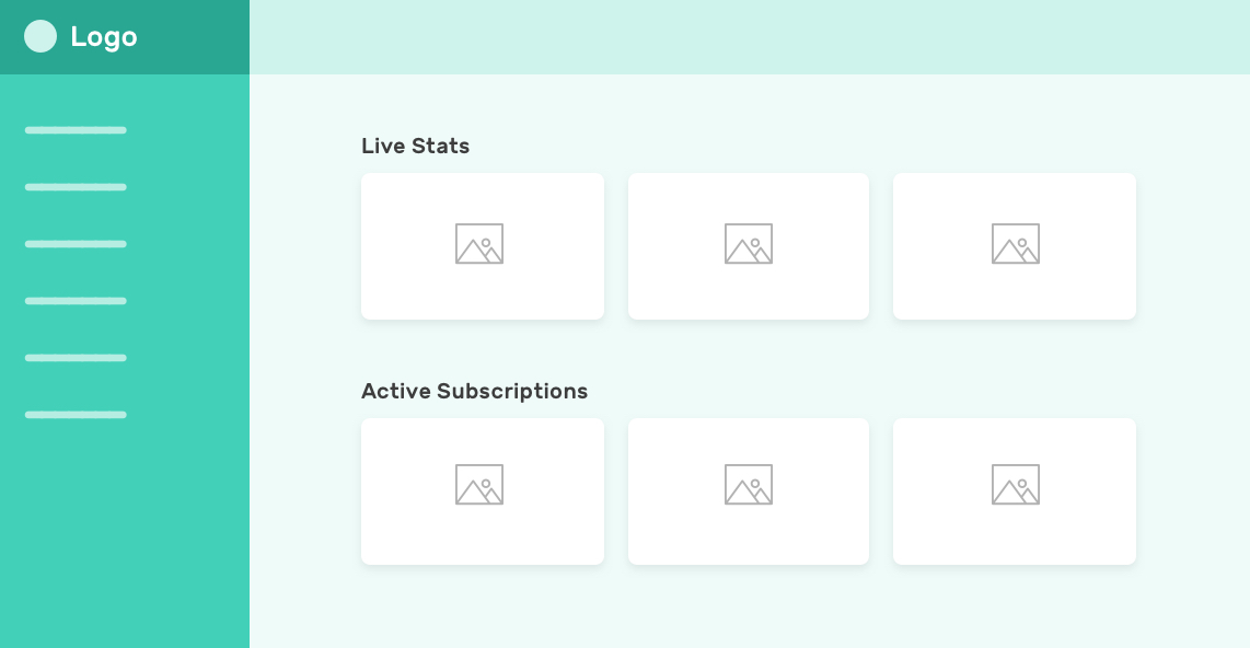
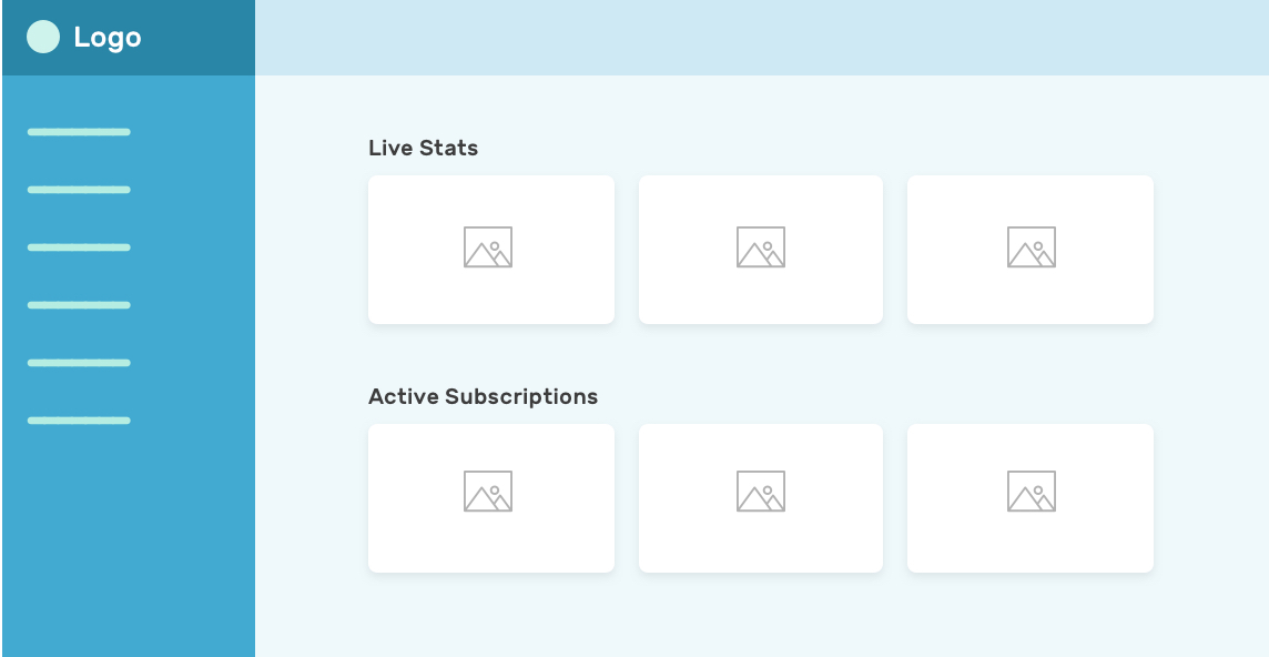
Interfaces often repeat one brand color at different strengths: a bold primary header and a softer secondary nav. Deriving the lighter shade is a single-value change on the lightness axis. Multiple themes can be supported by changing only the hue degree across the whole design system, as each theme keeps its own shade progression from the same base angle.
Generated Color Palettes
An 11-step palette ranging from an almost-black tint to an almost-white one is trivial to write when only the lightness changes per step. The result is a consistent ramp that designers can hand to developers for buttons, text, backgrounds, and borders. Moving the hue value of the whole ramp simultaneously updates every shade in the set.
See the Pen [Testing HSL Colors (22 Jun 2021)](https://codepen.io/smashingmag/pen/gOWawpX) by Ahmad Shadeed .
Softer "Whites"
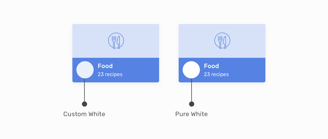
Pure white text on a saturated background can feel glaring. A custom white — a very light tint of the underlying accent — softens the contrast while keeping the text readable. This works because the only difference is a very high lightness value at the same hue.
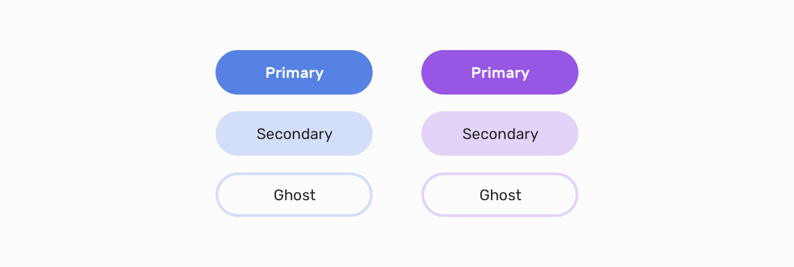
Button Variants Within One Family
Primary and secondary button states can share a hue while separating themselves through lightness. Change the single hue value in the variables, and every button theme follows. The setup also accommodates additional states like disabled or pressed with no extra color lookups.
Fading Gradient Endpoints
Need a visual that starts with a solid accent and fades to nothing? Type the same hue twice, dropping the lightness on the second stop to create a washed-out, near-invisible end. This works naturally for decorative hero sections:
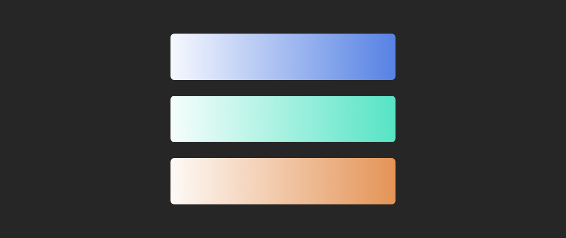
The gradient keeps a strong tint on one side and softens to a very light tail, all without opening a gradient editor to hunt down a matching terminal color.
The Bottom Line
HSL makes working with color arithmetic a habit rather than a hazard. The full triplet — angle for family, saturation for intensity, lightness for tone — gives you direct, editable control over the entire spectrum from your stylesheet. For hovered states, multi-theme interfaces, swatch ramps, softer white text, and layered gradients, HSL is faster than hex and easier to read than RGB. Adopting it does not require abandoning your existing design tools; it lets you bring one more value out of them and into your CSS.


