
Grommet As A React UI Library
Grommet is an open-source React component library focused on responsive, accessible, mobile-first code. Its components cover layouts, types, controls, inputs, visualizations, and utilities, all built with accessibility and responsiveness in mind. The library supports the W3C spec for accessibility and provides customizable themes for color, typography, and layout.
The library contrasts with alternatives like Tailwind CSS and styled-components. Tailwind is a utility-first framework that bypasses CSS's cascading constraints, while styled-components lets you write CSS in JavaScript through object literals. Grommet distinguishes itself by being mobile-first and accessible out of the box, with built-in theme variants and W3C support.
To get started, install the grommet package along with styled-components, which Grommet uses internally for style customization:
npm i grommet styled-componentsOr using yarn:
yarn add grommet styled-componentsGrommet comes pre-built with layout components like Box, Card, and Header. A basic card implementation imports both Grommet and the specific component you need:
import React from 'react';
import { Grommet, Card } from 'grommet';

export default function GrommetExample() {
  return (
     <Card>
        <CardBody pad="medium">Body</CardBody>
          <Button
            icon={<Icons.Favorite color="red" />}
              hoverIndicator
            />
        </Card>
      );
    }
Key Advantages
Grommet simplifies React development by providing responsive components that work across devices. Screen reader support is included, and theme variants like dark mode are configured through the themeMode prop. To implement dark mode, use a ternary operator that checks the current mode and toggles a button to switch between dark and light:
import React from "react";
import { Grommet, Box, Button, Heading, dark } from "grommet";
import { grommet } from "grommet";
const App = () => {
  const [darkMode, setDarkMode] = React.useState(false);
  return (
    <Grommet full theme={grommet} themeMode={darkMode ? "dark" : "light"}>
      <Box pad="large">
        <Heading level="1">Grommet Darkmode toggle</Heading>
        <Button
          label="Toggle Theme"
          primary
          alignSelf="center"
          margin="large"
          onClick={() => setDarkMode(!darkMode)}
        />
      </Box>
    </Grommet>
  );
};
export default App;
The library works alongside other frameworks without adding global styles that would affect existing components. You can interpolate functions and styles into object literals. Its layout components accept flexbox properties as props, and an SVG icon library is accessible via the <Icon /> component. Data visualization components for bar charts, maps, and progress trackers are also included.
Building A Pricing Component
Start by creating a new React app with create-react-app, then move into the project directory and install dependencies before launching the server.
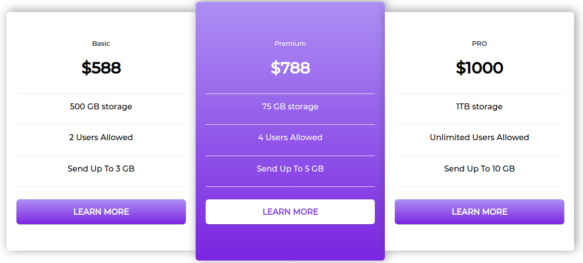
create-react-app grommet-appcd grommet-appyarn add grommet styled-componentsyarn startThe pricing component uses CardWrapper to contain all card components, CardContent to wrap content inside each card, and CardButton for actions on the cards.
import React from "react";
import styled from "styled-components";

export default function GrommetCard() {
  return (
    <>
       <CardWrapper>
        <Card left>
          <Div>
            <Div>
              <CardContent>
                <small>Basic</small>
                <h1>$588</h1>
              </CardContent>
              <CardContent>
                <p>500 GB storage</p>
              </CardContent>
              <CardContent>
                <p>2 Users Allowed</p>
              </CardContent>
              <CardContent>
                <p>Send Up To 3 GB</p>
              </CardContent>
            </Div>
            <CardButton secondary>LEARN MORE</CardButton>
          </Div>
        </Card>
   </CardWrapper>
    </>
  );
}
Style objects are defined using styled-components, starting with the card wrapper and then applying additional styles to the card elements.
const primaryGradient = "linear-gradient(hsl(236, 72%, 79%), hsl(237, 63%, 64%))";

const CardWrapper = styled.div`
  display: flex;
  justify-content: center;
  align-items: center;
  height: max-content;
  margin: 20px;
  @media all and (max-width: 1240px) {
    flex-direction: column;
  }
`;
const Card = styled.div`
min-width: 380px;
box-shadow: 3px -2px 19px 0px rgba(50, 50, 50, 0.51);
border-radius: ${(props) => (props.left ? " 6px 0 0 6px" : props.right ? "0 6px 6px 0" : "6px")};
background: ${(props) => (props.secondary === undefined ? "#fff" : primaryGradient)};
padding: 25px 20px;
height: ${(props) => (props.center ? "520px" : "480px")};
display: flex;
justify-content: center;
align-items: center;
@media all and (max-width: 1240px) {
margin-bottom: 20px;
border-radius: 6px;
height: 480px;
}
@media all and (max-width: 420px) {
min-width: 90%;
}
`;const CardButton = styled.div`
min-width: 100%;
padding: 10px 15px;
min-height: 50px;
box-shadow: 1px 1px 0 rgba(0, 0, 0, 0.2), 0px 0px 2px rgba(0, 0, 0, 0.2);
color: ${(props) => (props.secondary !== undefined ? "#fff" : "#7c7ee3")};
background: ${(props) => (props.secondary === undefined ? "#fff" : primaryGradient)};
text-align: center;
margin-top: 25px;
display: flex;
align-items: center;
justify-content: center;
font-weight: 600;
font-size: 16px;
border-radius: 6px;
`;
const CardContent = styled.div`
width: 100%;
color: ${(props) => (props.secondary !== undefined ? "#fff" : "#000")};
padding-bottom: 10px;
margin-bottom: 10px;
border-bottom: 1.3px solid #eee;
text-align: center;
`;
const Div = styled.div`
min-width: 100%;
`;Two additional cards are added with the same custom components, each wrapped with the defined style objects to improve styling consistency.
 <Card center secondary>
         <Div>
            <Div>
              <CardContent secondary>
                <small>Premium</small>
                <h1>$788</h1>
              </CardContent>
              <CardContent secondary>
                <p>75 GB storage</p>
              </CardContent>
              <CardContent secondary>
                <p>4 Users Allowed</p>
              </CardContent>
              <CardContent secondary>
                <p>Send Up To 5 GB</p>
              </CardContent>
            </Div>
            <CardButton>LEARN MORE</CardButton>
          </Div>
        </Card>

       <Card right>
          <Div>
            <Div>
              <CardContent>
                <small>PRO</small>
                <h1>$1000</h1>
              </CardContent>
              <CardContent>
                <p>1TB storage</p>
              </CardContent>
              <CardContent>
                <p>Unlimited Users Allowed</p>
              </CardContent>
              <CardContent>
                <p>Send Up To 10 GB</p>
              </CardContent>
            </Div>
            <CardButton secondary>LEARN MORE</CardButton>
          </Div>
        </Card>
      </CardWrapper>
    </>
  );
}
With all cards in place, the final result provides the complete pricing display.
Building A List App: The Real-world Example
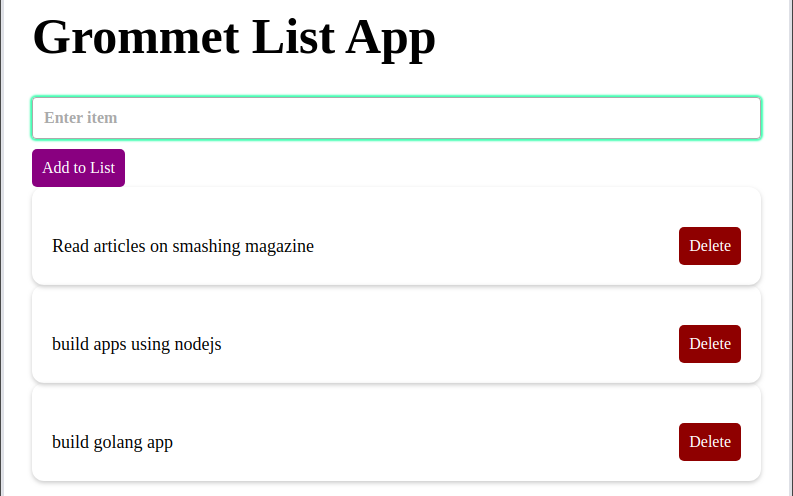
To see Grommet in a more complete application, we build a list manager where users can add, view, and delete items. State is managed with React's Context API, UI uses Grommet, and styled-components handle visual customization.
After initializing another React app and moving into that directory, the required packages are installed.
create-react-app list-appcd list-appyarn add grommet grommet-controls grommet-icons styled-componentsgrommet | Our UI component library |
grommet-controls, grommet-icons | Icons and controls packages we need to install to work with Grommet |
styled-components | For utilizing tagged literals for styling react components and grommet |
Setting Up The App Context
Since list data must be shared across components, the Context API provides a central store. This implementation uses createContext and useState hooks. The removeList function accepts an item parameter, spreads the current state, and splices out the object that matches the item meant for removal.
import React, { createContext, useState } from 'react';
export const Context = createContext();
const AppContext = ({children}) => {
  const [lists, setLists] = useState([]);
  const removeList = item => {
    let newLists = [...lists];

    lists.map((list, id) => {
      return list === item && newLists.splice(id, 1);
    });
    setLists(newLists);
  }
Methods for adding and deleting items are exposed through the Context.Provider, which accepts children props to let other components access the provided value. The lists object holds the list data, addToList accepts a newItem parameter for new lists, and deleteFromList handles removals.
return (
    <Context.Provider value={{
      lists,
      addToLists: (newItem) => setLists([...lists, newItem]),
      deleteFromList: (item) => removeList(item)
    }}>
      {children}
    </Context.Provider>
  )
}
export default AppContext;
The List And Display Components
The List component imports Card, CardBody, Box, Text, and Button from Grommet, then builds a card with a delete button that appears alongside any entry in the list. Styling for this component uses styled-components that are defined afterwards.
import React from "react";
import styled from "styled-components";
import { Card, CardBody, Box, Text, Button } from "grommet";
function List(props) {
  return (
    <StyledDiv>
      <Card>
        <CardBody className="card_body">
          <Box direction="row" className="item_box">
            <Text className="text">{props.list}</Text>
            <Box className="button_box">
              <Button
                onClick={props.deleteList.bind(this, props.list)}
                className="button"
              >
                Delete
              </Button>
            </Box>
          </Box>
        </CardBody>
      </Card>
    </StyledDiv>
  );
}
export default List;
const StyledDiv = styled.div`
.button {
background-color: #8b0000;
color: white;
padding: 10px;
border-radius: 5px;
}
.card_body {
padding: 20px;
margin-top: 20px;
}
.item_box {
justify-content: space-between;
}
.text {
margin-top: auto;
margin-bottom: auto;
}
`;

For displaying lists, ListDisplay wraps content in Context.Consumer from the app context. Inside a container div, the destructured list and deleteList methods from context are passed as props. Mapping through the lists returns new list items, with each returned object passed to the single List component.
import React from "react";
import List from "./List";
import { Context } from '../context/AppContext';
function ListDisplay() {
  return (
    <Context.Consumer>
      {(context) => (
        <div className="container">
          {context.lists.length ?
            context.lists.map((list, id) => (
              <List key={id} list={list} deleteList={context.deleteFromList} />
            )) : null
          }
        </div>
      )}
    </Context.Consumer>
  );
}
export default ListDisplay;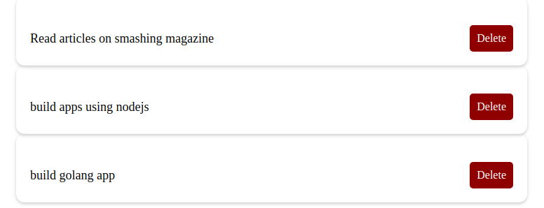
A Navbar For Adding Entries
The navbar component is the primary user interface. By wrapping in Context.Consumer, it accesses the context provider's properties. The component uses a Grommet Heading tag and includes an input form that adds lists through the addToList method, which takes the user's input as a value parameter. Finally, a Submit button handles the form submission.
import React, { useState } from "react";
import { Heading, Form, TextInput, Button } from "grommet";
import styled from "styled-components";
import { Context } from '../context/AppContext';
function Navbar() {
  const [value, setValue] = useState("");
  return (
    <Context.Consumer>
      {store => (
        <StyledDiv className="container">
          <Heading className="title">Grommet List App</Heading>
          <Form onSubmit={() => store.addToLists(value)} className="form-group">
            <TextInput
              className="form"
              value={value}
              type="text"
              onChange={(e) => setValue(e.target.value)}
              placeholder="Enter item"
            />
            <Button type='submit' className="button">Add to List</Button>
          </Form>
        </StyledDiv>
      )}
    </Context.Consumer>
  );
}
const StyledDiv = styled.div`
  .button {
    margin-top: 10px;
    background-color: purple;
    color: white;
    padding: 10px;
    border-radius: 5px;
  }
`;
export default Navbar;
When structured this way, the application demonstrates how Grommet integrates with state management and styling for a functioning interface.
Wrapping Up With Grommet
Grommet’s focus on accessibility and responsive design makes it a strong fit for React interfaces that need to work across devices without heavy custom CSS. Its theming system and pre-built components can significantly reduce development time for common UI patterns like forms, navigation, and pricing tables.
In the walkthrough, we built a pricing component and a task list application, demonstrating how to leverage Grommet’s grid, card, and form elements while keeping the markup clean and accessible. The finished examples are available for reference: the list application code is hosted on Codesandbox, and the pricing component can be viewed here.
Useful Resources
- Official Grommet documentation – API references, theme options, and component guides.
- An introduction to Grommet – A primer on the library’s core concepts.
- Introduction to React’s Context API – Helpful for managing theme or state across Grommet apps.
Further Reading
- The Safest Way To Hide Your API Keys When Using React
- Meet Codux: The React Visual Editor That Improves Developer Experience
- In Search Of The Ideal Privacy Icon
- Creating Accessible UI Animations



