

CSS Shapes, specifically the shape-outside property, assigns a geometric shape to a floated element, and surrounding content then wraps along that shape's boundary. Most demos of the standard target editorial text flowing beside an image. Swap the text for user controls, though, and the same mechanics produce curved, diagonal and otherwise fluid layouts for navigation and interactive elements.
Aligning controls to a product silhouette
The first pattern suits product pages, where action controls line up with the outline of the product itself.
<form>
  <img src="./img/bottle.png" alt="A tall refreshing and unopened bottle of Coca-Cola, complete with red bottle cap and the classic Coke logo in white.">
    <div>
      <input type="radio" id="one" name="coke" checked>
      <label for="one">One Bottle</label>
    </div>
    <div>
      <input type="radio" id="six" name="coke">
      <label for="six">Six Pack</label>
    </div>
    <div>
      <input type="radio" id="twelve" name="coke">
      <label for="twelve">Twelve Pack</label>
    </div>
    <div>
      <input type="radio" id="crate" name="coke">
      <label for="crate">Entire Crate</label>
    </div>
  </form>
img {
height: 600px;
float: left;
shape-outside: url("bottle.png");
filter: brightness(1.5);
}
input {
-webkit-appearance: none;
appearance: none;
width: 25px;
height: 25px;
margin-left: 20px;
box-sizing: content-box;
border: 10px solid #231714;
border-radius: 50%;
background: linear-gradient(45deg, pink, beige);
cursor: pointer;
}The product image is floated left and the image file itself is referenced as the shape boundary via shape-outside. The radio buttons get a custom style in place of the browser default, and once the shape is applied, they arrange themselves along the bottle without any per-button positioning. Controls added later fall in line with the existing ones along the same silhouette.
One constraint: only images with transparent backgrounds yield shapes that follow the image's outline.
Wrapping links on both sides
A main menu inspired by the Wikipedia homepage shows how far the approach stretches.
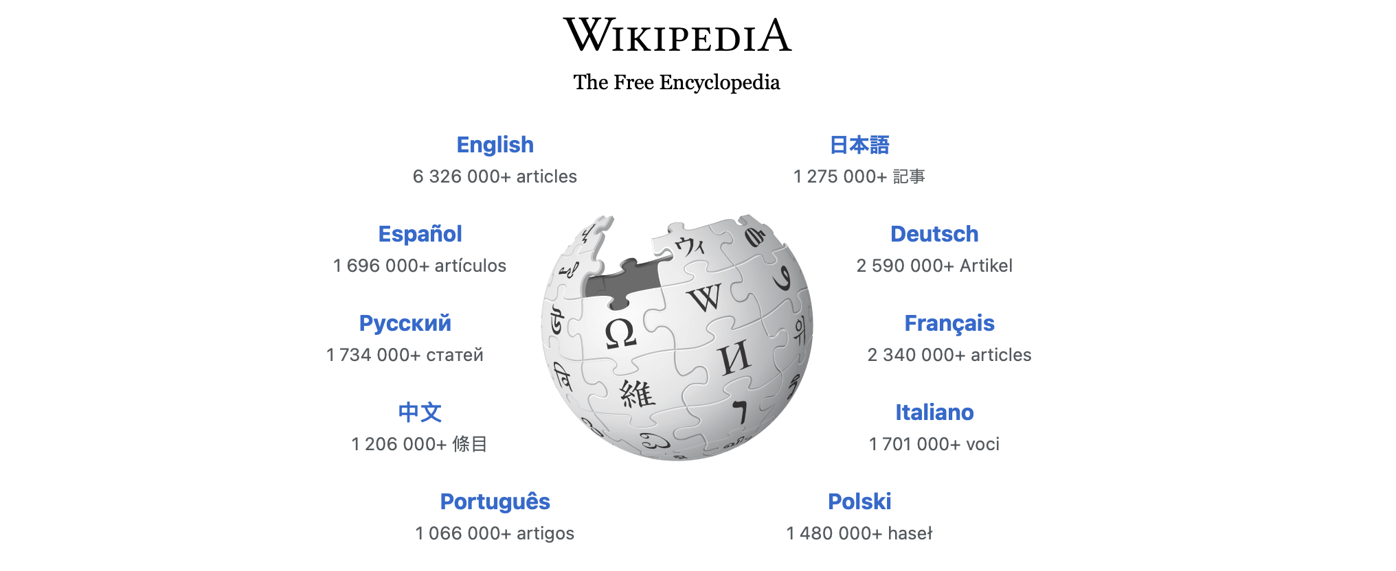
The build is manageable with shape-outside:
<div>
  <img src="earth.png">
  <div class="left">
    <a href="#">Formation</a><br>
    <a href="#">Atmosphere</a><br>
    <a href="#">Heat</a><br>
    <a href="#">Gravitation</a>
  </div>
</div>
<div>
  <img src="earth.png">
  <div class="right">
    <a href="#">Moon</a><br>
    <a href="#">Climate</a><br>
    <a href="#">Rotation</a><br>
    <a href="#">Orbit</a>
  </div>
</div>
img {
height: 250px;
float: left;
shape-outside: circle(40%);
}
/* stack both sets of menus on the same grid cell */
main > div { grid-area: 1/1; }
/* one set of menus is flipped and moved sideways over the other */
.right { transform: rotatey(180deg) translatex(250px); }
/* links inside the flipped set of menus are rotated back */
.right > a {
display: inline-block;
transform: rotateY(180deg) translateX(-40px);
}
/* hide one of the images */
main > div:nth-of-type(2) img { visibility: hidden; }Floats only go left or right — there is no centered float with content wrapping on both sides. To get links on both sides of the image, the design uses two sets of links, with one set flipped horizontally. Both sets reference the same image with a circle() shape value so the shapes still match after the flip. Flipping leaves that set's link text sideways and upside down, so the text is rotated back. The two images can sit stacked with no visible overflow, but it's best to hide one through opacity or visibility.
Progressive disclosure with <details>
The third example uses the <details> element, making it a fit for extra product information that stays hidden until requested.
<img src="diamond.png">
<details>
  <summary>Click to know more!</summary>
  <ul>
    <li>The diamond is now known as the Sancy
    <li>It comprises two back-to-back crowns
    <li>It's likely of Indian origin
  </ul>
</details>
img {
height: 200px;
float: left;
shape-outside: url("diamond.png");
shape-margin: 20px;
}
summary {
background: red;
color: white;
cursor: pointer;
font-weight: bold;
width: 80%;
height: 30px;
line-height: 30px;
}The image floats left with a shape matching the image, and shape-margin adds margin space around that shape. Clicking the <summary> element makes the parent <details> reveal its content, which wraps along the diamond shape automatically. The revealed content doesn't have to be a list — any inline content wraps along the floated image's shape.
Polygon shapes and diagonal menus
Instead of an image or a simple circle or ellipse, the last example uses a polygon, which yields angular geometry that can be adjusted by adding another coordinate.
<img src="nasa.png">
<div><!-- triangle --></div>
<ul>
  <li><a href="#">Home</a>
  <li><a href="#">Projects</a>
  <li><a href="#">Shop</a>
  <li><a href="#">Contact</a>
  <li><a href="#">Media</a>
</ul>
div {
width: 0;
height: 0;
--d: 200px;
/* red triangle */
border-right: var(--d) solid transparent;
border-bottom: var(--d) solid transparent;
border-left: var(--d) solid red;
float: left;
/* triangle CSS shape */
shape-outside: polygon(0 0, var(--d) 0, 0 var(--d));
}
ul {
list-style: none;
padding-top: 25px;
}A red triangle is built with border properties and floated left. A matching triangular CSS shape is supplied through the polygon() function, whose value is the triangle's three comma-separated coordinates. The links align around the floated triangle, producing a slanted menu that runs down the hypotenuse.
For even a plain diagonal arrangement, CSS Shapes add more to a design than rotating a row of controls: rotation also turns the alignment of the individual controls and their text, which creates layout awkwardness. A CSS Shape simply lays each control out along the shape's boundary.




