

Kitty Giraudel's folded-corner technique relies on CSS clip-path, a versatile shaping feature that works in every browser. The newer corner-shape property can produce the same effect with less code — though support currently stops at Chrome, with Safari and Firefox falling back to a plain rounded corner. The approach below treats the fold as a small utility that takes two coordinates and derives the whole geometry from them.
How border-radius corners are built
A rounded corner is defined by two coordinates: the x-axis value moves away from the corner horizontally, the y-axis value vertically, and border-radius draws the curvature between them. Storing those values as CSS variables keeps them reusable, makes the fold animatable, and lets the result stay reasonably realistic.
:root {
  /* x-axis coordinate */
  --x-coord: 9rem;

  /* y-axis coordinate */
  --y-coord: 5rem;
}
Forming the crease and the flip side
border-top-right-radius sets the corner coordinates, while corner-top-right-shape: bevel draws a straight line between them rather than a curve. This works because border-radius implicitly includes corner-shape: round; switching to bevel is what turns the corner into a fold.
/* Square */
div {
  /* Place coordinates */
  border-top-right-radius: var(--x-coord) var(--y-coord);

  /* Draw line between coordinates */
  corner-top-right-shape: bevel;
}
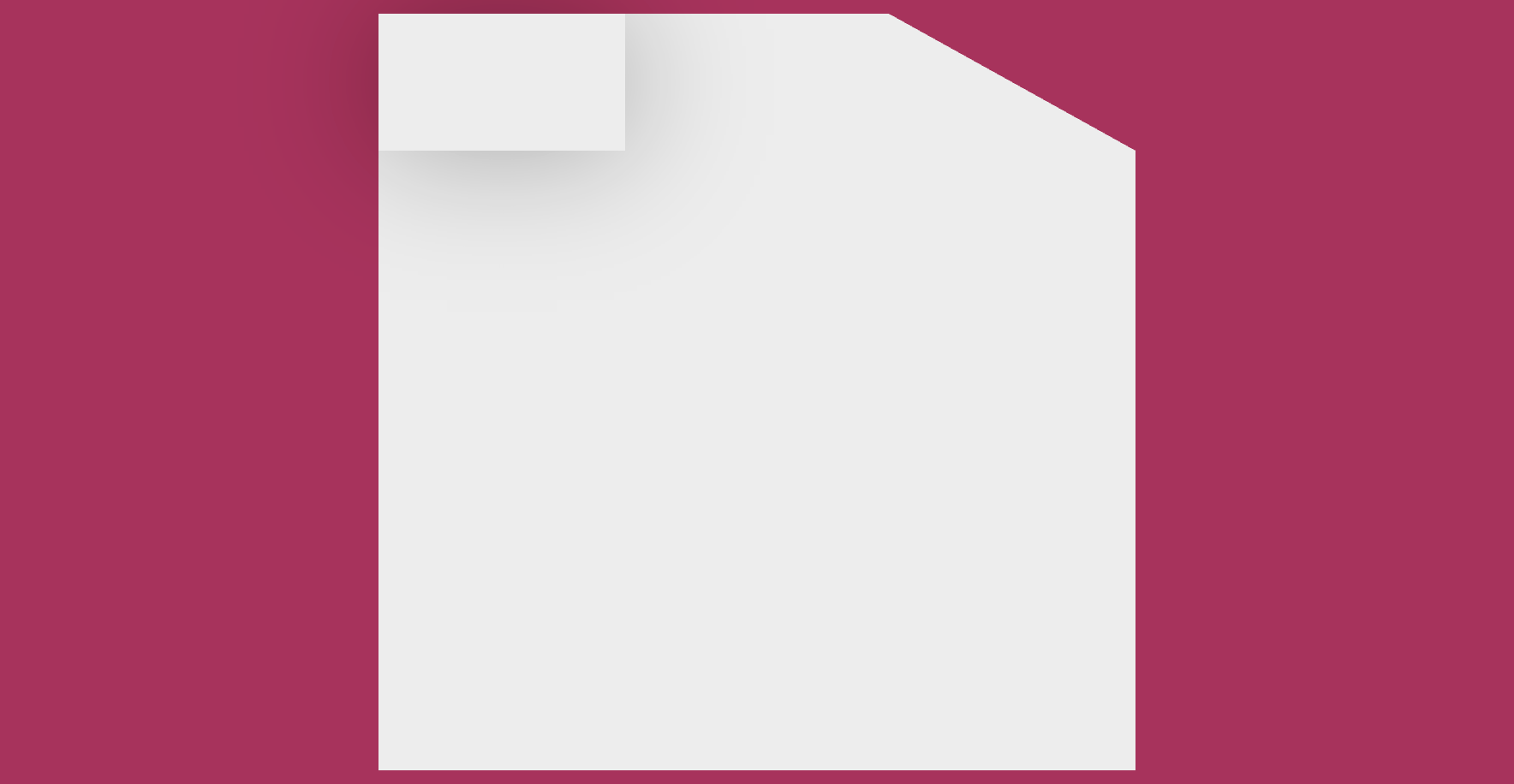
The flip side itself is a ::before pseudo-element with content: "" and an inherited background. Its dimensions are built from the saved coordinates, and a box-shadow whose blur radius scales with --x-coord and --y-coord completes the illusion; the formula can be adapted freely.
/* Square */
div {
  /* Place coordinates */
  border-top-right-radius: var(--x-coord) var(--y-coord);

  /* Draw line between coordinates */
  corner-top-right-shape: bevel;

  /* Flip side */
  &::before {
    /* Generate empty element */
    content: "";

    /* Inherit background */
    background: inherit;

    /* Same as coordinates */
    width: var(--x-coord);
    height: var(--y-coord);

    /* Scale blur radius with --x-coord and --y-coord */
    box-shadow: 0 0 calc((var(--x-coord) + var(--y-coord)) / 3) #00000050;
  }
}
Positioning without anchor positioning
The square gets position: relative and ::before gets position: absolute, so the pseudo-element positions against its parent. Declaring inset: 0 0 auto auto aligns it to the top-right corner, and overflow: clip on the square trims the half of ::before that overflows. Anchor positioning exists precisely to solve positioning outside parent-child relationships, but it is not needed here.
/* Square */
div {
  /* Place coordinates */
  border-top-right-radius: var(--x-coord) var(--y-coord);

  /* Draw line between coordinates */
  corner-top-right-shape: bevel;

  /* Clip any overflow */
  overflow: clip;

  /* For alignment */
  position: relative;

  /* Flip side */
  &::before {
    /* Generate empty element */
    content: "";

    /* Inherit background */
    background: inherit;

    /* Same as coordinates */
    width: var(--x-coord);
    height: var(--y-coord);

    /* Scale blur radius with --x-coord and --y-coord */
    box-shadow: 0 0 calc((var(--x-coord) + var(--y-coord)) / 3) #00000050;

    /* For alignment */
    position: absolute;

    /* Align to top-right */
    inset: 0 0 auto auto;
  }
}
Refining the perspective of the crease
Adding corner-bottom-left-shape: bevel to ::before makes one more straight cut and sharpens the fold. Plenty of other choices exist depending on how sharp the crease should be, how raised the flip side appears, and from what angle the square is viewed; a sharp crease, a lifted flip side and an aerial view are the targets here, and the shadow affects the outcome as well.
/* Ensure realistic fold */
@container style(--x-coord < --y-coord) {
  border-bottom-left-radius: 100% calc(100% - var(--x-coord));
}

@container style(--x-coord >= --y-coord) {
  border-bottom-left-radius: calc(100% - var(--y-coord)) 100%;
}
The refinement that matters uses container style queries with the range syntax. When --x-coord is smaller than --y-coord, the code subtracts --x-coord from 100% and uses the result as the y-axis coordinate of border-bottom-left-radius, with the other axis at 100%. When --x-coord is greater than or equal to --y-coord, it subtracts --y-coord from 100% and uses that as the x-axis coordinate, again with the other axis at 100%. Crease, shadow and perspective all follow from the two coordinates. slideVars toggles in the demo let you test various coordinate combinations directly.
A min()-based failsafe can keep coordinates inside the square's dimensions so the effect doesn't break. The example below assigns --y-coord an impossible 999999999rem and caps it at the square's height — although such a guard is unlikely to be needed in practice.
--x-coord: min(--square-width, 9rem);
--y-coord: min(--square-height, 999999999rem);
Container style queries could be swapped for if() functions, which are shorter but harder to read.
clip-path versus corner-shape
Giraudel's clip-path version works everywhere, and because clip-path is the more versatile shaping feature, it offers more room for customization — it is arguably the more "correct" approach. The corner-shape version is cleaner and probably needs no further customization at all, but it lacks Safari and Firefox support for now. Unless folded corners are needed today, both are worth bookmarking:
:root {
  /* x-axis coordinate */
  --x-coord: 9rem;

  /* y-axis coordinate */
  --y-coord: 5rem;

  /* Square */
  div {
    /* Place coordinates */
    border-top-right-radius: var(--x-coord) var(--y-coord);

    /* Draw line between coordinates */
    corner-top-right-shape: bevel;

    /* Clip any overflow */
    overflow: clip;

    /* For alignment */
    position: relative;

    /* Flip side */
    &::before {
      /* Generate empty element */
      content: "";

      /* Inherit background */
      background: inherit;

      /* Same as coordinates */
      width: var(--x-coord);
      height: var(--y-coord);

      /* Scale blur radius with --x-coord and --y-coord */
      box-shadow: 0 0 calc((var(--x-coord) + var(--y-coord)) / 3) #00000050;

      /* For alignment */
      position: absolute;

      /* Align to top-right */
      inset: 0 0 auto auto;

      /* Draw line between coordinates */
      corner-bottom-left-shape: bevel;

      /* Ensure realistic fold */
      @container style(--x-coord < --y-coord) {
        border-bottom-left-radius: 100% calc(100% - var(--x-coord));
      }

      @container style(--x-coord >= --y-coord) {
        border-bottom-left-radius: calc(100% - var(--y-coord)) 100%;
      }
    }
  }
}



