

Notifying Users With vue-notification
Most applications need to surface feedback like success messages, error alerts, or general information during user interaction. vue-notification offers a clean way to display such messages with built-in animations, without much configuration. Install it with Yarn or npm:
yarn add vue-notification
npm install --save vue-notification
Once installed, register the plugin in your app's entry point (main.js):
//several lines of existing code in the file
    import Notifications from 'vue-notification'
    Vue.use(Notifications)
To make notifications available everywhere without repeating setup, add the notification component to App.vue. Since components in this file persist across all routes, notifications can be triggered from any page or component without extra registration.
<template>
  <div id="app">
    <div id="nav">
      <router-link to="/">Home</router-link> |
      <router-link to="/about">Notifications</router-link>
    </div>
    <notifications group="demo"/>
    <router-view />
  </div>
</template>
The component accepts several props that control its behavior, including:
group— defines categories of notifications (e.g., form validation vs. API responses) so each can have its own styles and behavior.type— assigns a class name used to style each notification. Common values aresuccess,error, andwarn, and you can target them with the format.vue-notification.warn.duration— sets how long a notification stays visible (in milliseconds); use a negative number like-1to keep it visible until clicked.position— determines where notifications appear, such astop left,top right, orbottom center.
Configure these props where you add the component, along with styling for each notification type:
<template>
  <div id="app">
    <div id="nav">
      <router-link to="/">Home</router-link> |
      <router-link to="/about">Notifications</router-link>
    </div>
    <notifications
      :group="group"
      :type="type"
      :duration="duration"
      :position="position"
    />
    <router-view />
  </div>
</template>
<script>
  export default {
    data() {
      return {
        duration: -1,
        group: "demo",
        position: "top center",
        type: "info",
      };
    },
  };
</script>
<style>
  .vue-notification.info {
    border-left: 0;
    background-color: orange;
  }
  .vue-notification.success {
    border-left: 0;
    background-color: limegreen;
  }
  .vue-notification.error {
    border-left: 0;
    background-color: red;
  }
</style>
You can also override type, duration, and other props at the call site. Displaying a notification from any Vue file looks like this:
this.$notify({
  group: "demo",
  type: "error",
  text: "This is an error notification",
});
In this example, the group matches the component instance we registered, while type and text (the message content) are set dynamically. Additional prop options and setup details are available in the official documentation.
Form Validation With Vuelidate
Form fields are everywhere on the web, and validating user input is a common requirement. Rather than writing validation logic from scratch, the Vuelidate package provides a straightforward mechanism for adding validation rules to Vue forms.
Install Vuelidate with your preferred package manager:
yarn add vuelidate
npm install vuelidate --save
Then configure it in your app's entry file:
import Vuelidate from 'vuelidate'
Vue.use(Vuelidate)
For a form with fields such as fullName, age, email, and password, you can define rules per field. Vuelidate includes built-in validators; for example, enforcing a minimum length of 10 on fullName or a minimum value of 18 on age means importing the relevant validators and adding a validations property:
<script>
  import {
    required,
    minLength,
    minValue,
    email,
  } from "vuelidate/lib/validators";
  export default {
    validations: {
      form: {
        email: {
          email,
          required,
        },
        fullName: {
          minLength: minLength(10),
          required,
        },
        age: {
          required,
          minValue: minValue(18),
        },
      },
    },
  };
</script>
When you inspect the devTools after entering data, the $v computed property is exposed and offers useful checks. $v.form.age.minValue, for instance, returns false if the entered age is below the threshold for that validator.
Custom Validation Rules
Some validation needs aren't covered by built-in validators. Vuelidate allows you to write custom validators using a RegEx. For example, to ensure a password has an uppercase letter, a lowercase letter, a special character, a number, and a minimum length of six:
<script>
  import {
    required,
    minLength,
    minValue,
    email,
  } from "vuelidate/lib/validators";
  export default {
    validations: {
      form: {
//existing validator rules
        password: {
          required,
          validPassword(password) {
            let regExp = /^(?=.*[0-9])(?=.*[!@#$%^&*])(?=.*[A-Z]+)[a-zA-Z0-9!@#$%^&*]{6,}$/;
            return regExp.test(password);
          },
        },
      },
    },
  };
</script>
If you enter a password that doesn't satisfy any of the criteria in that pattern, the custom validator (e.g., validPassword) will evaluate to false.
Showing Errors and Handling Submission
Once validations work, communicate the issues clearly. Don't rely only on inspecting $v — the UX problem isn't detection but display timing. Error messages should not appear before the user has interacted with the form. Add them conditionally on a submitted state that only flips to true once the submit button is clicked:
<template>
  <form @submit.prevent="login" class="form">
    <div class="input__container">
      <label for="fullName" class="input__label">Full Name</label>
      <input
        type="text"
        name="fullName"
        id="fullName"
        v-model="form.fullName"
        class="input__field"
      />
      <p class="error__text" v-if="submitted && !$v.form.fullName.required">
        This field is required
      </p>
    </div>
    <div class="input__container">
      <label for="email" class="input__label">Email</label>
      <input
        type="email"
        name="email"
        id="email"
        v-model="form.email"
        class="input__field"
      />
      <p class="error__text" v-if="submitted && !$v.form.email.required">
        This field is required
      </p>
      <p class="error__text" v-if="submitted && !$v.form.email.email">
        This email is invalid
      </p>
    </div>
    <div class="input__container">
      <label for="email" class="input__label">Age</label>
      <input
        type="number"
        name="age"
        id="age"
        v-model="form.age"
        class="input__field"
      />
      <p class="error__text" v-if="submitted && !$v.form.age.required">
        This field is required
      </p>
    </div>
    <div class="input__container">
      <label for="password" class="input__label">Password</label>
      <input
        type="password"
        name="password"
        id="password"
        v-model="form.password"
        class="input__field"
      />
      <p class="error__text" v-if="submitted && !$v.form.password.required">
        This field is required
      </p>
      <p
        class="error__text"
        v-else-if="submitted && !$v.form.password.validPassword"
      >
        Password should contain at least a lower case letter, an upper case
        letter, a number and a special character
      </p>
    </div>
    <input type="submit" value="LOGIN" class="input__button" />
  </form>
</template>
When errors have been resolved, only then should you process the data. The $invalid property tells you whether the entire form passes all validators. If it evaluates to false, all rules have passed:
methods: {
      login() {
        this.submitted = true;
        let invalidForm = this.$v.form.$invalid;
        //check that every field in this form has been entered correctly.
        if (!invalidForm) {
          // process the form data
        }
      },
    },
You can use this same result to toggle the submit button's disabled state or its style. That way the response to validation failures (inline error messages, submission blocks, button states) becomes a coherent UX flow presented in predictable stages.
Keeping Vuex State Alive Across Sessions
Vuex store data is held in memory, which means it disappears the moment a user refreshes the page or opens the app in a new tab. That becomes a real problem when you’re storing things like a user token or profile data and then relying on a navigation guard to protect routes. If the store is empty, the guard thinks the user isn’t authenticated and kicks them back to the login screen. vuex-persistedstate solves this by writing the store to localStorage (or another storage backend) so it survives reloads.
Setting Up the Plugin
Install vuex-persistedstate via your preferred package manager:
yarn add vuex-persistedstate
npm install --save vuex-persistedstate
Once installed, wire it into the store as a plugin. By default, everything in the Vuex store will be persisted to localStorage, but the library also supports sessionStorage and cookie-based storage.
import Vue from 'vue'
import Vuex from 'vuex'
import createPersistedState from "vuex-persistedstate";
Vue.use(Vuex)
export default new Vuex.Store({
    state: {},
    mutations: {},
    actions: {},
    modules: {},
    plugins: [createPersistedState()]
})
import Vue from 'vue'
import Vuex from 'vuex'
import createPersistedState from "vuex-persistedstate";
Vue.use(Vuex)
export default new Vuex.Store({
    state: {},
    mutations: {},
    actions: {},
    modules: {},
  // changes storage to sessionStorage
    plugins: [createPersistedState({ storage: window.sessionStorage });
]
})
A Practical Example: Persisting a Logged-In User
To see it in action, add a user state that will hold data submitted from a form. Define a mutation (SET_USER) to update that state and an action (getUser) that accepts a user object and commits the mutation.
import Vue from 'vue'
import Vuex from 'vuex'
import createPersistedState from "vuex-persistedstate";
Vue.use(Vuex)
export default new Vuex.Store({
    state: {
        user: null
    },
    mutations: {
        SET_USER(state, user) {
            state.user = user
        }
    },
    actions: {
        getUser({ commit }, userInfo) {
            commit('SET_USER', userInfo)
        }
    },
    plugins: [createPersistedState()]
})
After the form passes validation, dispatch the getUser action with the entered data:
methods: {
    login() {
      this.submitted = true;
      let invalidForm = this.$v.form.$invalid;
      let form = this.form;
      //check that every field in this form has been entered correctly.
      if (!invalidForm) {
        // process the form data
        this.$store.dispatch("getUser", form);
      }
    },
  },
In the browser’s DevTools, open the Applications tab and expand localStorage. You should see a key named vuex holding your persisted state:
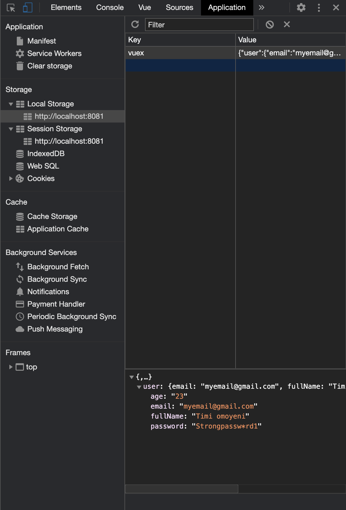
From that point on, refreshing the browser or opening a fresh tab will not wipe the user state, since it’s restored from storage before the app runs.
Finding the Right Libraries
The Vue ecosystem has no shortage of useful packages, but tracking them down takes effort. Two solid starting points are vuejsexamples.com and madewithvuejs.com.
When comparing options, check whether a library does exactly what you need and whether it’s actively maintained. A stale dependency is a liability — it can quietly break your app in a future update.
Further Reading
- Vue.js Notifications, GitHub
- Vuelidate, official website
- Form Validation In Under An Hour With Vuelidate, Sarah Drasner, CSS-Tricks
vuex-persistedstate, Yarn


