

Grid Starts With Display
CSS Grid is enabled through the display property. When you set display: grid on an element, you get a block-level box whose direct children become grid items and participate in a grid formatting context. Without any explicit columns or rows, the browser defaults to a single-column grid that generates as many implicit rows as needed to hold every direct child. Visually, those items still stack like ordinary block elements.
The shift is more obvious when the container has mixed content. Text nodes that are direct children get wrapped in anonymous elements and become grid items, and inline elements like span also turn into grid items once their parent is a grid container. An element with two block-level children plus a string of text containing a span produces five separate grid items: the two block elements, the text segment before the span, the span, and the trailing text segment.
See the Pen Grid Container: Direct children and strings of text become grid items by Rachel Andrew (@rachelandrew) on CodePen.
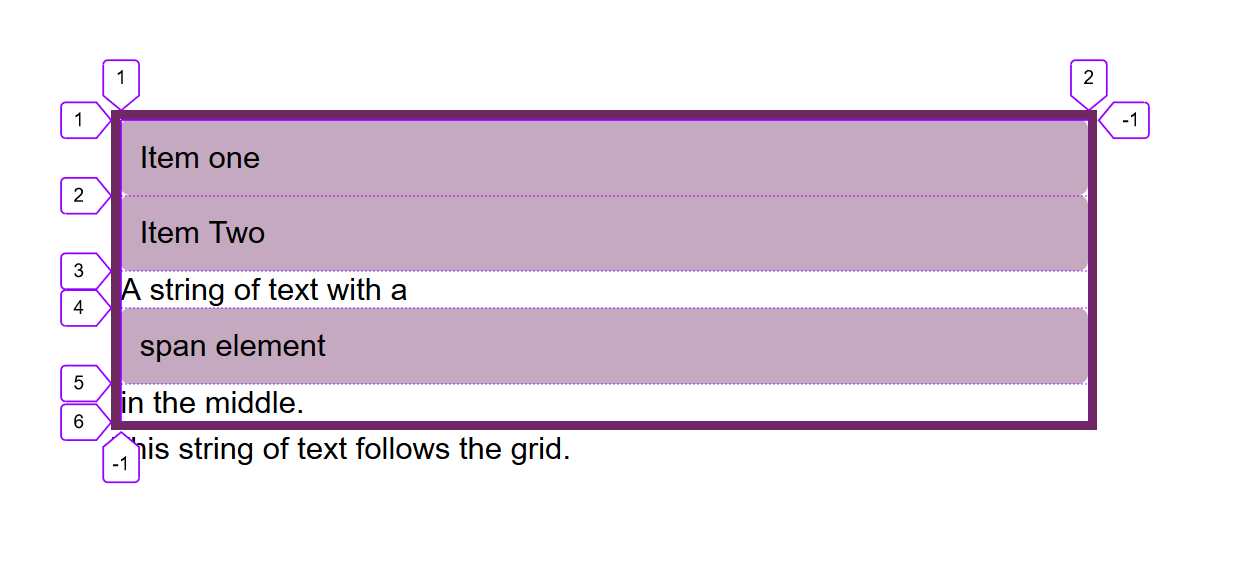
Using display: inline-grid creates an inline-level container while leaving the inner grid behavior unchanged. Only the outer display type changes, so descendants still behave as grid items, but the container itself no longer stretches across the available inline space the way a block-level box does.
See the Pen Grid Container: inline-grid by Rachel Andrew (@rachelandrew) on CodePen.
Going forward, two-value display syntax will make this distinction explicit with display: block grid and display: inline grid.
Building Columns and Rows
To get a visual grid, add tracks using grid-template-columns and grid-template-rows. Each accepts a space-separated track list, which specifies line names and track sizing functions for that axis.
grid-template-columns: 100px 100px 200px; | Creates a three-column grid: The first column is 100px, the second 100px, the third 200px. |
grid-template-columns: min-content max-content fit-content(10em) | Creates a three-column grid: The first column is the min-content size for that track, the second the max-content size. The third is either max-content unless the content is larger than 10em, in which case it is clamped to 10em. |
grid-template-columns: 1fr 1fr 1fr; | Creates a three-column grid using the fr unit. The available space in the grid container is divided into three and shared between the three columns. |
grid-template-columns: repeat(2, 10em 1fr); | Creates a four-column grid with a repeating pattern of 10em 1fr 10em 1fr as the track-list in the repeat statement is repeated twice. |
grid-template-columns: repeat(auto-fill, 200px); | Fills the container with as many 200px columns as will fit leaving a gap at the end if there is spare space. |
grid-template-columns: repeat(auto-fill, minmax(200px, 1fr)); | Fills the container with as many 200px columns as will fit then distributes the remaining space equally between the created columns. |
grid-template-columns: [full-start] 1fr [content-start] 3fr [content-end] 1fr [full-end]; | Creates a three-column grid: The first and third columns have 1 part each of the available space while the middle column has 3 parts. The lines are named by putting line names in square brackets. |
All of these approaches are valid. Track sizes can come from length units, percentages, intrinsic sizing keywords, the fr flex unit, or the repeat() and minmax() functions.
Lengths and Intrinsic Keywords
Any length unit or percentage can size a track. If the tracks total less than the container’s width, the leftover space sits at the end by default, because the initial value of justify-content (and align-content) is start. You can change this with the alignment properties.
See the Pen Grid Container: length units by Rachel Andrew (@rachelandrew) on CodePen.
Intrinsic sizing keywords offer content-aware options:
min-contentmakes the track as small as possible without overflow, so text wraps wherever possible and the track shrinks to the longest word or largest fixed element.max-contentprevents soft wrapping; long text goes unbroken, which can easily overflow its track.fit-content()takes a maximum value. The track behaves likemax-contentuntil its argument, then switches to normal wrapping. The track can end up smaller than the passed-in value, never larger.
See the Pen Grid Container: min-content, max-content, fit-content() by Rachel Andrew (@rachelandrew) on CodePen.
When tracks exceed the container’s size, they overflow. With percentage-based tracks, keep the total at or below 100% to avoid unintended overflow.
The fr Flex Unit
The fr unit sizes tracks flexibly relative to available space. It is not a length and cannot be used inside calc(). A track list of 1fr 1fr 1fr splits the available space into three equal parts. A list like 2fr 1fr 1fr divides the space into four shares, giving the first track two parts and the others one each.
See the Pen Grid Container: fr by Rachel Andrew (@rachelandrew) on CodePen.
One common trap is that fr distributes available space only — space already occupied by unbreakable content is excluded first. A long, unbreakable string like ItemThree with spaces removed shifts the distribution, because that item’s layout is accounted for before the rest is shared.
See the Pen Grid Container: fr with larger content by Rachel Andrew (@rachelandrew) on CodePen.
Combining fr with fixed-length tracks is where it shines. A component with two fixed columns and a flexible middle takes only a few lines:
See the Pen Grid Container: mixing fr units and fixed-size tracks by Rachel Andrew (@rachelandrew) on CodePen.
The same pattern works well with intrinsic sizing. A track of fit-content(300px) paired with a 1fr track yields a flexible layout: if the first track’s content is under 300px, it takes only what it needs and the flexible track fills the rest; if content exceeds 300px, the first track caps out and the rest of the space goes to the flexible track.
See the Pen Grid Container: mixing fr and fit-content() by Rachel Andrew (@rachelandrew) on CodePen.
Repeating Track Lists
The repeat() function avoids repeated values in a track list. These two declarations are identical, as are many longer patterns you can compress this way:
grid-template-columns: 1fr 1fr 1fr 1fr 1fr 1fr 1fr 1fr 1fr 1fr 1fr 1fr;
grid-template-columns: repeat(12, 1fr);
The first argument before the comma is the repetition count; the second argument can itself be multiple values so you can repeat an entire pattern. repeat() can also occupy just part of a track list, giving you mixed layout rules in a single declaration:
grid-template-columns: 1fr repeat(3,200px) 1fr
Instead of a fixed repetition count, you can use auto-fill or auto-fit. Both cause the container to be filled with as many tracks as fit. With fixed-length tracks, empty space remains if the container width doesn’t divide evenly, as a 500px container with 200px tracks demonstrates — it gets two tracks plus leftover space.
See the Pen Grid Container: auto-fill by Rachel Andrew (@rachelandrew) on CodePen.
Combining repeat() with minmax() solves the leftover-space problem. minmax(200px, 1fr) sets a minimum of 200px and allows each track to grow into a share of the remaining space:
See the Pen Grid Container: auto-fill and minmax() by Rachel Andrew (@rachelandrew) on CodePen.
auto-fill and auto-fit diverge only when content doesn’t fill the first row. With auto-fill, all tracks that can fit maintain their sizing even if empty:
See the Pen Grid Container: auto-fill and minmax() with one item by Rachel Andrew (@rachelandrew) on CodePen.
auto-fit collapses any empty tracks to zero, so the track count that appears in your layout reflects only the tracks holding content:
See the Pen Grid Container: auto-fit and minmax() with one item by Rachel Andrew (@rachelandrew) on CodePen.

Named Lines
Grid always provides numbered lines, but you can also assign names inside square brackets. A line can carry multiple names separated by spaces. The full set of track lines can each get two names that you can reference later when placing items:
grid-template-columns: [main-start sidebar-start] 1fr [sidebar-end content-start] 4fr [content-end main-end]
Names must not be span, which is reserved. Line-based placement and the use of named lines in item positioning are the next step in working with solid grid layouts.
Explicit And Implicit Grids
When you define tracks with grid-template-columns and grid-template-rows, you are setting up the explicit grid. That is the grid you declared, with the track sizes you specified.
If you have more items than your defined tracks can hold, or an item is placed outside those bounds, the browser creates additional tracks in the implicit grid. These implicit tracks are auto-sized by default. This was visible earlier when we set display: grid on the parent: rows were generated for each item, even though no rows were explicitly defined.
To control the size of implicitly created rows or columns, use grid-auto-rows or grid-auto-columns. These properties accept a track-listing. For instance, to make all implicit columns at least 200 pixels tall while allowing them to expand with content:
grid-auto-rows: minmax(200px, auto)
You can also pass multiple values so that, for example, the first implicit row sizes automatically while the second is min-content-driven:
grid-auto-rows: auto 100px
See the Pen Grid Container: grid-auto-rows by Rachel Andrew (@rachelandrew) on CodePen.
Auto-Placement In Practice
Defining a grid and letting the browser auto-place items is enough for many common layouts. No explicit item placement is needed — the browser follows source order, placing one item per cell.
For those new to CSS Grid, experimenting with different track sizes and observing how items drop into the resulting cells is an excellent starting point.
- Part 1: Creating A Grid Container
- Part 2: Grid Lines
- Part 3: Grid Template Areas
Further Reading
- In Praise Of The Basics
- How To Build A Magazine Layout With CSS Grid Areas
- Useful DevTools Tips and Tricks
- How To Design Effective Conversational AI Experiences: A Comprehensive Guide



