

Mobile navigation usually defaults to a JavaScript hamburger menu. Three patterns can replace it.
For most teams, the mobile navigation pattern of choice is the "hamburger" menu: a button that uses a little JavaScript to expand a vertical list of links. It is not the only option, though. Depending on the context and contents of the navigation, a JavaScript-free method may do the job while delivering a more accessible experience.
Progressive enhancement favors building pages for the oldest and least capable technology first, then layering enhancements on as support allows. If a basic experience already holds up, it is worth asking whether the page needs JavaScript at all. Keeping scripts out of the navigation means users can still get around when JavaScript is disabled or a network problem stops scripts from loading.
Option 1: Move the menu to its own page
Navigation does not have to live in the header of every page. When the front end is extremely lightweight or the menu holds a long list of items, a dedicated page listing every link can be the most practical route. The lightweight WordPress theme Susty takes this approach.
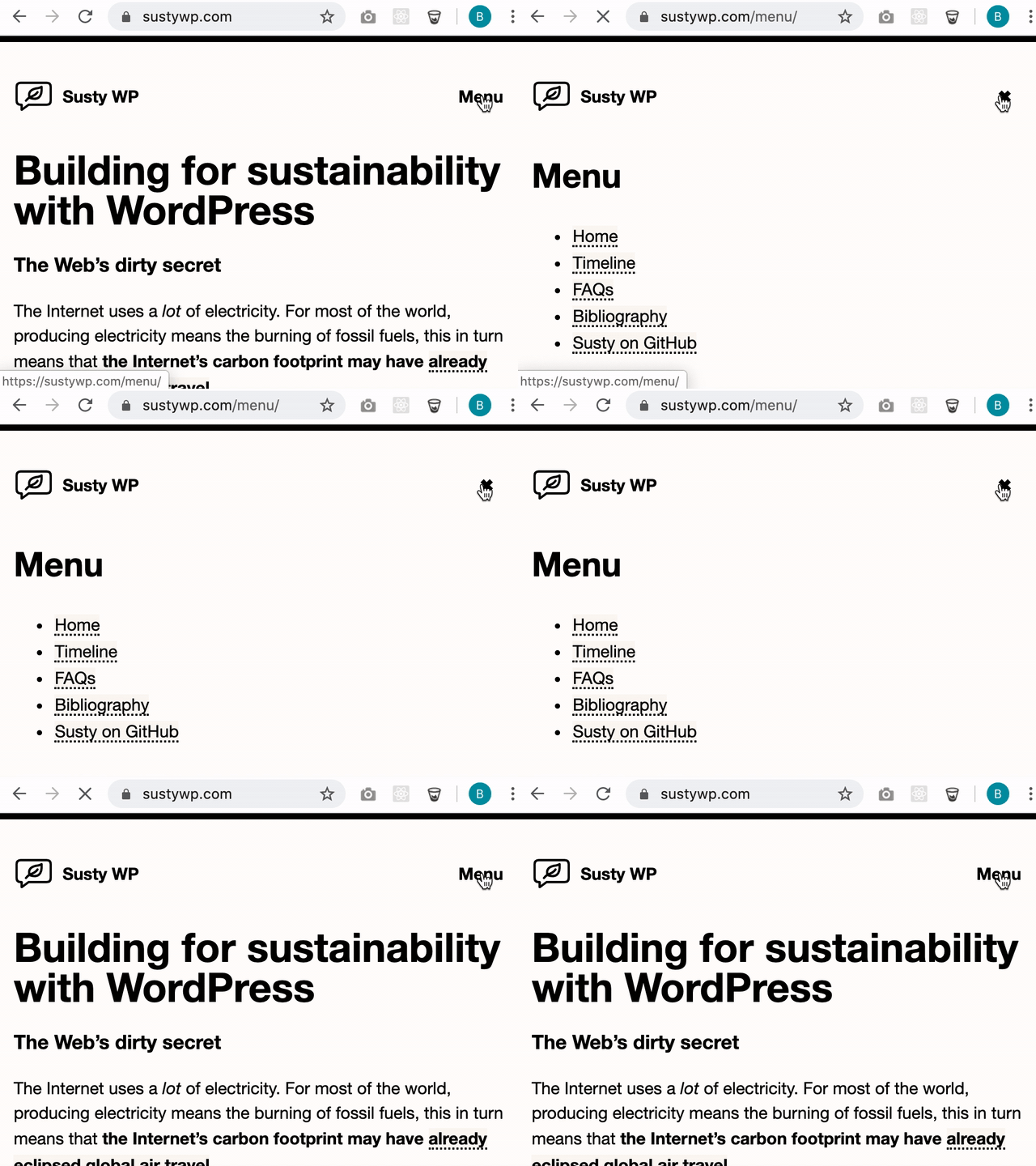
The pattern suits static sites built on filesystem routing. With a static site generator behind it, the page load can be imperceptible to the user, and templates stay as modular as possible.
Implementation is mostly a matter of swapping the "Menu" button for a close button while the user is on the menu page. Returning the user to the previous page can be handled in a couple of ways. On a server-side CMS such as WordPress, retrieve the last URL via $_SERVER['HTTP_REFERER'] and point the close button at it. Without a server-side setup, a few lines of JavaScript are needed to get that URL.
<a href="https://MyHomePage.com" onclick="handleClick(event)">×</a>


<script>
  function handleClick(event) {
    // Don't follow the link
    event.preventDefault();
    // Go back to last visited page
    window.history.back();
    // Bail out of the function
    return false;
  }
</script>
So the method has real appeal, but whether it stays JavaScript-free depends on the project.
Option 2: A horizontal scroller
A horizontal scroller works well for short lists of links and lets users reach every navigation item without opening anything or navigating away from their current spot. GitHub uses this for sub-menus.

In CSS, flexbox paired with a scrolling overflow achieves the effect.
Option 3: The hamburger built with CSS alone
The hamburger pattern is commonly built with JavaScript, but nothing requires it. CSS pseudo-selectors plus an HTML <input> element are enough to build a rich mobile menu, leaving JavaScript available for the functionality that genuinely needs it.
That a convention is popular does not make it mandatory. Simpler and more accessible approaches often exist, and navigation is a strong example: functional, lightweight navigation without JavaScript takes little effort and brings its own benefits along the way.




