
First Principles: Styled Components Without the Foot-Guns
Styled-components remains one of the most popular ways to manage CSS in React applications—and for good reason. It brings component-based thinking to styling, keeps styles colocated with markup, and makes dynamic styling straightforward. But many developers who adopt it never fully update their mental models around styling. The result is a half-measure approach: the library is installed, but the thinking remains deeply rooted in plain CSS habits.
If you're working with styled-components or a similar CSS-in-JS tool like Emotion, a few practical shifts can completely change how you experience the library. Here are the techniques that have made the biggest difference in real-world codebases.
CSS Variables Beat Prop Interpolation
Consider a simple Backdrop component that accepts opacity and color props and applies both to its wrapper:
function Backdrop({ opacity, color, children }) {
  return (
    <Wrapper>
      {children}
    </Wrapper>
  );
}

const Wrapper = styled.div`
  /* ?? */
`;
The conventional approach would use a prop interpolation function:
function Backdrop({ opacity, color, children }) {
  return (
    <Wrapper
      opacity={opacity}
      color={color}
    >
      {children}
    </Wrapper>
  );
}

const Wrapper = styled.div`
  opacity: ${p => p.opacity};
  background-color: ${p => p.color};
`;
That works, but it isn't the most efficient or flexible option. CSS variables offer a cleaner alternative:
function Backdrop({ opacity, color, children }) {
  return (
    <Wrapper
      style={{
        '--color': color,
        '--opacity': opacity,
      }}
    >
      {children}
    </Wrapper>
  );
}

const Wrapper = styled.div`
  opacity: var(--opacity);
  background-color: var(--color);
`;
Why favor CSS variables here? Because prop interpolation forces styled-components to generate and inject a brand new CSS rule every time the interpolated value changes. That's a real problem when values update frequently—during animations or drag interactions, for instance. CSS variables skip that entire process; the value only affects a custom property that's already in the stylesheet.
There's also a maintainability perk: your styles become less coupled to the styled-components API. If you ever port the component to another styling solution, the CSS variable version is far easier to carry over than the interpolated one.
The trade-off is losing compile-time type safety for the variable names—setting --cloor instead of --color won't trigger an error. In practice, that rarely causes real issues.
CSS variables also give you a clean way to define defaults right in the component's stylesheet:
function Backdrop({ opacity, color, children }) {
  return (
    <Wrapper
      style={{
        '--color': color,
        '--opacity': opacity,
      }}
    >
      {children}
    </Wrapper>
  )
}

const Wrapper = styled.div`
  opacity: var(--opacity, 0.75);
  background-color: var(--color, var(--color-gray-900));
`;
Now, rendering <Backdrop> without any props automatically picks up 75% opacity and that theme's dark gray color. It's a tiny ergonomic win that accumulates nicely across a codebase.
Keep All Styles in One Place
The single most impactful habit you can adopt with styled-components: when a component's appearance changes based on its ancestors, define that contextual styling inside the component itself—not in the ancestor.
Say you have a CodeSnippet component that renders static code blocks on a blog, and an Aside component that surfaces supplementary content. When a CodeSnippet sits inside an Aside, you want it to pick up customizations: a matched background depending on the aside's variant (success, info, warning, or error), a reduced font size, and adjusted spacing.
The tempting approach is to reach into the child from the parent and override its styles:
// Aside.js
function Aside({ children }) {
  return (
    <Wrapper>
      {children}
    </Wrapper>
  );
}

const Wrapper = styled.aside`
  /* Base styles */

  pre {
    font-size: 0.875rem;
    background-color: var(--color-variant-300);
  }
`;

export default Aside;
That pattern is a trap. It makes it genuinely difficult to trace all the ways a CodeSnippet can look in your application. The styles that apply inside an Aside now live inside that unrelated component, so unless you happen to spot them in the browser, you'll never know they exist.
An improvement is composition—importing the styled component created inside CodeSnippet and embedding it:
// Aside.js
import { Wrapper as CodeSnippetWrapper } from '../CodeSnippet'

function Aside({ children }) {
  return (
    <Wrapper>
      {children}
    </Wrapper>
  );
}

const Wrapper = styled.aside`
  /* Base styles */

  ${CodeSnippetWrapper} {
    font-size: 0.875rem;
    background-color: var(--color-variant-300);
  }
`;

export default Aside;
Styled-components handles that embedding elegantly: it injects a selector that matches the Wrapper class. You can now search the project for all CodeSnippet-related styles and find them all easily enough.
But you can do even better by thinking in terms of encapsulation. React gives you a way to pack logic and UI into a reusable box, with a strict boundary along its perimeter. HTML created in a single component is only modified from within that component. The same principle should apply to styles: no component should be reaching in and tampering with another one's look.
Here's the shift. Instead of the parent modifying the child, let the child declare its own variations:
// Aside.js
function Aside({ children }) {
  return (
    <Wrapper>
      {children}
    </Wrapper>
  );
}

// Export this wrapper
export const Wrapper = styled.aside`
  /* styles */
`;

export default Aside;
// CodeSnippet.js
import { Wrapper as AsideWrapper } from '../Aside';
function CodeSnippet() {
// ✂️ Omitted for brevity
}
const Wrapper = styled.pre`
/* Base styles */
${AsideWrapper} & {
font-size: 0.875rem;
background-color: var(--color-variant-300);
}
`;That pattern inverts the control. Instead of "when Aside exists, modify CodeSnippet," you're now saying "here are the CodeSnippet base styles, and here's how CodeSnippet looks when it appears inside AsideWrapper."
The results are dramatically easier to reason about. All the possible styles for CodeSnippet live in one file, in one column against its definition. A developer can get the complete story without leapfrogging across the codebase.
When you hit a situation where one component needs to adapt inside another, don't let the parent get its hands in the child's styling. Put the “embedded inside that particular wrapper” rule directly in the child component.
Make Spacing and Layers Context-Agnostic
There are two more easy ways to paint your styled-components into a corner: leaky margins and hard-coded z-indexes.
A common move is to add margin to a component so it doesn't sit flush against top-level siblings:
// Aside.js
function Aside({ children }) {
  return (
    <Wrapper>
      {children}
    </Wrapper>
  );
}

const Wrapper = styled.aside`
  margin-top: 32px;
  margin-bottom: 48px;
`;

export default Aside;
It works, but it locks the design down preemptively. When the component later moves into a context with different spacing requirements, those margins become obstacles instead of accommodations.
The bigger issue is that margin collapses in surprising, counterintuitive ways. Drop an <Aside> inside a <MainContent> and the margin on that aside can visually push the entire group down; even with accurate markup, it appears as if MainContent itself carries margin.
There's a growing sentiment among developers to skip margin altogether for component-level spacing. Team momentum be damned—the substitute options are solid:
- Use
gapin Flexbox or Grid—it adds spacing between children without involving any single child's margin. - Use a dedicated
Spacercomponent—an approach that feels strange at first but which becomes pleasant once you get used to it. - Rely on a purposeful layout component like
Stackfrom a design system, which centralizes the vertical rhythm rules for you.
None of these require weaning yourself off margin entirely. The goal is to avoid handing a specific spacing decision to every component. If a margin is truly required for a one-off situation, you can use it pragmatically—just know the trade-offs you're accepting.
Similar logic applies to z-index. Code like this makes a promise you'll regret later:
// Flourish.js
const Flourish = styled.div`
  position: relative;
  z-index: 2;
  /* Omitted decorative properties */
`;

export default Flourish;
Setting a z-index value of 2 assumes that's the right number forever. It often isn't. The browser has a better tool for containing those values: the isolation property. Applying it to a container creates a new stacking context and flattens all conflicting z-index values inside it. Get comfortable with that property and the layers in your app will stop interfering with each other across component boundaries.
The through-line for all these tips: treat styled-components as a vehicle for encapsulation, not just syntax convenience. When you control what a component can affect and when you let its enclosing context influence it through well-considered channels, styling in React becomes something you genuinely enjoy maintaining.
Small utilities, big payoffs
Beyond the core strategies, styled-components offers a handful of smaller features that can meaningfully improve your day-to-day work. Here are a few worth knowing.
Rendering the right tag with as
Developers often default to <div> for everything, which ignores the value of semantic HTML. styled-components can make this worse by adding a layer of indirection between your JSX and the actual rendered tag.

Every styled-component accepts an as prop that overrides the underlying HTML element. This is particularly useful for headings, where the correct level depends on context:
// `level` is a number from 1 to 6, mapping to h1-h6
function Heading({ level, children }) {
  const tag = `h${level}`;

  return (
    <Wrapper as={tag}>
      {children}
    </Wrapper>
  );
}

// The `h2` down here doesn't really matter,
// since it'll always get overwritten!
const Wrapper = styled.h2`
  /* Stuff */
`;
It also works well for components that need to switch between rendering as a button or a link:
function LinkButton({ href, children, ...delegated }) {
  const tag = typeof href === 'string'
    ? 'a'
    : 'button';

  return (
    <Wrapper as={tag} href={href} {...delegated}>
      {children}
    </Wrapper>
  );
}
Semantic HTML matters, and the as prop gives you a clean way to preserve it without creating separate components.
Boosting specificity without !important
Occasionally, a style you write won't take effect because another rule wins due to specificity. If you follow a component-based approach, this should be rare — aside from conflicts with third-party CSS. In a codebase with roughly 1,700 styled-components, specificity issues have not been a problem.
Still, escape hatches can be useful in less-than-ideal codebases. One such trick is the double-ampersand selector:
const Wrapper = styled.div`
  p {
    color: blue;
  }
`
const Paragraph = styled.p`
  color: red;

  && {
    color: green;
  }
`;

// Somewhere:
<Wrapper>
  <Paragraph>I'm green!</Paragraph>
</Wrapper>
Here, a base Paragraph sets red text, but a Wrapper with a descendant selector overrides it to blue. Using two ampersands repeats the generated class name — .paragraph.paragraph instead of .paragraph — which increases specificity enough to beat .wrapper p and turn the text green.
This technique is far less destructive than !important, but it opens the door to a specificity arms race. Use it sparingly.
The Babel plugin for readable class names
In production, styled-components generates terse, unique hashes like .hNN0ug or .gAJJhs. These keep server-rendered HTML small but are opaque during development.
The Babel plugin fixes that by using semantic class names in development:
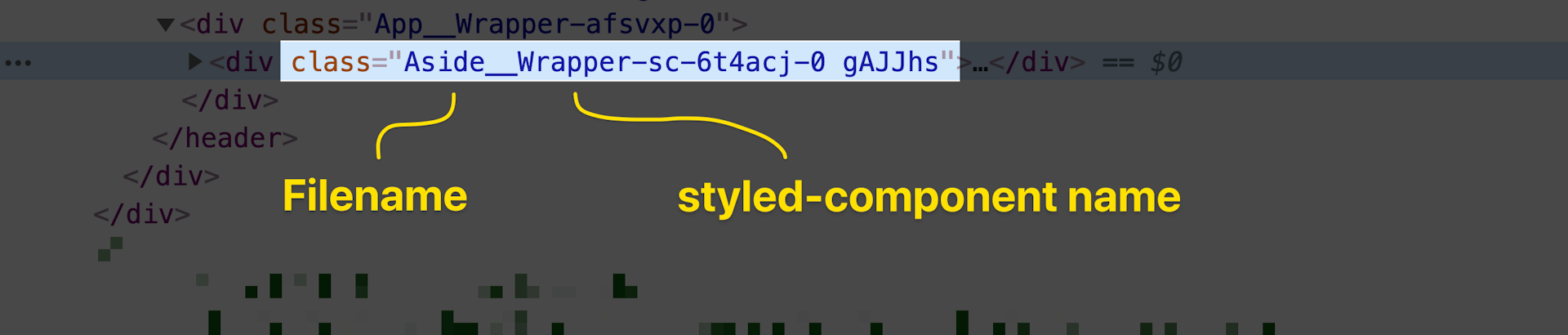
Next.js users are covered — the plugin has been ported to SWC, so no need to disable the compiler. For create-react-app, you can skip ejecting and simply change your imports:
import styled from 'styled-components/macro';A quick find-and-replace across the project noticeably improves the developer experience. Other setups can follow the official documentation.
Thinking in components
The specific APIs matter less than the underlying mindset. When you treat CSS as part of the component model, you gain real advantages:
- Confidence that removing a declaration won't affect unrelated parts of the app.
- Freedom from specificity wars and the tricks needed to win them.
- A mental model that makes your pages predictable without extensive manual testing.
styled-components is flexible, so it can be used in many ways. But treating it as a glorified class-name generator, or "Sass 2.0," misses the point. When you embrace the idea that styled-components are components first, the tool becomes far more valuable.
These recommendations align with the thinking of Max Stoiber, styled-components' creator. After reviewing an early draft, he responded:

These patterns took years of experimentation to become clear. Hopefully, they save you some of that time.


