

Why centering still trips people up
Centering an element takes two or three lines of code. The trouble is choosing which two or three. align-items, align-content, justify-content, place-self, margin: auto — the property list is long enough that beginners reasonably conclude the task is harder than everyone claims.
The honest framing: centering isn't hard, but it is a special case of alignment, and alignment is a broad subject. It covers more than top/center/bottom and left/center/right, and it behaves differently depending on the layout method in play. Picking a snippet that happens to work, without knowing why, tends to fail the moment the content changes.
One hundred ways, far fewer that matter
It is possible to enumerate about 100 distinct approaches for centering an element vertically and horizontally inside a container. That figure is misleading. Roughly 60 of those entries are hacky and not recommended. Of the remaining valid approaches, many are the same technique written differently, so the count of genuinely unique and valid methods lands under 15 — possibly under 10.
The underlying reason is that every layout type carries its own alignment logic. Collapse a layout down to a single item in a container and those distinct mechanisms converge on an identical result, which makes them look interchangeable. They aren't.
A comparison worth running
Three container-level snippets behave identically for one child, then diverge as soon as a second child appears.
.container {
  display: block;
  align-content: center;
  justify-items: center;
}
.container {
  display: grid;
  place-content: center;
}
.container {
  display: flex;
  flex-wrap: wrap;
  place-content: center;
}
With a single item, the three methods match. With multiple items, the Flexbox approach starts items horizontally and lets them wrap as the container narrows. Multiple items of differing sizes expose further differences in all three. That divergence is the point: choosing a centering method is choosing a layout behavior, not just a visual result.
All the properties above are declared once on the container and work for one item or many. One caveat on the third method: justify-items in the context of a block container is not yet supported across browsers; it is Chrome-only, so that demo requires Chrome.
Grabbing the right mental model first
Before reaching for a snippet, learn alignment itself. The theory rests on two levels of alignment — "content" and "item" — and two axes, horizontal and vertical.
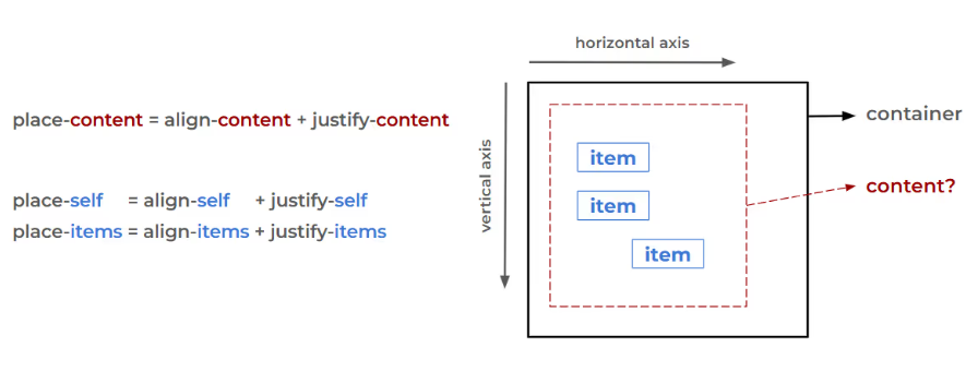
Identifying the content and the item in each layout is the key step, and it has to be done per layout; assuming the behavior transfers from one context to another is a common error. Once the core concept is clear, centering becomes trivial. A reference on alignment fundamentals across CSS layout methods covers this in depth.
Which layout you pick depends on requirements, not habit. There is a self-identified Grid camp and a Flexbox camp, but some cases want position: absolute or plain text-align: center. No single method is universally better.
Vertical centering of text
Boxes generally cooperate once the properties are applied correctly. Text is the awkward case: extra space above and below resists control, and people reach for magic line-height or padding values to compensate.
The text-box property trims that space according to its configuration. Applying a common centering snippet to two text boxes shows the problem — in the first, the text looks off even though the CSS is correct. For CSS, the box is perfectly centered; for the reader, it isn't.
The cause lies in font design and the space reserved per character. A border around the text makes it visible.
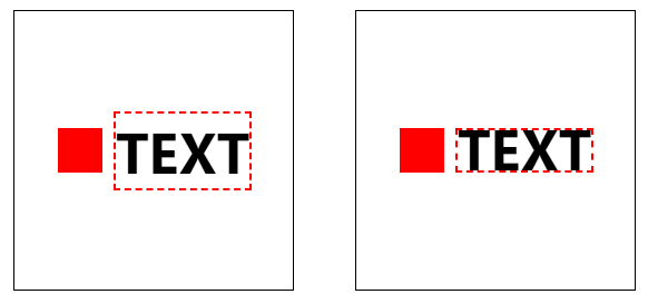
The text box is centered, but it contains unwanted space. One line removes it:
text-box: cap alphabetic;Lowercase text with neither descenders nor ascenders needs different keywords:
text-box: ex alphabetic;…used to remove the space for perfect centering:
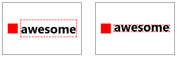
The values read as strange and unintuitive; a small generator lets you specify which space to trim and produces the code. For a more detailed treatment of the feature, see Danny Schwarz's "Two CSS Properties for Trimming Text Box Whitespace."
Out-of-flow elements: drop the translate trick
Absolutely or fixed-positioned elements follow a different alignment logic. The long-standing recipe is top/left paired with translate:
left: 50%;
top: 50%;
transform: translate(-50%, -50%);
That snippet still works, but by 2026 it deserves the same label as float-based layout: a valid historical approach now superseded by features designed for the job. The modern replacement:
inset: 0;
place-self: center;
inset controls the inset-modified containing block (IMCB), and place-self — the shorthand for justify-self and align-self — aligns the element inside that IMCB. Inline elements are covered in the same detailed alignment reference.
Anchor positioning and the anchor-center value
Anchor positioning also builds on absolutely or fixed-positioned elements, with a separate mechanism for placing an element relative to its anchor. Centering here introduces the anchor-center value.
In this example the text box sits above its anchor via position-area: top; dragging the anchor keeps the box attached to the top, centered.
Changing the alignment to place-self: center looks slightly off initially, but dragging the anchor reveals the box centered within the top area.
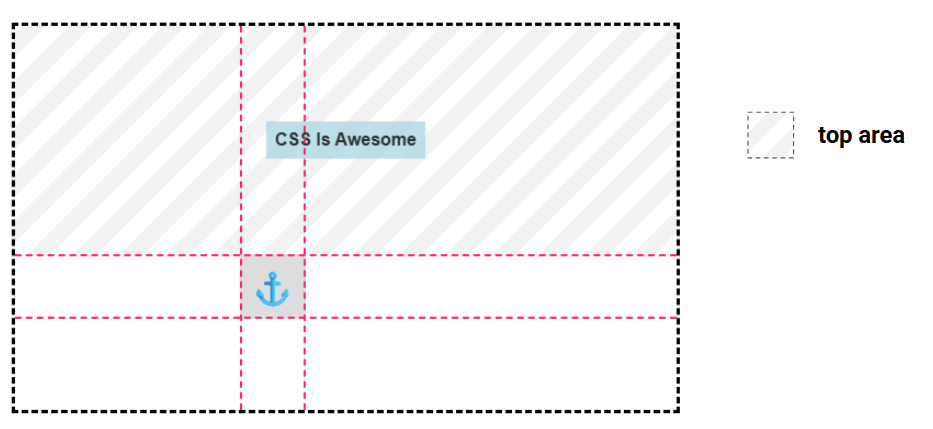
The confusion is understandable: if you don't know which area the element is centering inside, the result reads as broken. To return to the previous position:
place-self: end anchor-center;…or:
align-self: end;
justify-self: anchor-center;
Vertically the element is pushed to the end (the bottom); horizontally it tracks the center of the anchor. That tracking is the anchor-center value at work. So anchor positioning offers two distinct centering modes: centering within the selected area using center, or centering relative to the anchor using anchor-center.
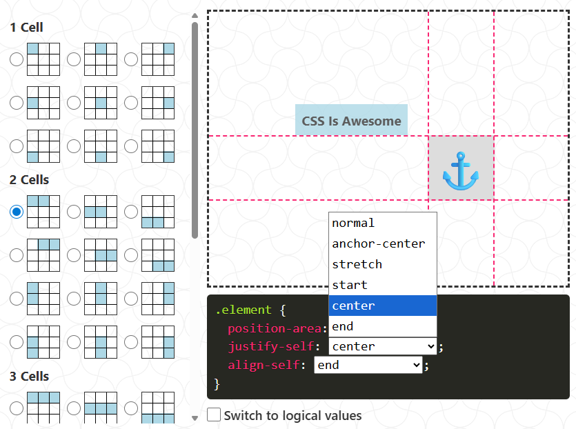
Most cases won't need anchor-center, because anchor positioning applies area-specific default alignment — setting position-area is usually sufficient. Still, knowing how to adjust alignment and how center differs from anchor-center pays off. An interactive demo allows setting the area and alignment directly: position-area supports 36 positions, with five alignment values per axis.
Safe versus unsafe alignment
Nothing security-related here — "safety" concerns what happens to your content when it overflows.
Consider a red square centered in a grid container, in two situations: square smaller than container (common), square larger (less common). In both, the square's center matches the container's center. That is unsafe centering, and it is the default for many methods.
The danger appears when the larger square overflows on all sides. Hide the overflow, add a scrollbar, and the top and left portions become unreachable — a form of data loss. Scrolling the second container can't reveal the square's top and left borders. The fix:
place-content: safe center;Now, on overflow the browser shifts the element to a safer position that keeps the full content scrollable. Content visibility takes priority over centering — the exact inverse of unsafe alignment.
Do not sprinkle safe everywhere. Unsafe behavior is sometimes desired; reach for safe only when content obstruction is an actual concern.
Anchor positioning defaults to safe alignment, which is why dragging the anchor toward the edges makes the box stop at the containing block and lose its default alignment:
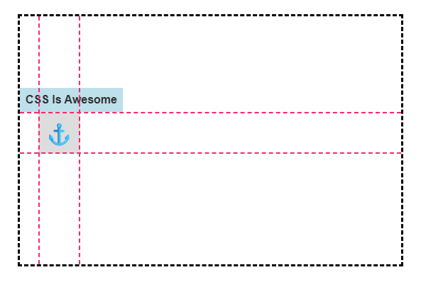
Without knowing this, you can spend a long while wondering why the element isn't centered. The behavior is overridable with unsafe:
place-self: unsafe end unsafe anchor-center;Or:
justify-self: unsafe anchor-center;
align-self: unsafe end;
The browser now permits the box to overflow, prioritizing alignment over potential content loss. This is not a corner case. One real use: a sticky header holding a small icon beside the site title that reveals a tooltip on hover. The sticky header establishes a containing block for the tooltip and, by default, blocks overflow past its boundary. Unsafe alignment was required to let the tooltip overflow while staying correctly placed.
In practice, safety keywords rarely need touching. Keep the browser defaults, but remember safe and unsafe exist for correcting a misalignment.
Where this leaves the problem
The takeaway is not a snippet. Understand how alignment works, assess your layout and requirements, choose the code that fits, and know why it fits. Copying a two-line solution that merely looks right is the habit that keeps this problem alive.




