

Gap Decorations: Styling the Space Between
The CSS gap property made it trivial to add consistent spacing between items in flex, grid, and multi-column layouts. What remained difficult was styling the space itself—drawing visible separators between items has traditionally required extra elements, pseudo-elements, or border tricks that pollute markup and can distort layout dimensions.
A new W3C specification draft, CSS Gap Decorations Module Level 1, aims to solve that problem. The proposal, currently available in Chrome and Edge 139 behind a flag, introduces properties designed specifically for drawing decorative lines within layout gaps. The intent is to keep such styling in CSS only, with no impact on your semantic HTML.
How the feature works
If you have used CSS multi-column layouts, the concept should feel familiar. The existing column-rule property draws vertical lines between columns. The new specification generalizes this behavior to other layout contexts.
article {
  column-width: 20rem;
  column-rule: 1px solid black;
}
Per the draft, column-rule also applies to flexbox and grid layouts, letting you draw vertical separators between items without any extra markup:
.my-grid-container {
  display: grid;
  gap: 2px;
  column-rule: 2px solid pink;
}
The feature also introduces a sibling property, row-rule, for drawing lines between rows. It accepts the same style syntax as column-rule, and you can define multiple line styles using comma-separated values and the repeat() function, similar to how grid row and column templates work. This allows precise control over an unknown number of gaps:
.my-flex-container {
  display: flex;
  gap: 10px;
  row-rule: 10px dotted limegreen;
  column-rule: 5px dashed coral;
}
.my-container {
  display: grid;
  gap: 2px;
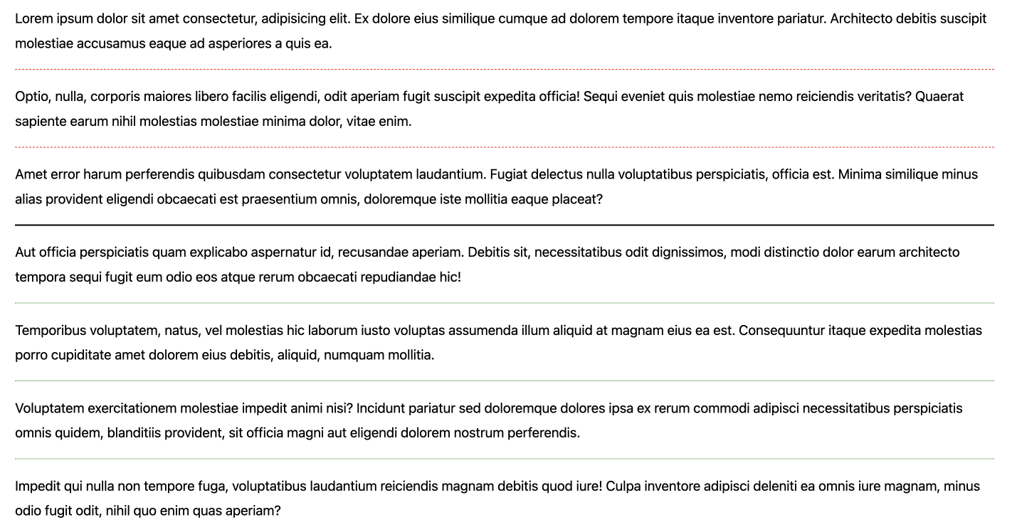
  row-rule:
    repeat(2, 1px dashed red),
    2px solid black,
    repeat(auto, 1px dotted green);
}
A handful of additional properties provide fine-tuning: row-rule-break, column-rule-break, row-rule-outset, column-rule-outset, and gap-rule-paint-order. These control behavior at line intersections, determine where lines start and end relative to the gap area, and set the paint order when row and column rules cross. The properties work across grid, flexbox, multi-column, and eventually masonry layouts.
Trying it in your browser
Support is currently limited to Chromium-based browsers. To experience the feature, use Chrome or Edge 139 or later and:
- Navigate to
about://flags. - Search for Enable Experimental Web Platform Features.
- Enable the flag and restart the browser.
A practical example
Consider a personal page layout composed of a header, navigation links, a main content area with text and photos, and a footer. It uses the following markup:
<body>
<header>
  <h1>My personal site</h1>
</header>
<nav>
  <ul>
    <li><a href="#">Home</a></li>
    <li><a href="#">Blog</a></li>
    <li><a href="#">About</a></li>
    <li><a href="#">Links</a></li>
  </ul>
</nav>
<main>
  <article>
    <p>...</p>
  </article>
  <article>
    <img src="cat.jpg" alt="A sleeping cat.">
  </article>
  <article>
    <p>...</p>
  </article>
  <article>
    <img src="tree.jpg" alt="An old olive tree trunk.">
  </article>
  <article>
    <p>...</p>
  </article>
  <article>
    <p>...</p>
  </article>
  <article>
    <p>...</p>
  </article>
  <article>
    <img src="strings.jpg" alt="Snow flakes falling in a motion blur effect.">
  </article>
</main>
<footer>
  <p>© 2025 Patrick Brosset</p>
</footer>
</body>
Setting the <body> as a grid container spaces out these regions with a single gap declaration:
body {
  display: grid;
  gap: 4rem;
  margin: 2rem;
}
Applying row-rule to the grid draws horizontal separator lines inside the defined gaps:
body {
  display: grid;
  gap: 4rem;
  margin: 2rem;

  row-rule: 1rem solid #efefef;
}
You can differentiate the first line from the others using the repeat() syntax, telling the browser to draw a thick first separator and thinner lines after it:
body {
  display: grid;
  gap: 4rem;
  margin: 2rem;

  row-rule:
    1rem solid #efefef,
    repeat(2, 2px solid #efefef);
}
Moving to the navigation, flexbox arranges its links in a single row. The column-rule property adds dashed vertical separators between each link:
nav ul {
  display: flex;
  flex-wrap: wrap;
  gap: 2rem;
  column-rule: 2px dashed #666;
}
The <main> element uses a wrapping flex layout to place paragraphs and images across multiple lines with a larger gap:
main {
  display: flex;
  flex-wrap: wrap;
  gap: 4rem;
}

main > * {
  flex: 1 1 200px;
}

main article:has(p) {
  flex-basis: 400px;
}
Adding both a row-rule and a column-rule draws a complete grid of separator lines between rows and columns:
main {
  display: flex;
  flex-wrap: wrap;
  gap: 4rem;
  row-rule: 2px solid #999;
  column-rule: 2px solid #999;
}
To avoid vertical lines crossing the entire flex line height, the column-rule-outset property adjusts the start and end points of each vertical separator:
main {
  display: flex;
  flex-wrap: wrap;
  gap: 4rem;
  row-rule: 2px solid #999;
  column-rule: 2px solid #999;
  column-rule-outset: 0;
}
Beyond the basics
Two other properties provide additional control:
gap-rule-paint-order: controls whether row or column decorations render on top at their intersections.row-rule-breakandcolumn-rule-break: determine whether lines are drawn as continuous elements or as segmented pieces that start and stop at each intersection.
As the draft is new, dedicated MDN documentation is not yet available. Reference materials include the CSS Gap Decorations Module Level 1 specification and the Microsoft Edge explainer. An interactive playground lets you experiment with the properties, and a live example with its source code shows the complete layout built in the walkthrough above.
Feedback from developers is a main reason the implementation is initially flag-gated. You can file issues and comments on the Chromium issue tracker.


