

Why React Styling Deserves Its Own Toolkit
React gives you a clean component model for structuring an interface, but it says nothing about how those components should look. The good news is that styling in React is still CSS — the strategies you choose are simply different ways of organizing and delivering that CSS to take advantage of React's component-based architecture. Each approach balances trade-offs in scoping, build tooling, performance, and developer experience. The four most commonly used strategies are traditional stylesheets, CSS Modules, styled-components, and JSS.
Plain CSS and SASS Stylesheets
The most familiar approach is treating styles exactly as you would in a static site: write CSS or SCSS in external files and import them where needed. For example, a Box.scss file can define classes for a Box.js component:
// Box.scss
.Box {
  margin: 40px;
  border: 5px black;
}

.Box_content {
  font-size: 16px;
  text-align: center;
}
To apply those styles, import the stylesheet directly in the component file and set the className attribute to match the selectors you defined:
import React from 'react';
import './Box.css';

const Box = () => (
  <div className="Box">
    <p className="Box_content"> Styling React Components </p>
  </div>
);

export default Box;
This strategy also lets you pull in frameworks like Bootstrap or Bulma, which provide ready-made classes and components for rapid prototyping or for teams that don't want to hand-write every style rule.
Advantages of Traditional Stylesheets
- Popularity and support: This is the most widely used approach, meaning plenty of documentation and community help exist.
- Performance and caching: Browsers handle plain CSS files well, caching them locally for repeat visits.
- Flexibility: CSS/SASS is unopinionated about how you render your UI, making it easy to integrate with legacy stylesheets or full redesigns — you can swap a whole file to refresh the look without touching component code.
- Framework access: CSS libraries provide ready-made building blocks that speed up new projects and prototypes.
Drawbacks of Traditional Stylesheets
- Readability over time: Without discipline, stylesheets grow long and get harder to navigate as your app becomes more complex.
- Dead code accumulates: Large stylesheets often carry outdated, unused rules for years, and cleaning them up becomes a substantial task.
Note: SASS comes in two syntaxes. The modern one, SCSS, is a superset of CSS, which means any valid CSS file is also valid SCSS. SCSS files end in.scss. The older indented syntax, using.sassfiles, relies on indentation instead of brackets and semicolons to delimit blocks.
CSS Modules: Scoped Styles at Build Time
A CSS Module is a CSS file where class and animation names are locally scoped by default. The appeal of this approach appears during the build step: your simple, local class names are automatically mapped to generated, unique names, and the mapping is exported as a JavaScript object that React can consume.
With a CSS Modules setup — which you get out of the box in a create-react-app project, or by adding the appropriate loader to webpack — your css file might look like this:
//Box.css
 :local(.container) {
   margin: 40px;
   border: 5px dashed pink;
 }
 :local(.content) {
   font-size: 15px;
   text-align: center;
 }
The :local() wrapper is what you use under the standard webpack configuration.
In the component, you import the module and reference classes as properties of the resulting object, using className rather than inline style props:
test: /\.css$/,
loader: 'style!css-loader?modules&importLoaders=1&localIdentName=[name]__[local]___[hash:base64:5]'
}
Here, styles is an object containing keys like container and content, each mapped to the build-generated class name.
Benefits of CSS Modules
- Reusable, modular CSS with local scope.
- No more class name collisions between components.
- Explicit dependencies that avoid unused or duplicated code.
- Zero extra JavaScript payload or SSR cost.
- Supports variable sharing between CSS and JavaScript.
Drawbacks of CSS Modules
- Requires a build tool like webpack.
- Mixing module-scoped and global CSS can get awkward.
- Referencing an undefined class silently resolves to
undefined— no warning. - You must always reference the
stylesobject when building aclassName. - Class names are limited to
camelCase.
styled-components: CSS-in-JS with a Component API
The styled-components library takes the scoped-styling idea from CSS Modules and moves it fully into JavaScript. It lets you attach styles directly to React components using tagged template literals. For React Native, the same library provides component-level styling.
To use it, you first install the package from npm, then import the styled object into your component file:
- Run
npm install styled-components --save. - Import:
import styled from 'styled-components'; - Create a style variable by selecting an HTML element and defining the style rules.
- Wrap your JSX with the variable as a tag.
The implementation looks like this:
import React from 'react';
import styled from 'styled-components';

const Box = styled.div`
  margin: 40px;
  border: 5px black;
`;

const Content = styled.p`
  font-size: 16px;
  text-align: center;
`;

const Box = () => (
  <Box>
    <Content> Styling React Components </Content>
  </Box>
);

export default Box;
The imported styled object uses tagged template literals to create new components — <Box> and <Content> here — each carrying the styles you defined for a particular HTML element. You can then use these as wrappers for your regular JSX content.
Advantages of styled-components
- Component consistency: Styled components publish well to npm; they can be adjusted through props or extended via
styled(Component), with no style conflicts. - Built-in SASS features: You get SASS-like nesting and syntax without installing an extra preprocessor.
- Dynamic styling with props: Changing styles based on component state or props feels natural for React developers.
- Context-based theming: Through React's Context API, a theme object can be passed down and interpolated into styled definitions without prop drilling.
Drawbacks of styled-components
- Learning curve: Developers used to traditional CSS must adopt a new mental model.
- Legacy CSS clashes: Combining styled-components with existing UI libraries or global stylesheets can make debugging style conflicts harder.
- Performance cost: The library regenerates plain CSS at build time and injects it into a
<style>tag in the HTML's<head>. This can bloat the HTML file and prevents you from splitting the output CSS for optimized loading.
JSS: CSS as a Declarative JavaScript Tool
JSS is an authoring tool that lets you describe styles in JavaScript in a declarative, conflict-free, and reusable way. It is framework agnostic and can compile in the browser, server-side, or at build time in Node. The ecosystem includes the core library, plugins, and framework integrations, as well as third-party API adapters that provide different syntaxes while using JSS under the hood:
- Styled-JSS — a styled-component API adapter.
- Glamor-JSS — Glamor-flavored CSS powered by JSS.
- Aphrodite-JSS — an Aphrodite-like API.
React-JSS brings JSS to React using the new Hooks API, with the core library and its default preset built in. According to the official docs, using React-JSS in your components offers several advantages over using core JSS directly:
- Dynamic Theming: Context-based theme propagation and runtime updates.
- Critical CSS Extraction: Only the CSS from actually rendered components is extracted.
- Lazy Evaluation: Style sheets are created on component mount and removed on unmount.
- The static parts of a Style Sheet are shared across all elements.
- Automatic Updates: Function values and rules update with any data passed to
useStyles(data), such as props, state, or context values.
The implementation mirrors a styled-component workflow:
import React from 'react'
import {render} from 'react-dom'
import injectSheet, { ThemeProvider } from 'react-jss'
const styles = (theme) => ({
  wrapper: {
    padding: 40,
    background: theme.background,
    textAlign: 'center'
  },
  title: {
    font: {
      size: 40,
      weight: 900,
    },
    color: props => props.color
  },
  link: {
    color: theme.color,
    '&:hover': {
      opacity: 0.5
    }
  }
})
const Comp = ({ classes }) => (
  <div className={classes.wrapper}>
    <h1 className={classes.title}>Hello React-JSS!</h1>
    <a
      className={classes.link}
      href="https://cssinjs.org/react-jss"
      traget="_blank"
    >
      See docs
    </a>
  </div>
)
const StyledComp = injectSheet(styles)(Comp)
const theme = {
  background: '#aaa',
  color: '#24292e'
}
const App = () => (
  <ThemeProvider theme={theme}>
    <StyledComp color="red"/>
  </ThemeProvider>
)
render(<App />, document.getElementById("root"))
This imports injectSheet and ThemeProvider from react-jss. ThemeProvider is a High-Order Component that uses React context to pass a theme object down the tree, serving as the root theme. injectSheet injects the created stylesheet (in this case, styles) into the target component. The main React component, not yet injected with our styles, holds the core code and will be styled once the styles object is attached:
const Comp = ({ classes }) => (
  <div className={classes.wrapper}>
    <h1 className={classes.title}>Hello React-JSS!</h1>
    <a
      className={classes.link}
      href="https://cssinjs.org/react-jss"
      traget="_blank"
    >
      See docs
    </a>
  </div>
)
The following code injects the style object into the component using the injectSheet() function:
const StyledComp = injectSheet(styles)(Comp)The theme object below is provided to the <ThemeProvider> HOC via context, establishing the root theme for the component:
const theme = {
  background: '#aaa',
  color: '#24292e'
}
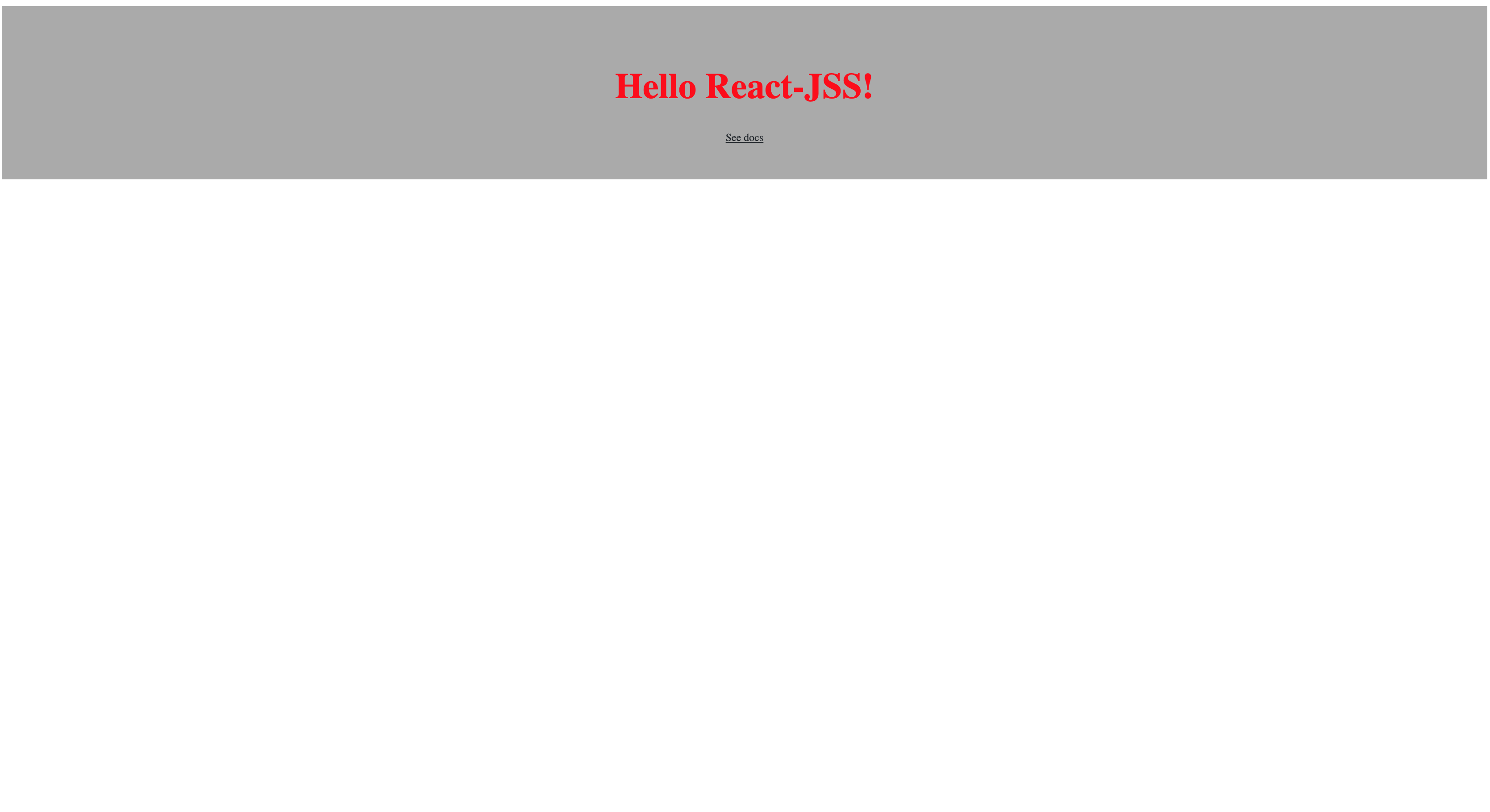
Here, the <ThemeProvider> HOC wraps the styled and injected component, rendering it as <StyledComp color= "red"/>. The final render output appears in the browser as shown:
Strengths and Weaknesses of JSS
Benefits
- Local Scoping: JSS automates CSS scoping, offering a high degree of predictability.
- Encapsulation: Keeping component code and style together simplifies maintenance and reduces errors, as changes stay contained.
- Reusability: Styled components can be reused across the app without losing their styling.
- Dynamic Styling: You can leverage React props to alter styles in a way that feels native to React developers.
Drawbacks
- Learning Curve: Adapting to JSS can be tricky for developers comfortable with traditional CSS.
- Extra Layer of Complexity: Introducing a CSS-in-JS library adds another layer to your application, which may be unnecessary for simpler projects.
- Code Readability: Custom or auto-generated selectors can be difficult to decipher, especially when debugging in browser devtools.
Final Thoughts
Each styling strategy has trade-offs, and the right choice depends on personal or company preference and application complexity. At the end of the day, no matter the tool, styling in React still relies on CSS. You can continue writing CSS as you always have, or adopt one of the React-centric approaches to add structure and convenience to your workflow.


