
Building a spinner from a single element
The usual way to build a spinning-bar loader is to create one element per bar inside a parent — nine elements in all — then animate opacity and transform. The approach here needs a single element, one gradient, one pseudo-element, and a mask:
<div class="loader"></div>That compiles down to ten declarations:
.loader {
  width: 150px; /* control the size */
  aspect-ratio: 1;
  display: grid;
  mask: conic-gradient(from 22deg, #0003, #000);
  animation: load 1s steps(8) infinite;
}
.loader,
.loader:before {
  --_g: linear-gradient(#17177c 0 0) 50%; /* update the color here */
  background:
    var(--_g)/34% 8%  space no-repeat,
    var(--_g)/8%  34% no-repeat space;
}
.loader:before {
  content: "";
  transform: rotate(45deg);
}
@keyframes load {
  to { transform: rotate(1turn); }
}
Sizing with one value
Every loader starts with a fixed square: 150px, kept square via aspect-ratio regardless of the chosen width.
.loader {
  width: 150px; /* control the size */
  aspect-ratio: 1; /* make height equal to width */
}
All calculations reference that width, so the overall size is controlled by changing a single value — no separate numbers to adjust when resizing.
Drawing the bars with gradients
The bars come from gradients, and that is the tricky part. A single gradient produces two bars at once:
background: linear-gradient(#17177c 0 0) 50%/34% 8% space no-repeat;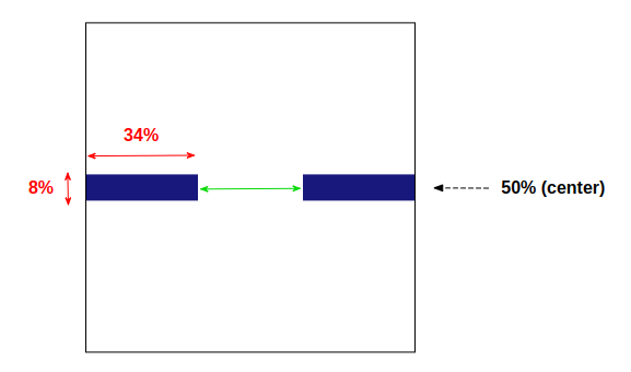
One color plus two color stops gives solid color with no fade. The background is set to 34% wide and 8% tall and centered at 50%. The key is the repeat keyword space, which duplicates the gradient into a second bar. Per the spec, the image repeats as often as fits without clipping, then the copies are spaced out to fill the area, with the first and last touching the edges.
Width is what limits the bar count: at 34%, three bars would exceed 100%, so two is the maximum, and the leftover 100% - 2 * 34% = 32% becomes the gap in the middle. A gradient width between 33% and 50% guarantees at least two bars with a little separation, and space handles the placement.
A second gradient of the same shape adds two bars at the top and bottom:
background:
 linear-gradient(#17177c 0 0) 50%/34% 8%  space no-repeat,
 linear-gradient(#17177c 0 0) 50%/8%  34% no-repeat space;
A CSS variable removes the duplication:
--_g: linear-gradient(#17177c 0 0) 50%; /* update the color here */
background:
 var(--_g)/34% 8%  space no-repeat,
 var(--_g)/8%  34% no-repeat space;
Four bars now, and the color — like the size — is written once.
The remaining bars come from the .loader element's ::before pseudo-element, adding four more for eight total:
.loader {
  width: 150px; /* control the size */
  aspect-ratio: 1;
  display: grid;
}
.loader,
.loader::before {
  --_g: linear-gradient(#17177c 0 0) 50%; /* update the color here */
  background:
    var(--_g)/34% 8%  space no-repeat,
    var(--_g)/8%  34% no-repeat space;
}
.loader::before {
  content: "";
  transform: rotate(45deg);
}
display: grid is deliberate: grid's default stretch alignment makes the pseudo-element fill its parent, so no dimensions are needed there either. Rotating the pseudo-element 45deg positions the last four bars.
Faking the fade with a mask
The goal is the impression of a single bar leaving a fading trail behind it as it travels a circular path. Transparency comes from a CSS mask combined with a conic-gradient:
mask: conic-gradient(from 22deg,#0003,#000);Applied to a fully colored box, the red's transparency increases gradually clockwise. Applied to the loader, the bars get different opacities:
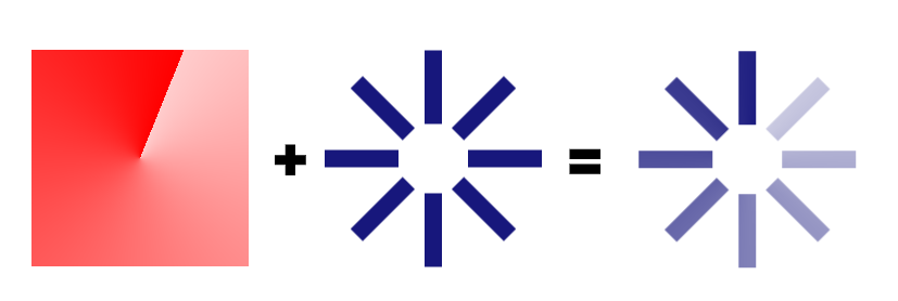
Strictly, each bar fades because it sits between two semi-transparent colors of the gradient mask. At running speed this is hardly noticeable, which is why it reads as one color at varying opacity.
Rotation with steps
The animation must be stepped, not continuous, hence steps(8). The 8 is simply the bar count and changes with it:
.loader {
  animation: load 3s steps(8) infinite;
}

/* Same as before: */
@keyframes load {
  to { transform: rotate(1turn) }
}
Size and color remain single-value changes.
Because only ::before was used, ::after adds four more bars for twelve in nearly identical code. The pseudo-elements rotate to 30deg and 60deg instead of 45deg, the animation takes twelve steps instead of eight, and bar height drops from 8% to 5% to keep them thinner. Both pseudo-elements use grid-area: 1/1, stacking them in the same area.
The same loader has an alternate implementation: here the opacity is handled inside the gradient and through the opacity property rather than a CSS mask.
Swapping to dots
The concept carries over to dots by switching from a linear gradient to a radial one — the mask still creates the opacity illusion, with circles instead of lines:
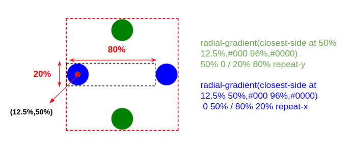
Safari currently lacks support for the at syntax in radial gradients, so the demo may misbehave there. Reconfiguring the gradient works around it:
.loader,
.loader:before,
.loader:after {
  background:
    radial-gradient(
      circle closest-side,
      currentColor 90%,
      #0000 98%
    )
    50% -150%/20% 80% repeat-y,
    radial-gradient(
      circle closest-side,
      currentColor 90%,
      #0000 98%
    )
    -150% 50%/80% 20% repeat-x;
}
Variations and compatibility notes
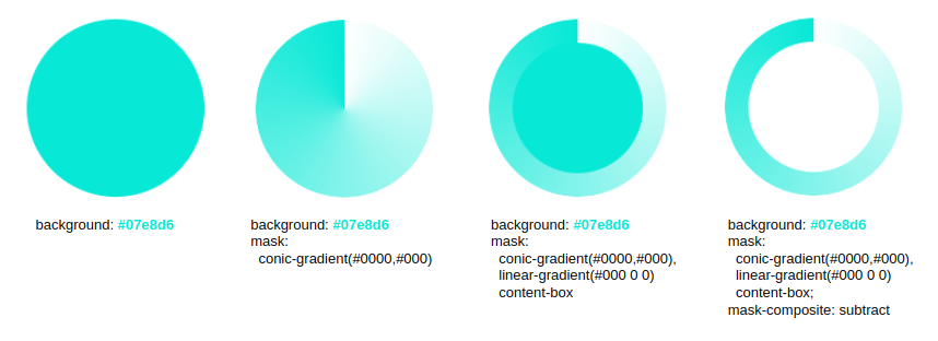
Another spinning design relies on background and mask alone — no pseudo-elements — with the whole configuration held in CSS variables so one block of code yields many variations. Some browsers still require a -webkit- prefix for mask-composite with their own value set and will not render the spinner; an alternative avoids mask-composite entirely for broader support.
A further example sets the color with background-color and builds the shape with mask and mask-composite:
All of these spinning loaders are variations on the same few ingredients: one div, gradients, masks, pseudo-elements, and variables.




