

Building the dot loader with gradients and masks
A three-dot loader that reads like a dancing ellipsis is common enough that most people know it on sight. Reproducing it with CSS normally means one element per dot, each with its own animation. The technique here collapses all of that into a single div with no pseudo-elements, assembling the loader from two pieces: a sliding background and a mask shaped like three circles. Animating the background gradient supplies the illusion of each dot shifting color as the dots rise and fall in turn.
Sliding a two-tone background
The first piece is the animated background:
.loader {
  width: 180px; /* this controls the size */
  aspect-ratio: 8/5; /* maintain the scale */
  background:
    conic-gradient(red   50%, blue   0) no-repeat, /* top colors */
    conic-gradient(green 50%, purple 0) no-repeat; /* bottom colors */
  background-size: 200% 50%;
  animation: back 4s infinite linear; /* applies the animation */
}

/* define the animation */
@keyframes back {
  0%,                       /* X   Y , X     Y */
  100% { background-position: 0%   0%, 0%   100%; }
  25%  { background-position: 100% 0%, 0%   100%; }
  50%  { background-position: 100% 0%, 100% 100%; }
  75%  { background-position: 0%   0%, 100% 100%; }
}
The .loader element is 180px wide and carries two conic gradients. Each uses a hard stop between a pair of colors: red and blue in the top half, green and purple in the bottom half.
Because the background is sized 200% wide, only one color from each gradient shows in each half at a given moment. A keyframe drives background-position left, right, and back again indefinitely. The first layer keeps Y=0% while X travels from 0% to 100%; the second layer does the same with X, but sits at Y=100%.
A conic-gradient() may seem like an odd choice over linear-gradient() for two-color gradients. It works, and with less code than the linear version would need.
linear-gradient(90deg, red 50%, blue 0)The sliding motion also introduces a flaw: at certain moments a single dot can display two colors at once. Switching the animation's timing function from linear to steps(1) swaps the gradual transition for an instant color change, so no dot ever shows both halves at once.
Cutting the dots out of the background
Masks do the rest. A mask lets us conceal parts of the background outside the shape of another element, so three circles reveal the gradient beneath only where the dots are.
.loader {
  width: 180px;
  aspect-ratio: 8/5;
  mask:
    radial-gradient(#000 68%, #0000 71%) no-repeat,
    radial-gradient(#000 68%, #0000 71%) no-repeat,
    radial-gradient(#000 68%, #0000 71%) no-repeat;
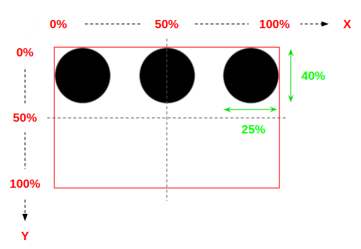
  mask-size: 25% 40%; /* the size of our dots */
}
The radial-gradient() pattern repeats three times, which invites a CSS variable:
.loader {
  width: 180px;
  aspect-ratio: 8/5;
  --_g: radial-gradient(#000 68%, #0000 71%) no-repeat;
  mask: var(--_g),var(--_g),var(--_g);
  mask-size: 25% 40%;
}
The dots still need to move, so a second animation steps their mask-position up and down across the animated background:
.loader {
  /* same as before */
  animation: load 2s infinite;
}

@keyframes load {      /* X  Y,     X   Y,    X   Y */
  0%     { mask-position: 0% 0%  , 50% 0%  , 100% 0%; } /* all of them at the top */
  16.67% { mask-position: 0% 100%, 50% 0%  , 100% 0%; }
  33.33% { mask-position: 0% 100%, 50% 100%, 100% 0%; }
  50%    { mask-position: 0% 100%, 50% 100%, 100% 100%; } /* all of them at the bottom */
  66.67% { mask-position: 0% 0%  , 50% 100%, 100% 100%; }
  83.33% { mask-position: 0% 0%  , 50% 0%  , 100% 100%; }
  100%   { mask-position: 0% 0%  , 50% 0%  , 100% 0%; } /* all of them at the top */
}
Each of the three radial gradients shares the same configuration and size. The X coordinate for each dot is fixed — 0% at the left, 50% at the center, 100% at the right — while the Y coordinate runs from 0% to 100% to produce the dancing motion.
Run the dot animation and the background animation together and the loader comes to life.
Changing colors, sizes, and motion
The CSS variable introduced above makes variations cheap. Swapping colors and sizes takes little effort, and the dots can follow other paths: changing the positions used in the mask-position animation produces an entirely different loader from the same code structure.
The same animation approach applies to background layers instead of mask layers, yielding many single-color loaders from one structure; only a handful of values change between them, and several such examples are collected at the end of the article.
A one-dot load creates the same technique under simpler logic.
Combining an animated radial-gradient with filter and mix-blend-mode yields a blobby loader. The code animates background-position just like the earlier loader, with background-size added so the blob appears to grow as it absorbs dots.
A different take uses just 10 CSS declarations and one keyframe. The main element and its two pseudo-elements share a single background configuration with one radial gradient, each producing one dot for a total of three. Different animation delays per dot move the gradient from top to bottom in sequence. CSS Grid makes the sizing trivial: each pseudo-element is stretched over its full parent by the grid's default stretch alignment, and translate() handles the rest.
Series context
This is the second entry in a four-part series on single element loaders, following spinners. The next installment covers bars, extending the techniques here with minimal code and maximum flexibility.




