

Mixing Colors Without the Palette Bloat
Design systems have a way of accumulating color tokens. Every state — hover, active, disabled, focus — seems to demand its own carefully chosen shade, and before long, what started as a simple palette becomes a sprawling spreadsheet of hex values. The CSS color-mix() function offers an alternative: rather than hand-picking every variation, blend the theme colors you already have.
The function, part of the CSS Color Module 5 specification, accepts two colors and returns their mixture. At the time of writing, support is minimal — it can be enabled behind development flags in Firefox and Safari Technology Preview — but the syntax is stable enough to experiment with. The general form looks like this:
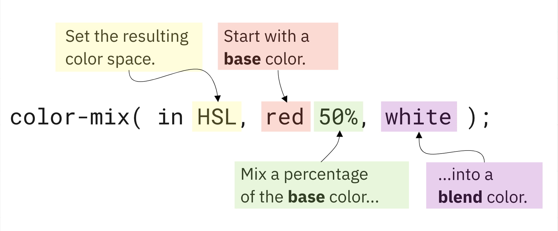
To use the terminology from that example: Color Space is HSL, Base Color is red, Base Percent is 50%, and Blend Color is white. An optional Blend Percent argument can also be supplied, covered below. You can simulate different values interactively to get a feel for how the mixing behaves:
See the Pen [CSS Color-Mix – Base Color Percentage Demo](https://codepen.io/smashingmag/pen/jOZvVqM) by Daniel Yuschick.
Before diving deeper, note a quirk: when you specify only a base percentage, the blend color's percentage is automatically calculated to bring the total to 100%. So a base percent of 75% means the blend percent is 25%. This implicit behavior changes once you add an explicit blend percent.
Rebuilding the Color Wheel
A useful exercise for understanding color-mix() is recreating something familiar: the classic color wheel.
Start with the three primary colors. Mixing adjacent primaries produces secondary colors, and mixing a primary with a secondary produces tertiary colors. The following series of code blocks shows this progression:
See the Pen [CSS Color-Mix – Art Class Demo](https://codepen.io/smashingmag/pen/GRQXNZb) by Daniel Yuschick.
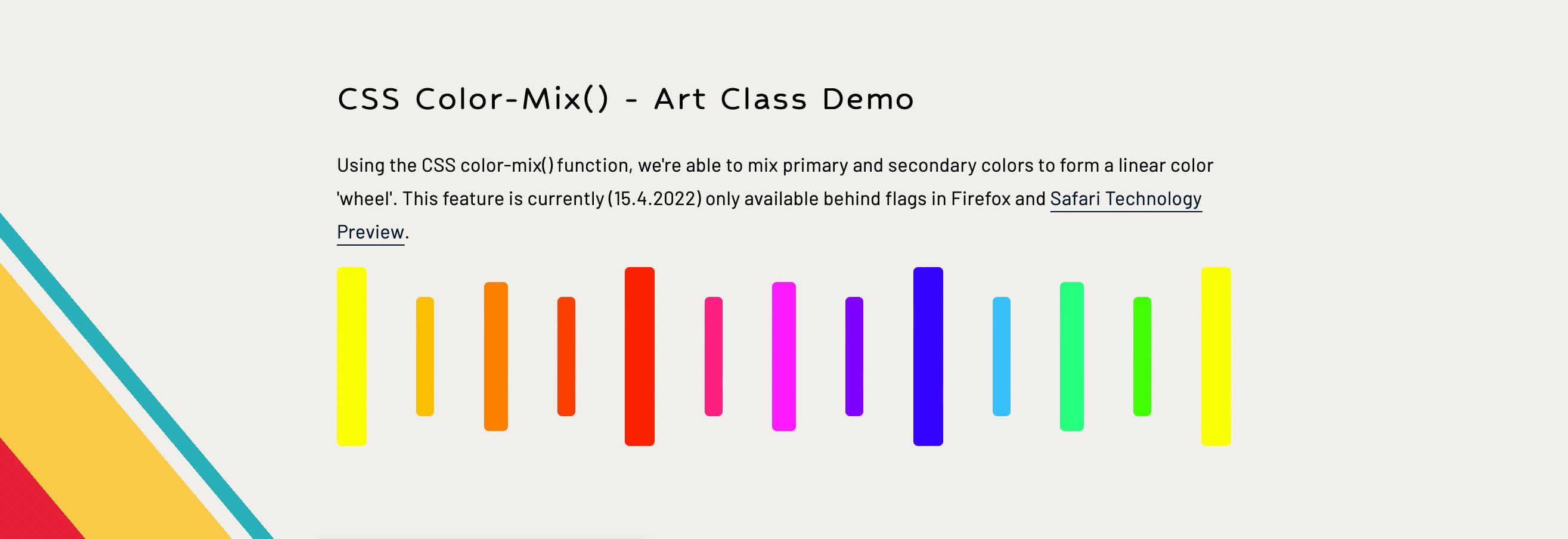
First, define the base primaries as custom properties:
--primary-1: #ff0;
--primary-2: #f00;
--primary-3: #00f;
Then mix primaries together to derive the secondary layer:
--secondary-1: color-mix(in srgb, var(--primary-1) 50%, var(--primary-2));
--secondary-2: color-mix(in srgb, var(--primary-2) 50%, var(--primary-3));
--secondary-3: color-mix(in srgb, var(--primary-3) 50%, var(--primary-1));
Finally, blend primaries with secondaries to obtain the tertiary colors:
--tertiary-1: color-mix(in srgb, var(--primary-1) 50%, var(--secondary-1));
--tertiary-2: color-mix(in srgb, var(--secondary-1) 50%, var(--primary-2));
--tertiary-3: color-mix(in srgb, var(--primary-2) 50%, var(--secondary-2));
--tertiary-4: color-mix(in srgb, var(--secondary-2) 50%, var(--primary-3));
--tertiary-5: color-mix(in srgb, var(--primary-3) 50%, var(--secondary-3));
--tertiary-6: color-mix(in srgb, var(--secondary-3) 50%, var(--primary-1));
One variable worth exploring is the color space itself. The srgb space used above is just one option; newer color spaces calculate colors differently and can produce wider palettes with more vivid shades, making them suitable for modern high-definition displays. A single color can appear differently across spaces, so swapping the color space argument — perhaps via a custom property — changes the resulting wheel entirely:
See the Pen [CSS Color-Mix – Color Space Demo](https://codepen.io/smashingmag/pen/ZErMBOy) by Daniel Yuschick.
The function is also not limited to mixing identical color types. You can blend HEX codes, rgb(), named colors and more in a single call, as this modified primary-color dataset demonstrates:
--primary-1: yellow;
--primary-2: rgb(255,0,0);
--primary-3: hsl(240,100%,50%);
--secondary-1: color-mix(in srgb, var(--primary-1) 50%, var(--primary-2));
--secondary-2: color-mix(in srgb, var(--primary-2) 50%, var(--primary-3));
--secondary-3: color-mix(in srgb, var(--primary-3) 50%, var(--primary-1));
Practical Applications in UI Themes
More pragmatically, color-mix() can generate contextual UI colors. Button :hover and :active states are traditionally hand-tuned for each theme. By blending the button's base color with an existing theme value like --color-dark-primary, you can create states that stay visually cohesive:
See the Pen [CSS Color-Mix() – Contextual Button Demo](https://codepen.io/smashingmag/pen/gOvdLMV) by Daniel Yuschick.
This approach has an advantage over both the HWB color function — which darkens by simply increasing blackness — and Sass's darken() and lighten() helpers. Those tools apply a uniform adjustment; color-mix() gives you granular control over exactly which color tints the result, and it does so natively in CSS.
Results can also be chained. A color-mix() output can serve as the base color in another call. This is used in the demo below to define a button's :active state relative to its :hover state. Here, --btn-bg-hover mixes 75% of --btn-bg with --color-dark-primary, and --btn-bg-active then mixes 80% of that hover color with the same dark primary.
 :root {
  --color-dark-primary: #dedbd2;
}

button {
  --btn-bg: #087e8b;
  --btn-bg-hover: color-mix(in srgb, var(--btn-bg) 75%, var(--color-dark-primary));
  --btn-bg-active: color-mix(in srgb, var(--btn-bg-hover) 80%, var(--color-dark-primary));

  background: var(--btn-bg);

  &:hover {
    background: var(--btn-bg-hover);
  }

  &:active {
    background: var(--btn-bg-active);
  }
}
"A lot of time can be spent defining every color variation and shade, but color-mix() can blend theme values together to fill in those variation gaps."
Understanding Blend Percentages
The optional blend percentage argument adds a layer of subtlety. When you specify both a base percent and a blend percent that don't total 100%, the function scales both values proportionally so they add up to 100%.
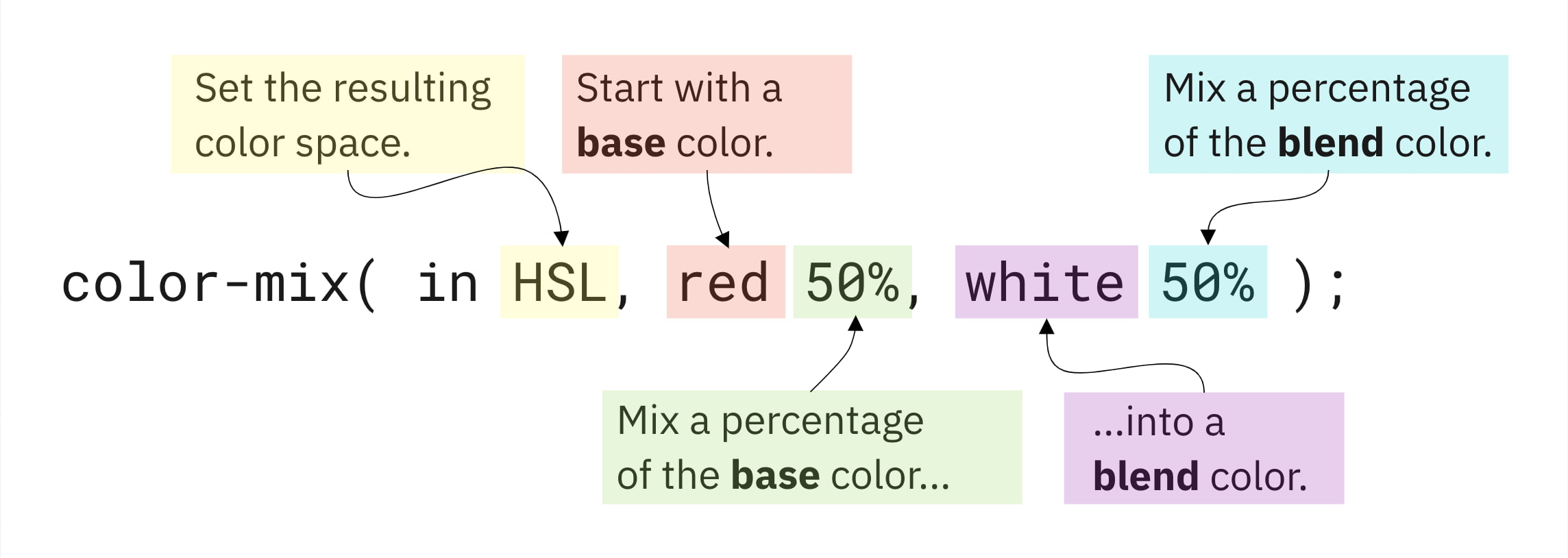
For example, with a base percentage of 20 and a blend percentage of 60 — a total of 80 — the function applies what's called an alpha multiplier of 0.8 (since 0.8 = 80%). Both percentages are multiplied by this factor to scale them up while preserving their relative weights:
--math-bg: color-mix(in srgb, red 20%, white 60%);
20% * 100/80 = 25%
60% * 100/80 = 75%

--math-bg: color-mix(in srgb, red 25%, white 75%);
If the total exceeds 100%, the inverse approach rounds down. The full mathematical explanation lives in the W3C docs; the interactive demo below lets you adjust both sliders to see the effect without the math:
See the Pen [CSS Color-Mix – Blend Color Percentage Demo](https://codepen.io/smashingmag/pen/rNJZWMY) by Daniel Yuschick.
Transparency Mixes, Too
Colors carrying their own opacity values behave predictably. Mixing a red and a blue, each defined with rgba at 50% opacity, yields the same pink shade you'd expect from opaque mixing — but with averaged transparency. If base opacities are 100% and 0%, the resulting opacity lands at 50%, regardless of the color mix's consistent pink hue.
 :root {
  --base-opacity: 50%;
  --blend-opacity: 50%;
  --base-color: rgba(255, 0, 0, var(--base-opacity));
  --blend-color: rgba(0, 0, 255, var(--blend-opacity));
}

#result {
  background: color-mix(in lch, var(--base-color) 50%, var(--blend-color));
}
See the Pen [CSS Color-Mix – Opacities Demo](https://codepen.io/smashingmag/pen/mdXGOrZ) by Daniel Yuschick.
Known Caveats
As with any young feature, there are wrinkles to be aware of.
Custom Properties and Fallbacks Don't Mix Well
CSS custom properties support fallback values for when a property isn't defined. It's tempting to use color-mix() as a progressive enhancement by nesting it as a fallback:
--background-color: color-mix(in srgb, red 50%, blue);
background: var(--background-color, var(--fallback-color));
In an unsupported browser, however, the fallback won't trigger as expected. The custom property is technically defined — its value is just the unparsed function itself, as observed in Chrome DevTools:

The @supports() rule offers a path for progressive enhancement, but given the minimal support and possibility of syntax changes, exercising caution before adopting color-mix() across an entire codebase is advisable.
@supports (background: color-mix(in srgb, red 50%, blue)) {
  --background-color: color-mix(in srgb, red 50%, blue);
}
currentColor Is Not Accepted
The currentColor keyword can't serve as an argument to color-mix(). That limitation may frustrate attempts to keep component styles relative to their own text color. The upcoming relative color syntax in CSS is positioned to address this need, so there is a workaround on the horizon.
button {
  background: color-mix(in srgb, currentColor 50%, white);
}
Where color-mix() Fits In
color-mix() is not a replacement for more advanced color functions like color-contrast(), but it earns its place in the modern CSS toolkit. Its real strength lies in generating contextual colors and simplifying palette management inside design systems and themes, where it can reduce duplication while keeping flexibility high.
The intersection of color-mix() and color-contrast() is particularly promising. Combining them could enable adaptive theming that adjusts both hue and readability in one pass. That exploration, however, remains limited by current browser support, which makes large-scale experimentation impractical for production work.
Practical Entry Points
Several patterns stand out as natural first uses for color-mix():
- Recreating the behavior of SCSS
lighten()anddarken()helpers via a small mixin or utility class. - Supporting user-generated themes where a single base color gets mixed into multiple surface and text variants.
- Building web-based graphic editors or color tools that derive shades and tints on the fly.
- Converting between color formats based on what the device and browser can render efficiently.
These are early ideas, not settled patterns. The feature is young, and the best practices will emerge as browser support matures and more developers push on its limits. For now, it is a versatile ingredient in an increasingly rich CSS color recipe book.
Further Reading
- “Manage Accessible Design System Themes With CSS Color-Contrast(),” Daniel Yuschick
- “A Recipe For A Good Design System,” Átila Fassina
- “A Guide To Modern CSS Colors With RGB, HSL, HWB, LAB And LCH,” Michelle Barker
- “Color Tools And Resources,” Cosima Mielke



