
Sequential animations for any number of elements
When N elements share the same animation and need to run one after another — first, second, up to the last, then back to the start — the usual approach gets awkward fast: elaborate keyframes, hand-computed delays, hardcoded counts. Modern CSS can do this with a fixed rule set that holds for any number of items. The demo currently works in Chrome and Edge; wider support depends on sibling-index() and sibling-count() (Firefox: Ticket #1953973, WebKit: Issue #471).
The keyframes themselves stay trivial — a single to frame changing background color and scale:
@keyframes x {
  to {
    background: #F8CA00;
    scale: .8;
  }
}
The heavy lifting happens in one dense block of CSS:
.container > * {
  --_s: calc(100%*(sibling-index() - 1)/sibling-count());
  --_e: calc(100%*(sibling-index())/sibling-count());

  animation:
    x calc(var(--d)*sibling-count()) infinite
    linear(0, 0 var(--_s), 1, 0 var(--_e), 0);
}
How the linear() timing function works
Timing functions (linear, ease, steps(), cubic-bezier()) control easing. The newer linear() is more capable. Per the spec: "A linear easing function is an easing function that interpolates linearly between its control points. Each control point is a pair of numbers, associating an input progress value to an output progress value."
Whereas animation-timing-function: linear interpolates between just the animation's start and end, linear() accepts an arbitrary list of points with linear interpolation between consecutive ones. The first value below is equivalent to plain linear:
linear(0 0%, 1 100%)Each point is a pair: output progress (the animation state defined in the keyframes) and input progress (time). For example:
.box {
  animation: move 2s linear(0 0%, 1 100%);
}

@keyframes move {
  0%   {translate: 0px }
  100% {translate: 80px}
}
In words: 0 of the animation (translate: 0px) at t=0% (0s), 1 (translate: 80px) at t=100% (2s of a 2s duration), with a linear ramp between. Numbers can replace percentages, but the author recommends percentages to avoid confusing the time value with the output value, which is a plain number:
linear(0 0, 1 1)Since 0% and 100% are implicit, the following is equivalent:
linear(0, 1)Adding a third point:
linear(0, 1, 0)The first point always sits at 0% and the last at 100%; a point that omits its input progress gets the midpoint between its neighbors, just like color stops in gradients:
linear(0 0%, 1, 0 100%)Written explicitly, the timing is easier to grasp:
linear(0 0%, 1 50%, 0 100%)We have made the element travel from translate: 0px at 0s to translate: 80px at 1s, then back to translate: 0px at 2s. This is the real power of linear(): most timing functions only move forward, but this one can reverse as many times as needed, producing intricate animations from a single simple keyframe set.
The same effect could be authored through multi-step keyframes:
@keyframes move {
  0%, 100% { translate: 0px }
  50% { translate: 80px }
}
The catch: keyframe percentages can't be changed from CSS, so every variation would need new keyframes. With linear(), one keyframe set serves all verticals — in the demo, the elements share the same keyframes yet animate entirely differently.
Building a delay with control points
Each element must animate, wait while the rest finish, then start over; the wait is effectively a delay. The intuitive route is a keyframe rule holding the same value from 0% to 50%:
@keyframes move {
  0%, 50% { translate: 0px }
  100% { translate: 80px }
}
Nothing happens before the halfway point — but again those percentages aren't editable from CSS. In linear() form, giving the first two control points identical output progress but different input times produces the same pause without touching the keyframes:
linear(0 0%, 0 50%, 1 100%)@keyframes move {
0% { translate: 0px }
100% { translate: 80px }
}Adding a point to return to the initial state:
linear(0 0%, 0 50%, 1 75%, 0 100%)Which condenses to:
linear(0, 0 50%, 1, 0)Since everything is configurable inside the linear() string, each element can get its own variant — the basis of the sequential effect.
Staggering across elements
With two identical elements, both animate in sync. Changing the first element's timing to animate in the first half and wait in the second:
linear(0, 1, 0 50%, 0)…inverts the previous value, and the two elements now alternate: while one waits, the other animates.
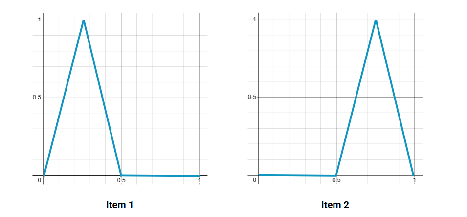
Scaling the idea to three elements requires three ranges — each element animating in one and waiting in two:
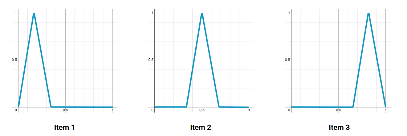
The pattern generalizes: N elements mean N ranges, with the linear() syntax:
linear(0, 0 S, 1, 0 E, 0)The start and end states are both 0, the animation runs between S and E, and an element waits from 0% to S, animates from S to E, then waits from E to 100%. The animation window equals 100%/N, so E - S = 100%/N. Element i (zero-based) begins its range at i * 100%/N, making S:
S = (i - 1) * 100%/NN and i come directly from CSS. The count:
S = calc(100%*(sibling-index() - 1)/sibling-count())The index:
E = S + 100%/N
E = calc(100%*sibling-index()/sibling-count())
With those, the entire effect, including a --d duration variable multiplied by N to control each element's animation time, is a few lines:
.box {
  --d: .5s; /* animation duration */
  --_s: calc(100%*(sibling-index() - 1)/sibling-count());
  --_e: calc(100%*(sibling-index())/sibling-count());

  animation: x calc(var(--d)*sibling-count()) infinite linear(0, 0 var(--_s), 1, 0 var(--_e), 0);
}
@keyframes x {
  to {
    background: #F8CA00;
    scale: .8;
  }
}
One note: the variables need registering with @property to work; otherwise a bug (cause unknown) breaks things.
Variants
The groundwork extends naturally. One variation lets the next element start before the current one finishes: define N + 1 ranges with each element animating across two, so consecutive animations overlap in a shared range — the first spans ranges one and two, the second spans two and three, and so on. Further examples follow the same rethinking of the range layout.
Though linear() was introduced mainly for complex easing like bounce and elastic curves, it achieves far more when paired with other modern CSS features.




