

Arranging Avatars on a Circle with offset or transform
This is the second half of the avatar list exercise; the HTML and CSS base carry over from the horizontal version: a set of images inside a container, with mask-ed cutouts between them. Only the positions change, since the list now wraps around a circle. The demo currently targets Chrome and Edge; broader browser reach depends on sibling-index() and sibling-count() support (Firefox progress is tracked in Ticket #1953973, WebKit in Issue #471).
There are multiple ways to distribute images around a circle. The first uses the offset shorthand:
.container {
  display: grid;
}
.container img {
  grid-area: 1/1;
  offset: circle(180px) calc(100%*sibling-index()/sibling-count()) 0deg;
}
Rewriting it in longhand makes the mechanism clearer:
offset-path: circle(180px);
offset-distance: calc(100%*sibling-index()/sibling-count());
offset-rotate: 0deg;
Every image follows a circular path with a 180px radius, initially stacked at the same point. Spreading them out is a matter of adjusting offset-distance, computed from sibling-index() and sibling-count() so the code works for any element count rather than a fixed one.
With six elements the values come out like this:
100% x 1/6 = 16.67%
100% x 2/6 = 33.33%
100% x 3/6 = 50%
100% x 4/6 = 66,67%
100% x 5/6 = 83.33%
100% x 6/6 = 100%
An offset-rotate of 0deg keeps each image upright along the path instead of spinning with it. Changing the result then means only changing the radius.
The alternative approach combines two rotations with a translation in transform:
.container {
  display: grid;
}
.container img {
  grid-area: 1/1;
  --_i: calc(1turn*sibling-index()/sibling-count());
  transform: rotate(calc(-1*var(--_i))) translate(180px) rotate(var(--_i));
}
The translation carries the circle radius and the rotation terms use the sibling-* functions just as offset-distance did. Despite preferring offset, the walkthrough uses the transform version, because the rotation angle can be reused in more places.
Sizing the Circle Responsively
As in Part 1, container query units drive the radius so the component responds to its container:
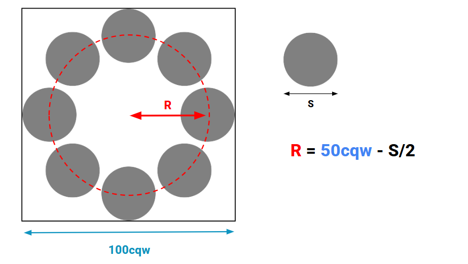
.container {
  --s: 120px; /* image size */

  aspect-ratio: 1;
  container-type: inline-size;
}
.container img {
  width: var(--s);
  --_r: calc(50cqw - var(--s)/2);
  --_i: calc(1turn*sibling-index()/sibling-count());
  transform: rotate(calc(-1*var(--_i))) translate(var(--_r)) rotate(var(--_i));
}
Making the circle scale is not enough on its own: at larger sizes the images drift apart too much. The aim is the smallest circle that holds all images without overlap — analogous to the maximum margin boundary used previously. The radius (R) works out to:
S/(2 x sin(.5turn/N))In CSS:
--_r: min(50cqw - var(--s)/2,var(--s)/(2*sin(.5turn/sibling-count())));A further variable for the gap between images, --g, refines the formula to maintain a small separation:
.container {
  --s: 120px; /* image size */
  --g: 10px;  /* the gap */

  aspect-ratio: 1;
  container-type: inline-size;
}
.container img {
  width: var(--s);
  --_r: min(50cqw - var(--s)/2,(var(--s) + var(--g))/(2*sin(.5turn/sibling-count())));
  --_i: calc(1turn*sibling-index()/sibling-count());
  transform: rotate(calc(-1*var(--_i))) translate(var(--_r)) rotate(var(--_i));
}
Computing the Mask Cut-Out
The mask itself matches the previous article:
mask: radial-gradient(50% 50% at X Y, #0000 calc(100% + var(--g)), #000);For the horizontal list, X and Y were easy: Y could keep its default, and X was either 150% + M or -50% - M (with M the margin governing overlap). Conceptually they locate the center point of the next or previous image, which still holds here — the math is just harder:
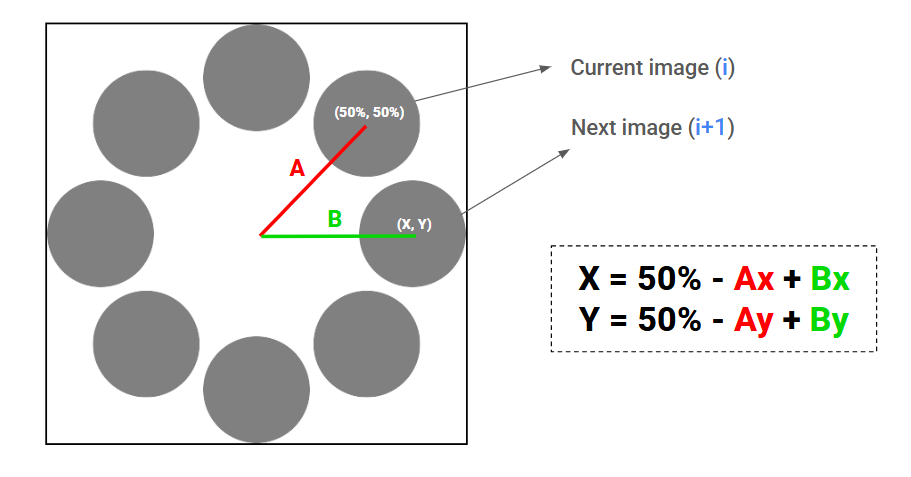
The approach starts at the current image's center (50% 50%) and travels to the next image's center. First comes segment A, out to the center of the large circle, then segment B, out to the center of the next image. The formula:
X = 50% - Ax + Bx
Y = 50% - Ay + By
Ax and Ay are the projections of segment A onto the X- and Y-axes, obtained with trigonometric functions:
Ax = r x sin(i);
Ay = r x cos(i);
Here r is the circle radius stored in --_r and i is the rotation angle in --_i. Segment B follows the same pattern, with j standing for the next image in the sequence — the index incremented by one:
Bx = r x sin(j);
By = r x cos(j);
--_i: calc(1turn*sibling-index()/sibling-count());
--_j: calc(1turn*(sibling-index() + 1)/sibling-count());And the mask code in full:
.container {
--s: 120px; /* image size */
--g: 14px; /* the gap */
aspect-ratio: 1;
container-type: inline-size;
}
.container img {
width: var(--s);
--_r: min(50cqw - var(--s)/2,(var(--s) + var(--g))/(2*sin(.5turn/sibling-count())));
--_i: calc(1turn*sibling-index()/sibling-count());
--_j: calc(1turn*(sibling-index() + 1)/sibling-count());
transform: rotate(calc(-1*var(--_i))) translate(var(--_r)) rotate(var(--_i));
mask: radial-gradient(50% 50% at
calc(50% + var(--_r)*(cos(var(--_j)) - cos(var(--_i))))
calc(50% + var(--_r)*(sin(var(--_i)) - sin(var(--_j)))),
#0000 calc(100% + var(--g)), #000);
}The cut-out can also be produced on the opposite side by looking at the previous image rather than the next: decrement the index instead of incrementing it, and apply it through a .reverse class.
Reveal on Hover
Where Part 1's horizontal list zeroed out an image's margin and compensated on the other images, the circular version works differently: on hover, every image except the hovered one rotates until the hovered one is fully exposed. The rotation direction follows the cut-out direction.
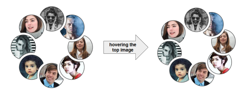
The rotation happens by changing the --_i variable, which feeds the rotate argument. Start with an arbitrary 20deg:
.container img {
  --_i: calc(1turn*sibling-index()/sibling-count());
}
.container:has(:hover) img {
  --_i: calc(1turn*sibling-index()/sibling-count() + 20deg);
}
.container.reverse:has(:hover) img {
  --_i: calc(1turn*sibling-index()/sibling-count() - 20deg);
}
All images rotate, but the mask does not follow. Since the mask depends on the next/previous image via --_j, and that image rotates too, --_j has to be updated alongside:
.container img {
  --_i: calc(1turn*sibling-index()/sibling-count());
  --_j: calc(1turn*(sibling-index() + 1)/sibling-count());
}
.container.reverse img {
  --_j: calc(1turn*(sibling-index() - 1)/sibling-count());
}
.container:has(:hover) img {
  --_i: calc(1turn*sibling-index()/sibling-count() + 20deg);
  --_j: calc(1turn*(sibling-index() + 1)/sibling-count() + 20deg);
}
.container.reverse:has(:hover) img {
  --_i: calc(1turn*sibling-index()/sibling-count() - 20deg);
  --_j: calc(1turn*(sibling-index() - 1)/sibling-count() - 20deg);
}
That duplicates a lot of code. Extra variables clean it up:
.container img {
  --_a: 20deg;

  --_i: calc(1turn*sibling-index()/sibling-count() + var(--_ii, 0deg));
  --_j: calc(1turn*(sibling-index() + 1)/sibling-count() + var(--_jj, 0deg));
}
.container.reverse img {
  --_i: calc(1turn*sibling-index()/sibling-count() - var(--_ii, 0deg));
  --_j: calc(1turn*(sibling-index() - 1)/sibling-count() - var(--_jj, 0deg));
}
.container:has(:hover) img {
  --_ii: var(--_a);
  --_jj: var(--_a);
}
The angle lives in one place as --_a, with two intermediate variables adding offsets to --_i and --_j. Next, disable rotation for the hovered image:
.container img:hover {
  --_ii: 0deg;
  --_jj: 0deg;
}
The mask breaks again. The hovered image should stay still while the others rotate, but its --_j must still change because it refers to a neighbor. So drop --_jj: 0deg and keep only --_ii: 0deg:
.container img:hover {
  --_ii: 0deg;
}
Better, but not complete: the hovered image is itself the next or previous neighbor of another image, and since it does not rotate, that other image's --_j must remain unchanged as well. In the first list that is the previous image's variable; in the second list, the next image's:
/* select previous element of hovered */
.container:not(.reverse) img:has(+ :hover),
/* select next element of hovered */
.container.reverse img:hover + * {
  --_jj: 0deg;
}
The alternative that also works, for reference:
.container:not(.reverse) img:hover + *,
.container.reverse img:has(+ :hover) {
  --_jj: 0deg;
}
One image per list still misbehaves. The cause is structural: the list is circular visually but not in HTML, so the first and last images are neighbors on screen yet not for the adjacent sibling selector (+). Two additional selectors bridge those edges:
.container.reverse:has(:last-child:hover) img:first-child,
.container:not(.reverse):has(:first-child:hover) img:last-child {
  --_jj: 0deg;
}
The last step replaces the arbitrary rotation with the smallest value that eliminates overlap while keeping the images as close together as possible:
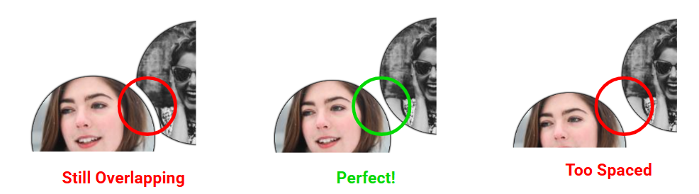
--_a: calc(2*asin((var(--s) + var(--g))/(2*var(--_r))) - 1turn/sibling-count());Takeaways
The formulas here are specific to this example, so forgetting them later is fine. The ingredients they exercise are the reusable part: offset, mask, the sibling-* functions, container query units, and min()/max().




