Native JavaScript dialogs bring more built-in behavior than most developers pause to notice. alert(), confirm() and prompt() are genuine modals that sit above anything on the page — including a <div> with z-index: 99999;. They respond to Enter to accept and Escape to cancel, move focus so screen readers can announce their content, and respect light and dark mode preferences out of the box. Focus is trapped inside them, though Tab cannot reach the accept or cancel buttons in any browser — in Firefox and Safari it moves focus to the browser UI instead. They also pause code execution and wait for user input.
Two things keep developers away: the dialogs look like unstylable system errors, and there has been movement toward their deprecation — first their removal from cross-domain iframes, then, reportedly, from the web platform entirely, although those plans sound like they are on hold.
The HTML <dialog> element combined with a JavaScript class gets us nearly all the way there. An identical replacement is impossible, but pairing the showModal() method with a Promise that resolves (accept) or rejects (cancel) lands almost as good — and while we're at it, the dialog can play sound like real system dialogs do.
A settings-driven Dialog class
The class starts with a settings object merged over default settings that apply to every dialog unless overridden at invocation.
export default class Dialog {
constructor(settings = {}) {
  this.settings = Object.assign(
    {
      /* DEFAULT SETTINGS - see description below */
    },
    settings
  )
  this.init()
}
The settings cover the accept and cancel button labels, a bodyClass added to <body> while the dialog is open in browsers without <dialog> support, a custom dialogClass on the element, the message content, sound URLs for opening (soundOpen) and accepting (soundAccept), and an optional template injected into the <dialog>.
The init method adds a feature-detection helper and builds the base markup.
init() {
  // Testing for <dialog> support
  this.dialogSupported = typeof HTMLDialogElement === 'function'
  this.dialog = document.createElement('dialog')
  this.dialog.dataset.component = this.dialogSupported ? 'dialog' : 'no-dialog'
  this.dialog.role = 'dialog'

  // HTML template
  this.dialog.innerHTML = `
  <form method="dialog">
    <fieldset role="document">
      <legend id="${(Math.round(Date.now())).toString(36)}">
      </legend>
      <div></div>
    </fieldset>
    <menu>
      <button value="cancel"></button>
      <button value="default"></button>
    </menu>
    <audio></audio>
    <audio></audio>
  </form>`

  document.body.appendChild(this.dialog)

  // ...
}
Support, markup and DOM references
Browser support for <dialog> has been a long road — Safari picked it up fairly recently, Firefox more recently still, and Firefox lacks the <form method="dialog"> part. Because of that gap, the mimicked accept and cancel buttons need type="button"; otherwise they would POST the form and refresh the page.
<button${this.dialogSupported ? '' : ` type="button"`}...></button>The markup's data-ref attributes provide node references, so this.elements.accept points at the accept button and this.elements.cancel at the cancel button.
this.elements = {}
this.dialog.querySelectorAll('[data-ref]').forEach(el => this.elements[el.dataset.ref] = el)
For screen readers, an aria-labelledby attribute points at the ID of the <legend> tag that carries the message.
this.dialog.setAttribute('aria-labelledby', this.elements.message.id)On the cancel side, the element's built-in cancel() method does the heavy lifting for emulating confirm(); the cancel button emits that event.
this.elements.cancel.addEventListener('click', () => {
  this.dialog.dispatchEvent(new Event('cancel'))
})
Handling unsupported browsers and keyboard users
A toggle() method wraps the show/hide logic and hides the element where <dialog> isn't supported.
toggle(open = false) {
  if (this.dialogSupported && open) this.dialog.showModal()
  if (!this.dialogSupported) {
    document.body.classList.toggle(this.settings.bodyClass, open)
    this.dialog.hidden = !open
    /* If a `target` exists, set focus on it when closing */
    if (this.elements.target && !open) {
      this.elements.target.focus()
    }
  }
}
/* Then call it at the end of `init`: */
this.toggle()
Trapping focus is needed so tabbing between buttons doesn't exit the dialog. A CSS-only approach is unreliable, so the class collects every focusable element in the dialog as a NodeList stored in this.focusable.
getFocusable() {
  return [...this.dialog.querySelectorAll('button,[href],select,textarea,input:not([type="hidden"]),[tabindex]:not([tabindex="-1"])')]
}
A keydown listener then handles all navigation:
this.dialog.addEventListener('keydown', e => {
  if (e.key === 'Enter') {
    if (!this.dialogSupported) e.preventDefault()
    this.elements.accept.dispatchEvent(new Event('click'))
  }
  if (e.key === 'Escape') this.dialog.dispatchEvent(new Event('cancel'))
  if (e.key === 'Tab') {
    e.preventDefault()
    const len =  this.focusable.length - 1;
    let index = this.focusable.indexOf(e.target);
    index = e.shiftKey ? index-1 : index+1;
    if (index < 0) index = len;
    if (index > len) index = 0;
    this.focusable[index].focus();
  }
})
On Enter, the handler prevents form submission in browsers without <dialog> support. Escape emits a cancel event. Tab locates the current element in this.focusable and focuses the next or previous item, the latter when Shift is held.
Opening the dialog and waiting for input
Opening merges an optional per-invocation settings object over the defaults, so individual dialogs can add or change any setting.
open(settings = {}) {
  const dialog = Object.assign({}, this.settings, settings)
  this.dialog.className = dialog.dialogClass || ''

  /* set innerText of the elements */
  this.elements.accept.innerText = dialog.accept
  this.elements.cancel.innerText = dialog.cancel
  this.elements.cancel.hidden = dialog.cancel === ''
  this.elements.message.innerText = dialog.message

  /* If sounds exists, update `src` */
  this.elements.soundAccept.src = dialog.soundAccept || ''
  this.elements.soundOpen.src = dialog.soundOpen || ''

  /* A target can be added (from the element invoking the dialog */
  this.elements.target = dialog.target || ''

  /* Optional HTML for custom dialogs */
  this.elements.template.innerHTML = dialog.template || ''

  /* Grab focusable elements */
  this.focusable = this.getFocusable()
  this.hasFormData = this.elements.fieldset.elements.length > 0
  if (dialog.soundOpen) {
    this.elements.soundOpen.play()
  }
  this.toggle(true)
  if (this.hasFormData) {
    /* If form elements exist, focus on that first */
    this.focusable[0].focus()
    this.focusable[0].select()
  }
  else {
    this.elements.accept.focus()
  }
}
To emulate the way native methods wait for a response, a waitForUser() method returns a Promise with listeners for accept and cancel that resolve true or false. When formData exists — custom dialogs or prompt — it is collected with a helper method and returned in an object.
waitForUser() {
  return new Promise(resolve => {
    this.dialog.addEventListener('cancel', () => {
      this.toggle()
      resolve(false)
    }, { once: true })
    this.elements.accept.addEventListener('click', () => {
      let value = this.hasFormData ?
        this.collectFormData(new FormData(this.elements.form)) : true;
      if (this.elements.soundAccept.src) this.elements.soundAccept.play()
      this.toggle()
      resolve(value)
    }, { once: true })
  })
}
collectFormData(formData) {
const object = {};
formData.forEach((value, key) => {
if (!Reflect.has(object, key)) {
object[key] = value
return
}
if (!Array.isArray(object[key])) {
object[key] = [object[key]]
}
object[key].push(value)
})
return object
}The listeners are removed immediately via { once: true }. For simplicity the implementation resolves false rather than calling reject().
The built-in cancel event, fired by the cancel button or Escape, removes the open attribute on the <dialog> and hides it.
Deciding where focus lands
The open() method focuses either the first focusable form field or the accept button.
if (this.hasFormData) {
  this.focusable[0].focus()
  this.focusable[0].select()
}
else {
  this.elements.accept.focus()
}
W3's "Modal Dialog" example does the same, but Scott Ohara's example focuses the dialog itself — sensible when the screen reader should read the text named in aria-labelledby. For that approach, add tabindex="-1" to the <dialog> in init:
this.dialog.tabIndex = -1and replace the focus code in open() with:
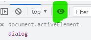
this.dialog.focus()In DevTools you can watch document.activeElement update by clicking the "eye" icon and typing it in the console while tabbing around.
Adding alert, confirm and prompt helpers
Small helper methods mirror the original syntax, all calling open() with a settings object shaped to match each native call. Native alert() is triggered like this:
window.alert(message);The class version blanks out cancel and template so that only message and accept render, even when defaults were set earlier:
/* dialog.alert() */
alert(message, config = { target: event.target }) {
  const settings = Object.assign({}, config, { cancel: '', message, template: '' })
  this.open(settings)
  return this.waitForUser()
}
Native confirm():
window.confirm(message);Here the helper shows message, cancel and accept:
/* dialog.confirm() */
confirm(message, config = { target: event.target }) {
  const settings = Object.assign({}, config, { message, template: '' })
  this.open(settings)
  return this.waitForUser()
}
Native prompt():
window.prompt(message, default);This one needs a template containing an <input> wrapped in a <label>:
/* dialog.prompt() */
prompt(message, value, config = { target: event.target }) {
  const template = `
  <label aria-label="${message}">
    <input name="prompt" value="${value}">
  </label>`
  const settings = Object.assign({}, config, { message, template })
  this.open(settings)
  return this.waitForUser()
}
{ target: event.target } references the element that invoked the method; when the dialog closes, focus returns there so the user ends up where they started.
Testing it out
Create a new HTML file, import the class and instantiate it:
<script type="module">
  import Dialog from './dialog.js';
  const dialog = new Dialog();
</script>
Then walk through each use case one at a time:
/* alert */
dialog.alert('Please refresh your browser')
/* or */
dialog.alert('Please refresh your browser').then((res) => {  console.log(res) })

/* confirm */
dialog.confirm('Do you want to continue?').then((res) => { console.log(res) })

/* prompt */
dialog.prompt('The meaning of life?', 42).then((res) => { console.log(res) })
Watch the console while clicking accept or cancel, then repeat using the Escape and Enter keys.
Async/await
The same flow works with async/await, which mimics the original syntax even more closely. The wrapping function must be async and the call needs await:
document.getElementById('promptButton').addEventListener('click', async (e) => {
  const value = await dialog.prompt('The meaning of life?', 42);
  console.log(value);
});
Styling across browsers
The existing data-component and data-ref attributes are enough to build cross-browser styles — no extra classes needed. The default CSS uses the :where pseudo-selector to keep specificity at zero:
:where([data-component*="dialog"] *) {
  box-sizing: border-box;
  outline-color: var(--dlg-outline-c, hsl(218, 79.19%, 35%))
}
:where([data-component*="dialog"]) {
  --dlg-gap: 1em;
  background: var(--dlg-bg, #fff);
  border: var(--dlg-b, 0);
  border-radius: var(--dlg-bdrs, 0.25em);
  box-shadow: var(--dlg-bxsh, 0px 25px 50px -12px rgba(0, 0, 0, 0.25));
  font-family:var(--dlg-ff, ui-sansserif, system-ui, sans-serif);
  min-inline-size: var(--dlg-mis, auto);
  padding: var(--dlg-p, var(--dlg-gap));
  width: var(--dlg-w, fit-content);
}
:where([data-component="no-dialog"]:not([hidden])) {
  display: block;
  inset-block-start: var(--dlg-gap);
  inset-inline-start: 50%;
  position: fixed;
  transform: translateX(-50%);
}
:where([data-component*="dialog"] menu) {
  display: flex;
  gap: calc(var(--dlg-gap) / 2);
  justify-content: var(--dlg-menu-jc, flex-end);
  margin: 0;
  padding: 0;
}
:where([data-component*="dialog"] menu button) {
  background-color: var(--dlg-button-bgc);
  border: 0;
  border-radius: var(--dlg-bdrs, 0.25em);
  color: var(--dlg-button-c);
  font-size: var(--dlg-button-fz, 0.8em);
  padding: var(--dlg-button-p, 0.65em 1.5em);
}
:where([data-component*="dialog"] [data-ref="accept"]) {
  --dlg-button-bgc: var(--dlg-accept-bgc, hsl(218, 79.19%, 46.08%));
  --dlg-button-c: var(--dlg-accept-c, #fff);
}
:where([data-component*="dialog"] [data-ref="cancel"]) {
  --dlg-button-bgc: var(--dlg-cancel-bgc, transparent);
  --dlg-button-c: var(--dlg-cancel-c, inherit);
}
:where([data-component*="dialog"] [data-ref="fieldset"]) {
  border: 0;
  margin: unset;
  padding: unset;
}
:where([data-component*="dialog"] [data-ref="message"]) {
  font-size: var(--dlg-message-fz, 1.25em);
  margin-block-end: var(--dlg-gap);
}
:where([data-component*="dialog"] [data-ref="template"]:not(:empty)) {
  margin-block-end: var(--dlg-gap);
  width: 100%;
}
That CSS produces the following result:

alert()
confirm()
prompt()To replace the defaults, put a class in dialogClass,
dialogClass: 'custom'then target it in CSS and update the custom property values:
.custom {
  --dlg-accept-bgc: hsl(159, 65%, 75%);
  --dlg-accept-c: #000;
  /* etc. */
}
A custom example with sound
The template property lets a dialog go past the three mimicked methods. Invoked from a <button> with id="btnCustom", this example injects extra HTML and plays an MP3 sound:
document.getElementById('btnCustom').addEventListener('click', (e) => {
  dialog.open({
    accept: 'Sign in',
    dialogClass: 'custom',
    message: 'Please enter your credentials',
    soundAccept: 'https://assets.yourdomain.com/accept.mp3',
    soundOpen: 'https://assets.yourdomain.com/open.mp3',
    target: e.target,
    template: `
    <label>Username<input type="text" name="username" value="admin"></label>
    <label>Password<input type="password" name="password" value="password"></label>`
  })
  dialog.waitForUser().then((res) => {  console.log(res) })
});



