
A Custom Component for a Physical Button
Standard HTML input controls cover most form needs, but simulating physical electronics calls for something more specialized. Building an Arduino simulator that runs in the browser requires virtual components that look and behave like their real counterparts, so users can interact with them the same way they would with physical hardware.
Creating such components combines several web technologies: SVG for graphics that stay crisp and are easy to manipulate, Web Components for encapsulation and reusability, and the lightweight lit-element library to streamline component authoring. The result is a momentary pushbutton that works across desktop and mobile, is keyboard-accessible, and can be dropped into any web project.
Defining Component Requirements
The target is a 12mm pushbutton, a standard part in electronics starter kits. These buttons come in multiple cap colors and have two distinct states: pressed and released. Those states need to be visually obvious to the user.
For an Arduino simulator, the component only needs to report its current state. It doesn't need to emit click or double-click events, since physical buttons don't generate them and the simulated Arduino program decides how to react. Requirements boil down to:
- Look like a real 12mm pushbutton.
- Have clearly visible pressed and released states.
- Support mouse, touch, and keyboard interaction.
- Support interchangeable cap colors (at least red, green, blue, yellow, white, and black).
Why SVG Is the Right Choice
Complex graphics built from CSS and HTML quickly become unwieldy. SVG is better suited for detailed vector illustrations, and it brings practical advantages for component development: the graphic is easy to manipulate from JavaScript and can be styled via CSS. This makes it possible to ship a single button image and change cap colors at runtime, or use CSS to indicate state.
SVG is also just XML, so it can be inspected and edited in a text editor and embedded directly into HTML. That makes it a natural fit for reusable web components.
Creating the Graphic in Inkscape
Inkscape provides all the tools needed to draw the button. The artwork is a top view comprising six basic shapes:
- A 12×12mm dark gray rectangle with slightly rounded corners for the plastic housing.
- A smaller 10.5×10.5mm light gray rectangle for the metal cover on top.
- Four darker circles at the corners, representing the pins that hold the assembly together.
- A large central circle marking the contour of the button cap.
- A smaller inner circle for the top surface of the cap.
- Four light gray rectangles arranged in a "T" shape for the metal leads.

Adding SVG gradient effects to the cap contour gives the flat shapes a subtle three-dimensional appearance.

Optimizing the SVG for the Web
Raw SVG exported from Inkscape carries overhead that isn't needed in a web component. Metadata about the software and last editing session is irrelevant, and unused gradients, filters, and empty elements all inflate file size.
A few menu steps in Inkscape clean up most of it:
- Choose File → Clean up document to strip unused definitions.
- Select File → Save as… and pick Optimized SVG as the file type.
- In the options dialog, enable all the cleaning options except "Keep editor data," "Keep unreferenced definitions," and "Preserve manually created IDs."
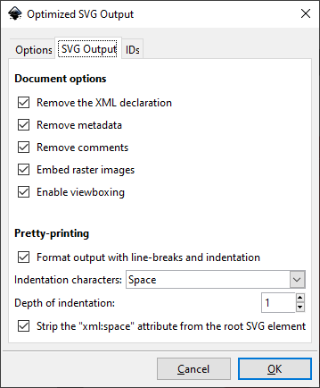
These steps compressed the button artwork from 4593 bytes to 2080 bytes. Larger, more complex SVG files can show even more dramatic savings, which matters for page load time.
The optimized file is also far more legible. The body rectangles, for instance, become immediately identifiable in the source:
<rect width="12" height="12" rx=".44" ry=".44" fill="#464646" stroke-width="1.0003"/>
<rect x=".75" y=".75" width="10.5" height="10.5" rx=".211" ry=".211" fill="#eaeaea"/>
<g fill="#1b1b1b">
  <circle cx="1.767" cy="1.7916" r=".37"/>
  <circle cx="10.161" cy="1.7916" r=".37"/>
  <circle cx="10.161" cy="10.197" r=".37"/>
  <circle cx="1.767" cy="10.197" r=".37"/>
</g>
<circle cx="6" cy="6" r="3.822" fill="url(#a)"/>
<circle cx="6" cy="6" r="2.9" fill="#ff2a2a" stroke="#2f2f2f" stroke-opacity=".47" stroke-width=".08"/>
A quick manual pass is still worth doing. Minor tweaks like changing a stroke width from 1.0003 to 1 don't save significant bytes but improve readability. Removing empty groups, simplifying matrix transforms, or converting gradient coordinates from global space to object bounding box also makes the code more maintainable. Once this pass is complete, the image is ready to be embedded in code.
Building the Reusable Component
The SVG is now self-contained, and its colors are easy to customize by editing fill values. To make it a proper component, the next step is to wrap it with lit-element, a small library that simplifies Web Component creation. Web Components built this way work in any framework environment — Angular, React, Vue, or vanilla JavaScript — since they rely on browser standards.
lit-element uses class-based syntax with a render() method that returns the component's HTML, leveraging standard tagged template literals. A basic component definition looks like this:
import { customElement, html, LitElement } from 'lit-element';

@customElement('hello-world')
export class HelloWorldElement extends LitElement {
  render() {
    return html`
      <h1>
        Hello, World!
      </h1>
    `;
  }
}
Once defined, the component is used anywhere in HTML with a simple custom tag. In the case of the pushbutton, the class declares a color property and embeds the optimized SVG markup inside render(), substituting the cap colors with the property's current value. The property declaration itself is one line:
@property() color = 'red';
And inside the SVG template, the fill color of the cap circle is tied to that property using JavaScript template literal syntax:
<circle cx="6" cy="6" r="2.9" fill="${color}" stroke="#2f2f2f" stroke-opacity=".47" stroke-width=".08" />
Handling the Pressed State
The button needs to respond visually and programmatically. For the visual response, inverting the gradient fill of the button contour creates the illusion of a physical press. Rather than defining a second, reversed gradient, the same gradient can be reused by rotating the SVG element 180 degrees with a transform:
<circle cx="6" cy="6" r="3.822" fill="url(#a)" transform="rotate(180 6 6)" />
This rotates the circle (and its fill) around its center point, defined by cx and cy. The rotation is applied conditionally via a CSS class on the circle, with the :active pseudo-class triggering the change. SVG transforms can be set through CSS using a slightly different syntax:
transform: rotate(180deg);
transform-origin: 6px 6px;
When combined with the :active pseudo-class on the SVG element, the button contour inverts properly upon click:
svg:active .button-contour {
  transform: rotate(180deg);
  transform-origin: 6px 6px;
}
lit-element attaches the stylesheet via a static getter and a tagged template literal, which also supports injecting dynamic values. It creates Shadow DOM, scoping the styles strictly to the component.
Event Handling and Accessibility Concerns
The programmatic side involves firing button-press and button-release events when the state changes. One approach—listening for mousedown and mouseup—has drawbacks. It does not support keyboard input, and on mobile, the events drop out if the finger is held too long.
The critical accessibility fix is to wrap the SVG in a standard <button> element. This provides keyboard focus, screen reader compatibility, and native behavior. The default button styling can be reset:
button {
  border: none;
  background: none;
  padding: 0;
  margin: 0;
  text-decoration: none;
  -webkit-appearance: none;
  -moz-appearance: none;
}

button:active .button-contour {
  transform: rotate(180deg);
  transform-origin: 6px 6px;
}
This also lets the CSS selector switch to button:active, ensuring the visual pressed state works across all input devices. Adding an aria-label with the button color improves screen reader output.
Listening for CSS pseudo-class changes from JavaScript is tricky. A proposed method uses :active to trigger a tiny CSS animation and listens for the animationstart event. While the technique proved reliable in a test environment, it is unnecessarily complex and unsupported on Edge and iOS Safari.
The selected approach is simpler: attach three pairs of event listeners to the <button> element—for mouse, touch, and keyboard:
<button
  aria-label="${color} pushbutton"
  @mousedown=${this.down}
  @mouseup=${this.up}
  @touchstart=${this.down}
  @touchend=${this.up}
  @keydown=${(e: KeyboardEvent) => e.keyCode === SPACE_KEY && this.down()}
  @keyup=${(e: KeyboardEvent) => e.keyCode === SPACE_KEY && this.up()}
>
Here, SPACE_KEY equals 32, and the down/up methods dispatch the corresponding custom events:
@property() pressed = false;

private down() {
  if (!this.pressed) {
    this.pressed = true;
    this.dispatchEvent(new Event('button-press'));
  }
}

private up() {
  if (this.pressed) {
    this.pressed = false;
    this.dispatchEvent(new Event('button-release'));
  }
}
This works consistently across all browsers, making the pushbutton-press and pushbutton-release events reliable for any input method.
A Reactive, Accessible Pushbutton
This virtual pushbutton uses SVG for the drawing and lit-element for encapsulation. Less than a hundred lines of code handle the gradient-laden design, conditional state transforms, and cross-device event handling.
The component is part of a larger open-source library of virtual electronic components. Further interaction examples are available in the live demo and the project's Storybook instance.


