

Recreating the Gemini Button Animation in Pure CSS
The Gemini button in Gmail has a distinctive hover effect: a four-pointed star that spins and shifts color while an outer shape morphs through several forms. I wanted to see if this could be recreated using only CSS, specifically with the shape() function and some carefully orchestrated animations. Here’s how I approached it.
Designing the Shapes
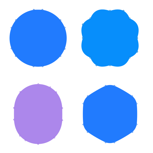
The animation cycles through five distinct shapes:
- Four-pointed star
- Flower-like shape
- Cylinder-like shape
- Rounded hexagon
- Circle
I drew each shape in Affinity Designer, exported them as SVG paths, and used a converter tool to translate the paths into CSS shape() syntax. The critical constraint during drawing: every shape needed the same number of anchor points. Without that, the browser cannot morph smoothly between them, and the animation jumps instead of blending. I settled on twelve anchor points per shape, matching the highest count used by the rounded hexagon.
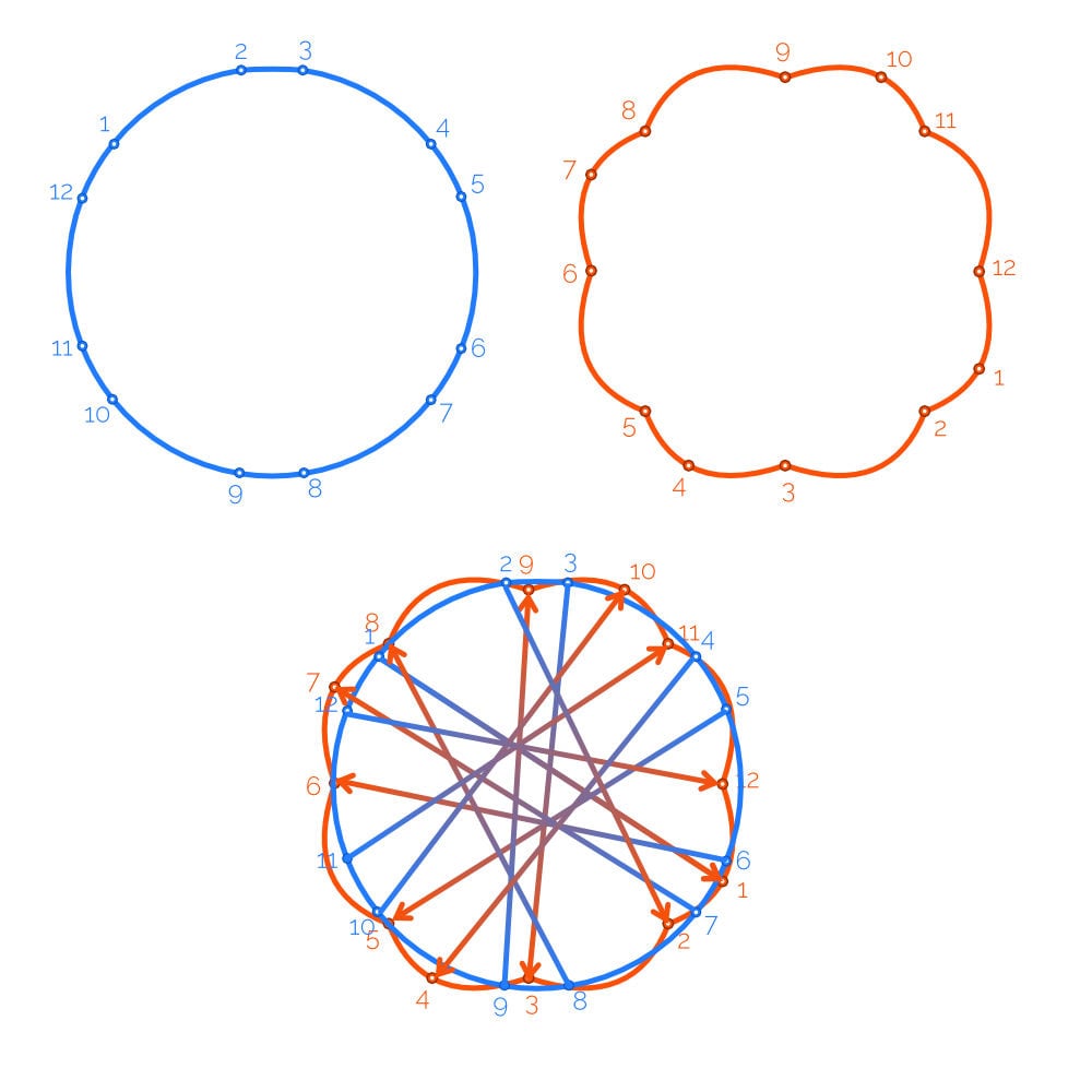
Even with equal anchor point counts, the interpolation can go wrong. If one shape’s starting point is far from another’s, the morph produces wild rotations and squishing. The circle caused the most trouble here; the fix was rotating the circle in the editor until its starting point aligned with the others.
Another issue surfaced with the cylinder-like shape: its shape() used straight line commands, which prevented smooth morphing. The transition snapped between shapes rather than interpolating. Adding a tiny bit of curvature to those edges in the vector editor solved it. Testing with the path() function showed the same behavior, suggesting this is a general interpolation limitation, not a quirk of shape().
Once the shapes were finalized, I stored each shape() value in a CSS custom property. The resulting code is dense—twelve coordinate pairs per shape—but the variables make it readable and maintainable.
View Shape Code
:root {
  --hexagon: shape(
    evenodd from 6.47% 67.001%,
    curve by 0% -34.002% with -1.1735% -7.7% / -1.1735% -26.302%,
    curve by 7.0415% -12.1965% with 0.7075% -4.641% / 3.3765% -9.2635%,
    curve by 29.447% -17.001% with 6.0815% -4.8665% / 22.192% -14.1675%,
    curve by 14.083% 0% with 4.3725% -1.708% / 9.7105% -1.708%,
    curve by 29.447% 17.001% with 7.255% 2.8335% / 23.3655% 12.1345%,
    curve by 7.0415% 12.1965% with 3.665% 2.933% / 6.334% 7.5555%,
    curve by 0% 34.002% with 1.1735% 7.7% / 1.1735% 26.302%,
    curve by -7.0415% 12.1965% with -0.7075% 4.641% / -3.3765% 9.2635%,
    curve by -29.447% 17.001% with -6.0815% 4.8665% / -22.192% 14.1675%,
    curve by -14.083% 0% with -4.3725% 1.708% / -9.7105% 1.708%,
    curve by -29.447% -17.001% with -7.255% -2.8335% / -23.3655% -12.1345%,
    curve by -7.0415% -12.1965% with -3.665% -2.933% / -6.334% -7.5555%,
    close
  );

  --flower: shape(
    evenodd from 17.9665% 82.0335%,
    curve by -12.349% -32.0335% with -13.239% -5.129% / -18.021% -15.402%,
    curve by -0.0275% -22.203% with -3.1825% -9.331% / -3.074% -16.6605%,
    curve by 12.3765% -9.8305% with 2.3835% -4.3365% / 6.565% -7.579%,
    curve by 32.0335% -12.349% with 5.129% -13.239% / 15.402% -18.021%,
    curve by 20.4535% -0.8665% with 8.3805% -2.858% / 15.1465% -3.062%,
    curve by 11.58% 13.2155% with 5.225% 2.161% / 9.0355% 6.6475%,
    curve by 12.349% 32.0335% with 13.239% 5.129% / 18.021% 15.402%,
    curve by 0.5715% 21.1275% with 2.9805% 8.7395% / 3.0745% 15.723%,
    curve by -12.9205% 10.906% with -2.26% 4.88% / -6.638% 8.472%,
    curve by -32.0335% 12.349% with -5.129% 13.239% / -15.402% 18.021%,
    curve by -21.1215% 0.5745% with -8.736% 2.9795% / -15.718% 3.0745%,
    curve by -10.912% -12.9235% with -4.883% -2.2595% / -8.477% -6.6385%,
    close
  );

  --cylinder: shape(
    evenodd from 10.5845% 59.7305%,
    curve by 0% -19.461% with -0.113% -1.7525% / -0.11% -18.14%,
    curve by 10.098% -26.213% with 0.837% -10.0375% / 3.821% -19.2625%,
    curve by 29.3175% -13.0215% with 7.2175% -7.992% / 17.682% -13.0215%,
    curve by 19.5845% 5.185% with 7.1265% 0% / 13.8135% 1.887%,
    curve by 9.8595% 7.9775% with 3.7065% 2.1185% / 7.035% 4.8195%,
    curve by 9.9715% 26.072% with 6.2015% 6.933% / 9.4345% 16.082%,
    curve by 0% 19.461% with 0.074% 1.384% / 0.0745% 17.7715%,
    curve by -13.0065% 29.1155% with -0.511% 11.5345% / -5.021% 21.933%,
    curve by -26.409% 10.119% with -6.991% 6.288% / -16.254% 10.119%,
    curve by -20.945% -5.9995% with -7.6935% 0% / -14.8755% -2.199%,
    curve by -8.713% -7.404% with -3.255% -2.0385% / -6.1905% -4.537%,
    curve by -9.7575% -25.831% with -6.074% -6.9035% / -9.1205% -15.963%,
    close
  );

  --star: shape(
    evenodd from 50% 24.787%,
    curve by 7.143% 18.016% with 0% 0% / 2.9725% 13.814%,
    curve by 17.882% 7.197% with 4.171% 4.2025% / 17.882% 7.197%,
    curve by -17.882% 8.6765% with 0% 0% / -13.711% 4.474%,
    curve by -7.143% 16.5365% with -4.1705% 4.202% / -7.143% 16.5365%,
    curve by -8.6115% -16.5365% with 0% 0% / -4.441% -12.3345%,
    curve by -16.4135% -8.6765% with -4.171% -4.2025% / -16.4135% -8.6765%,
    curve by 16.4135% -7.197% with 0% 0% / 12.2425% -2.9945%,
    curve by 8.6115% -18.016% with 4.1705% -4.202% / 8.6115% -18.016%,
    close
  );

  --circle: shape(
    evenodd from 13.482% 79.505%,
    curve by -7.1945% -12.47% with -1.4985% -1.8575% / -6.328% -10.225%,
    curve by 0.0985% -33.8965% with -4.1645% -10.7945% / -4.1685% -23.0235%,
    curve by 6.9955% -12.101% with 1.72% -4.3825% / 4.0845% -8.458%,
    curve by 30.125% -17.119% with 7.339% -9.1825% / 18.4775% -15.5135%,
    curve by 13.4165% 0.095% with 4.432% -0.6105% / 8.9505% -0.5855%,
    curve by 29.364% 16.9% with 11.6215% 1.77% / 22.102% 7.9015%,
    curve by 7.176% 12.4145% with 3.002% 3.7195% / 5.453% 7.968%,
    curve by -0.0475% 33.8925% with 4.168% 10.756% / 4.2305% 22.942%,
    curve by -7.1135% 12.2825% with -1.74% 4.4535% / -4.1455% 8.592%,
    curve by -29.404% 16.9075% with -7.202% 8.954% / -18.019% 15.137%,
    curve by -14.19% -0.018% with -4.6635% 0.7255% / -9.4575% 0.7205%,
    curve by -29.226% -16.8875% with -11.573% -1.8065% / -21.9955% -7.9235%,
    close
  );
}
Anatomy of the Animation
Studying the Gmail interaction closely, I identified six phases. Four happen on hover, two on mouse-out:
- The star spins right and changes color.
- A blue shape expands outward from beneath the star.
- That shape morphs through several forms while spinning.
- A purple gradient sweeps across the shape.
- On mouse-out, the blue shape contracts back.
- The star spins left and returns to its original color.
Structure and Core CSS
This animation needs two elements, not one. The star and the morphing shape must remain separate; clipping or shrinking a single element would cut off the star. So the markup uses a container with one child div.
<div id="geminianimation">
  <div></div>
</div>
Base styling gives each shape box the same dimensions and spacing. A pseudo-element clips the box into the desired shape, for example applying the --star variable with a background color:
#geminianimation {
  width: 200px;
  aspect-ratio: 1;
  margin: 50px auto;
  position: relative;

  &::before {
    content: "";
    clip-path: var(--star);
    width: 100%;
    height: 100%;
    position: absolute;
    background-color: #494949;
  }
}
The child div is clipped to the flower shape as the animation’s default starting state:
#geminianimation div {
  width: 100%;
  height: 100%;
  clip-path: var(--flower);
  background: linear-gradient(135deg, #217bfe, #078efb, #ac87eb, #217bfe);
}
For the color wipe in Phase 4, the gradient needs a large surface to move across. The child div’s pseudo-element carries a linear gradient sized to 400% of the shape, giving room to translate the visible portion:
#geminianimation div {
  width: 100%;
  height: 100%;
  clip-path: var(--flower);

  &::after {
    content: "";
    background: linear-gradient(135deg, #217bfe, #078efb, #ac87eb, #217bfe);
    width: 400%;
    height: 400%;
    position: absolute;
  }
}
Phases 1 and 6: The Star
The star’s rotation and color change are the simplest part, but they highlight a useful trick. Keyframes animate the star forward (Phase 1) but cannot cleanly reverse it when the mouse leaves. The transition property handles both directions elegantly: set the initial state on the ::before pseudo-element, then override the background color and rotation on the parent’s :hover state. A 1-second ease-in-out transition covers the forward and reverse motion.
#geminianimation {
  &::before {
    /* Existing styles */
    transition: 1s ease-in-out;
  }
  &:hover {
    &::before {
      transform: rotate(180deg);
      background-color: #FAFBFE;
    }
  }
}
Phases 2 and 5: Expand and Contract
The flower shape’s spread and retreat are mirror operations, so a transition works here too. The child div starts with scale: 0 and expands to scale: 1 on hover:
#geminianimation {
  div {
    scale: 0;
    transition: 1s ease-in-out;
  }
  &:hover {
    div {
      scale: 1;
  }
}
Phase 3: The Morph Sequence
Transitions are not the right tool for the multi-step morph. Keyframes are better suited to orchestrating the sequence of shapes. The browser interpolates between each shape(), so the keyframes only need to specify which shape to clip at each step:
@keyframes shapeshift {
  0% { clip-path: var(--circle); }
  25% { clip-path: var(--flower); }
  50% { clip-path: var(--cylinder); }
  75% { clip-path: var(--hexagon); }
  100% { clip-path: var(--circle); }
}
The initial and final keyframes are both the circle shape. Keeping them separate lets me add a rotation that starts at 0turn and ends at 1turn, so the shape spins continuously through the whole sequence:
@keyframes shapeshift {
  0% {
    clip-path: var(--circle);
    rotate: 0turn;
  }
  25% {
    clip-path: var(--flower);
  }
  50% {
    clip-path: var(--cylinder);
  }
  75% {
    clip-path: var(--hexagon);
  }
  100% {
    clip-path: var(--circle);
    rotate: 1turn;
  }
}
The ease-in-out timing function smooths the morph, but it also eases the rotation. That is invisible here because the sequence begins and ends with a circle—a circle looks identical at any rotation. If the endpoints were different shapes, the visible slowdown at the start and end would require splitting the morph and rotation into separate keyframe sets on the same element.
#geminianimation:hover {
  div {
    animation: shapeshift 5s ease-in-out infinite forwards;
  }
}
Phase 4: The Color Wipe
The final keyframe set moves the large background gradient to create the color wipe. Because the gradient is on a pseudo-element sized to 400%, translating it moves the visible band of color across the shape:
#geminianimation div {
  width: 100%;
  height: 100%;
  clip-path: var(--flower);

  &::after {
    content: "";
    background: linear-gradient(135deg, #217bfe, #078efb, #ac87eb, #217bfe);
    width: 400%;
    height: 400%;
    position: absolute;
  }
}
At 400% width, the gradient can be moved in quarters. Since the pseudo-element sits inside a child div that is already spinning, a simple linear translation of the gradient reads as a color wash that sweeps in from varying directions:
@keyframes gradientMove {
  0% {
    translate: 0 0;
  }
  100% {
    translate: -75% -75%;
  }
}
Refining the Default State
One final change improved the feel: the default shape is the circle rather than the flower. When the hover ends and the animation stops midpoint, returning to a circle is visually smoother than snapping back to the flower form.
The result is a faithful recreation of the Gemini button animation using only CSS. It likely differs from Google’s own implementation, but that is the point of the exercise: there is always more than one path to the same visual effect.


