
A new foundation for Facebook.com
Facebook.com began as a simple, server-rendered PHP site in 2004. Since then, we layered on new technologies to support increasingly interactive features, and each layer added complexity and slower performance. Features like dark mode or remembering your position in News Feed had no easy path to implementation. So we stepped back and rethought our architecture from scratch.
Our goal was a web app built for today’s browsers that could deliver app-like feel and speed. That meant moving to a client-driven model with fast startup, which we believed we could achieve with current web technology. A full rewrite is rare, but the web has changed so much in the last decade that we knew it was necessary. We rebuilt Facebook.com using React, a declarative JavaScript library for building user interfaces, and Relay, a GraphQL client for React.
Two principles guided our work:
- As little as possible, as early as possible. Load only what’s needed, and deliver it just before we need it.
- Engineering experience in service of user experience. The user is the end goal; we shape the development experience to make the right choices the default.
We applied these principles to four main areas: CSS, JavaScript, data, and navigation.
Rebuilding CSS for performance and flexibility
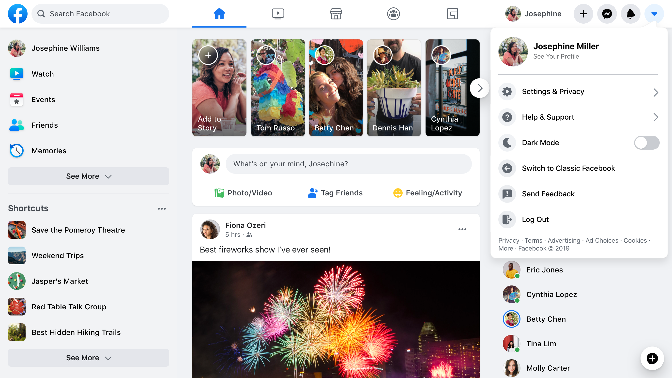
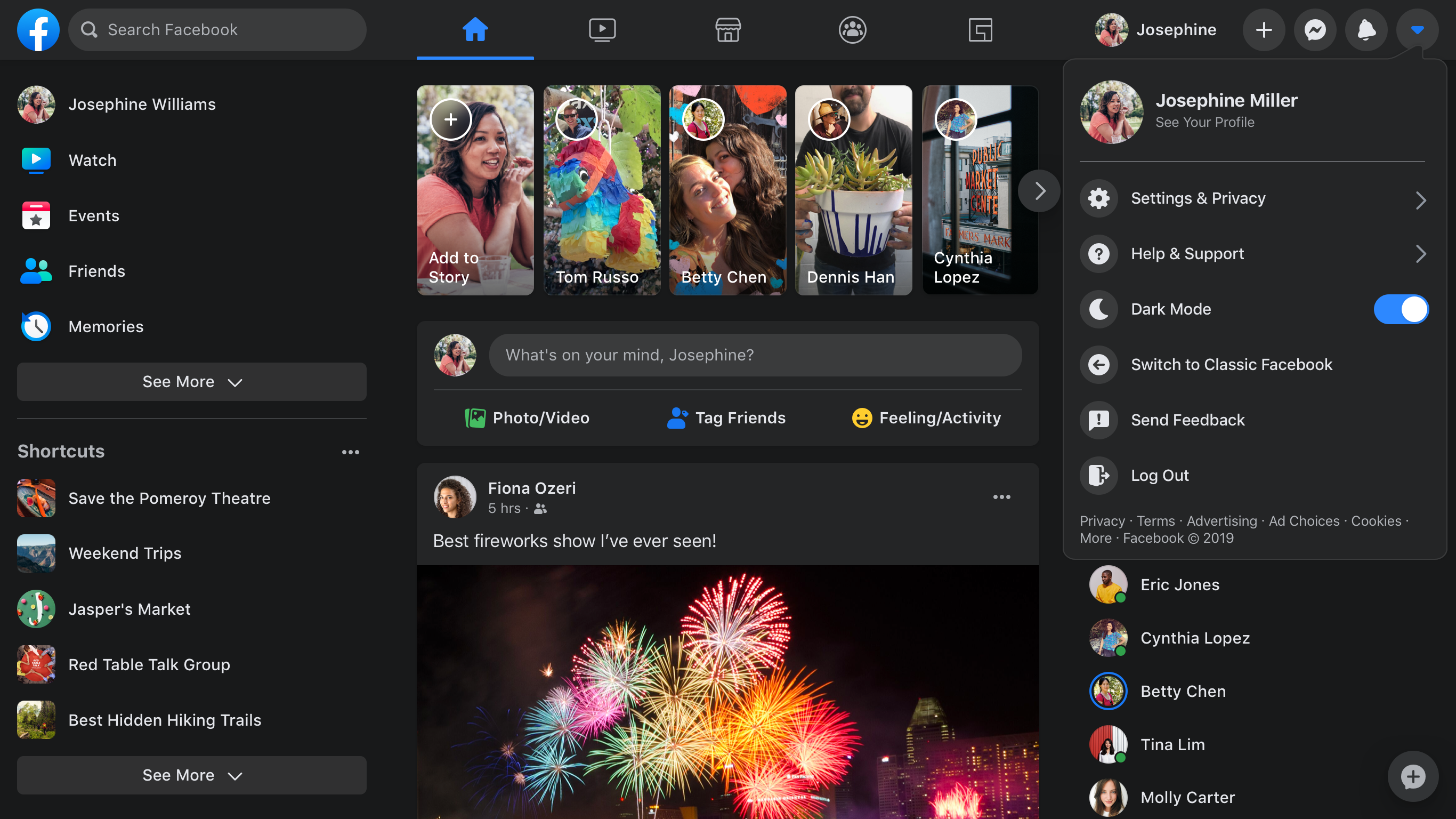
Our first change cut homepage CSS by 80 percent. On the new site, the CSS we write differs from what ships to the browser. We author styles using familiar syntax that looks like CSS-in-JavaScript, colocated next to components. At build time, those files are split into optimized CSS bundles. The new site ships far less CSS while unlocking dark mode, dynamic font sizing for accessibility, and improved image rendering—and it makes engineering easier.
Atomic CSS shrinks the homepage footprint
The old homepage loaded over 400 KB of compressed CSS (2 MB uncompressed), but only about 10 percent of that was used for the initial render. The CSS grew with every new feature and rarely shrank. We solved this by generating atomic CSS at build time. Because atomic CSS scales with the number of unique style declarations rather than the number of components or features, its growth curve is logarithmic. Generated atomic CSS from across the site can be combined into one small, shared stylesheet. The new homepage downloads less than 20 percent of the CSS the old site did.
Colocated styles cut waste and maintenance
On the old site, it was hard to know whether CSS rules were still in use, which is why dead styles lingered. Atomic CSS reduces the performance cost, but unused source CSS still adds engineering overhead. Now styles live alongside their components, so when a component is deleted, its styles go with it. At build time, we split them into bundles.
Another issue was CSS precedence by ordering—hard to manage with automated packaging that may reorder files. A change in one file could break another component’s styles without the author knowing. We’ve moved to a styling API inspired by React Native: styles apply in a stable order, and we don’t support CSS descendant selectors.
Font sizes that respect user defaults
Browser zoom can interfere with accessibility. Many sites now enlarge text by zooming, which triggers tablet or mobile layouts or enlarges images that shouldn’t change. We use rems to respect user-specified defaults and offer custom font-size controls without touching stylesheets. Manually converting design pixel values to rems risks bugs, so our build tool does that conversion automatically.
Here’s a simplified view of the process. The source code might look like this:
const styles = stylex.create({
  emphasis: {
    fontWeight: 'bold',
  },
  text: {
    fontSize: '16px',
    fontWeight: 'normal',
  },
});

function MyComponent(props) {
  return <span className={styles('text', props.isEmphasized && 'emphasis')} />;
}
The generated CSS looks like this:
.c0 { font-weight: bold; }
.c1 { font-weight: normal; }
.c2 { font-size: 0.9rem; }
And the JavaScript output:
function MyComponent(props) {
  return <span className={(props.isEmphasized ? 'c0 ' : 'c1 ') + 'c2 '} />;
}
Theming via CSS variables
On the old site, themes were applied by adding a class to the body element and using higher-specificity rules to override existing styles. That approach no longer works with atomic CSS-in-JavaScript, so we switched to CSS variables. Each theme is defined under a class; when that class is applied to a DOM element, the theme’s values cascade through its subtree. This means themes can live in a single stylesheet, toggling between them doesn’t require a page reload, and multiple themes can coexist on the same page.
.light-theme {
  --card-bg: #eee;
}
.dark-theme {
  --card-bg: #111;
}
.card {
  background-color: var(--card-bg);
}
The performance cost of a theme is now proportional to the palette size, not the component-library complexity. The atomic bundle also includes dark mode support.
SVGs inline for single-pass rendering
Icon flicker—where icons appear after the surrounding content—was a real problem. We now render SVGs inline in HTML via React rather than passing them to <img> tags. Since these SVGs are effectively JavaScript, they bundle and deliver with their components, ensuring a single clean render pass. The cost in SVG paint performance was worth eliminating the pop-in. Icons can also change colors smoothly at runtime without extra downloads: we style them from props and use our CSS variables for monochrome theming.
function MyIcon(props) {
  return (
    <svg {...props} className={styles({/*...*/})}>
       <path d="M17.5 ... 25.479Z" />
    </svg>
  );
}
Shrinking what the browser has to download
JavaScript size directly affects how fast a single-page app can load. To make a client-side React app viable for Facebook.com, the team had to keep downloads as small as possible at every stage of the render. That meant moving away from monolithic bundles and toward a tiered loading model controlled by a declarative, statically analyzable API.
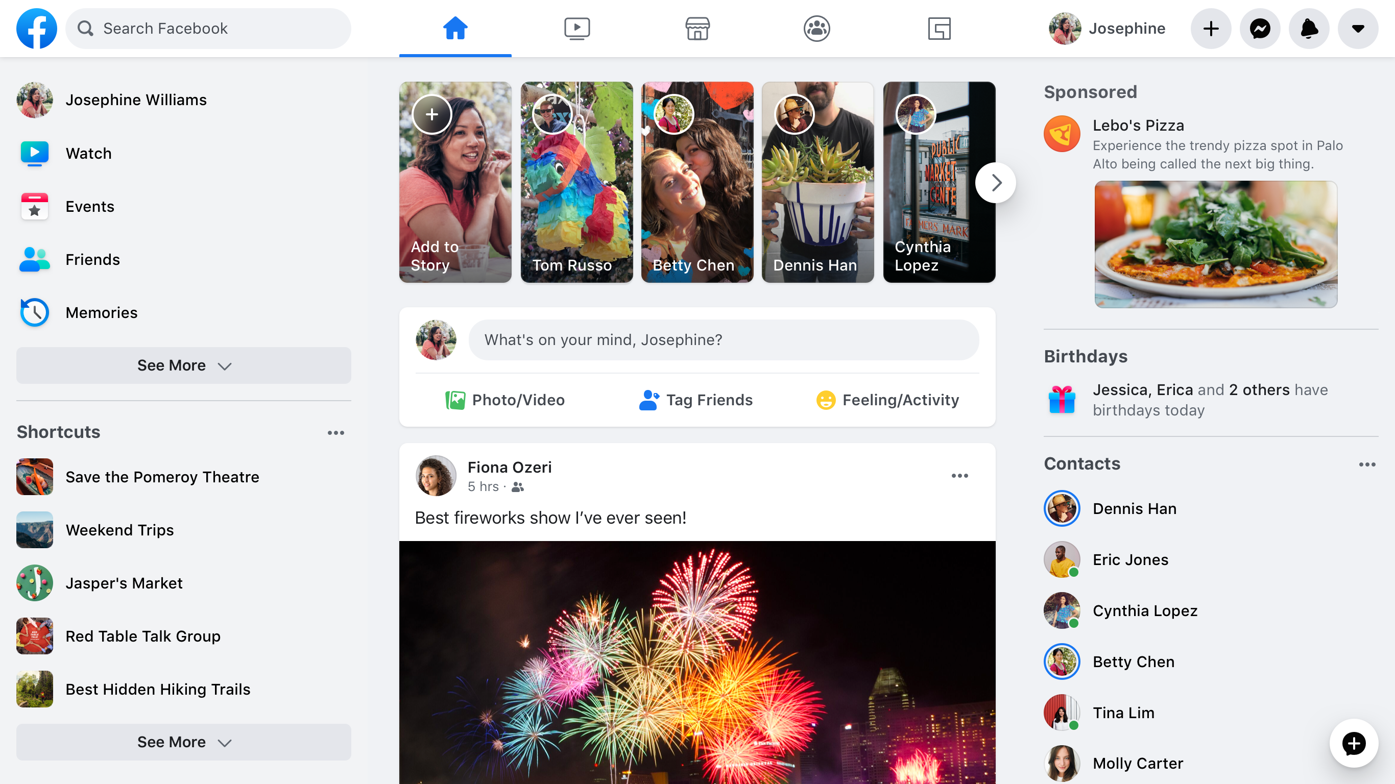
The core idea is JavaScript Loading Tiers: code needed for the initial viewport is split into three groups. Tier 1 covers the basic layout and UI skeletons that make up the first paint. Tier 2 holds everything required to fully render above-the-fold content, so that once it finishes, nothing on screen should still be changing because of code loading. Tier 3 is everything else — logging, live-update subscriptions, and other code that doesn't affect the current pixels.
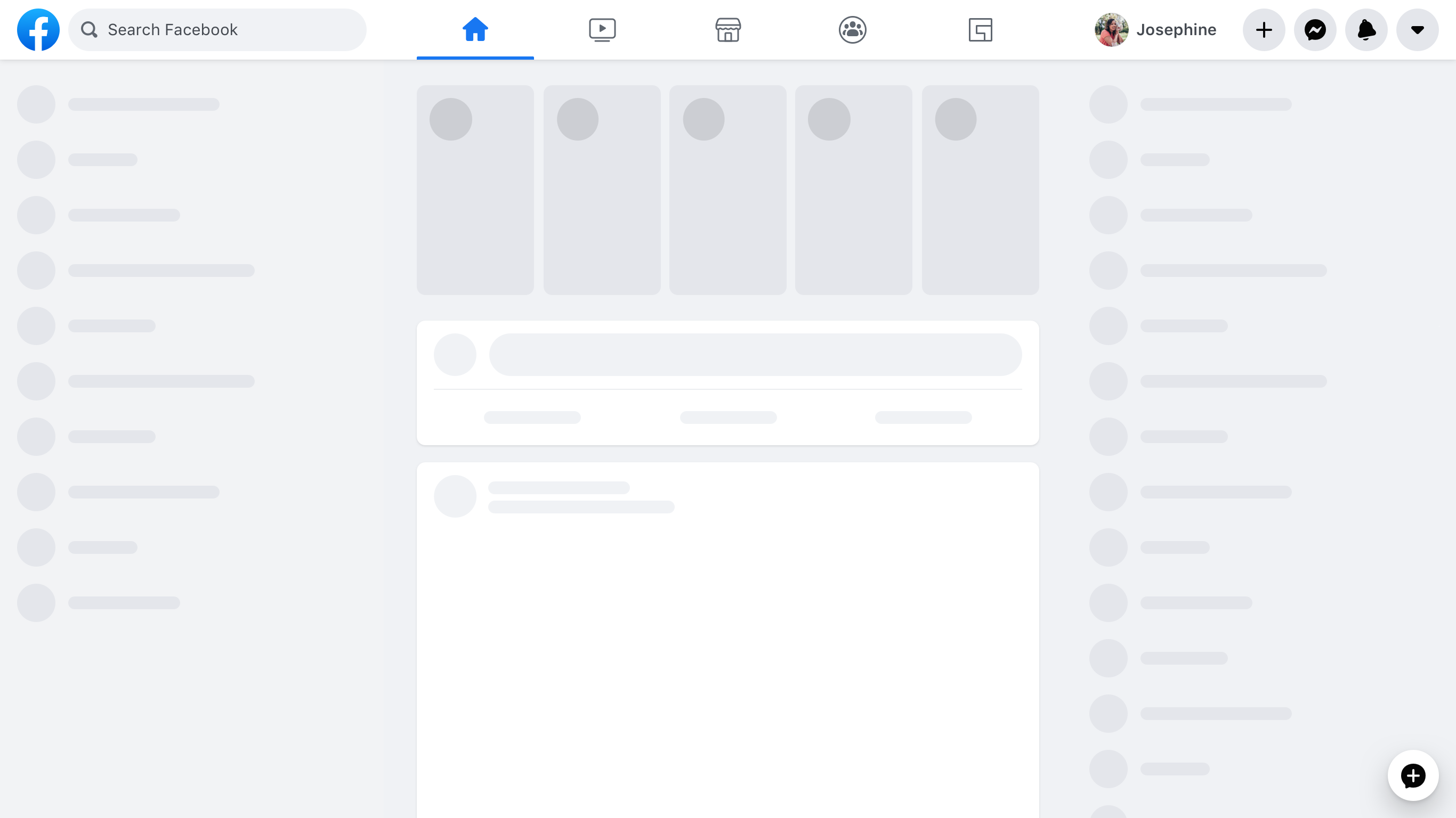
import ModuleA from 'ModuleA';Tier 1 uses regular import syntax. Tier 2 code is pulled in when the render encounters an importForDisplay call, which returns a promise-based wrapper; Tier 3 works the same way with importForAfterDisplay. Instead of one 500 KB JavaScript file delivered up front, a page may need only 50 KB for its first paint, another 150 KB to become fully interactive on screen, and 300 KB that can arrive later without delaying either milestone. The loading screen renders much earlier, and the final paint is not held up by code that doesn't affect it.
importForDisplay ModuleBDeferred from 'ModuleB';
importForAfterDisplay ModuleCDeferred from 'ModuleC';

// ...

function onClick(e) {
  ModuleCDeferred.onReady(ModuleC => {
    ModuleC.log('Click happened! ', e);
  });
}
Splitting code by experiment, then by data
A/B tests and locale differences mean the same UI often has multiple variations. Downloading all of them for every person wastes bytes; fetching variations lazily during render can be slow. Instead, these decisions are declared ahead of time and encoded in the dependency graph. While the page loads, the server checks the experiment and sends only the needed code version. This approach suits conditions that are static for a person across page loads, such as tests, locales, and device classes.
const Composer = importCond('NewComposerExperiment', {
  true: 'NewComposer',
  false: 'OldComposer',
});
Data-driven branches are trickier because they depend on runtime responses. News Feed posts, for instance, can contain many attachment types; shipping render code for every possibility would bloat the page. Using Relay, developers can declare rendering dependencies based on the shape of returned data — if a post has a photo attachment, the query states that PhotoComponent is needed to render it.
... on Post {
  ... on PhotoPost {
    @module('PhotoComponent.js')
    photo_data
  }
  ... on VideoPost {
    @module('VideoComponent.js')
    video_data
  }
}
Each component additionally describes its own data requirements as a fragment, so the query logic is split alongside the code.
Keeping tiers honest with budgets
Tiered loading and conditional dependencies only help if sizes are kept in check over time. Per-product JavaScript budgets set limits based on performance goals, technical constraints, and product boundaries. Shared infrastructure has its own carefully curated budget; it counts against every page but is free for product teams to use. Separate budgets cover deferred, conditionally loaded, and on-interaction code.
Tooling enforces those budgets across the development pipeline:
- A dependency graph tool visualizes where bytes originate.
- Merge-request monitoring shows size regressions and improvements, with customizable alerts.
- Interactive graphs display size history between revisions.
- Dashboards track current size relative to budgets.
Fetching data earlier and in smaller pieces
The rebuild also unified web data-fetching around GraphQL and Relay, matching the mobile apps. That stack already minimized the amount of data requested; the remaining work was to get it to the client sooner.
Because Relay statically knows what a page needs, the server can begin preparing data as soon as it receives the page request — in parallel with the download of the required code. Data is streamed with the page as it becomes ready, avoiding extra round trips.
Streaming feeds, deferring slow queries
On the initial load, content below the viewport is streamed with an internal GraphQL extension, @stream. The client doesn't know how many News Feed stories will fit on screen, and fetching them one by one on scroll would be slow. Streaming the feed connection with a single query lets each story arrive as soon as it is ready, whether for the first screen or for pagination.
fragment HomepageData on User {
  newsFeed(first: 10) {
    edges @stream
  }
  ...AdditionalData
}
Other queries mix fast and slow parts. A profile's name and photo are quick; loading the Timeline takes longer. The @defer extension lets different response sections stream in as they finish, so the initial UI can render without waiting on the slowest piece. Combined with React Suspense, this creates explicit loading states for a smooth top-down experience.
fragment ProfileData on User {
  name
  profile_picture { ... }
  ...AdditionalData @defer
}
Having the route plan ready before navigation
Navigating between routes requires both code and data for the destination. To minimize round trips, the client keeps a route map — ahead-of-time knowledge of which resources each route will need. The map is too large for Facebook to send in full, so entries are added dynamically as links are rendered during the session. The router sits at the top of the app, so route state can drive global UI decisions such as the top navigation bar and chat tabs.
Prefetching, then navigating in the background
Waiting until React renders a route to fetch its code and data makes navigation slow. Instead, the first resource requests begin before the destination link is clicked.
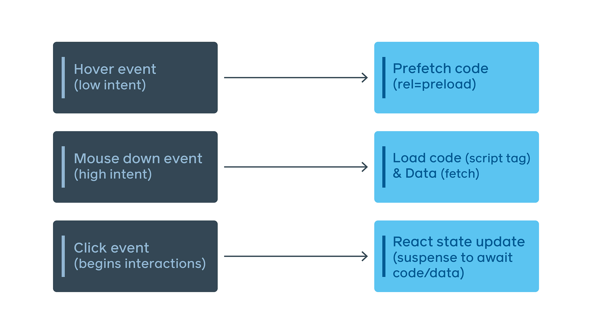
When navigation does happen, React Suspense transitions keep the previous route visible until the next one either renders fully or settles into its skeleton loading state — a smoother experience than a blank screen.
Breaking the serial code-then-data chain
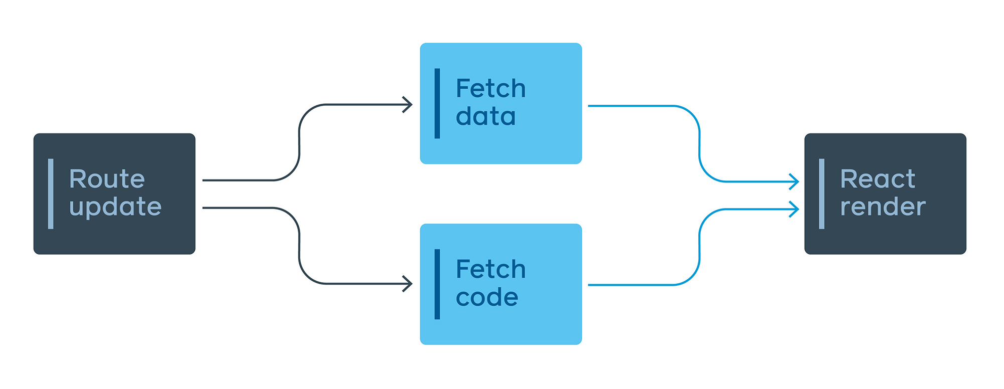
Lazy loading route code becomes a problem when the data-fetching logic lives inside the same lazy chunk. The browser would have to download and execute the code before it even knows what data to request, creating a serial network load.
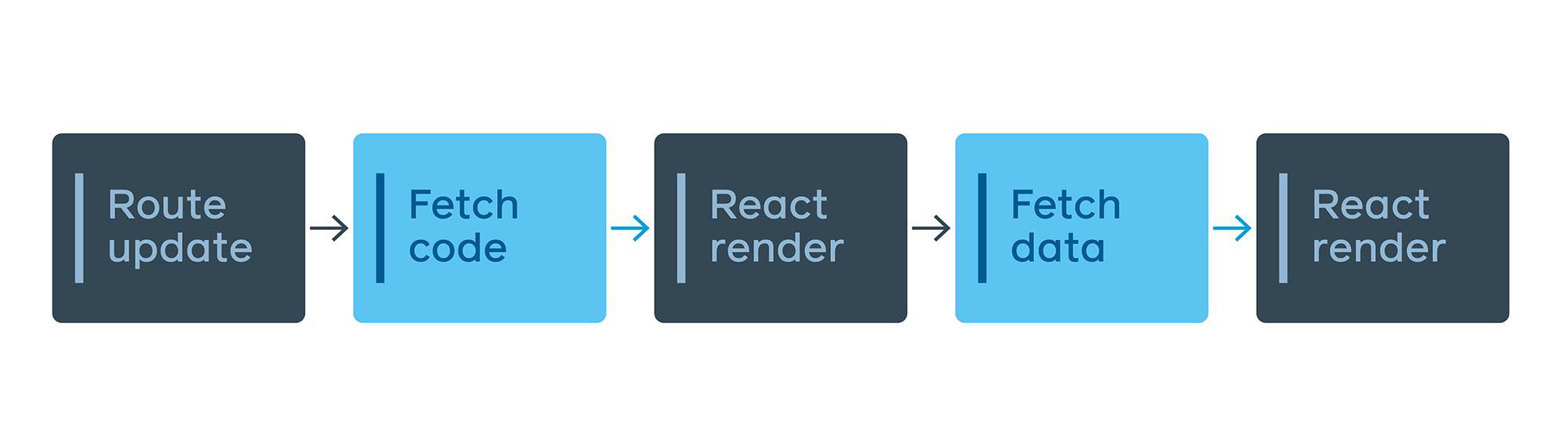
The solution is an EntryPoint: a small file that wraps each code-split point and transforms inputs into GraphQL queries. EntryPoints are downloaded in advance for any reachable split point; the app then automatically decides when to fetch the underlying code and data. The query remains colocated with the view component, but EntryPoint encapsulates when that query fires and how inputs map to query variables. A side benefit is a single JavaScript function capturing all data-fetching needs for each point in the app, which feeds into the server preloading logic described above.
These patterns are not Facebook-specific. Declarative code splitting, streamed and deferred queries, and route-aware prefetching can apply to any client-side application regardless of framework. Treating performance as part of the engineering experience — not a tax on shipping features — makes it possible to build more ambitious products without sacrificing load time or accessibility.


