

Tabs have long been a case where CSS alone struggles to produce something usable, let alone accessible. The older techniques still work, but there is a cleaner approach now: a set of <details> elements arranged with CSS Grid, where each <details> becomes a tab and Subgrid keeps the labels and the open panel aligned on shared lines.
Starting markup
The structure is a parent wrapper — call it .grid — holding one <details> per tab, each classed as .item. Nothing about this looks like a tab set yet; that part comes with the layout.
<div class="grid">
  <!-- First tab: set to open -->
  <details class="item" name="alpha" open>
    <summary class="subitem">First item</summary>
    <div><!-- etc. --></div>
  </details>
  <details class="item" name="alpha">
    <summary class="subitem">Second item</summary>
    <div><!-- etc. --></div>
  </details>
  <details class="item" name="alpha">
    <summary class="subitem">Third item</summary>
    <div><!-- etc. --></div>
  </details>
</div>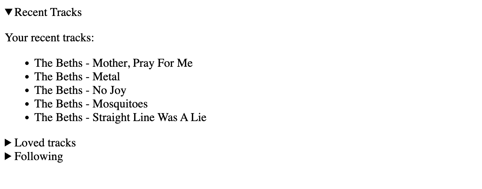
Laying out the wrapper
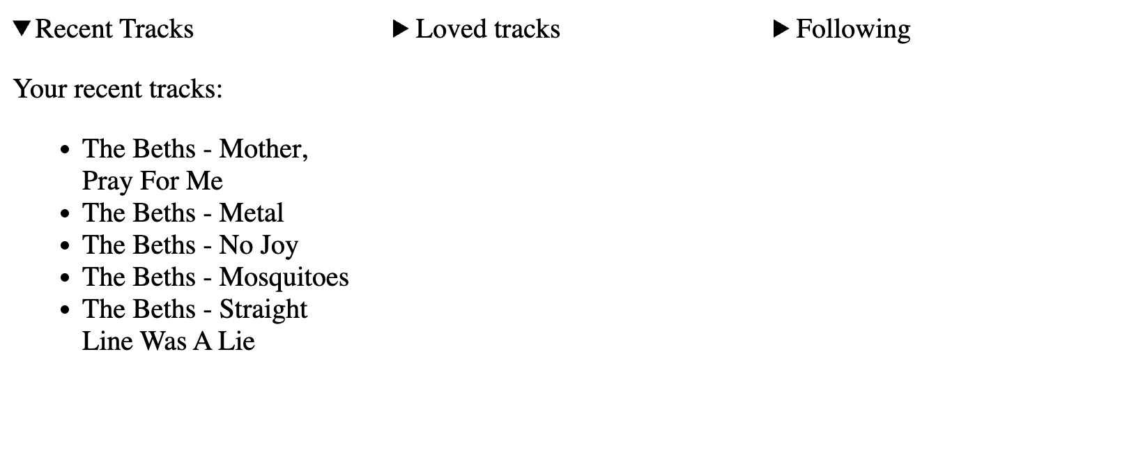
The wrapper gets a three-column grid, one column per tab, with spacing between them. It also gets two rows: the first sized to its content for the tab labels, the second taking a share of the available space for the active panel.
.grid {
  display: grid;
  grid-template-columns: repeat(3, minmax(200px, 1fr));
  grid-template-rows: auto 1fr;
  column-gap: 1rem;
}
Letting tabs share the wrapper's lines
Setting each tab to subgrid means the <details> elements reuse the existing lines from .grid rather than spawning a separate nested grid with lines of its own.
details {
  display: grid;
  grid-template-columns: subgrid;
  grid-template-rows: subgrid;
}
Each <details> is then made to span the whole wrapper using grid-column and grid-row:
details {
  display: grid;
  grid-template-columns: subgrid;
  grid-template-rows: subgrid;
  grid-column: 1 / -1;
  grid-row: 1 / span 3;
}
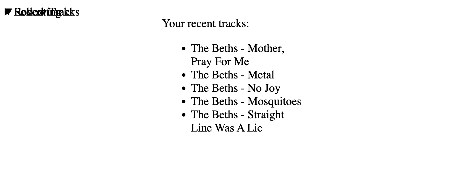
The result looks broken at first — every tab occupying the same area, stacked on top of the others — but covering the full .grid is the intended intermediate state.
Placing the active panel
The panel content goes into the second subgrid row, stretched across all three columns. It is targeted with ::details-content, a pseudo-element with decent support that is not yet in WebKit at the time of writing. It avoids adding a wrapper element in the markup purely for styling.
details::details-content {
  grid-row: 2; /* position in the second row */
  grid-column: 1 / -1; /* cover all three columns */
  padding: 1rem;
  border-bottom: 2px solid dodgerblue;
}
Only one panel should be visible. The enabling-selector pattern handles this: hide the ::details-content of every <details> that is :not([open]).
details:not([open])::details-content {
  display: none;
}
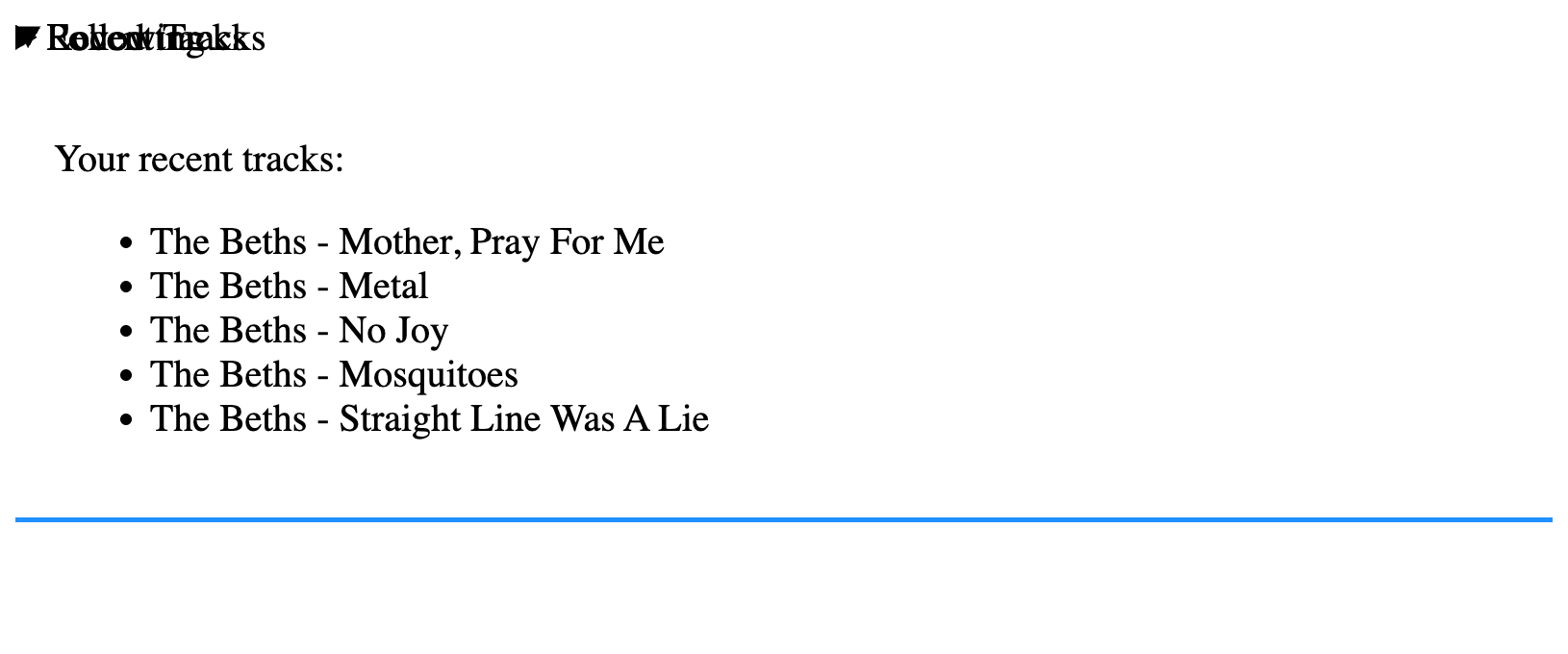
The tabs still overlap, but the only panel rendered belongs to the open tab.
Spreading the tab labels
Each <details> holds a <summary>, which supplies both the tab label and the toggle control. Placing <summary> in the first subgrid row and adding a light open-state style is the next step:
summary {
  grid-row: 1; /* First subgrid row */
  display: grid;
  padding: 1rem; /* Some breathing room */
  border-bottom: 2px solid dodgerblue;
  cursor: pointer; /* Update the cursor when hovered */
}

/* Style the <summary> element when <details> is [open] */
details[open] summary {
  font-weight: bold;
}
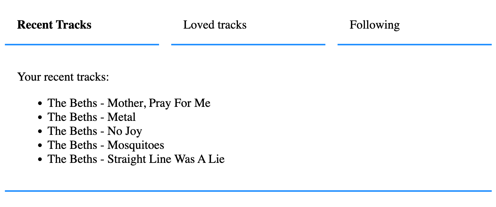
The labels remain stacked until each is assigned to its own subgrid column. :nth-of-type picks them off one by one according to source order:
/* First item in first column */
details:nth-of-type(1) summary {
  grid-column: 1 / span 1;
}
/* Second item in second column */
details:nth-of-type(2) summary {
  grid-column: 2 / span 1;
}
/* Third item in third column */
details:nth-of-type(3) summary {
  grid-column: 3 / span 1;
}
CSS has no loops, but variables keep the rules DRY:
summary {
  grid-column: var(--n) / span 1;
}
A --n variable is set per <details>, inlined in the HTML and used as a styling hook:
<div class="grid">
  <details class="item" name="alpha" open style="--n: 1">
    <summary class="subitem">First item</summary>
    <div><!-- etc. --></div>
  </details>
  <details class="item" name="alpha" style="--n: 2">
    <summary class="subitem">Second item</summary>
    <div><!-- etc. --></div>
  </details>
  <details class="item" name="alpha" style="--n: 3">
    <summary class="subitem">Third item</summary>
    <div><!-- etc. --></div>
  </details>
</div>
For the loop itself, a templating language (the example uses Liquid) can generate the tab markup instead of writing each element by hand. Other templating languages work just as well.
{% for item in itemList %}
  <div class="grid">
    <details class="item" name="alpha" style="--n: {{ forloop.index }}" {% if forloop.first %}open{% endif %}>
      <!-- etc. -->
    </details>
  </div>
{% endfor %}
Making every label clickable
Because the <details> elements are stacked, only the last <summary> is reachable — it sits on top of the rest. Giving the <summary> elements a z-index lifts them above the stack.
summary {
  z-index: 1;
}
The complete version runs as a working demo.
What the element gives you for free
<details> ships with built-in accessibility: keyboard navigation and screen reader support for both the expanded and collapsed states. There is room to push it further, which is a subject for separate coverage.
Update: Nathan Knowler and Adrian Roselli both contributed additional points on the approach after publication.




