
Why PWAs Need Their Own Design Pass
Progressive Web Apps are a powerful bridge between the web and native applications, but that bridge works both ways. When you hide the browser interface to create a more app-like feel, you also hide the tools users rely on every day: back and forward buttons, refresh, URL copying, and search.
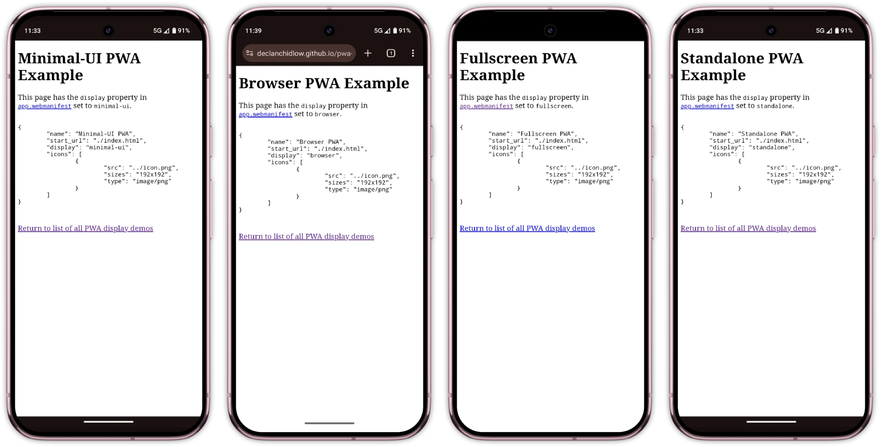
The display member of your PWA manifest controls how much of that browser UI remains visible. The available modes are:
fullscreen: Hides all browser UI, using the entire display.standalone: Looks like a native app, hiding browser controls but keeping system UI.minimal-ui: Shows minimal browser UI elements.browser: Standard web browser experience with full browser interface.
Choosing fullscreen or standalone makes your app feel native, but it can also trap users. Consider someone midway through a long form with no way to go back, or a user trying to share a product page without being able to copy the URL. The browser provides all of these capabilities, and when it disappears, your app must fill the gap.
The lesson is similar to designing for print versus the web: standalone app experiences require their own set of design considerations, not just a re-skinned website.
Detecting Display Modes with Media Queries
The display-mode media feature lets you adapt your styles to the current display mode. Each mode can be used as a media query condition:
@media (display-mode: standalone)applies only to pages in standalone mode.@media (display-mode: fullscreen)applies to fullscreen mode, and also applies when the Fullscreen API is in use.@media (display-mode: minimal-ui)applies to minimal UI mode.@media (display-mode: browser)applies to standard browser mode.
Keep in mind that the actual display mode can differ from what you set in your manifest, depending on browser support.
Two experimental modes are worth watching: window-controls-overlay and tabbed. These are used with the display_override manifest member. Unlike display, which has a fixed fallback chain (fullscreen → standalone → minimal-ui → browser), display_override lets you define your own fallback order:
"display_override": ["fullscreen", "minimal-ui"]
window-controls-overlay applies only to desktop PWAs, where the app takes up the entire window and window control buttons appear as an overlay. tabbed is relevant when multiple applications share a single window. There is also the picture-in-picture display mode.
These media queries work exactly like any other. To show an element with the class .pwa-only only in standalone mode:
.pwa-only {
    display: none;
}

@media (display-mode: standalone) {
    .pwa-only {
        display: block;
    }
}
To apply a style in both standalone and minimal-ui modes:
@media (display-mode: standalone), (display-mode: minimal-ui) {
    .pwa-only {
        display: block;
    }
}
When CSS alone isn't sufficient, you can also reference the display mode from JavaScript:
const isStandalone = window.matchMedia("(display-mode: standalone)").matches;
// Listen for display mode changes
window.matchMedia("(display-mode: standalone)").addEventListener("change", (e) => {
  if (e.matches) {
    // App is now in standalone mode
    console.log("Running as PWA");
  }
});
Putting Display Modes to Work
Tailor Content for Installed Users
Users who have installed your PWA have already committed. You can reduce marketing content and installation prompts for them, focusing instead on the user experience. These users likely don't need to be sold on features they have already embraced.
Expose Features and Options
When browser UI is hidden, features like font sizing, light/dark mode toggles, bookmarks, sharing, and tabs may need in-app alternatives. Consider directly exposing more functionality in PWA mode since users can't easily reach browser settings.
Choose Platform-Appropriate Features
Some UI patterns feel out of place on the web but are natural in apps. A bottom navigation bar, for instance, is common in native mobile apps due to easier reachability but is uncommon on websites. Conversely, features like print buttons rarely make sense in an app context and can be hidden in PWA mode.
Handle Install Prompts Gracefully
A recurring annoyance is an install prompt appearing after the app is already installed. While the browser may provide its own prompt, this behavior is inconsistent. To avoid the problem, hide install prompts using display mode media queries or skip triggering popups when JavaScript detects the app is already running in PWA mode.
You can create a reusable utility class to hide elements when the app is installed as a PWA:
/* Utility class to hide elements in PWA mode */
.hide-in-pwa {
  display: block;
}

@media (display-mode: standalone), (display-mode: minimal-ui) {
  .hide-in-pwa {
    display: none !important;
  }
}
Then use it in your HTML:
<div class="install-prompt hide-in-pwa">
  <button>Install Our App</button>
</div>

<div class="browser-notice hide-in-pwa">
  <p>For the best experience, install this as an app!</p>
</div>
The same pattern can be reversed to show elements only when in PWA mode.
Leverage Scope and Start URL
The scope and start_url manifest properties offer another way to present different content. Here is an example manifest:
{ "name": "Example PWA","scope": "/dashboard/","start_url": "/dashboard/index.html","display": "standalone", "icons": [ { "src": "icon.png", "sizes": "192x192", "type": "image/png" } ] }
scope defines the top level of the PWA. When users navigate outside the scope, they still get an app-like interface but regain access to browser UI elements. This is useful for parts of the app that aren't optimised for the standalone experience.
start_url defines the page users see when they open the app. If your marketing site is at example.com and the dashboard is at example.com/dashboard/index.html, you can set start_url to /dashboard/index.html so installed users land directly on the content they need.
PWA-Only View Transitions
View transitions can feel out of place on the web but are a common part of native app design. You can restrict them to PWA mode by wrapping the relevant CSS in a display mode media query:
@media (display-mode: standalone) {
  @view-transition {
    navigation: auto;
  }
}
For more ambitious projects, you can pair display mode checks with device and browser detection to make an installed PWA feel closer to the native design language of the platform.
Support and Testing Considerations
Browser support for display mode media queries is generally good. However, Firefox lacks PWA support entirely, and Firefox for Android only renders PWAs in browser mode. Progressive enhancement handles these cases, providing graceful degradation when display mode features are unavailable.
Testing PWAs is complicated by the fact that every device and browser combination handles display modes slightly differently. There is no convenient browser tool for simulating display modes, so testing must be done manually across the devices, browsers, and operating systems you intend to support.
The Context-Shifted Experience
People interact with a Progressive Web App very differently depending on how they open it. Someone tapping an icon on their home screen expects a focused, application-like tool. A visitor arriving from a search engine link expects a standard webpage with familiar browser furniture. Treating both scenarios identically misses an opportunity to optimize the experience for each context.
The key is remembering that PWA users in standalone mode have different needs and expectations than standard website visitors. By detecting and responding to display modes, we can create experiences that feel more polished, purposeful, and genuinely app-like.
The gap between these two realities is where smart design lives. A standalone PWA window has no browser back button, no URL bar, and no tab strip. The UI must supply its own navigation and status cues. Meanwhile, the same code running in a browser tab needs to respect the conventions of the traditional web.
What Display Modes Unlock
Implementing context-aware logic via media queries delivers several concrete wins:
- Remove redundant promotion: Users who have already installed the app shouldn't see install banners or prompts. The media query allows you to suppress these elements entirely in standalone mode.
- Compensate for missing chrome: When the browser's own controls vanish, the app must provide its own way back, whether through an in-app back button or a prominent navigation drawer.
- Adjust content density and tone: A utility in an app window can prioritize quick actions and data display, while the website version can include more explanatory copy and marketing context.
- Mirror platform feel: Respectful integration means matching the visual and interactive norms of the operating system, making the app feel less like a website and more like a native citizen.
- Layer in enhancements: The baseline website remains fully functional, with progressive enhancements available to those in deeper modes.
Each of these is a practical response to the same underlying principle: a standalone PWA is a different product surface than the website, even if it shares the same codebase.
From Detection to Deliberate Design
Separating users by entrance path is not about gating content but about shaping the interaction. The display-mode media query functions as a bridge between the web's universal reach and the app model's intention. It allows one codebase to fluidly change its interface contract based on how it is being consumed.
This strategy turns a potential weakness — the PWA's identity split between website and app — into its greatest strength. Instead of a diluted experience that tries to satisfy everyone at once, the query lets developers create focused interfaces that match the user's immediate intent.
What separates a great PWA from a good one is increasingly this level of attention to context. As the platform matures, users will come to expect this kind of seamless transition between web and app. Building with display-mode awareness now ensures your application provides that genuinely app-like polish where it counts, without sacrificing the accessibility of the standard website experience. For a broader foundation in the subject, Ankita Masand’s “Extensive Guide To Progressive Web Applications” offers a deeper dive into the underlying principles.


