

What Anchor Positioning Changes
Anchor positioning is a CSS feature for tethering one element to one or more others. The attached element — the target — gets positioned relative to an anchor element, and the new @position-try at-rule supplies fallback placements when the primary one doesn't fit. A useful shorthand: it makes absolutely positioned elements behave the way you expect them to, without the usual fights over absolute positioning and z-index.
The feature is a W3C draft spec and carries "limited availability" status in Baseline, meaning Chromium-based browsers only (versions 125+) at the time of writing. Oddbird maintains a polyfill for other engines. Browser support data comes from Caniuse:
Desktop
| Chrome | Firefox | IE | Edge | Safari |
|---|---|---|---|---|
| 160 | 163 | No | 156 | 27 |
Mobile / Tablet
| Android Chrome | Android Firefox | Android | iOS Safari |
|---|---|---|---|
| 157 | 160 | 157 | 27.0 |
The Basic Mechanism
A working pair needs two elements: the anchor-positioned element and the target tethered to it.
<!-- Anchor element -->
<div id="anchor">
  Anchor
</div>

<!-- Target element -->
<div id="target">
  Target
</div>
The anchor gets an anchor-name property. You pick the name, but it requires the double-dash prefix, the same convention as CSS custom properties.
#anchor {
  anchor-name: --anchor;
}
The target needs position: absolute; plus a position-anchor value that matches the anchor's anchor-name.
#anchor {
  anchor-name: --anchor;
}

#target {
  position: absolute;
  position-anchor: --anchor;
}
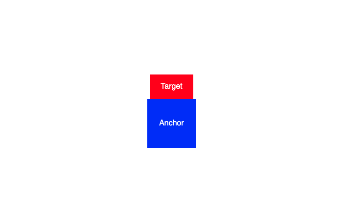
That attaches the pair. Actual placement comes from position-area, which lays an invisible 3×3 grid over the anchor; positioning keywords choose which cell of that grid the target occupies.
#target {
  position: absolute;
  position-anchor: --anchor;
  position-area: top center;
}
In the example, the target now sits at the top-center of its anchor.
Experiments That Hold Up
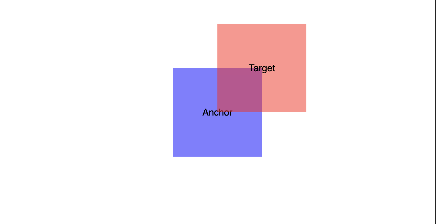
Pseudo-elements can be anchored just like regular elements, which could be handy for design flourishes or indicator-style functionality.
#anchor {
  anchor-name: --anchor;

  &::before {
    content: "Target";
    position: absolute;
    position-anchor: --anchor;
    left: anchor(center);
    bottom: anchor(center);
  }
}
Anchors can also be swapped on the fly. Instead of position-area, this next example uses the anchor() function, which positions a target from the computed values of the anchor itself — here, the target's top matches the anchor's bottom, and its left matches the anchor's left. Hovering the container flips position-anchor from --anchor-one to --anchor-two, and because the target is positioned via top and left, a transition animates the swap smoothly.
#target {
  position: absolute;
  position-anchor: --anchor-one;
  top: anchor(bottom);
  left: anchor(left);
}
.container:hover {
#target {
position-anchor: --anchor-two;
}
}One more experimental result: Chrome's newer ::details-content pseudo-selector, which styles the hidden portion of a <details> element, can itself be anchored. Definitely not production-ready, but it works.
Practical Patterns
All of the following are Chrome-only at the time of writing.
Tooltips
A tooltip is the simplest case: hover an icon, a label floats nearby. The markup places the tooltip as a sibling of the anchor <button>, with [aria-labelledby] on the button pointing at the tooltip's [id]. The tooltip is a <div> given [role="tooltip"]; that role doubles as a semantic selector for shared tooltip styling, including positioning relative to the anchor.
Mechanically: give the button an anchor-name, set the tooltip's position-anchor to match, default the tooltip's visibility to hidden, and switch it to visible through sibling selectors when the target receives hover or focus-visible.
<!-- ... -->;
<li class="toolbar-item">;
  <button type="button"
    id="inbox-tool"
    aria-labelledby="inbox-label"
    class="tool">
    <svg id="inbox-tool-icon">
      <!-- SVG icon code ... -->
    </svg>
  </button>

  <div id="inbox-label" role="tooltip">
    <p>Inbox</p>
  </div>
</li>
<!-- ... -->
/* Anchor-positioned Element */
#inbox-tool {
anchor-name: --inbox-tool;
}
/* Target element */
[role="tooltip"]#inbox-label {
position-anchor: --inbox-tool
}
/* Target positioning */
[role="tooltip"] {
position: absolute;
position-area: end center;
/* Hidden by default */
visibility: hidden;
}
/* Visible when tool is hovered or receives focus */
.tool:hover + [role="tooltip"],
.tool:focus-visible + [role="tooltip"] {
visibility: visible;
}Touch devices can't hover, so a toggletip pattern may be the better fit there.
Floating disclosures
Floating disclosure components — dropdown menus, for instance — traditionally mean JavaScript plus absolute positioning plus z-index trouble. Combining anchor positioning with the [popover] attribute removes most of that. The Popover API lifts non-modal elements into the top layer and brings light dismissals along with it.
<nav>
  <button id="anchor">Toggle</button>
  <ul id="target">
    <li><a href="#">Link 1</a></li>
    <li><a href="#">Link 2</a></li>
    <li><a href="#">Link 3</a></li>
  </ul>
</nav>
Mark the target <ul> with [popover], add [popoveraction="toggle"] and a [popovertarget] pointing at the target's [id] on the controlling button, and you have a toggleable disclosure with no JavaScript.
<nav>
  <button id="anchor"
          popoveraction="toggle"
          popovertarget="target">
    Toggle
  </button>

  <ul id="target" popover>
    <li><a href="#">Link 1</a></li>
    <li><a href="#">Link 2</a></li>
    <li><a href="#">Link 3</a></li>
  </ul>
</nav>
Popovers carry a default browser margin; strip it first.
ul[popover] {
  margin: 0;
}
Anchor the button:
ul[popover] {
  margin: 0;
}

#anchor {
  anchor-name: --toggle;
}
Tether the target with position: absolute and position-anchor:
ul[popover] {
  margin: 0;
}

#anchor {
  anchor-name: --toggle;
}

#target {
  position: absolute;
  position-anchor: --toggle;
}
Then place it with position-area. The target's width uses anchor-size(width) to match the anchor's width.
ul[popover] {
  margin: 0;
}

#anchor {
  anchor-name: --toggle;
}

#target {
  position: absolute;
  position-anchor: --toggle;
  position-area: bottom;
  width: anchor-size(width);
}
Fallback positioning handles the case where the menu would land near the viewport bottom — overflowing or forcing extra scrolling. The position-try-fallbacks property supplies an alternate location. In the demo, the simplest option suffices: the opposite of the position-area value, top.
#target {
  position: absolute;
  position-anchor: --toggle;
  position-area: bottom;
  postion-try-fallbacks: top;
  width: anchor-size(width);
}
A shopping cart
This component stacks the previous techniques on a single anchor. Start with a button carrying a shopping cart icon:
<button id="shopping-cart-toggle">
  <svg id="shopping-cart-icon" />
    <!-- SVG icon code ... -->
  </svg>
</button>
Reuse the tooltip styles for a label, adding the class .tool to the button and including the tooltip inside it:
<!-- Toggle -->
<button id="shopping-cart-toggle"
        aria-labelledby="shopping-cart-label"
        class="tool">
  <svg id="shopping-cart-icon" />
    <!-- SVG icon code ... -->
  </svg>
</button>

<!-- Tooltip -->
<div id="shopping-cart-label"
     role="tooltip"
     class="tooltip">
  <p>Shopping Cart</p>
</div>
Both get wired up in CSS: the button's anchor-name matches the tooltip's position-anchor.
button#shopping-cart-toggle {
    anchor-name: --shopping-cart-toggle;
}

[role="tooltip"]#shopping-cart-label {
    position-anchor: --shopping-cart-toggle;
}
The button also needs to disclose a list of cart items. Since the UI floats and contains actions, a <dialog> is the semantic choice, made non-modal with the [popover] attribute. The button carries [popovertarget="shopping-cart"] and [popoveraction="toggle"]; a second button inside the dialog closes it via [popoveraction="close"].
<!-- Toggle -->
<button id="shopping-cart-toggle"
	aria-labelledby="shopping-cart-label"
	class="tool"
	popovertarget="shopping-cart"
	popoveraction="toggle">
  <svg id="shopping-cart-icon" />
    <!-- SVG icon code ... -->
  </svg>
</button>
<!-- Tooltip -->
<div id="shopping-cart-label"
     role="tooltip"
     class="tooltip">
  <p>Shopping Cart</p>
</div>
<!-- Shopping Cart -->
<dialog id="shopping-cart" popover>
  <!-- Shopping cart template... -->
  <button popovertarget="shopping-cart" popoveraction="close">
    Dismiss Cart
  </button>
</dialog>
Anchor the dialog with position-anchor and position-area:
#shopping-cart {
  position-anchor: --shopping-cart;
  position-area: end center;
}
At this point two elements are tethered to one anchor. Then comes the notification badge, placed inside the anchor this time.
<!-- Toggle -->
<button id="shopping-cart-toggle"
	aria-labelledby="shopping-cart-label"
	class="tool"
	popovertarget="shopping-cart"
        popoveraction="toggle">

  <svg id="shopping-cart-icon" />
    <!-- SVG icon code ... -->
  </svg>

  <!-- Notification Badge -->
  <div id="shopping-cart-badge" class="notification-badge">
    1
  </div>
</button>
<!-- ... -->
The tooltip copy can include the item count:
<!-- Tooltip -->
<div id="shopping-cart-label"
     role="tooltip">
  <p>Shopping Cart</p>
  <p>(1 item in cart)</p>
</div>
The anchor's accessible name now reads Shopping Cart (1 item in cart), giving assistive technologies useful context. Setting the badge's position-anchor to --shopping-cart-toggle tethers it to the same anchor as the tooltip and the dialog:
#shopping-cart-badge {
  position: absolute;
  position-anchor: --shopping-cart-toggle;
}
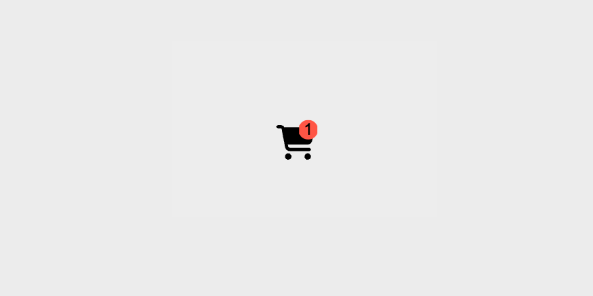
The badge shouldn't sit beside the anchor but overlap it, so anchor functions position it from the anchor's dimensions — bottom and left are matched to the anchor's center, putting the badge in the icon's upper-right corner:
#shopping-cart-badge {
  position: absolute;
  position-anchor: --shopping-cart-toggle;
  bottom: anchor(center);
  left: anchor(center);
}
An Onboarding Tool, Built on Anchors
The final project was an anchor-positioning-based onboarding tool, a return visit to a JavaScript attempt — "HandHoldJS" — that tracked a great many positions and misbehaved in odd ways. The new version, <hand-hold>, is a native custom element working entirely in the light DOM.
Tour stops are declared anywhere on the page with [data-tour-stop] attributes ordered by value. Inside <hand-hold> live a start <button>, a <dialog> holding the tour information, <section> elements separating content per stop, a fieldset[data-handhold-navigation] holding navigation radio buttons, and a second <button> that ends the tour. Each <section> carries a matching [data-handhold-content] attribute. JavaScript dynamically promotes each tour stop to an anchor, the <dialog> attaches via CSS anchor positioning, and a pseudo-element on the anchor highlights the current stop.
The dialog also relocates in the DOM to sit next to the anchor in the accessibility tree, an attempt at giving assistive-device users context about which element the dialog describes. It is far from a perfect accessible experience. Because the dialog moves in the DOM, a plain CSS transition won't do; a View Transition wrapping the DOM manipulation smooths the change instead.
Browser support is too limited and too much remains untested, so <hand-hold> is not recommended for production. It is an experiment.
Where This Leads
Like flexbox and grid before it, anchor positioning has the look of a feature that will change how CSS is written. Some further material worth exploring: Tab Atkins-Bittner, a contributing author of the W3C draft, spoke on the topic at CSS Day 2024, with the talk on YouTube. Thomas Park's Anchoreum, a Flexbox Froggy-style game, is a good way to get comfortable with the position-area property. Kevin Powell's video "CSS Popover + Anchor Positioning is Magical" demonstrates the combination, and an earlier CSS-Tricks piece mixes anchor positioning with view-driven animations for a floating notes effect.




